When it comes to selling books, the littlest details can make the biggest difference. One author of a middle-grade book (read: for kids ages 8-12) recently ran a PickFu poll that asked the simple yet critical question, “Which book would you buy?”
At first glance, the covers look exactly the same, but one cover won by a significant number of votes. Obviously, there’s a big difference between the two. Let’s see if we can find the graphic design secrets behind the winner.
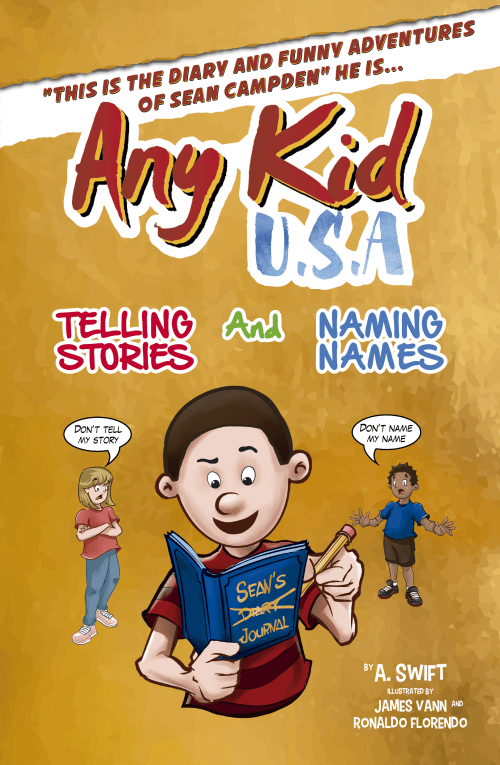
In Option A, the book cover’s style is evocative of a comic book crossed with a diary. The title, which is the same as the title on Option B is “This is the Diary and Funny Adventures of Sean Campden” He Is…Any Kid, U.S.A.: Telling Stories and Naming Names.
It’s a doozy of a title, but middle grade kids would probably adore it.
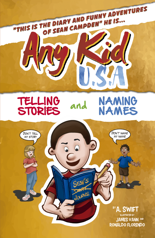
Option B is the same, except it removes the white banner that holds the subtitle inside. The white outline around the main character is gone, too.
Can you guess which one won?
And the winner is…Option A! With a score of 82 to Option B’s 18, it’s clear people almost exclusively loved Option A.
Let’s find the graphic design secrets that tell us why.
Graphic design secrets: the white banner is everything
Literally the one big reason people voted for Option A? They loved the white banner in the middle.
Option A got 41 votes. Of those, 30 respondents directly referenced the white banner.
First of all, the white banner draws the eye to the subtitle. One respondent said, “I liked the white torn-out section for the subtitle. I thought it was very eye
Another respondent specifically appreciated that the banner highlighted an interesting part of the title: “This design is remarking important facts about this book and they are: Telling Stories and Naming Names. I think this would be very helpful for me to decide in favor of this book.”
What young reader wouldn’t be interested in a book that promises to tell stories and name names? The white banner brings that part of the novel straight to the potential buyer’s eye.
Not only that, the banner makes the cover — which is pretty busy — easier to digest. As another respondent said, “I like how the white breaks up the text a little bit and makes it easier to read.”
Pay attention to each comment
Among all the overwhelmingly positive comments, there lies one small but important bit of feedback.
The respondent first praises the white banner but then goes on to say, “I’m not sure why you’ve got that first part of the blurb inside quotation marks. It seems unnecessary and weird.”
She’s referring to the first part of the title, “This is the Diary and Funny Adventures of Sean Campden” which appears in quotation marks that are, indeed, awkward.
No one else caught them. They’re the same in both images. But they are distracting to this respondent. They look out-of-place and awkward. If you were the author of this book or the creator of this poll, you’d do well to pay attention to this piece of feedback.
Key takeaways
First, never underestimate the importance of white space! And second, take note of all feedback, even if it’s a misspelling or grammatical piece of your book cover that is the same on all the options.
Need help deciding which cover to use for your middle-grade book? Create your own PickFu poll and to compare the designs!