Poll results
Save to favorites
Add this poll to your saved list for easy reference.
Which design are you MOST LIKELY to pruchase? Assume ALL variables are EQUAL!
Option B won this Ranked poll with a final tally of 26 votes after 3 rounds of votes counting.
In a Ranked poll, respondents rank every option in order of preference. For example, when you test 6 options, each respondent orders their choices from first to sixth place.
PickFu requires a majority to win a Ranked poll. A majority winner differs from a plurality winner. A majority winner earns over 50% of the votes, whereas a plurality winner earns the most votes, regardless of winning percentage.
If an option does not earn a majority of votes, PickFu eliminates the option with the lowest number of votes. The votes from the eliminated option are reassigned based on each respondent’s next choice. This process continues in rounds until a majority winner emerges.
Scores reflect the percentage of total votes an option receives during the vote counting and indicate the relative preference of the respondents. If there is no majority winner, look to the scores to see how the options fared relative to one another.
| Option | Round 1 | Round 2 | Round 3 |
|---|---|---|---|
| B | 34% 17 votes | 38% 19 votes +2 | 52% 26 votes +7 |
| D | 26% 13 votes | 34% 17 votes +4 | 48% 24 votes +7 |
| A | 26% 13 votes | 28% 14 votes +1 | Eliminated 14 votes reassigned |
| C | 14% 7 votes | Eliminated 7 votes reassigned |
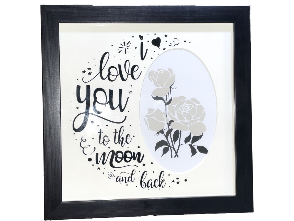
13 Responses to Option A
I like the black frame and the art on the matte that goes around the picture. It's modern and cute.
I like that choice A is very warm and personable.
I like the clever use of a moon shape with the poem in Option A. And the string moon in option B is unique design as well that would stand out to someone whose sees it.
I picked A because the white and black is classy looking and fits the style of my house.
I liked the design for option A the most, it has this nice look to due to the font style and the moon like shape for the text. Option b, I liked the moon artwork design, it stood out to me. Option C, was okay. Option D, I felt like the design didn't match up as with the quote like the other options.
I like the plain black border the most. B is the best one with some sort of design. C and D are just kind of whatever. They look good but nothing which I would buy.
I like choice A because it's very modern. I love choice B because it's vintage. I'm not a fan of D and C.
B is hard to read so i rated it last. A might be simpler, but in this case i prefer it
I like all of these. I have a frame already with the saying on it. I really like the font and design of Option A.
A looks the best to me I prefer this style the most, it has a more aesthetically pleasant look to me and it seems very high quality.
I like the font and background best on choice A. It has kind of an airy and light look to it. The message is nice all of these, but choice A makes it stand out from the others.
I loved the subtlety of A since this was the finest and had the most detail; it also had the most intricate design. D felt overly bulky and thus didn't come off as elegant and classy. I also liked the way B looked handmade with the hand-scratched, scrawled text.
Like hte colors and descrption. like the appeal of them. like how they all look different
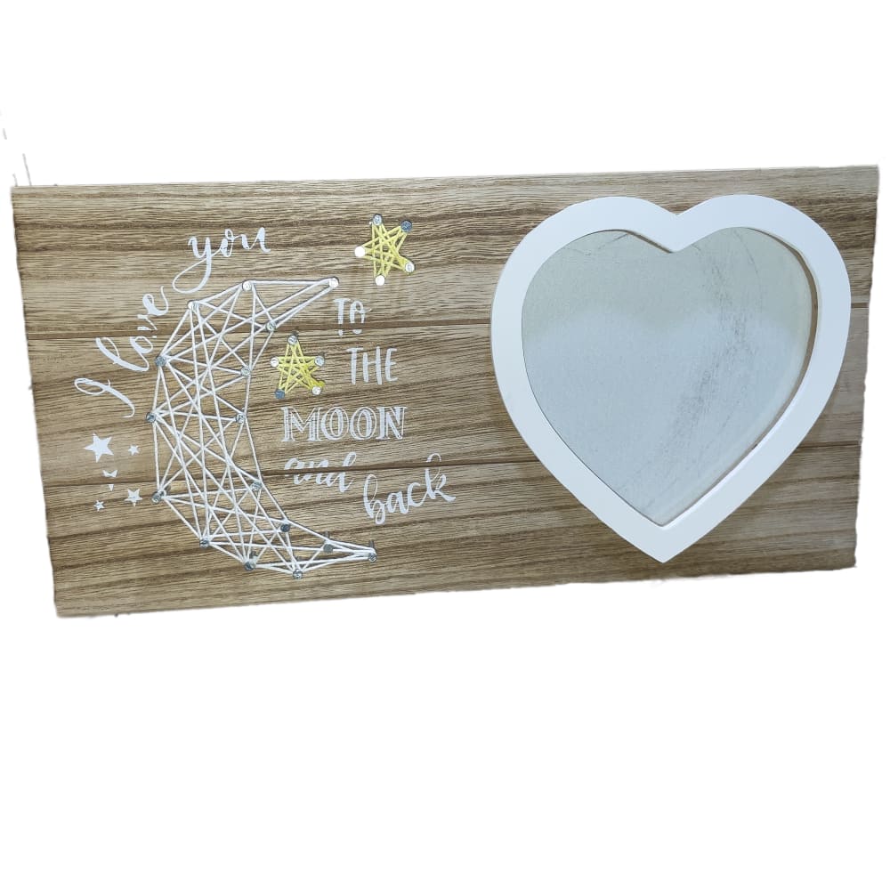
17 Responses to Option B
Option B with the moon looking more handmade adds more sentimental to the product.
I like the natural wood and the geometric print of the moon.
The wood design in B is pretty cool and unique. It reminds me of something that I would find on etsy.
I would purchase on option "B". The design looks creative and unique. The message matches the overall design perfectly.
i really enjoyed the creative styles in choices b & d
I chose panel B as I like the blending for the written text and cursive text. I also like the crescent moon.
I honestly only really liked the two options with the Wood on it. Those two I ranked #1 and #2. I didn't like thee others because they were just so plain and average.But the wood ones with the words engraved / Etched/ Painted on there with the moons. --AMAZING--. I love it as a very thoughtful but corny gift!
I like the heart and the nice stitch work as well on the sign
I was drawn to them in the selected order.
I don't like that A doesn't have a moon. I like the string art the most in B. Then, I like the wood in D over the little bit over wood and blue in C.
I do not like any of the options but I like option B the best of the available choices.
I like B the best because I like how unique the moon looks. I like D and C somewhat but I don't really care for A because of the white with the black frame.
I just love the rustic/farmhouse look of B best. It would be easy to decorate with.
like the dark coour the most
I think that A and C have too little color, B stands out more
B and D are very nice. I like the use of wood to give it a natural look. I do not like A, it's a bit too feminin.
I love the handmade look of B and the wood grain frame.
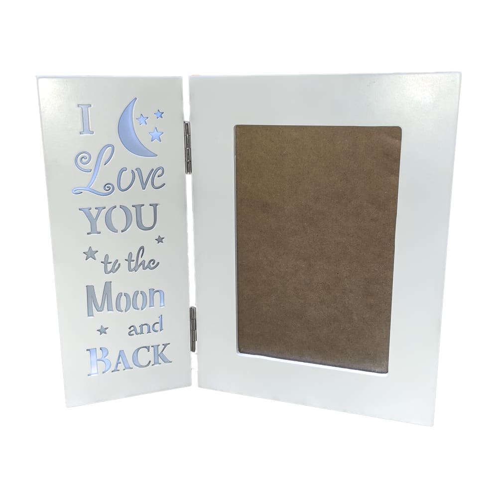
7 Responses to Option C
I prefer to have the open space large like my top choice because it allows more flexibility of what I put in the place of it.
Option C is my preferred choice because it would be easier to display a standard size photo in this and the white color is neutral so as to blend nicely with any décor.
C is the prettiest option and the easiest to read. The colors in D doesn't lend themselves to every decor. A is okay. The half moon in B is just ugly.
It like this one because it folds. It provides a more unique form, and will stand easy on virtually any shelf
I made my first choice because I like how much the text stands out from the background, the uniqueness of the fonts without making them hard to read, and the emphasis on the picture and not the frame itself. My 2nd choice also had clear to read font, I'm just not a huge fan of hearts or the wood aesthetic which kept it from being the first choice. In terms of just color, my third choice is my favorite, but I really don't like the lower case 'i' or that there are so many little graphics there but not a single one is moon or sky related. The main reason I made my last choice is that in this picture, the text seems pretty hard to read with the dark striations in the wood.
I liked the hinged version the best followed by d because it was easy to read whereas the other options were too 'busy'
Option C is is my favorite because I like the physical design the best.
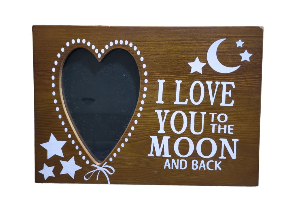
13 Responses to Option D
The letting is the prettiest in option D and makes the gift more special.
I like option D the best because the dark wood design makes the text stand out more.
C and B are hard to read. Prefer the easier to read font.
I like the simple lettering and heart-shaped picture frame.
I like the wood grain with D. It is a more attractive design all together.
I think the wood is both pretty and unique
I like the design in option D the best. I think it looks the highest quality and is easiest to read
After carefully studying and comparing all four images of decorative picture frames displayed above I selected Option D as my first preference and definitely the one that I would purchase for myself. I felt that this image jumped right out at me as having the most eye catching appeal and know that it would look great hung in my home. Option A was my second choice followed by Option C and finally Option B with the final three rankings based on my own personal opinion of the relative attractiveness of each product image.
Design wise, D is really good. It's a product I can easily see giving as a gift. I can think of a few friends who would appreciate this.
The heart made a huge difference in my choices. The colors are compatible and the way everything looks together is very cohesive and well done. The frame looks professional and demonstrates great love and affection when given from one person to another. I would be proud to give my first choice as a gift to someone
Option D stands out the most to me when compared to the other choices. I think that Option B is nice but it just doesnt hold up when you compare it to Option D. I think Option A is a nice design and is beautiful but it doesnt really grab my attention like Option D or B does. Option C is my least favorite of all the choices its pretty boring and doesnt really stand out to me.
The product is artistic. The product is well written.
I like any of them except for the two piece one. It seems like it would be easier to break.
Explore who answered your poll
Analyze your results with demographic reports.
Demographics
Sorry, AI highlights are currently only available for polls created after February 28th.
We're working hard to bring AI to more polls, please check back soon.

