Poll results
Save to favorites
Add this poll to your saved list for easy reference.
Which picture frame design are you MOST LIKELY to purchase? Assume ALL variables are EQUAL!
Option A won this Ranked poll with a final tally of 27 votes after 4 rounds of votes counting.
In a Ranked poll, respondents rank every option in order of preference. For example, when you test 6 options, each respondent orders their choices from first to sixth place.
PickFu requires a majority to win a Ranked poll. A majority winner differs from a plurality winner. A majority winner earns over 50% of the votes, whereas a plurality winner earns the most votes, regardless of winning percentage.
If an option does not earn a majority of votes, PickFu eliminates the option with the lowest number of votes. The votes from the eliminated option are reassigned based on each respondent’s next choice. This process continues in rounds until a majority winner emerges.
Scores reflect the percentage of total votes an option receives during the vote counting and indicate the relative preference of the respondents. If there is no majority winner, look to the scores to see how the options fared relative to one another.
| Option | Round 1 | Round 2 | Round 3 | Round 4 |
|---|---|---|---|---|
| A | 18% 9 votes | 22% 11 votes +2 | 38% 19 votes +8 | 54% 27 votes +8 |
| E | 34% 17 votes | 34% 17 votes | 38% 19 votes +2 | 46% 23 votes +4 |
| B | 22% 11 votes | 24% 12 votes +1 | 24% 12 votes | Eliminated 12 votes reassigned |
| D | 18% 9 votes | 20% 10 votes +1 | Eliminated 10 votes reassigned | |
| C | 8% 4 votes | Eliminated 4 votes reassigned |
9 Responses to Option A
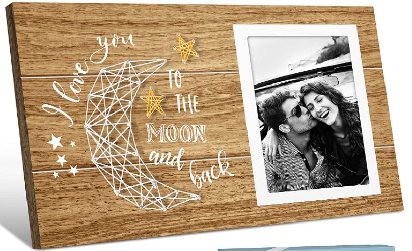
I thought it was the best looking.
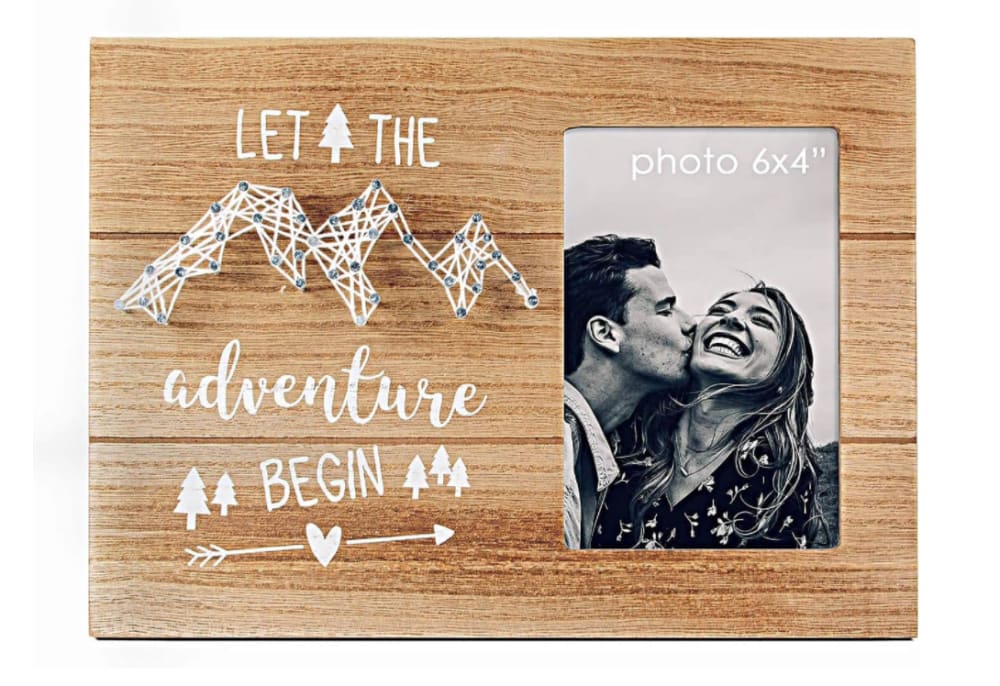
I like the moon designs the most. The hearts would be my second favorite design. I don't like D because the design seems random.
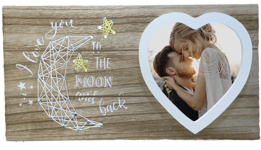
Options A and C are my favorites because of the moon and heart designs and the vibrancy of the wood compared to the others. Though I do like the richness of the wood in E the most, the heart in that one is a little cheesy.
I like the etching of this moon on the wood for the item here
Option A is the most well designed, from an artistic and modern standpoint. It has a very unique, and stylish look, and would be my pick.
I like the design and materials of Option A the best. It looks very nice and something I would be proud to display in my home with a nice photograph inside of it.
I like A the best. I think it looks like the most balanced and pretty design.
A: favorite sentiment here. B: wood color is less appealing than A. D: Cute string art. E: Prefer the 3d string art in the others. C: the text is stupid.
A, B, E, I love you to the moon and back - easy and straight to the point. The rectangle is the easiest to put a photo in. I like the hearts too, but like the background more in B than E. C sounds mostly like something the woman would say to the man, she'd probably moreso be the one searching for the photo and enjoying the frame. D adventure begin, maybe the relationship isn't so new, it's not at the beginning.
11 Responses to Option B
I focused on the secondary art work. They are most attractive in this order.
I prefer choice B picture frame design is visually appealing. I find the frame design stands out well.
The heart shape is the best version in option B. That looks excellent and the item I would click on. I like option E as well and that is a nice heart too. Good horrible in those two there.
I chose option B as being the best one because the photo in the frame actually has color. Whereas none of the other option have color in their framed photos. Option E is second because of the large and unique design that makes the photo stand out. Option A is next because it has nice ornamentation. The final options were not appealing to look at, meaning they weren't creative enough to gather my attention.
B: Liking the wood color, thread craft design moon with coordinating heart bordered picture frame.A: The picture image really gives meaning of the words written there.C:The big threaded heart suits the wording.D:The mountain design a bit odd, can be confusing if you missed the wording.E: Just the plain wording and picture frame kind of feels simple after comparing with the other listed frame with some kind of depiction presenetd with crafts.
I love that heart-moon combo! it would git mine and my gf's relationship!
I picked b because I liked the heart shape frame and it looked classy
The product is well crafted and written. The high quality is maintained by the former.
I like the heart and moon included in my top choice, which makes for an appealing combination. Looks like a really nice set of products for sure!
The frame where the picture goes, it is more fitting with options B and E for the heart shape. Makes it all the more special for that significant other.
i picked the one i like the most.
4 Responses to Option C
I like C the most because it is funny and cute, sweet and short and to the point. D is also very nice because my boyfriend and I hike often in the mountains so it is meaningful. E is nice though a little overused. It is easiest to see and has a nice aesthetic. A is next because it is similar to E but a little harder to see. B is last because it is very hard to see, illegible and confusing to me.
C: Like the heart shape made with threads. Square border looks better for the picture.A: Like the white boarder around the picture with moon made out of thread.D: Simple design. Not having white border around the photo looks comparatively less attractive.B: heart shape picture border looks little worse than square border.E: not having art with thread makes this least attractive.
The heart is fitting, but the heart for C looks much more modern than the one for E. E is cheesy.
I picked C, B and D as my top choices as the designs of the frames make it look like they are handmade.
9 Responses to Option D
I like D and C because of the design as well as the text color. I like how the text color is bright and easy to read
I would be most likely to purchase D because I like the saying on this one the best. I think the addition of the trees and the heart with the arrow is super cute. I picked A and B next because I would buy them second. I like the colors of B more but I like the shape of the photo portion on A better. The heart shape on B cuts off part of the photo so I would prefer the square. C is fourth because the heart is cute but I don't really like the quote that much. I picked E last because I like the string art design better but this one is still really cute.
I'm a fan of the lighter color of wood and the mountain design is the most attractive to me.
E was too bold and aggressive and thus came off as tacky. I liked that D was the subtlest and classiest in terms of the "love you to the moon and back" message, font and photo frame. "Let the adventure begin" was also a sweet message. The heart frame in B was too clunky.
Most likely to purchase to Option D picture frame design.
because i really liked let the adventure begin
I really admire and adore all of these picture frame concepts. I think "Let the adventure begin" and "I love you to the moon and back" are heartwarming and cute. They give me a strong sense of emotion and nostalgia, especially when I think about framing a memorable picture of myself and a loved one.
choices d,a,b, & c i like the most because of the simple wording design on the frames.
I like the saying "let the adventure begin" better than the other sayings.
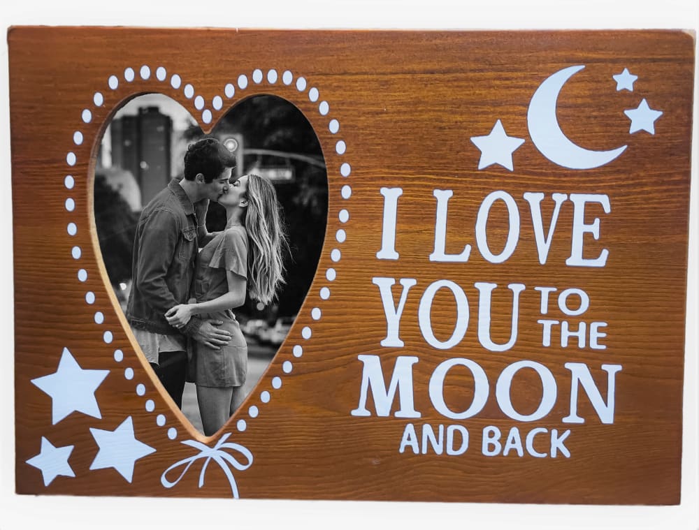
17 Responses to Option E
Option E is the most eye catching and easiest to read
My first 3 are the most memorable and easy to read and i think resonate with more people because of their universal messaging. The other 2 are very hard to read due to the color scheme but also simply aren't as effective to me.
I chose by options that are easy to read.
I like the color of E and C the most, very nice color of wood.
E has good contrast and graphics. C is awful and love is not a contest. Drop that one
I like the moon and the saying on this one. I love the darker color. The text stands out a LOT more.
Option E is definitely my preferred choice. I like the color of the frame and I like the heart shaped picture as well. I also like the variety of moons and stars as well.
I think that this design would be memorable and make the picture very special that it was framing.
I prefer option E out of these 5 options because that one has the most visible and stand out text out of all 5 options and the phrase/wording "I love you to the moon and back" with the picture of the moon and the heart shaped picture just really goes well together.
E is the best one for me because of the darker wood and I love the the heart and the moon on this one the best. It is more eye catching and I would buy this one first.
The black and white photographs are classy and full of old-fashioned values. I find those designs that are simple, basic, and laid out in an appealing style to be the most reasonable overall.
I really like the large heart frame. It really draws my attention to the picture.
based on what looks like a better product
I like option E the best because I like the heart shaped photo spot, the stars, and the saying on the frame.
I think choice E is the best font choice in terms of readability and the phrase's message when compared to the others.
E is the only one i would buy due to the darker color and larger text. all the rest are unreadable
I like the one I chose it looks much nice the others look sloppy
Explore who answered your poll
Analyze your results with demographic reports.
Demographics
Sorry, AI highlights are currently only available for polls created after February 28th.
We're working hard to bring AI to more polls, please check back soon.

