Poll results
Save to favorites
Add this poll to your saved list for easy reference.
Based on the following 3 images, which product would you rather click & buy? Why?
Option A won this Ranked poll with a final tally of 51 votes after 2 rounds of votes counting.
In a Ranked poll, respondents rank every option in order of preference. For example, when you test 6 options, each respondent orders their choices from first to sixth place.
PickFu requires a majority to win a Ranked poll. A majority winner differs from a plurality winner. A majority winner earns over 50% of the votes, whereas a plurality winner earns the most votes, regardless of winning percentage.
If an option does not earn a majority of votes, PickFu eliminates the option with the lowest number of votes. The votes from the eliminated option are reassigned based on each respondent’s next choice. This process continues in rounds until a majority winner emerges.
Scores reflect the percentage of total votes an option receives during the vote counting and indicate the relative preference of the respondents. If there is no majority winner, look to the scores to see how the options fared relative to one another.
| Option | Round 1 | Round 2 |
|---|---|---|
| A | 41% 41 votes | 51% 51 votes +10 |
| B | 39% 39 votes | 49% 49 votes +10 |
| C | 20% 20 votes | Eliminated 20 votes reassigned |
Age range
Education level
Gender identity
Options
Personal income range
Racial or ethnic identity
Religious affiliation
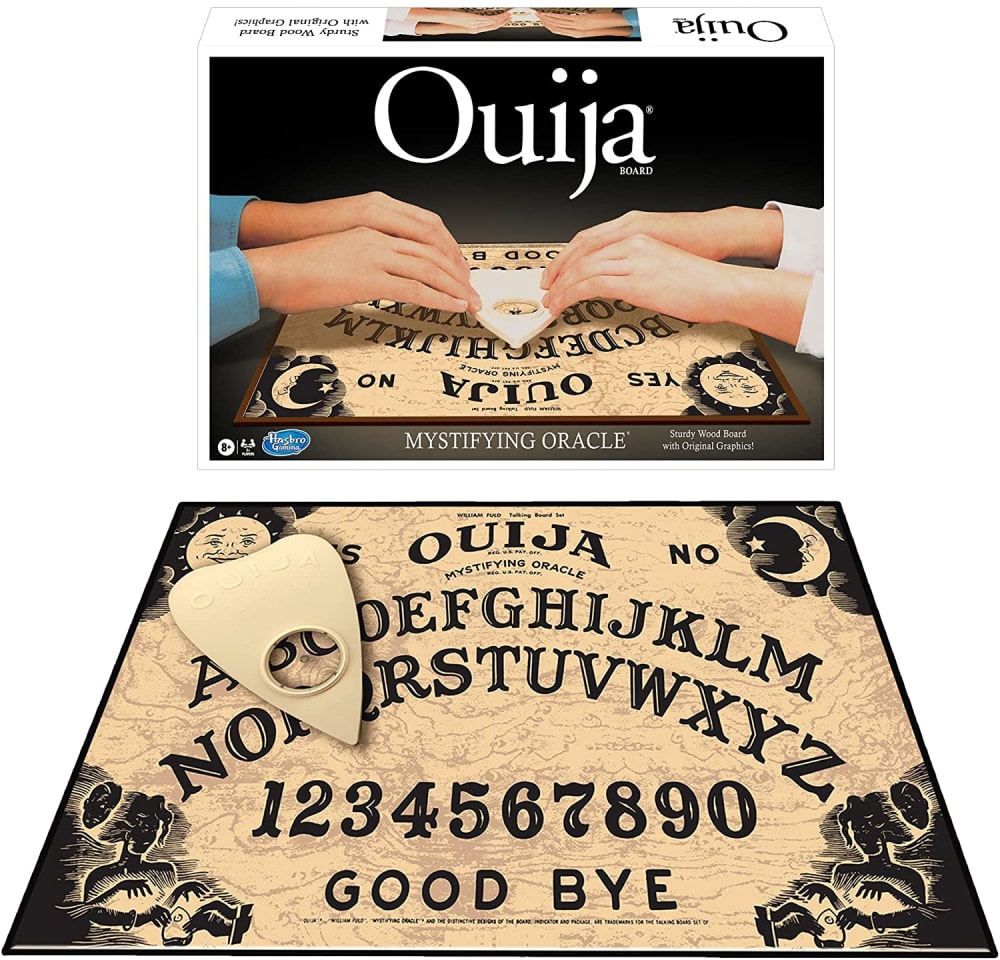
41 Responses to Option A
This is more appropriate to what the product is
i recognize the name in A so it would be my first preference
The top two choices have a nice overall layout. I also prefer the lighter coloring overall of the #1 and the hands moving together makes it seem more fun.
I voted based on what I thought looked the scariest and most fun to play.
A seems like its the original. I like the board design, black background with white letters the most, the moving piece also has a nice design.
I like the look of the product and board in A. I find that B is also cool with a purple main magnifier. I think B looks boring with black and white tones.
I like the colors and more vintage feel of A
I prefer the more traditional ouija board. I grew up with one and I like the brown background. Like B second because the brown background makes everything easier to see
I like the one with the Oija name on it
I have never seen the product called a 'Spirit Board' before. My top choice sticks out the most for sure. You can see everything and the item has the proper name
The product layout is demonstrable and personable. The product is mystique, ecofriendly, and intimate.
I would rather buy Option A because it's like the set I played as a child.
I like option A the best because I like the graphics that are on the board better than the graphics shown on the other two options.
Option A looks the most like a professional ouija board, and I like seeing the hands using it on the box cover.
You can't beat the classic look. It's instantly recognizable, even iconic. If it ain't broke, don't fix it.
I like the classic version. That’s the one i remember using with my older cousins back in the late 1980s
i think that i like the coloring on #2 more but the writing on #1 is more familiar. i think of a ouija board and this is more what comes to mind, i also like the fact that the actual board is a bit bigger too. but i do like the color of 2 better. the design of 3 is a bit too busy and confusing for me.
Option A and B provide more detail about the product. Option C is just a picture of the board and contains less detail.
I like the black with the box the most. It shows everything you get. The purple color is my least favorite because the color does not appeal to me.
I ranked these in order of how nice and higher quality they looked compared to each other. I think A's image with that version of the Ouija board and packaging looks best.
A seems like a very classic style of board that looks authentic and pleasant.
If you’re gonna by a ouija board you are gonna by one called it. I like a better of the two choices gives good example of board size.
The beige look that is used in A and C gives the best effect for the ouija board
I chose A because it's the original but I like the colors in option B.
I feel like I want and 'original' Ouija board, so I would go with Option A here. Option C is nice too, since it looks very fancy ad ornate, while Option B is pretty plain and the whole 'spirit board by LotsOfZen' branding makes it look like some sort of knockoff.
I like the box and the board design
I prefer the classic look and design of A, however I like C too as the black and white board is quite appealing.
A is your classis OUija board. The image shows off the product and the product box which gives you a lot of information about the product
I much prefer the classic board which is A that is closest to it
I like A because everyone knows what a Ouija board is. That name is synonymous with this game board.
The classic design is certainly captivating and I'm drawn in by the colorful shades that are presented in these product options.
It's a Ouija board! "Spirit board" feels like a knockoff. Everyone knows the oujia name.
I like the original style of option A. They are all nice designs though.
I like the design of the board in Option A the best.
A: the classic brand, recognizable. C: nice design on the controller/moving piece. B: looks cheap, like a knockoff
I like the description on A best and i like the look of C. B is okay.
Option B seems a little too childish to me. I really think Option A and C are more grownup and went with Option A because it included the box and board seperately.
A has the value and nostalgia of the famous brand name. C does not have a visible brand name, while B has a lesser-known brand name, which slightly weakens the value.
I prefer the option A product image because the product box is clearly visible, and I like the classic look of this board game. I chose option B second because I like the product box shown in this image but not the non-traditional look of this board game. I chose option C last because the product box was not shown in the product image.
I'm familiar with the old school game board and this picture reminds me of that.
I realize that all of these are essentially the same product, but I know the name Ouija, but I don't know the brand name of the other two. All else being equal, I would select the board under choice A.
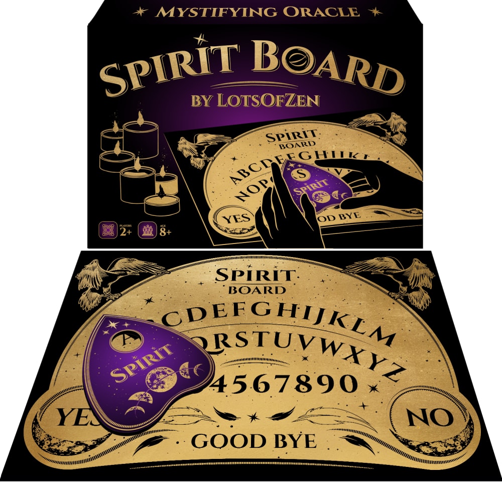
39 Responses to Option B
I prefer to see the packaging in the design as well because it offers me more information when I look at the photos.
Because I would hope that it would offer different benefits or a different experience than a regular ouija board
B because of the 'spooky' color theme, C because the board looks very intricate, and finally A because the box looks very generic.
I like the purple of Option B.
The design in Option B gives the Quija board that aura of darkness
The bold purple color on the packaging for B was really energizing and caught my attention. C felt really plain in comparison.
I liked the colors and the design for option B the most. Option C, looked more interesting design wise than option A. Option A, looked a bit typical and looks a bit more boring.
I rated based on how mysterious and spooky each board set looked. The set with the purple piece looked the creepiest.
i do not really mess with these, but I like B the most because it seems like the most colorful and cheerful (if that is even possible)
I like the product in option B the best. I like the color design of the board as it looks visually appealing.
B looks the best. I love the purple color and the box is super nice. Spirit Board is a cool name. A looks second best. Not quite as colorful and neat as B though. C looks pretty good too, I like the colors and aesthetic but just slightly less than the first two.
Choices B and A shows me the board as well as the packaging , so I prefer these two options overall. I like the font style and the color scheme more in choice B , so I like this option the most.
I like the purple i guess shifter thing here the best. I also like th eblack and goldish of it. I think A is the closest to the original and i do not like C. C looks like a blackboard to me.
The hands on A disrupt the occult and arcane aesthetic
I would pick option B because this image shows product in detail and a good light, I can truly see and examin it better.
B. I like the purple & Gold color, it's bright & pretty. C. The black & white goes well together & easy on the eyes. A. Looks old fashion.
I like this option first because I think it looks the best, and the next option is next.
I love the purple in option B. It looks wonderful and suits the theme.
Purple is my favorite color, C looks the most like the classic board with no color which is clean, A looks classic
Option A looks cheap, like a generic knock-off of Option B. I also prefer the colors and design more of Option B, feel like the board is a little more designed and nice looking.
B has the best design, and good color. It is the most attractive. A looks classic. C has poor design
I like the color of the thing that moves.
Option B has some decent color to it, unlike the other options. Option C is stylish but there is a big lack of color. Option A is much too plain for it to catch my eye.
I would prefer to but the product on option B as its design is captivating to me and i find it to be appealing.
The color really makes it pop.
I like the purple color used in my top choice, which is classy and striking. Very cool for sure!
B. I like the purple board piece. Its gonna do the same thing as the other two and look cooler!
The purple really adds flare and vibrance to the color palette of the product image
I picked B and A as my top choices as the colors make it look like it's very rich.
the colors in option B are very attractive and pleasing to look at. It makes the product look fun and inviting
I don't like the white and black in option C at all. B looks old and antiquey
Option B: Liked the name "Sprit Board".Option C: Liked the simple black and white design.Option A: The name is difficult to say and remember.
I like the overall look of B the best. just based on it's design. Ouija is the original but it doesn't look at nice so I chose it second. I chose C last because it only shows the board.
I like the colors of the boards in B and C the best
I would be most likely to click on and ultimately purchase option B because I think that it has the most eye-catching and visually appealing product image out of the three options.
I think that something as esoteric as an oujia board sort of requires a fancy box to come in.
I would choose option B because it is more vibrant and pleasing to look at. Option C is to dull and boring and is my least favorite.
Purple is a very attractive color hence my first choice. Followed by the size of the product on my second choice and finally the last one.
I like option B best because it has a pop of purple for color on the packaging and product, I think this adds to the product and is why I think it is most appealing.
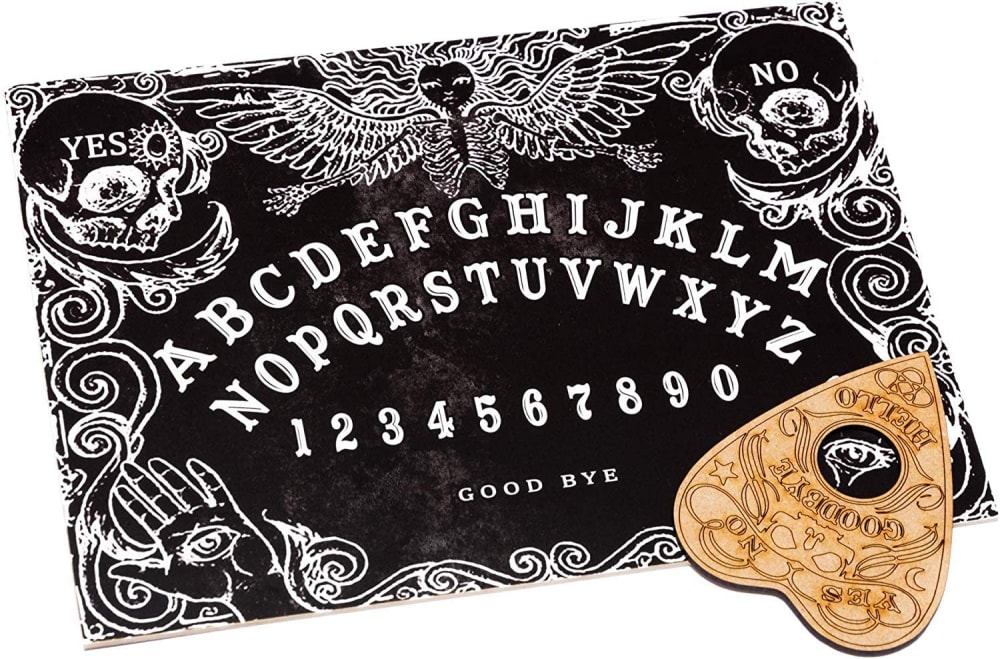
20 Responses to Option C
The classic black and white design is best suited for this board.
I like the look of the white text on black in C, and I like how C has a more intricate design on the top part of the board.
I prefer the more detailed and interesting designs
C looks the spookiest.
Although I like the color purple, I chose the item that looked the most traditional for this product in particular.
I prefer option C because the board design looks really nice.
C has a very mysterious element that I find both scary yet engaging.
I like the design of C the best. A is the standard board though. C seems more like a knock off.
Option A looks more classic and the color more appropriate for the product type.
I would prefer C the most. I think it really took a modern twist on the board, yet it still contains the essence and originality. I think this would better attract more potential consumers.
C looks the nicest for the actual board. A is and B are close but I don’t like the large brand name that is prominent on the box of B.
It seems a little more creepy to me.
I like the 2 colors on this one. It is very calming.
Option C has the visual flavor and details I prefer given the options presented. I would at very least click this image for a closer look.
Option C looks the most authentic when compared to A and B
C is different from normal, I like the black. I also like the touch of purple in B. A is pretty standard/typical and boring.
The cool black and white set up for the board is what made choice C stand out above the rest. I think having a more unique looking board will make the product stand out more.
designs are more beautiful and unique
Love the white background of option C
I actually liked all of these. I think that C is the best looking and B is ok as well. A wasn’t my favorite but it seems like a decent one though.
Explore who answered your poll
Analyze your results with demographic reports.
Demographics
Sorry, AI highlights are currently only available for polls created after February 28th.
We're working hard to bring AI to more polls, please check back soon.

