Poll results
Save to favorites
Add this poll to your saved list for easy reference.
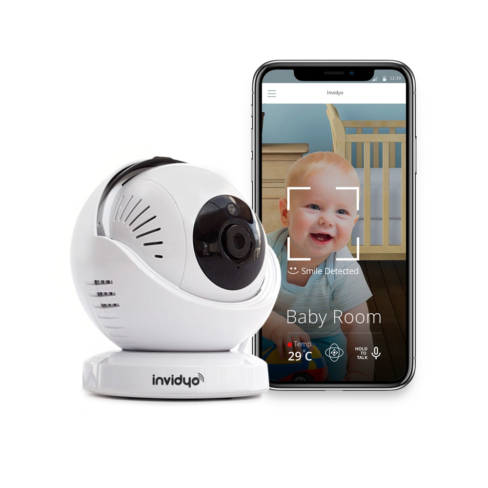
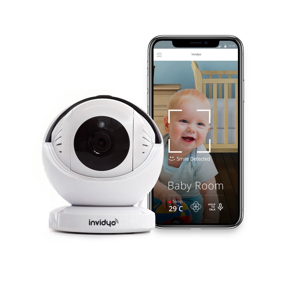
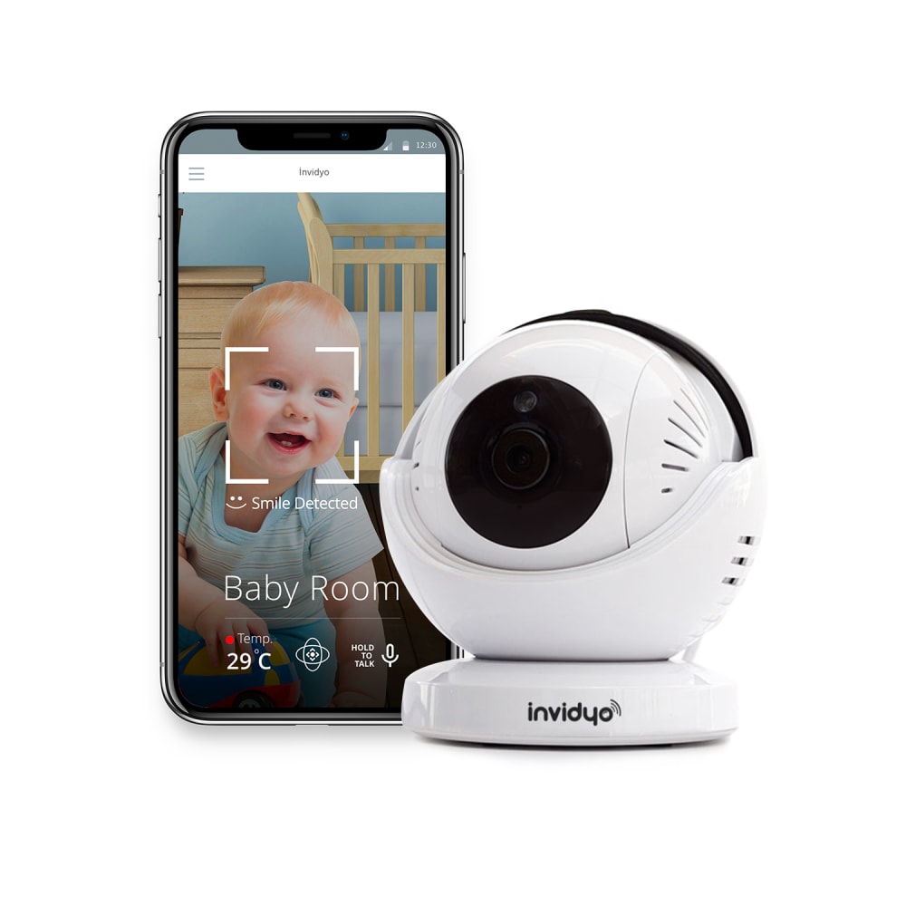
Which image is more appealing to click on Amazon?


Option A won this Ranked poll with a final tally of 27 votes after 1 round of vote counting.
In a Ranked poll, respondents rank every option in order of preference. For example, when you test 6 options, each respondent orders their choices from first to sixth place.
PickFu requires a majority to win a Ranked poll. A majority winner differs from a plurality winner. A majority winner earns over 50% of the votes, whereas a plurality winner earns the most votes, regardless of winning percentage.
If an option does not earn a majority of votes, PickFu eliminates the option with the lowest number of votes. The votes from the eliminated option are reassigned based on each respondent’s next choice. This process continues in rounds until a majority winner emerges.
Scores reflect the percentage of total votes an option receives during the vote counting and indicate the relative preference of the respondents. If there is no majority winner, look to the scores to see how the options fared relative to one another.
| Option | Round 1 |
|---|---|
| A | 54% 27 votes |
| B | 28% 14 votes |
| C | 18% 9 votes |
27 Responses to Option A
I like it looking to the right since that seems more natural to me.
I like A the most. I think the way the camera is postioned helps set the item apart
The angle and lighting is best in A and I can see what the product looks like best.
The items I picked were more visually appealing.
The side angle looks nicer
Option A is the best because it has the clearest view of the product, slightly from the side but still clearly showing the front. C is next best for the same reason. B is the worst, the head-on shot of the camera is somewhat disturbing.
I chose A because you can see a great side view of the camera, you can see the dimensions so to speak, and how the camera looks within the black eye. I chose B next because it gives you a frontal view and an vivid image of where you can place it within your household. One issue with B is that the coloration of the black slip, can confuse consumers that the entire back is black by the view.I chose option C last because I can't even see the camera inside the black eye as well as confusion for consumers thinking the back side of it is black and not just that strip.
to be honest they all look the same but the webcam at an angle looks more interesting
I like the pictures that give a little bit of a profile view of the camera better than the one that is just a straight on view. It allows you to see a little more detail on what the camera looks like.
i like this one because it doesnt seem like its pointing directly at me
I really want the camera to not point towards me as the first image. I think off to the side is much more inviting.
I like the product being presented from the left, it is where your eye naturally goes. This first picture also shows exactly what the side and the lens looks like without making the baby the center of the photo. The second one shows more of a side on view and the third gets lost because of too much white showing.
i like that A you can see more of the camera, and its much easier to see that i can move than in the other pics. A straight on view like B doesnt let you see what exactly the camera looks like from all sides
It's a matter of degrees. It's really cute that A is looking right at the smiling baby. C looks like it just turned away a little, and B doesn't seem to know what's going on. A makes the device seem interactive.
There is something very off putting with C staring straight at me, not sure why. I prefer A the most because it flows well left to right like how I read.
A&C are similar, the preference is slight. Choice B is low because the device being pointed at me feels intimidating.
The more you can see of the product the better.
I think seeing the camera from the side more, I can better tell it's size and formfactor.
I feel like B is staring at me and it's a little uncomfortable. I like A slightly more than C, but they are both OK.
I like that you can see the details of the camera on A. I think it helps with sharing what the product looks like.
The image of the camera in profile is better, in A you can see the lens more clearly
I feel this image is more appealing to click on Amazon because you can see more of the camera and its functions.
A is white object is slanted perfect. C is slanted pretty good. B I don't like how it is straightforward.
I just like camera position more - it's not straight. Anyway it's not big difference for me.
The angle of the camera is the focus here, so I tend to prefer one pointed away from my perspective.
I like the side angles more because it shows you more of what it looks like
I like the views from the side because we know what a camera eye looks like. A side view makes it appear mobile. I chose the top choice because it appears to be looking towards the baby.
14 Responses to Option B
Prefer the straight on picture of B
i like the angle of the camera
The first choice is easier on the eyes, second pick is second easiest, and I really dislike the last pick but I had to pick three.
The angle of the camera was more attractive from the front.
I prefer the camera facing me. It looks better aligned. The less of an angle, the better it looks. It looks off when the camera is facing the photo.
I like the camera head on and slightly skewed equally. The only thing I would suggest if you're going to carry this on Amazon US is to change the temperature on the phone from Celsius to Fahrenheit, if possible. It's a little thing that may make a big difference in sales.
I like camera facing the front
choice B shows more details when comparing to the other two options
I like seeing the camera facing me
With Option B, I like the symmetry of having both the phone and the device facing forward. I don't like the way Options C and A are tilted. C is better because it not titled quite as much.
The camera with the baby's face just matched well in my first rank, I loved the complement of colors.
I like seeing the picture head on. I want a good look at the product before I buy.
I chose B first because you get a good view of the front of product. C was chosen second because you still get a good view of product not as good as option B. A was my last choice because it was not as visually appealing as the other two.
Option B has the camera with an orientation that is centered and directly toward the viewer of the picture. This gives me the best view and perspective on the items size and allows me to assess its quality. C also has a direct forward view / orientation positioning of the camera, so I can see it and asses it for quality. A has the camera unit oriented to far to one side and I cannot adequately assess the quality of the unit.
9 Responses to Option C
i like it very much
45 degree angle is best. Don't have the device pointing straight at the camera.
C and A shows the full view of the campera and how big it will be.
There really isn't much of a difference just the way the camera is. They all look really good.
they all look pretty good but I think that's the best order I could put them in
I think with camera slightly turn looks great. I believe most people would set their camera up this way. It looks more natural
I like it on the right side.
I find my first choice to be more appalling. I like the camera's position and angle. It is less boring and just looks right to me
C is more aesthetically pleasing and looks "friendly" in a way; comfortable - not startling like B does. I don't like how B is staring straight out; it's fairly off-putting. A isn't bad, but it's turned a bit to in and it seems to compete with the cuteness of the baby.
Explore who answered your poll
Analyze your results with demographic reports.
Demographics
Sorry, AI highlights are currently only available for polls created after February 28th.
We're working hard to bring AI to more polls, please check back soon.

