Poll results
Save to favorites
Add this poll to your saved list for easy reference.
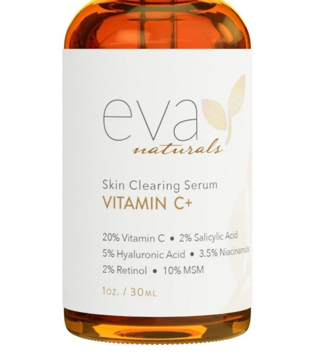
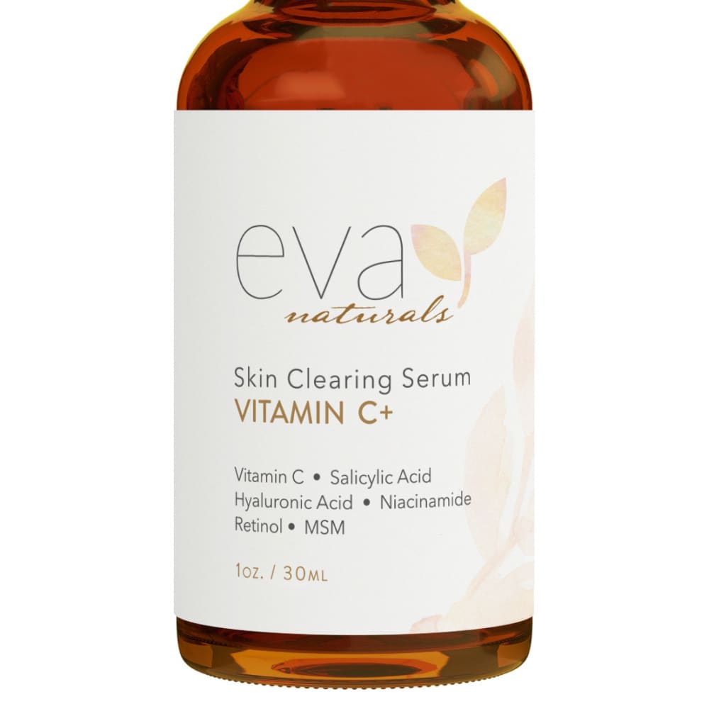
Which image would you be more likely to click on? (They would be the same size when listed)
Age range
Education level
Gender identity
Household income range
Options
Personal income range
Racial or ethnic identity
36 Responses to Option A
I like this picture better because it is closer and I also like that the bottle looks a little lighter. I like to be able to see inside the bottle. I get a lot more detail with his picture
EASY TO READ AND I LIKE THAT I CAN SEEHOW MUCH OF EACH THING ON THE LABEL
I like option A because it is larger and more clearly readable.
I liked the bottles big. All the words are nice and bright and easy to read
A is much more informative and helpful with the extra information given.
I am most likely to buy option A.
I would click on option A because it looks more intuitive and fluid to me. Option B doesn't seem quite as competent overall.
I like the more translucent nature of the class on choice A. It it quite beautiful and so draws my attention.
The serum was a lighter and brighter color and thus looked a bit more natural and healthful to me.
I like how it is zoomed in more, I like how it shows how much percentage of each thing is in the item.
I prefer seeing the product up close and a larger image will show the details to the consumer better so they know fully about what they are getting.
I like that it's giving me detailed information.
It's helpful to see the percentages for the ingredients
I like how bottle is bigger and easier to read.
I would click on the item that gives the percentages of ingredients in it.
I choose option A for the image that I would be more likely to click on because of the larger display which makes it easier to read for necessary information.
I like the clearer, brighter, more amber/honey look to the bottle and liquid inside.
I like option A the best because the text is larger and easier to read on the product.
I can see the list of ingredients better in the larger version and it list the percentages.
I prefer the option A product label because the product label describes the percentage content of this product, which I find to be very detailed and informative.
I like that this seems a little brighter and the image being larger also makes it seem more bold.
I like seeing the percentages on the package. I can tell at a glance if the ingredients are adequate for my needs.
A gives a lot more information that is useful
I like option A the best because the percentages are included on the label.
I like seeing the percentage of ingredients. Much more info at a glance.
I like option A because it is easier to read at first glance.
I prefer to see what ingredients are truly used
I am more likely to click on option A. The reason I choose option A is for the percentage information of the ingredients listed. Option B is an image of the same product but does not disclose how much of each ingredient is included.
I vote for A as the label gives the percentages of each ingredient. I would want to know that. The other label does not list that.
I chose option A because it is much more descriptive than option A. It describes the exact amounts of each chemical added to the product, whereas option B simply states what it contains.
I like A the best because you can see the dropper in the bottle. I think it it better to be able to see through the bottle so you know how much of the product is left
I would be more likely to click on and ultimately purchase option A because I think that it has a slightly more eye-catching and visually appealing product image.
Gives me the percentages which is more informative
The wording is much easier to read and pops off the page more.
looks higher quality with the higher amount of light on the contents
This image is a little easier to see. I like that it is closer to the front of the picture.
14 Responses to Option B
Ultimately I do not need to see the percentages of the ingredients in the product.
Just looks a bit clearer and easier to comprehend.
The percentages just makes more confused
Most people get overwhelmed by too many numbers and I don't think you need the percentages on the label.
I think B is the better listing image. I find this font very easy to read, and the overall layout is clean and looks professional.
I prefer the design of B
I chose 'B' because it's rotated more directly towards the viewer therefore making the writings much easier to read.
Choice B have a better size, that makes it more appealing it also looks like the image have a better quality, while choice a seems to be a little bit blurry
This image has a clear matte finishing which makes it look very classy and modern. The words are very visible and the use of pastel is very appealing.
I prefer Choice B. It's a bit more minimalistic, which actually makes the product label a bit easier to read at a glance (for me).
The label without the percentages is easier to read and understand. Most people don't care enough about percentages to take the time to read it on the label.
I like the font and design more of B than A
These ingredients look more understandable than the first one.
The label is clearer and whiter, which makes it stand out more.
Explore who answered your poll
Analyze your results with demographic reports.
Demographics
Sorry, AI highlights are currently only available for polls created after February 28th.
We're working hard to bring AI to more polls, please check back soon.

