Poll results
Save to favorites
Add this poll to your saved list for easy reference.
Which image would you click on, and why?
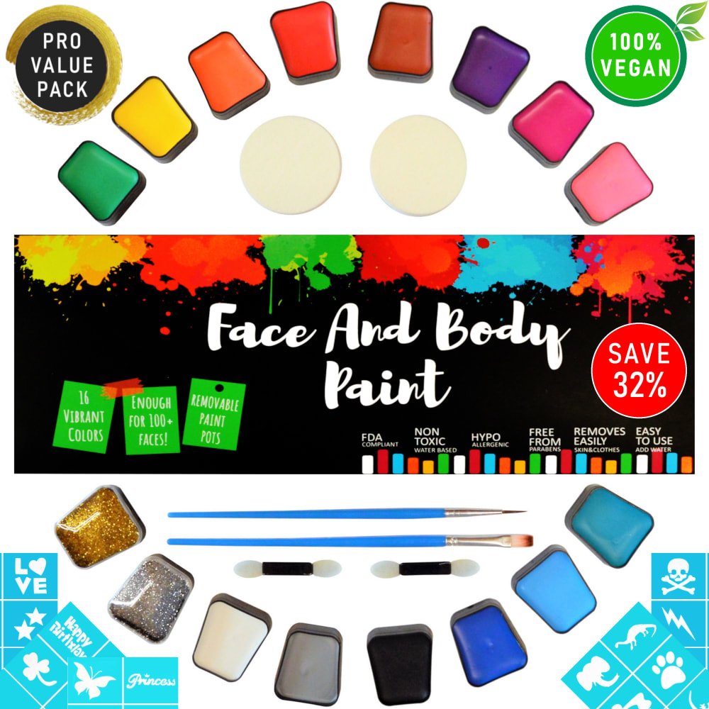
19 Responses to Option A
i don't want those birds attacking my face like that!
I feel the colors are more vibrant and makes the product look more appealing.
The image I picked is less busy and easier to understand. The other one just has to much in the image and it looks very messy and unorganized.
I would choose A because the colors catch my eye and keep my attention better than option B.I also see a "save 32%" on option A and not immediately on B, which is also appealing to me because saving money wherever I can is important.
The face on the alternative doesn't work for me, its a bit cheesy
the "save 32%" caught my eye
This caught my eye because it looks like a box of candy. It made me interested.
This was a REALLY tough call. I actually love the packaging for Option B, with how colorful it is. But I'm not sure it would communicate that it's a paint product right off the bat the way Choice A would. And the idea is probably to get people to notice the product and what it is supposed to be from a distance, without having to read the packaging. So Option A works best in that case - the paint splatters communicate what it's all about.
Both are extremely cluttered but the package on A is more appealing
I love A because (1) the product listing image is not too busy; (2) I love the Face and Body Paint font and artwork and (3) Overall, this choice makes more sense, in that it is easier to quickly determine the product.
I chose Option A because of the bright and bold center of the display. It immediately caught my attention. I was not very fond of the green-looking woman in the other option.
the colors on this pops more for me.
I like this one more because it is to the point.
A looks more vibrant. Also I found the woman on B to look a bit creepy.
The text in B is a bit too hard to read easily at a glance and the model shown seems quite unrealistic for an amateur to manage.
this one i liked better the design is on point with it looks good enough
Including an image with this one would help.
I am thinking more about my kids and these colors look more like that. The other one looks way out there like something a normal person could not do only a really good artist.
Option A is more appealing. There is just too much going on under the description of Option B - parrots over the face don't look really good.
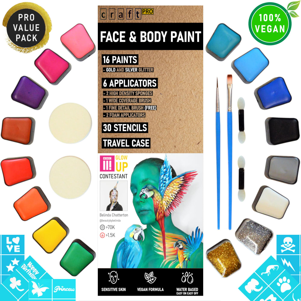
31 Responses to Option B
stands out a lot more
i like the B shows the use of the make up on faces, gives you ideas.
this looks higher quality
This is more descriptive. The other one could be mistaken for regular paint.
It looks a lot more modern, colorful, and more attractive. It also has more information about it.
Design is way more cleaner and organized. The body art is nice as well
I like seeing the example image so I can see how it looks when used.
The women and the way that she is painted makes the whole picture. I really enjoy the way that it looks.
I think the artwork shown is much better. It gives you an idea, even if it is unrealistic, of a use case for the paints
The central banner in A felt like a starter kit in a craft store. B felt more legitimate, less aimed at beginners.
I like the picture of the girl in the middle showing all the different colors on her
I like that the picture has a model included in it and shows the real potential for the paints.
I think the paints seem less bold and more sophisticated in Opt B... having the center brochure with mild toned colors are much better and more adult. If you were looking for kids party or clown paint, Opt A might work better.
That girl with the colorful birds in front of her is really capturing my imagination.
Any time I can see a product actually being used in a shot, I think its a better sell for that product. Kinetic / 'action' shots just tend to work well .. ESPECIALLY on something like this where its actual paint that one would apply to their face / body :) Having the eye candy on the cover of the package doesn't hurt either and might drive me to procure it as a gift for my other half.
I find the artful image on the box for B to be intriguing. A sort of looks sloppy and and makes me think of kid's finger paints
I prefer choice B because of the vertical display and description of the body paint. The picture of the human face displayed also gives further indication of what this product is used for.
THE BROWN MENU IN B MAKES IT LOOK MORE APPEALING
I like the packaging on B with the woman covered in birds, it shows you the capabilities of this kit
I prefer this option because the packaging displayed on the image more clearly specifies what you will receive when you order the product.
If it's face and body paint, I want a picture of it being used on somebody's face and body.
I like how A has a description of what comes with the box
I like the image of the person in B; it inspires creativity as to what could be done with this kit.
felt like the image really drives home what the paint is for, by showing a person on the cover.
More balanced picture because of the use of a woman on the packaging, conveying a message that the lady is the subject of the paint.
I like seeing the box and how the paint looks on skin.
Choice B shows the actual picture of the item's use.
The image with the young woman is preferred because it is always more interesting to look at an attractive model vs. looking at the product by itself.
The lady in the picture sticks out to me more; therefore, I would choose B.
I choose B because it has more visual effects with the picture of the lady and parrots.
B - IT shows all the colours in the kit, and shows how they could be used on the body for effects. It lists the included products - applicators, stencils, travel case, etc. It shows its safe for sensitive skin, is vegan and water based (which for those of us in the non professional special effects world, implies easier to remove - or clean up if you mess up your design)
Explore who answered your poll
Analyze your results with demographic reports.
Demographics
Sorry, AI highlights are currently only available for polls created after February 28th.
We're working hard to bring AI to more polls, please check back soon.

