Poll results
Save to favorites
Add this poll to your saved list for easy reference.
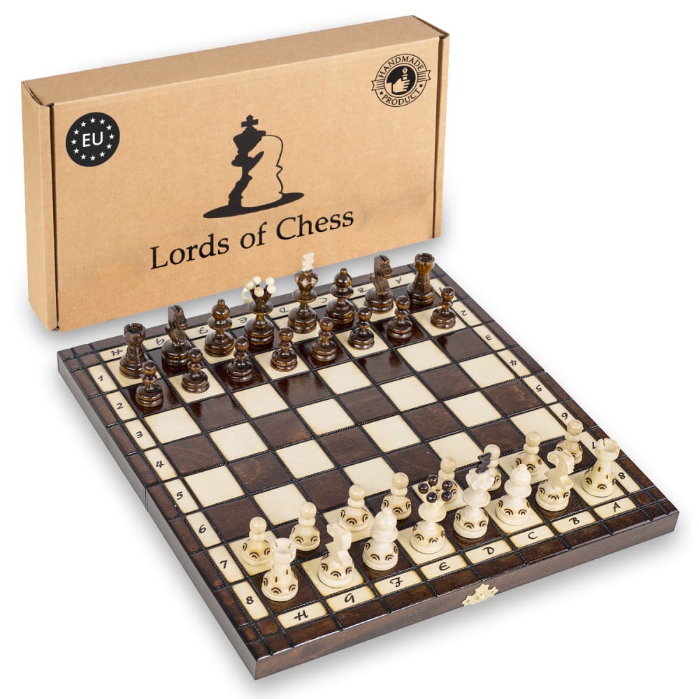
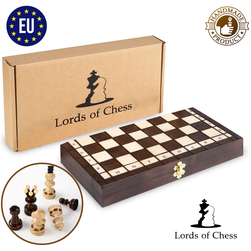
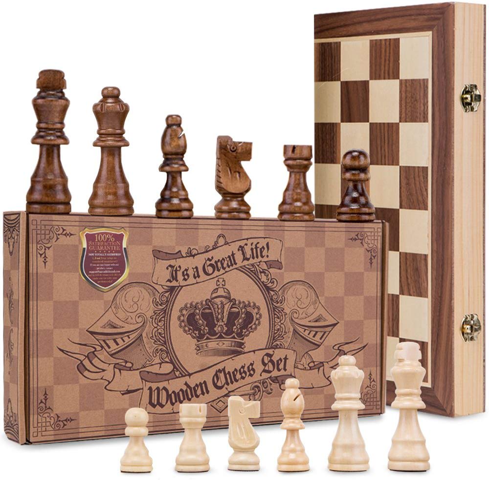
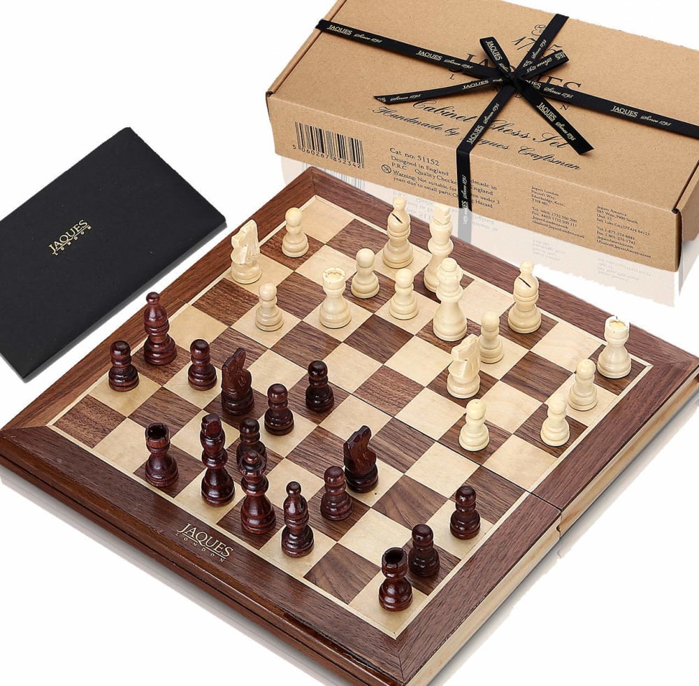
Which image is more appealing?
Option C won this Ranked poll with a final tally of 27 votes after 1 round of vote counting.
In a Ranked poll, respondents rank every option in order of preference. For example, when you test 6 options, each respondent orders their choices from first to sixth place.
PickFu requires a majority to win a Ranked poll. A majority winner differs from a plurality winner. A majority winner earns over 50% of the votes, whereas a plurality winner earns the most votes, regardless of winning percentage.
If an option does not earn a majority of votes, PickFu eliminates the option with the lowest number of votes. The votes from the eliminated option are reassigned based on each respondent’s next choice. This process continues in rounds until a majority winner emerges.
Scores reflect the percentage of total votes an option receives during the vote counting and indicate the relative preference of the respondents. If there is no majority winner, look to the scores to see how the options fared relative to one another.
| Option | Round 1 |
|---|---|
| C | 54% 27 votes |
| D | 34% 17 votes |
| A | 12% 6 votes |
| B |
6 Responses to Option A
To me I like to see the pieces on the board, then I like to see the details of the pieces.
I like the choices that show the pieces actually being used on the boards.
Option A is clean and uncluttered and the box shows well. Option D is nice but the colors are not as rich. Option B is acceptable but doesn't show the entire board set up which is enticing to a chest player.
I like the simpler images that say Lords of Chess better.
I like choice A the best since the angle the set of chess pieces and board are placed in are most appealing and attention getting. I like seeing all the pieces of choice A and how they look on the board.
The order of what I felt was really cool
27 Responses to Option C
I chose C because i like that it shows the neat looking box and all of the pieces
I like the detailed box in C best
The presentation of option C is best and most appealing followed by A.
I like c since the box is so pretty and it shows the chess pieces in large format and then a since it shows the whole board and then b since it does not show the whole board the rest are actully good too it would be hard to choose and would boil down to price
My main criteria was which one looked like it had the most comfortable pieces to hold, I think the feel of the chess piece is the most important aspect to the games atmosphere. When I couldn't decide between that I would then decide on the board's look itself. C A D reflect this thought process.
All are great pictures, love how it shows the box inside/out all the game pieces as well as board
Option C lets us see eaach piece better and they are in a nice arrangement.
i like how the first one is laid out. you see all the components, and the chess pieces take the prime spot. it's nice to look at. the second one is nice as well because it shows all the pieces and the box it comes in. the last one is good because it's nice and evenly laid out, so you can see everything. a bit boring in comparison, but still nice.
C. Definitely. I love that wood-grained box, that just really pops! The others are quite drab by comparison.
I find these images more appealing.
I liked C best because it gives the most detail of what the pieces look like, which is more important than the board to me, because those look mostly alike. I liked D second best because it shows all the content of the set.
Showing the case folded up is helpful
I like C because the way the pieces and board are set up is more creative and it allows a more close up view of the pieces themselves
I like these images best in this order.
I like to see the quality of the chess pieces and next the entire product.
nice materials and designs godd
seeing them laid out in compelling compositions makes viewer more likely to click
C JUST LOOKS THE CLASSIEST AND MOST COMPELLING
chess is about the pieces. I get a good idea of what I am getting in this otdet
The layout for option C shows how nice the pieces look. The high resolution on the pieces is great and shows better detail in the setup. I like option C the most here. Great wooden chess set!
I prefer option c because I can see the pieces in greater detail and they look to be very high quality.
Selection based on gift giving ability.
C shows scale
I like how the chess pieces are set from smallest to largest, but I also like seeing the game being played in real time.
I like C and B because you can see that the board folds up. I like D because you see how it comes in the box, with the ribbon around it.
I generally like the images that show the chess board set up, but made my primary choice because I really like the detail of the box that the pieces come in.
The box looks best in the first choice.
17 Responses to Option D
I like to clearly see the board and chess pieces in the image together. It presents a better over all representation of the product.
option D showcased the chess board and pieces the best and also showed the box and bag it comes in for storage. I like to know what i'm buying
it looks good from that angle
Option D has a good presentation of the whole product, as well as option C. A is more boring compared to the other two, but is better than option B.
i like the arrangement of d
The pieces and the board make a good showing to promote a sell
i like the layout in D, C is creative and shows me a lot of the game, A is okay but not exciting at all.
Option D has the best representation out of all the images. I like the gift wrapping bow on the box, and I like the sturdy look for the chess board and it's parts.
I liked D best because I find it appealing to see the pieces on the chess board. The box with the bow in the background makes it appear high end. Option A was chosen because it also featured the pieces on the chess board but it was not as appealing because the box is more nondescript. Option C was my least favorite although I do like the box. I think option C could easily have been the most appealing if the board was flat in front of the box and the pieces were on the board instead.
Image 1 looks like it would make for a fantastic gift. The box with the tied bow on the top puts the visual over the top as far as attractiveness goes, its laid out nicely, and even with the way the box cuts off at the corners, interestingly enough makes it look more appealing.
most attractive, and appealing
clearer looking demo
I love that you can clearly see all of the components in the first picture, the board looks well made and the pieces don't look junky. The second picture however is pure art. I absolutely love the box and the setup of the pieces but the board looks cheap. The third picture shows the individual piece detail off of the board so that it is more clear.
I chose option D because I like the layout of the board.
Want to see the board and the pieces - they both are pretty.
I like the choices with more detail like D and C. Very cool and fun looking the way things are stacked up.
I like this one at the top because of how it shows the pieces.
Explore who answered your poll
Analyze your results with demographic reports.
Demographics
Sorry, AI highlights are currently only available for polls created after February 28th.
We're working hard to bring AI to more polls, please check back soon.

