{"app_id":"fyv2a0qw"}Head-to-head
Poll complete
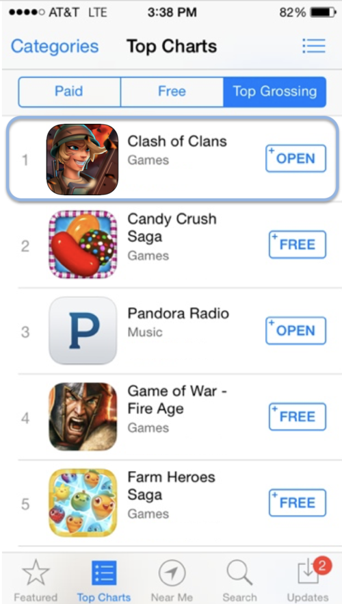
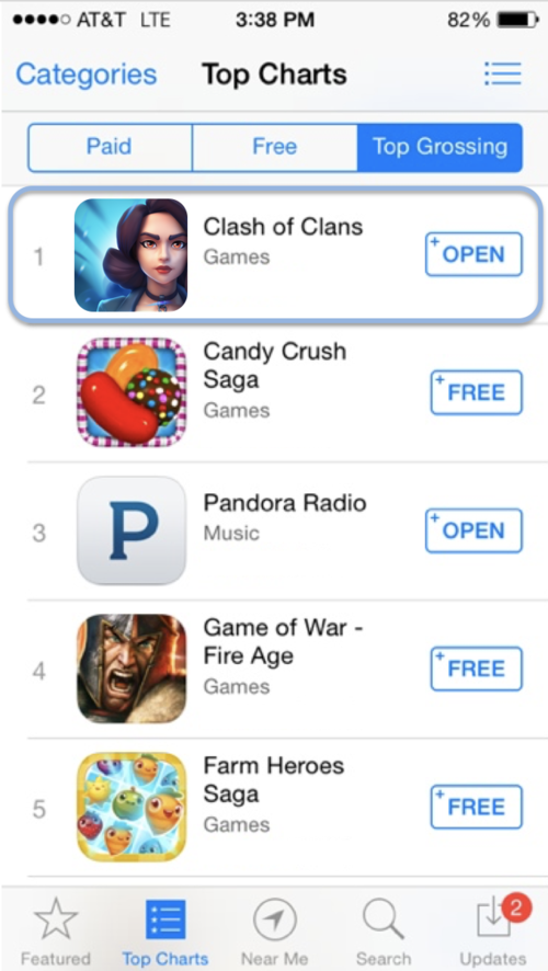
50 people answered in about 1 hour.Q: Which game app icon is more appealing in the appstore?
Head-to-head poll
AI Summary
Ask PickFu
Ask natural language questions about your poll to our custom AI engine. Don’t worry, it’s friendly.
The character looks more fun which makes me think the game will be more fun.
I'm not a huge fan of either but I like that A depicts a person in battle gear it shows more what the game is about
Option a looks more appealing! It shows emotion and a feeling of action. Choice B, while pretty, is boring.
The character shown is more realistic to the title to the game than the other character that is shown in B
This character looks like she has personality and energy so it's more appealing to me.
Tough choice, but I would be more likely to choose option A for colors and ease of use.
The graphic defines a Clash of Clans better in A versus the graphic in B which looks more like a story type game versus an action game
For a game, I prefer the more cartoony picture o A since I assume it's a more fun than serious game.
Oh! It's this one again, except now I get to choose between two women? Excellent! OK, so now I prefer the woman who looks mean and growly. The other woman is slightly too cheerful looking (or is perhaps drugged, with that giant smile, heh). Thanks, I enjoy these.
Totally picked this one because the icon looks more feminine. The nose is too sharp in the other image and it is too cartoonish.
Interesting choice for a mobile game icon - looks vaguely BioShock Infinite esque.
I just like the graphic on this option better. The brunette is attractive to look at, but the other graphic looks cheesy. I think option B is a more appealing image, and I would be more likely to download this game vs the other image with the cheesy smiling blonde. (No offense regarding hair color...just think in Option A the avatar is a little too happy. The other Graphic on B is just the right amount of happy, and attractive).
the lady on option a looked like she was having too much fun like war is a joke. i like the intensity of the lady in option b
Subscribe to PickFu+ to unlock AI highlights on every poll.
Or, unlock AI features for this poll as a one-time $29 add-on.
AI analysis (sample data)
Unearth more insights with a detailed poll report, discovering what respondents liked, disliked, and what to do next.Survey Analysis
Winning Option: Characteristics and Appeal
- Option B emerged as the preferred brand packaging design, securing 12 out of 15 votes. Respondents frequently highlighted its aesthetic appeal, emphasizing the luxurious and high-quality impression it conveys. The ability to stack packages was a notable practical advantage mentioned by participants.
- Several respondents appreciated the monochrome color scheme of Option B, which they found less overwhelming compared to more colorful designs. This preference for simplicity suggests that minimalistic designs may resonate well with this group.
- Additionally, environmental considerations played a role in favoring Option B; some participants noted its reduced plastic usage and recyclability as attractive features.
Key Topics Across Options
-
Aesthetic Appeal: Across both options, aesthetics were crucial in influencing preferences. Participants often referred to colors and overall design quality when justifying their choices.
-
Environmental Concerns: Both options had respondents who valued environmentally friendly aspects of packaging. However, while Option A was praised for being reusable and eco-friendly by some, others perceived Option B’s reduced plastic use as more sustainable.
-
Practicality: Practical elements such as ease of stacking (Option B) or suitability for travel (Option B) were significant factors in decision-making processes.
Hypotheses for Further Testing
-
Investigate whether minimalistic designs consistently outperform colorful ones across different demographic groups or product categories.
-
Explore if environmental messaging on packaging significantly influences consumer preference when compared with other attributes like luxury perception or practicality.
-
Assess how important stacking capability is relative to other functional benefits in various contexts such as home storage versus travel convenience.
These hypotheses can guide further research into understanding deeper consumer motivations behind packaging preferences observed in this survey context.
AI themes (sample data)
Learn what respondents like and dislike about your poll based on sentiments analyzed by our AI.Likes (sample data)
- Sleek and modern design
- Large ear cup sizes for comfort
- Minimalist and streamlined look
Dislikes (sample data)
- Lack of unique features or standout elements
- White color may get dirty easily
- Not as much cushioning as other options
Likes (sample data)
- (Note: There were no positive mentions specific to Option B in the provided survey answers)
Dislikes (sample data)
- (Note: There were no negative mentions specific to Option B in the provided survey answers)
Likes (sample data)
- Unique and stylish metallic grating design
- Sturdy and flexible build
- 'Cool' aesthetic appeal
Dislikes (sample data)
- 'Weird' or unpleasant cone shape for earmuffs
- 'Odd' overall appearance with metallic accents
- (Note: Third negative mention not available from provided survey answers)
Likes (sample data)
- Comfortable and sturdy design
- Aesthetic appeal, including color options
- Familiarity with the brand's quality
Dislikes (sample data)
- Negative perception of the brand logo
- Smaller ear size perceived as less comfortable
- Design not preferred compared to others
Likes (sample data)
- Sleek, modern, and professional look
- Comfortable fit with larger ear sections that cup the ears well
- Minimalist and clean black aesthetic
Dislikes (sample data)
- 'Flat' appearance perceived as less comfortable by some
- 'Bulky' design disliked by a few respondents
- Narrower piece near headband' not appealing to all users
Likes (sample data)
- 'Cushiony padding' for comfort over long periods of use
- 'Solid build' making it durable and secure on the head/ears
- Preferred neutral colors like black for headphones
Dislikes (sample data)
- 'Large ear covering' may be too big for some users’ preferences
- 'Separation of controls/buttons' not liked by everyone
- 'Chrome accent rings on headband' not appealing to all respondents
Likes (sample data)
- Design perceived as high quality and appealing
- Liked the color, especially the blue
- Thin padding was appreciated
Dislikes (sample data)
- Looked flimsy to some respondents
- Perceived as less sturdy compared to other options
- Color preference for white or black over blue
Likes (sample data)
- Modern and high-quality appearance with a white design
- Comfortable padding on headband and ears
- Sleek and neutral look preferred by many
Dislikes (sample data)
- 'White' color seen as prone to getting dirty easily
- 'Large ear cups' might be problematic for glasses wearers over long periods of use
- 'Sturdy design' could be considered bulky by some users

