Más información
Cómo funciona
Panel de audiencia
Casos de estudio
Testimonios
Industrias
Amazon
E-commerce
Gaming
Marketing
Publicación
Empresarial
Productos
Todos los productos
Encuestas
Servicios llave en mano
AI tools
Precios
Recursos
Blog
Events
Centro de ayuda
Plantillas
Ejemplos de encuestas
Guía de imagen principal de Amazon
Iniciar sesión
Registrarse gratis
English
Chinese
Russian
Spanish
Ir al panel de control
Idioma
English
Chinese
Russian
Spanish
Configuración
Cerrar sesión
Search examples
Industry
Apps and games
Business
E-commerce
Publishing
Poll type
5 Second Test
Click Test
Emoji Reaction
Head-To-Head
Multi Select
Open-Ended
Ranked
Single Select
Star Rating
Survey
Clear filters
Thank you! Your submission has been received!
Oops! Something went wrong while submitting the form.
Browse our examples library
Explore our collection of poll and survey examples to spark ideas for your next PickFu test.
Showing
0
examples
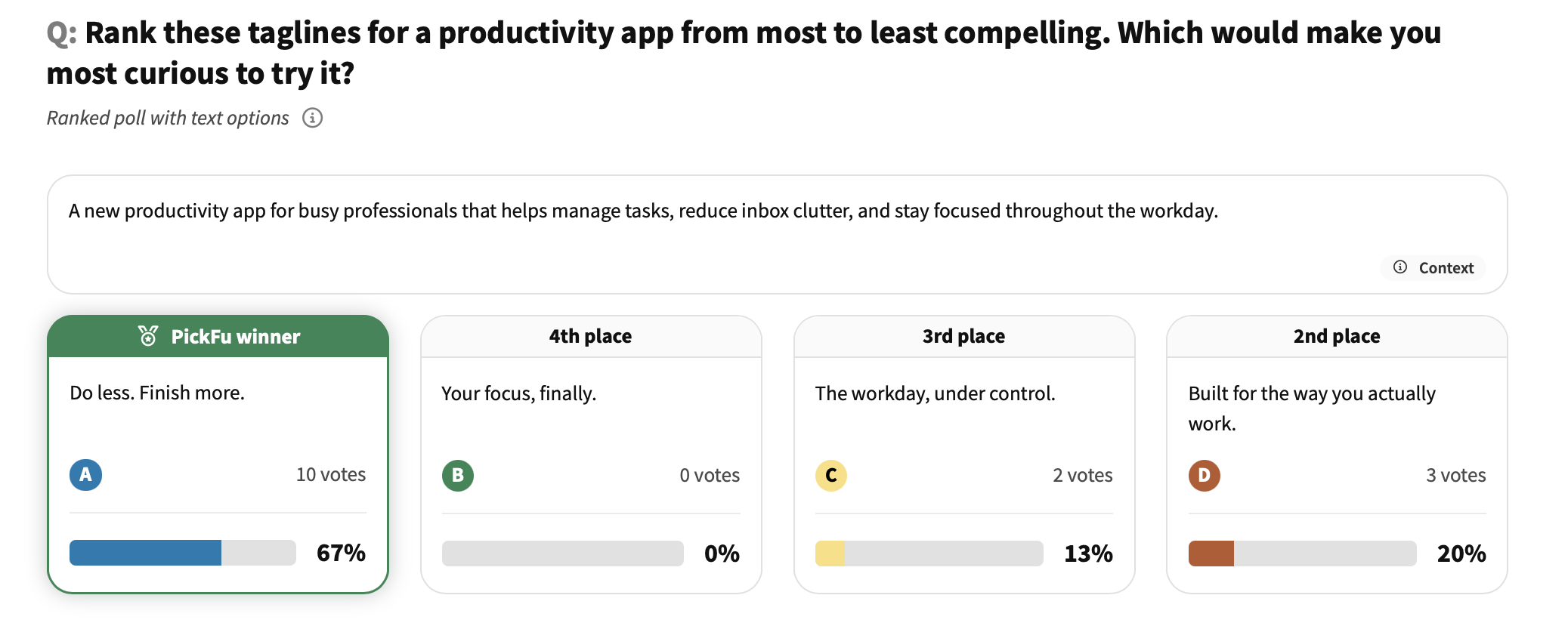
Clasificación de eslóganes de una app: app de productividad
Descubre qué eslogan de app de productividad resuena más entre 15 consumidores de EE. UU. y qué enfoques de texto no funcionan.
This is some text inside of a div block.
Prueba de mensajes, prueba de eslóganes, optimización de textos para SaaS
This is some text inside of a div block.
Población general
Decisión de compra DTC: sitio web de una marca de cuidado de la piel
Descubre qué señales de confianza influyen más en los compradores primerizos en el sitio web de una marca de cuidado de la piel: comentarios reales de selección múltiple de 15 consumidores de EE. UU.
This is some text inside of a div block.
Optimización de sitios web DTC, investigación de decisiones de compra, prueba de señales de confianza
This is some text inside of a div block.
Población general
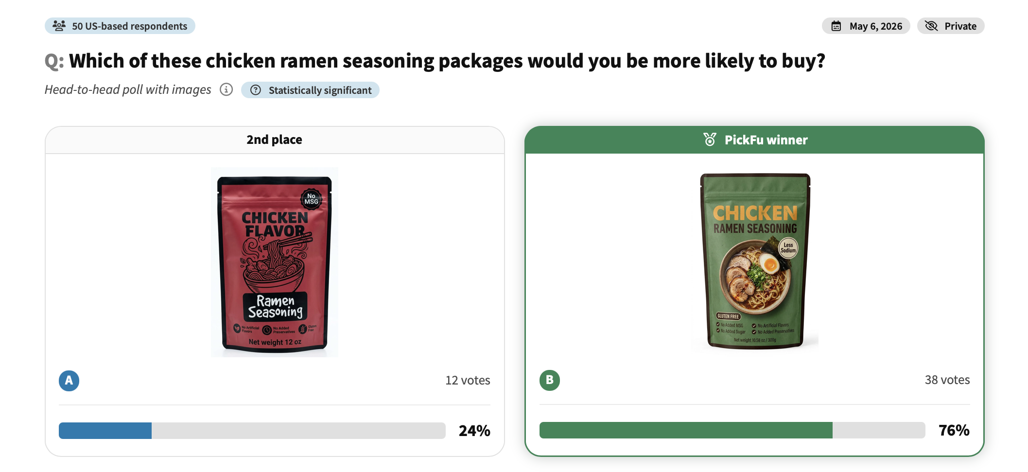
Comparación de diseño de empaque: condimento para ramen de pollo
Mira qué empaque de condimento para ramen de pollo prefirieron 50 compradores y qué los impulsó a elegir.
E-commerce
This is some text inside of a div block.
Pruebas de diseño de empaque, branding de productos alimenticios, psicología del color
This is some text inside of a div block.
Head-To-Head
Población general
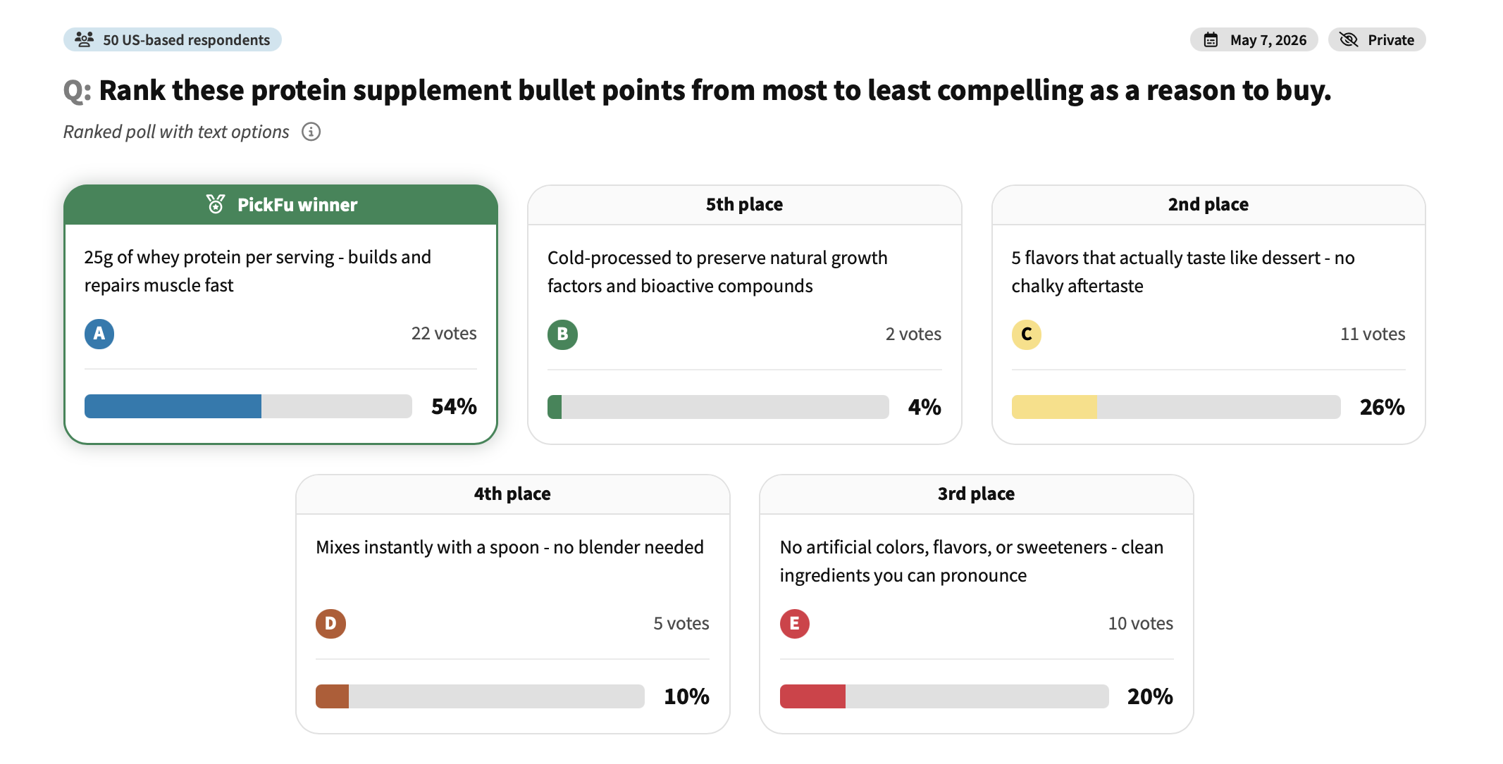
Prueba de viñetas en Amazon: suplemento proteico
Mira qué viñetas de un suplemento proteico encuentran más convincentes 50 compradores y cuáles no logran impactar.
E-commerce
This is some text inside of a div block.
Optimización de viñetas en Amazon, prueba de copy del listado
This is some text inside of a div block.
Ranked
Población general
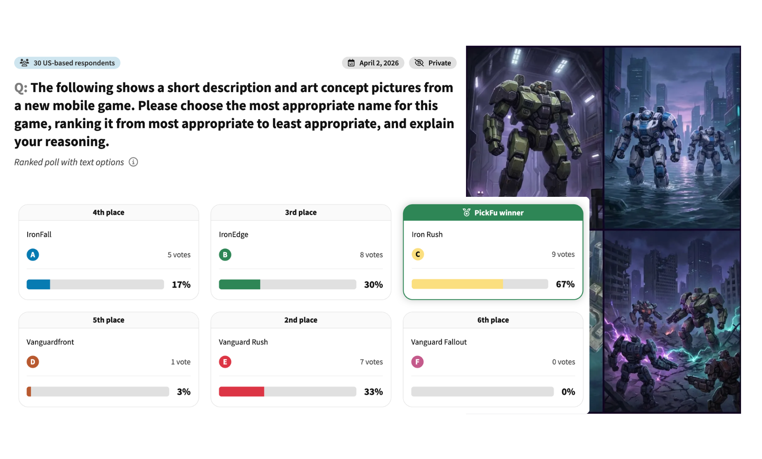
Prueba de nombre de juego: juego móvil de mechas de ciencia ficción
Mira cómo 50 consumidores de EE. UU. clasifican 6 posibles nombres para un juego móvil de mechas de ciencia ficción y qué hace que un título suene épico.
Apps and games
This is some text inside of a div block.
Prueba de nombre de juego
This is some text inside of a div block.
Ranked
Población general
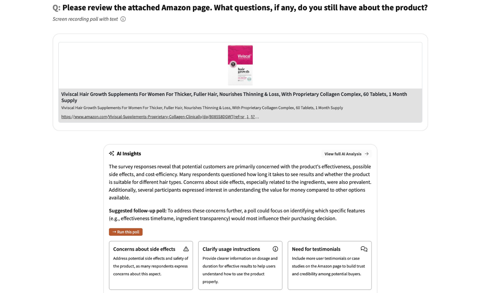
Preguntas sobre página de producto en Amazon: suplemento para el crecimiento del cabello
Descubre qué dudas siguen teniendo 15 consumidores de EE. UU. tras ver la página de Amazon de un suplemento para el crecimiento del cabello.
E-commerce
This is some text inside of a div block.
Optimización de listado en Amazon
This is some text inside of a div block.
Open-Ended
Población general
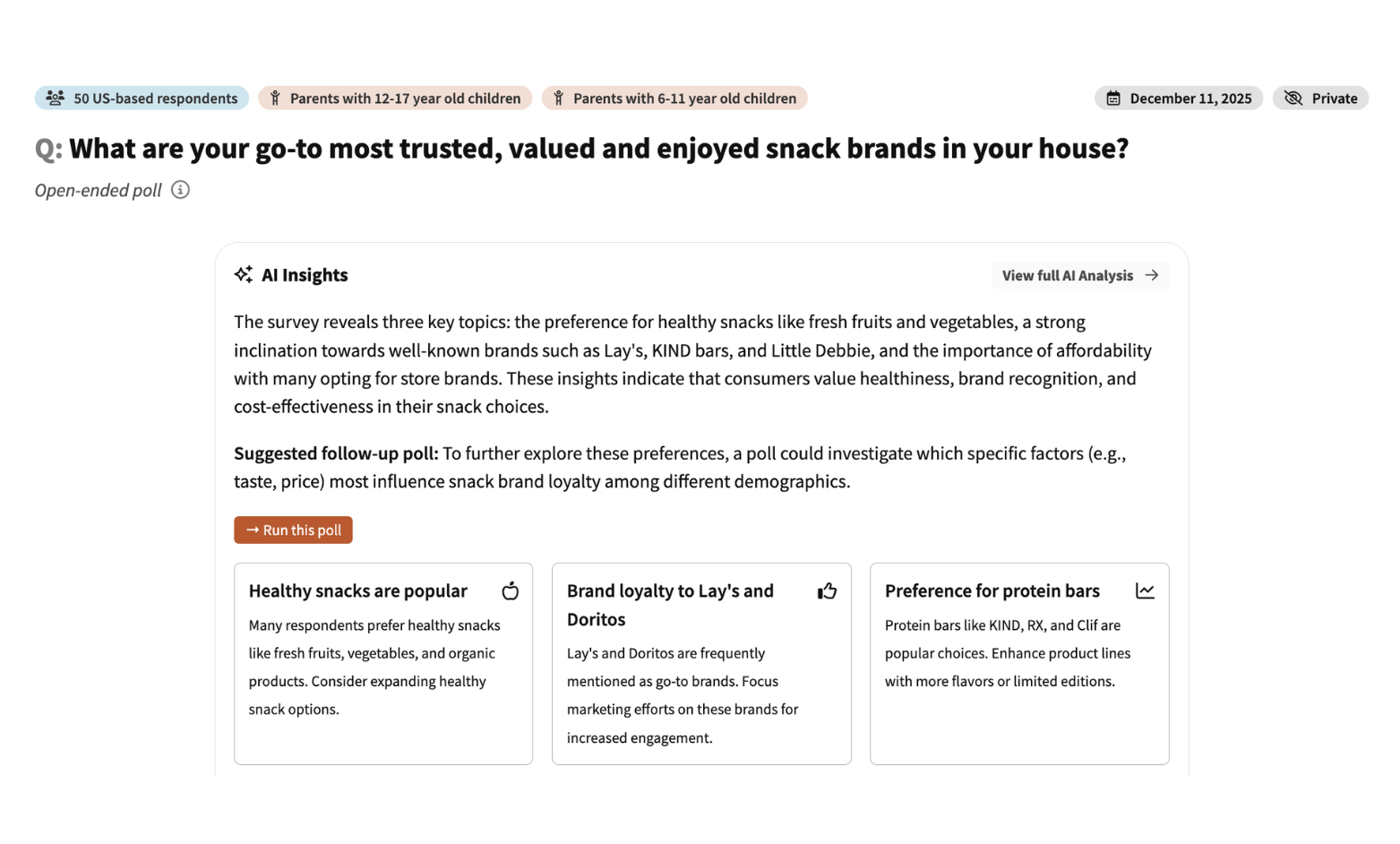
Clasificación de snacks saludables: opciones de snacks para niños
Mira cómo 50 padres estadounidenses clasifican seis snacks para niños según lo saludables que son y qué marcas de confianza ya compran.
E-commerce
This is some text inside of a div block.
Validación de ideas
This is some text inside of a div block.
Survey
Padres de preadolescentes y adolescentes
Prueba de preferencia de producto: juguetes para perros que se pueden romper
Mira cómo 30 dueños de perros en EE. UU. eligen entre dos juguetes de peluche que se pueden romper y qué características inclinan la decisión.
E-commerce
This is some text inside of a div block.
Investigación de audiencia
This is some text inside of a div block.
Head-To-Head
Dueños de perros
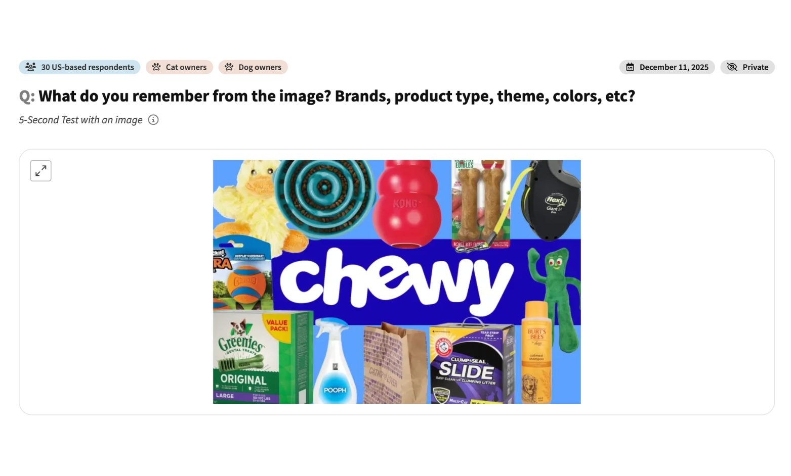
Prueba de recordación de marca: imagen publicitaria de un retailer de mascotas
Mira qué recuerdan 30 dueños de mascotas en EE. UU. tras una breve exposición a un anuncio de un retailer de mascotas y qué se perdió entre el desorden visual.
E-commerce
This is some text inside of a div block.
Marketing, campaña publicitaria, reconocimiento/recordación de marca
This is some text inside of a div block.
5 Second Test
Dueños de perros y gatos
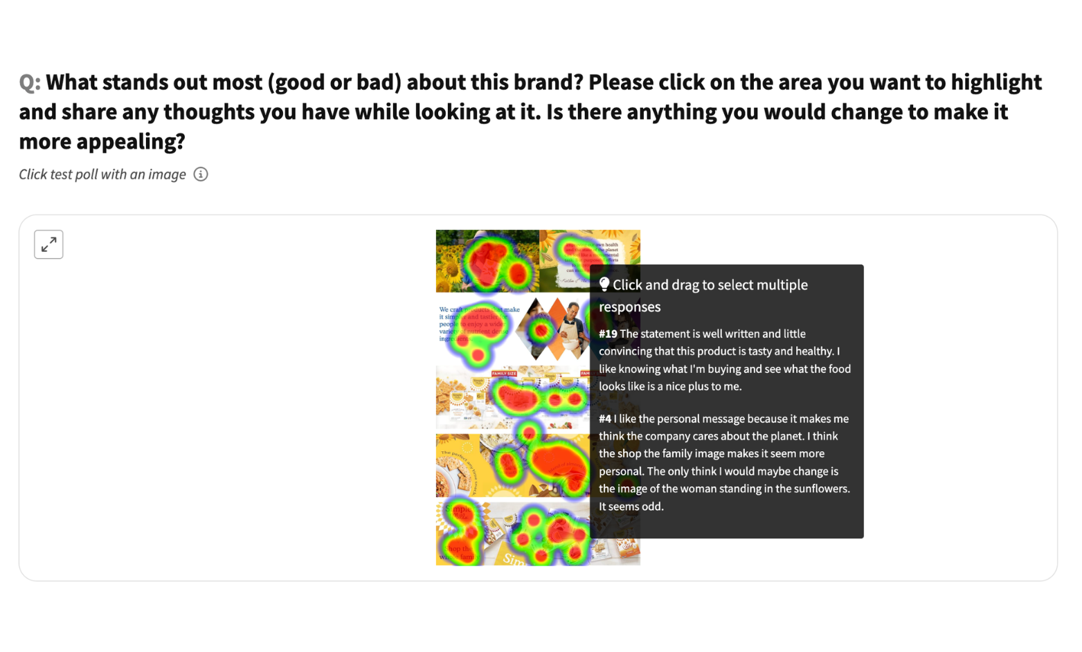
Prueba de clic en contenido A+: marca de alimentos saludables
Mira dónde hacen clic 30 consumidores de EE. UU. en el contenido A+ de una marca de snacks saludables: qué atrae la atención y qué pasa desapercibido.
E-commerce
This is some text inside of a div block.
Diseño de contenido A+, atractivo de marca
This is some text inside of a div block.
Click Test
Población general
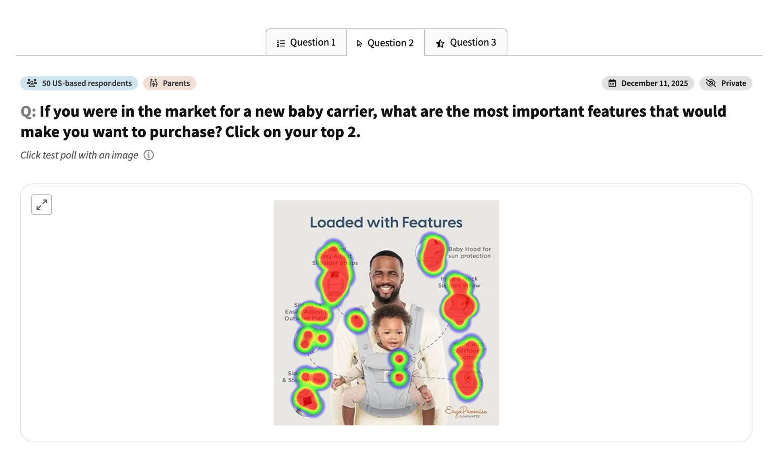
Comparación de competidores: portabebés
Mira cómo 50 padres estadounidenses clasifican cuatro portabebés y valoran la confianza en la marca Ergobaby. Comentarios reales sobre precio, comodidad y seguridad.
E-commerce
This is some text inside of a div block.
Comparación de competidores, intención de compra
This is some text inside of a div block.
Survey
Padres
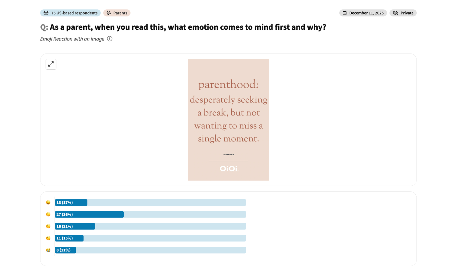
Prueba de mensaje de marketing: eslogan de marca para padres
Mira cómo 75 padres estadounidenses responden emocionalmente a un eslogan de una marca para padres: calidez, humor y reacciones encontradas.
E-commerce
This is some text inside of a div block.
Pruebas de mensajes de marketing
This is some text inside of a div block.
Emoji Reaction
Padres
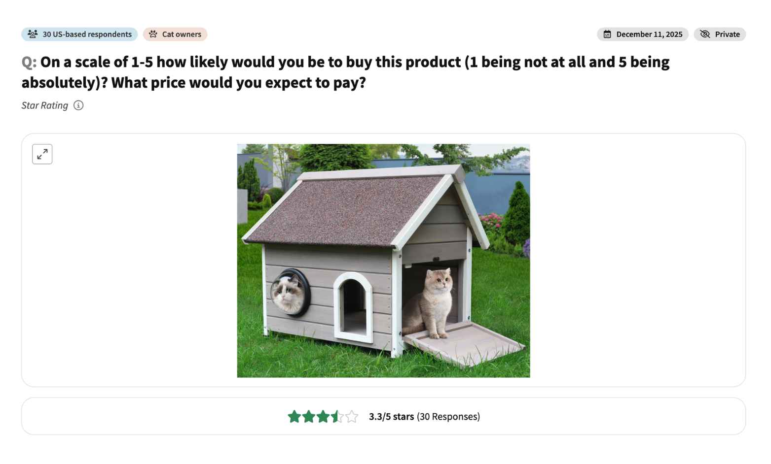
Prueba de concepto de producto: casa para gatos de exterior
Mira cómo 30 dueños de gatos en EE. UU. valoran su intención de compra y el precio esperado para una casa para gatos de exterior.
E-commerce
This is some text inside of a div block.
Pruebas de diseño y precio de producto
This is some text inside of a div block.
Star Rating
Dueños de gatos
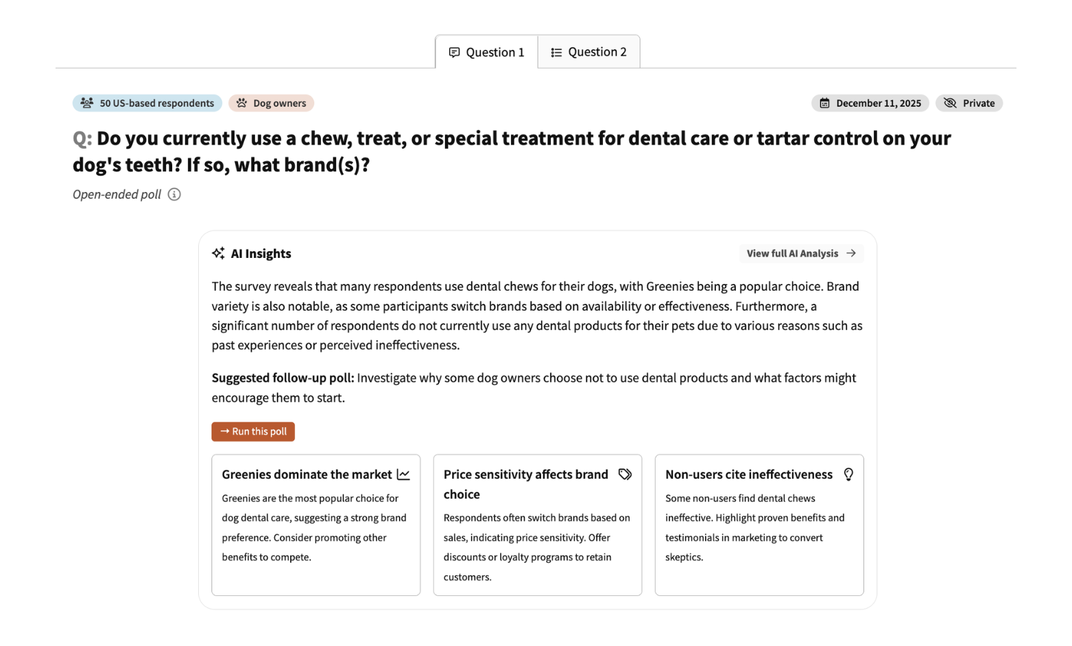
Encuesta de lealtad de marca: productos de cuidado dental para perros
Mira cómo responden 50 dueños de perros en EE. UU. a una marca de masticables dentales para mascotas: qué compran ya y si cambiarían de marca.
E-commerce
This is some text inside of a div block.
Investigación de lealtad de marca
This is some text inside of a div block.
Survey
Dueños de perros
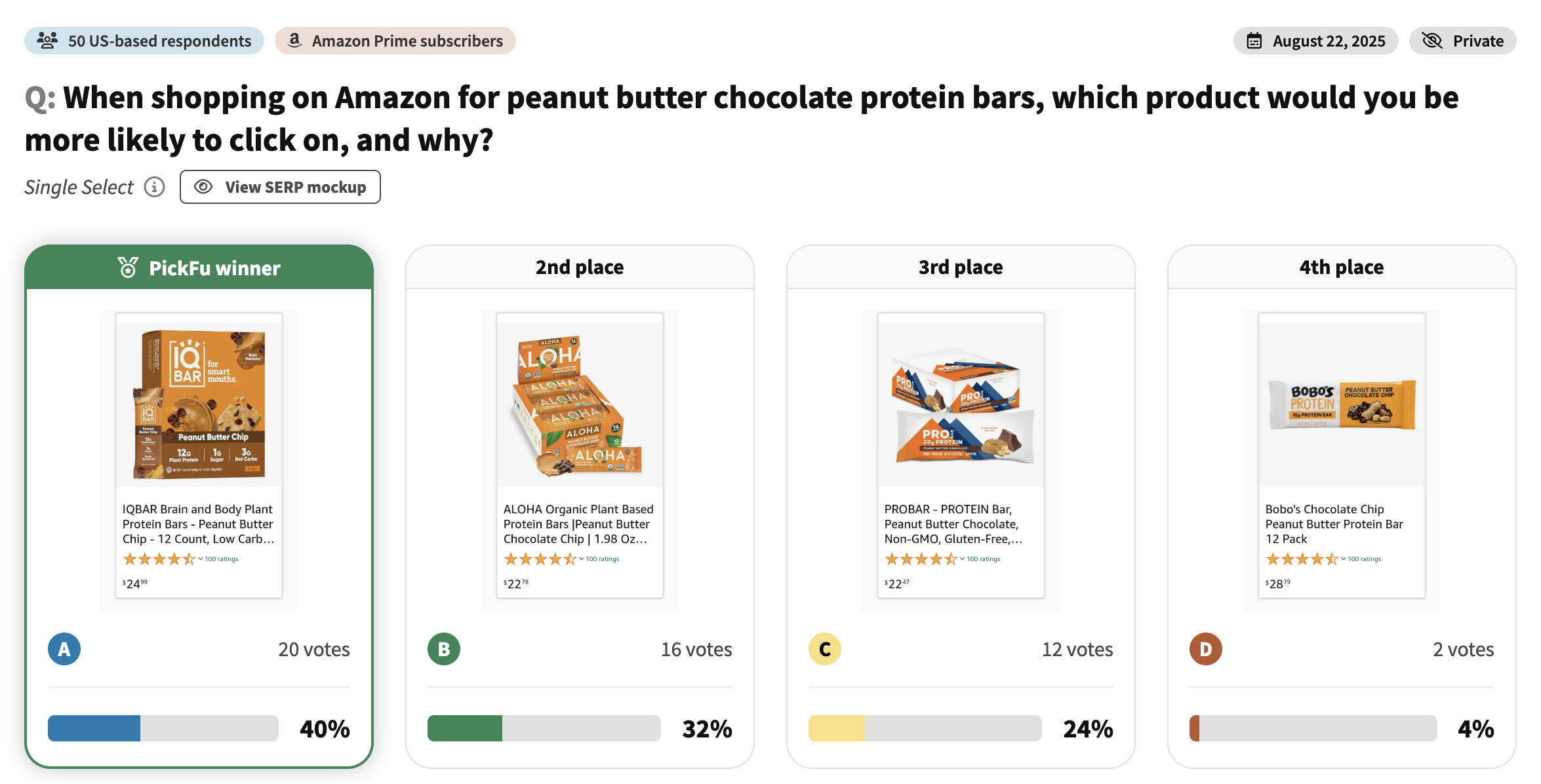
Comparación de competidores en Amazon: barritas de proteína
Mira cómo 50 compradores de Amazon Prime compararon 4 listados de barritas de proteína. Comentarios reales sobre empaque, declaraciones nutricionales y qué impulsa los clics en Amazon.
E-commerce
This is some text inside of a div block.
Optimización de listado en Amazon
This is some text inside of a div block.
Single Select
Suscriptores de Amazon Prime
Comentarios sobre diseño de empaque: fideos instantáneos
Mira cómo los consumidores identifican elementos confusos en el empaque de fideos instantáneos. Comentarios reales de prueba de clic sobre complejidad del diseño y legibilidad.
E-commerce
This is some text inside of a div block.
Simplificación del empaque
This is some text inside of a div block.
Click Test
Product packaging
Development
Población general
Prueba de color de etiqueta de producto: producto de limpieza
Mira qué color de etiqueta gana para una botella de producto de limpieza. Comentarios reales de consumidores sobre legibilidad, contraste y atractivo en el lineal.
E-commerce
This is some text inside of a div block.
Diseño de empaque de producto
This is some text inside of a div block.
Ranked
Product packaging
Design
Población general
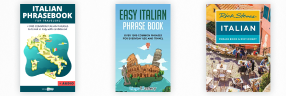
Comparación de portadas: libro de frases en italiano
Mira qué portada de libro de frases en italiano destaca para los estudiantes de idiomas. Comentarios reales sobre el atractivo del diseño y la importancia de las funciones.
Publishing
This is some text inside of a div block.
Diseño de portada de libro
This is some text inside of a div block.
Ranked
Book cover
Design
Población general
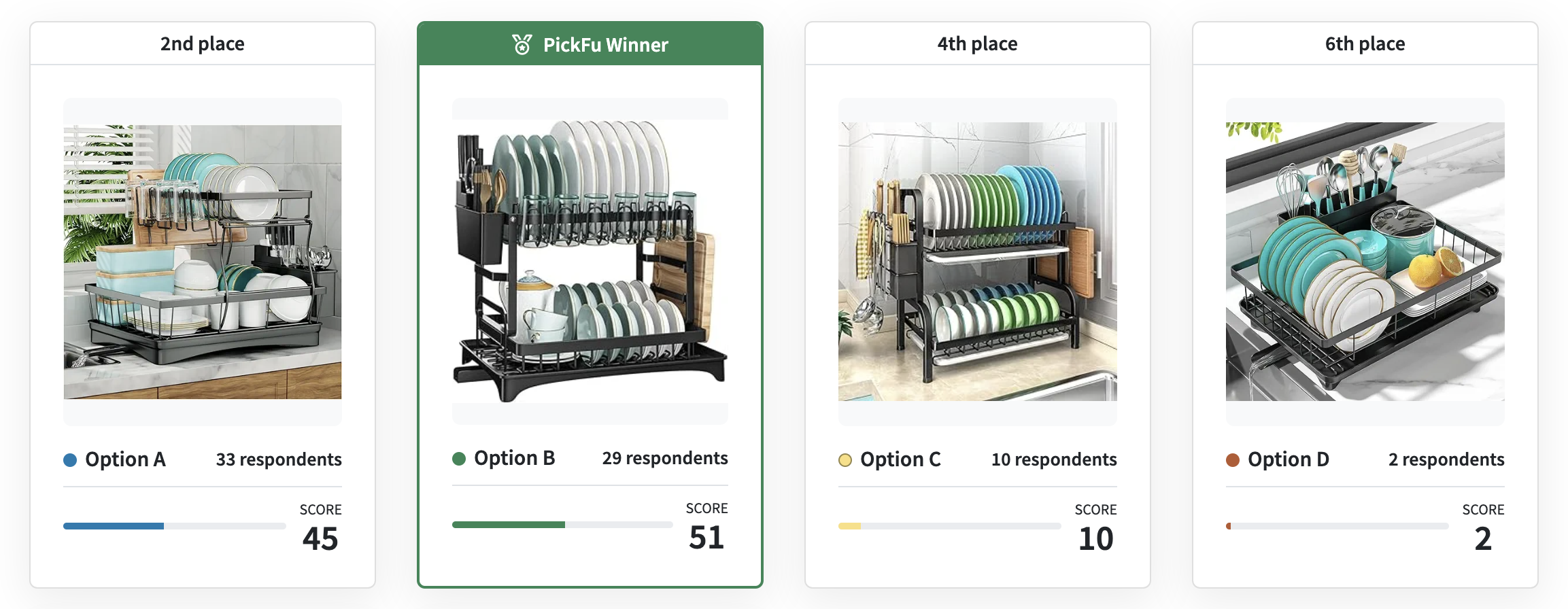
Comparación de productos en Amazon: escurridores de platos (México)
Mira qué diseño de escurridor de platos prefieren los compradores de Amazon en México. Comentarios reales sobre eficiencia de espacio y funcionalidad.
E-commerce
This is some text inside of a div block.
Pruebas de productos internacionales
This is some text inside of a div block.
Ranked
Product design
Distribution
Compradores de Amazon en México
Prueba de diseño de portada: libro cristiano de autoayuda
Mira hacia dónde van los ojos de los lectores cristianos en la portada de un libro de autoayuda. Esta prueba de clic revela los elementos de diseño más llamativos.
Publishing
This is some text inside of a div block.
Optimización del diseño de portada
This is some text inside of a div block.
Click Test
Book cover
Design
Audiencia cristiana
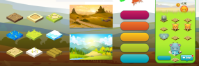
Comparación de temáticas de juego: juego de puzles para móvil
Mira qué temática de juego de puzles gana entre los jugadores móviles. Comparación rotativa de diseños de personajes y estilos visuales.
Apps and games
This is some text inside of a div block.
Selección de temática de juego
This is some text inside of a div block.
Round Robin
Character concept, App store screenshot
Design
Jugadores móviles
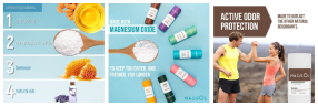
Prueba de imágenes secundarias en Amazon: desodorante natural
Mira qué imágenes secundarias captan primero la atención en Amazon. Prueba de clic de una cuadrícula 3x3 de infografías para un desodorante natural.
E-commerce
This is some text inside of a div block.
Pruebas de jerarquía de imágenes
This is some text inside of a div block.
Click Test
Infographics or secondary images
Distribution
Población general
Comentarios sobre concepto de app: guía de senderos para caminatas
Mira cómo valoran los consumidores el concepto de una app de guía de senderos. Calificaciones con estrellas y comentarios sobre funciones, utilidad y conectividad.
Business
This is some text inside of a div block.
Validación de concepto de app
This is some text inside of a div block.
Star Rating
Video
Design
Población general
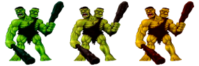
Calificación de personaje de juego: diseño de monstruo
Mira los comentarios de jugadores sobre el diseño de un ogro de dos cabezas. Encuesta de calificación con estrellas sobre proporciones, colores y atractivo general.
Apps and games
This is some text inside of a div block.
Comentarios sobre diseño de personaje
This is some text inside of a div block.
Star Rating
Character concept
Design
Jugadores hombres aficionados a juegos de acción, aventura y RPG
Comentarios sobre personajes de juego: diseños de vikingos
Mira qué diseño de personaje vikingo gana entre los jugadores de estrategia. Comparación clasificada de tres conceptos de personajes.
Apps and games
This is some text inside of a div block.
Selección de diseño de personaje
This is some text inside of a div block.
Ranked
Character concept
Design
Jugadores móviles de estrategia
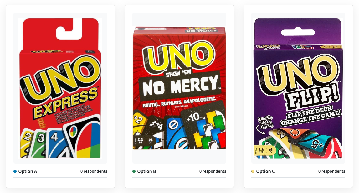
Comparación de productos: versiones del juego UNO
Mira qué versión del juego UNO prefieren los consumidores mexicanos. Comparación clasificada de la versión clásica frente a ediciones temáticas.
E-commerce
This is some text inside of a div block.
Pruebas de variantes de producto
This is some text inside of a div block.
Ranked
Product packaging
Distribution
Consumidores residentes en México
Comentarios sobre esquema de color: app de partituras
Mira qué esquema de color de app de partituras prefieren los lectores. Comparación directa entre azul y verde para lectura prolongada.
Apps and games
This is some text inside of a div block.
Optimización del diseño de la app
This is some text inside of a div block.
Head-To-Head
App icon, App store screenshot
Design
Población general
Prueba de empaque de producto: diseños de botellas de miel
Mira qué diseño de botella de miel prefieren los consumidores. Comparación directa de colores de etiqueta y formas de botella.
E-commerce
This is some text inside of a div block.
Diseño de empaque
This is some text inside of a div block.
Head-To-Head
Product packaging
Design
Población general
Prueba de clic en capturas de App Store: juego móvil de granja
Mira qué captura de pantalla de juego móvil capta primero la atención. Esta prueba de clic revela los elementos más atractivos en un juego con temática de granja.
Apps and games
This is some text inside of a div block.
Optimización de capturas de pantalla
This is some text inside of a div block.
Click Test
Character concept, App store screenshot
Distribution
Jugadores móviles
Sorry, we couldn't find any templates that matched your search or filters.
Try adjusting your search terms or removing filters.


.png)