
Head-To-Head
E-commerce
Packaging design comparison: chicken ramen seasoning
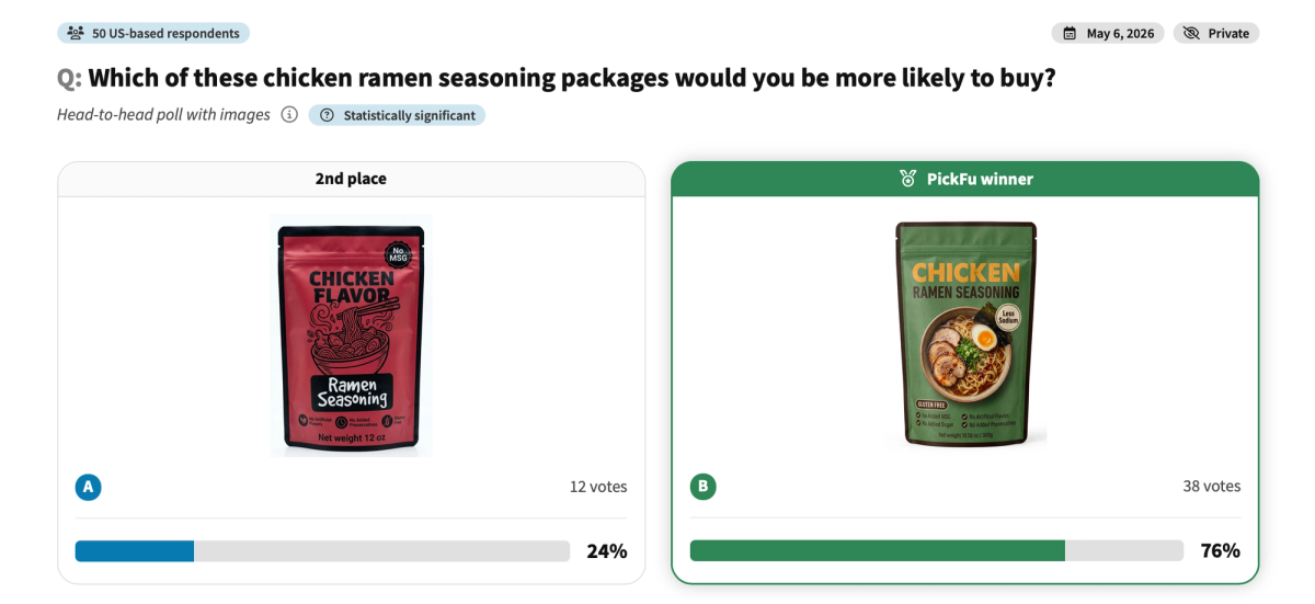
This survey asks 50 U.S. shoppers to choose between two chicken ramen seasoning packages in a head-to-head comparison. Option A features a bold illustrated style on a crimson red pouch. Option B uses photorealistic food photography on a forest green pouch. Option B won decisively with 76% of the vote, revealing how packaging style and color psychology directly shape purchase intent in the food and seasoning category.
- Тип опроса
- Head-To-Head
- Респонденты
- 50
- Местоположение
- U.S.
- Аудитория
- General population
- Отрасль
- E-commerce
- Сценарий использования
- Packaging design testing, food product branding, color psychology
“I will choose this one. I like the color scheme signals a more natural, health conscious and high end ingredient profile. The high contrast white and orange typography against the muted green background feels modern, clean and organic. In a modern grocery market, less sodium is a massive selling point for ramen products which are notorious for excessive salt.”
“A may be a bit too stylized. It's hard to see and distinguish the different items in the bowl. For food products I am much more intrigued when I see actual food on the packaging.”
“I like B better because it looks more upscale and I like that it has real pictures on the front so I can imagine what my food would look like if I used it.”