
When to use this playbook
The optimization loop
1
Test first impressions
A 5-second test reveals what the packaging communicates at a glance — what the product is and
which features stand out before deliberate study.
2
See what catches the eye
A click test (heatmap) shows which areas of the design draw attention, and the written feedback
explains why.
3
Benchmark against competitors
Test your current design vs. 2–3 competitor packages. Save this competitor set — you reuse it in
the final validation.
4
Iterate your design
Generate or upload improved variations and run head-to-head questions until a design wins with a
score of 70 or higher.
5
Re-validate against the original competitor set
Run a final survey with the winning design plus the SAME competitor packages from step 3 to
confirm the improvement holds against the category.
Sample size and cost. Defaults to small, cheap surveys — 50 respondents for the impression,
click, benchmark, and validation tests, 15 respondents per iteration. The loop triangulates
across surveys, so a single noisy result self-corrects. Scale the final validation to 100–200
before committing to an expensive print run. See
sample size guidance.
Run this playbook with an AI agent
Copy prompt for AI
Paste this prompt into Claude, ChatGPT, Cursor, or any AI agent connected to the
PickFu MCP server, CLI,
or REST API. The agent will run the entire loop on your behalf —
creating polls, reading responses, and iterating until a winning variation emerges.
Step-by-step (human operator view)
1. Test first impressions
What you’ll get: whether the packaging communicates the product and its key benefit in the
first few seconds — the single most important test of shelf legibility.
Launch the 5-second test → · See an example →
2. See what catches the eye
What you’ll get: a heatmap of attention plus written reasons. Use it to confirm your hero
element (logo, product window, key claim) is actually where eyes go.
Launch the click test → · See an example →
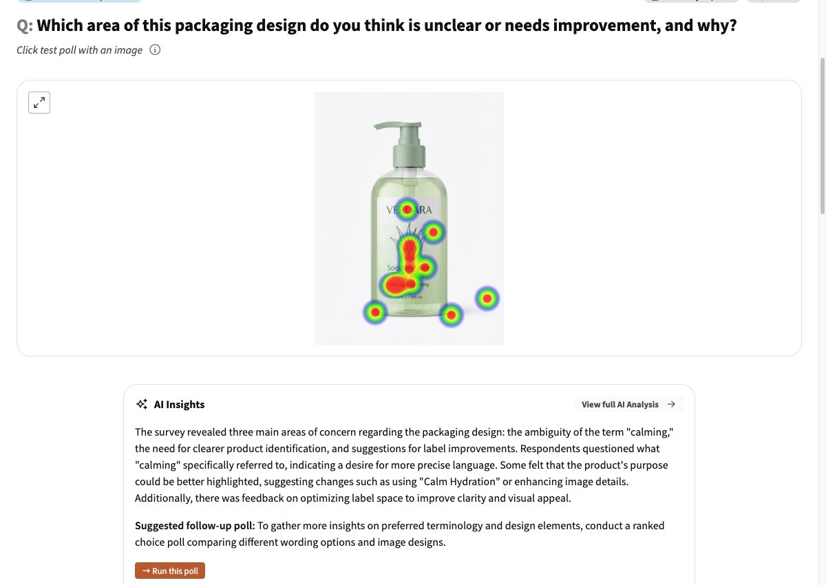
A click-test heatmap: respondents tap the areas that stand out, producing an attention map over your design plus an AI summary of what drew or confused them.
3. Benchmark against competitors
What you’ll get: a baseline ranking against the competitive set. Save these competitor images —
you reuse them in step 5.
Launch the benchmark survey → · See an example →
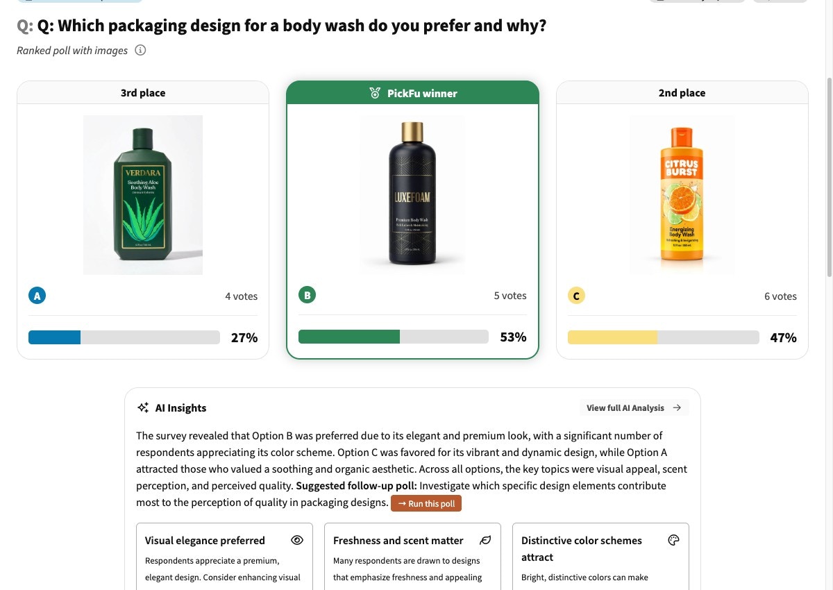
A packaging benchmark: your design ranked against competitors, with vote share, the PickFu winner, and an AI summary of the themes driving preference.
4. Iterate your design
See an example iteration →
5. Re-validate against the original competitor set
Interpret the result: a higher ranking/score than your step-3 baseline confirms the new design
out-performs against the real competitive set, not just against your old design.
See an example validation →
Troubleshooting
The 5-second test shows people don't know what the product is.
The 5-second test shows people don't know what the product is.
This is the most valuable failure to catch early. Before iterating on aesthetics, fix
legibility: larger product name, a clearer product window or photo, or an explicit category
descriptor. A beautiful package that doesn’t communicate the product loses on the shelf.
The heatmap shows attention on the wrong element.
The heatmap shows attention on the wrong element.
If eyes land on a decorative element instead of your key claim or brand, increase the visual
weight of what matters (size, contrast, position) and de-emphasize the distraction. Re-run the
click test to confirm the shift.
My design wins head-to-head but loses the benchmark.
My design wins head-to-head but loses the benchmark.
You improved on your old design but didn’t beat the category. Look at what the winning competitor
does that you don’t — often a clearer benefit claim or stronger color contrast — and address that
specifically.
Related
- More ways to test your packaging (advanced tests & FAQs) — label design, premium perception, gift appeal, sustainability trade-offs, and more
- Amazon main image playbook — for digital-shelf thumbnails
- Best practices for survey design
- MCP server reference
- PickFu CLI