
Click Test
Publishing
Book cover design test: Christian self-help book
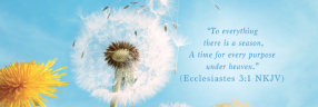
This survey uses a Click Test to identify which elements of a self-help book cover catch readers' attention first. It's targeting 50 U.S. Christian readers. Respondents clicked on the most eye-catching elements and shared what they would change about the design.
- Question types
- Click Test
- Respondents
- 50
- Location
- U.S.
- Audience
- Christian audience
- Industry
- Publishing
- Use case
- Cover design optimization
- Stage
- Design
“I think the most eye catching part of the cover is definitely the dandelion flowing in the wind. It reminds me that you should try to go with the flow, somethings are out of your control. I dont like the font that was used for the word "WHO"”
“The script of the word really makes it stand out more and gives it the weight needed to catch one's attention on a boo shelf. If I wanted to change the book, I would add something to contrast the cool blue background.... perhaps a complimentary color like orange to really give it some weight.”
“I would change the dark blue color used on the text for the subtitle. It just doesn't have enough contrast against the blue background. I'd also like to add something to the upper left where people may look first, maybe one dandelion seed, slightly larger as if it's coming towards you?”