Poll results
Save to favorites
Add this poll to your saved list for easy reference.
Which book on self-driving cars looks like an stimulating read?

Option D won this Ranked poll with a final tally of 28 votes after 3 rounds of votes counting.
In a Ranked poll, respondents rank every option in order of preference. For example, when you test 6 options, each respondent orders their choices from first to sixth place.
PickFu requires a majority to win a Ranked poll. A majority winner differs from a plurality winner. A majority winner earns over 50% of the votes, whereas a plurality winner earns the most votes, regardless of winning percentage.
If an option does not earn a majority of votes, PickFu eliminates the option with the lowest number of votes. The votes from the eliminated option are reassigned based on each respondent’s next choice. This process continues in rounds until a majority winner emerges.
Scores reflect the percentage of total votes an option receives during the vote counting and indicate the relative preference of the respondents. If there is no majority winner, look to the scores to see how the options fared relative to one another.
| Option | Round 1 | Round 2 | Round 3 |
|---|---|---|---|
| D | 40% 20 votes | 46% 23 votes +3 | 56% 28 votes +5 |
| B | 32% 16 votes | 34% 17 votes +1 | 44% 22 votes +5 |
| A | 18% 9 votes | 20% 10 votes +1 | Eliminated 10 votes reassigned |
| C | 10% 5 votes | Eliminated 5 votes reassigned |
9 Responses to Option A
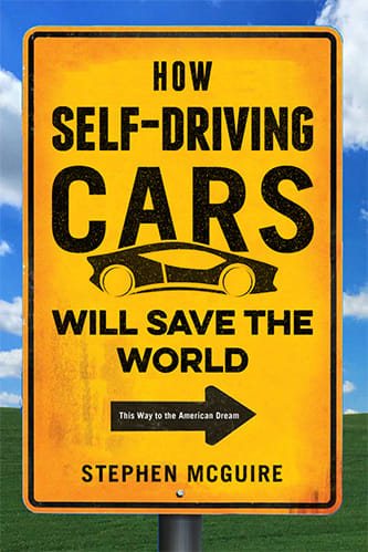
I just like the big yellow sign on the cover. I find it appealing for some reason. It is more attention grabbing.
I like the first two options the best because they look like your typical how to books. I don't like the graphics on the other two options either.
A is really good. The other ones are lame compared to it.
They all look good but I like the first one I chose the best
I like how choice A combines the American Dream with self driving cars. The cover on choice B looks very cool and interesting.
I like the road in 3 it look like I would like to be driving on it. The silver car looks kinds weird cause there isn't a real world equivalent I am use to seeing. The road sign titles in 1 and 2 look kinda cool they go with the theme of the book and invite you to read the cover I would turn those over and read the back for more information fairly quickly.
I chose A because it is the most catchy cover and makes me want to read it
I like the covers with yellow in it, they appear to be natural signs/license plates you would see while driving and its more catchy to look at.
Option "A" is realistic and inviting.Option "B" is to unrealistic.Option "C" is inviting
16 Responses to Option B
B is the best because it looks like driverless cars are superheroes who wills ave the world.
B cover looks the best with the shiny car. A look ok, and still professional with the sign. C looks very unprofessional with the simple font and the separation btw text and picture.
Having a fast and sleek looking car on the cover gets you to want to see more, everyone loves speed and fancy cars. The second one gives you the idea of sitting back and relaxing with an automated car, and the third has the open road and the story is out there to discover
This cover is the most entertaining and fun. It really grabs my attention and interests me. It stands out the most.
funner and more creative is better
I like the term "self-driving" in B&A vs driverless. A looks more futuristic.
Option B is the best option as it is futuristic and very sleek. It's a great looking and fresh cover. Think that will be the best look and the bold font is excellent as well.
The book on self-driving cars of Option B looks like an stimulating read due to the fact of the great amazing front view picture of the car. The car looks very futuristic as well as very expensive. That cover caught my attention right away, much more than the other options.
The option B cover is the most striking and eyecatching. It seems the most interesting because to me it communicates action.
B has the most intriguing graphics, and therefore makes me most interested in reading it. A & C have less interesting graphics, but I do like their catchphrases.
B really nails the title the best.
The image in Option B made it interesting for me. The word driverless in option D got me curious about the book.
The more original ans colorful the bettet
It gives an idea how the future will look.
B is most unique in its impact to drive home the topic of self-driving vehicles via its large font title and the car image popping from the page. D offers a focus on the key word "driverless" which immediately grabs attention and directs you to review the cover. A has all the details you need to understand the book topic, but its a very wordy and busy cover.
Catchy artwork, catchy title - those are both in B and to a lesser extent C. If I were looking for a book those 2 would jump out at me well before the others.
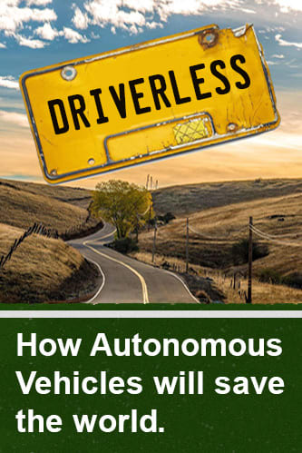
5 Responses to Option C
The road signs seemed attractive and appropriate for a book cover. The first one I selected is miles ahead of the remaining selections (pun intended).
C I like how the whole book looks like and says. A has great words about driving. B looks attractive but to corny looking.
I ranked the book covers I liked the most.
they are descriptive
more interesting with the road signs
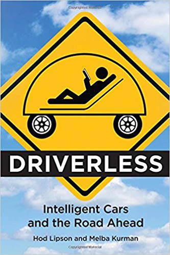
20 Responses to Option D
I like these plates for the cover of the driverless book
The covers with the signs I think bring the most attention as it is more focused on the material rather than the car.
It looks the most interesting to read.
I chose option D. I like the driver laying back in the seat reading.
Option D just plays on one of the biggest imagined benefits of the self-driving vehicle, free time during the ride, and piques my interest from there. The layout and font choices on this cover are the most visually appealing to me as well. From there the license plate and open road of C I find artistically appealing as well. Though I don't feel it's as strong as D. Option a is my third choice only because I dislike it less than option B, not because I like anything in particular about it.
I like the covers that look simple and a little comedic and then also the one with the race car look.
I like the idea of reading the book while driving since the cars can do it now, then I just like the road sign as the cover and that car is too cool to not be number 3
It really captures the idea of how much time it can save you
I really like the roadsign image of the driver reclining and reading - not only is that appropriate for such a work, but the image of a reader is especially enticing for such a book. I would love to be able to read while driving! I suspect most self-driving cars won't be as "cool" looking as the car in A or B, but I like the road sign in A, and prefer the term self-driving car to the other terms used across the four options. Finally, the empty road and "DRIVERLESS" license plate in C are amusing. Looking at my options, I'm clearly biased towards covers with road signs for such a work.
D looks as though how you want to feel when in a driver-less car. A's just a simple design with not too much going on which is appealing and C just has a catchy title "How driverless cars will save the world"
I happen to like the the yellow background image the best, because it most meminds me of the typical raod sign. Plus,"D" image seems the most interesting to me in terms of understanding what a driveless car means to us as a whole. I feel that "A" and "C" do so in a less meaning manner.
These are the most appealing visually.
D seems pretty cool, thats what exactly what i would do if my car could drive by itself. B seems like is a pretty cool car. I just dont like C so I put A in the third pick.
To be honest, none are very inspiring. However, of all the options, option D looks to be the more appealing with the road sign, the driver relaxing and the car driving itself. Option B plays off the superhero mantra and so that is something. Option A is just the more appealing between the last two since option C feels apocalyptic with no cars on the road, which is odd for a book about cars saving the world.
"Will Save the World" feels like clickbait hyperbole, so D seemed the most realistic. The graphic design of A and B were high quality and easy to read to get an idea for what to expect.
I like the yellow road sign designs, they are really eye catching and are used in a clever and pertinent way.
The usage of common street signs seems like a more clever cover option. But I do like #4 as well. Tough choice. All of them are good to be honest.
The yellow signange catches my eyes first
The picture on option D is amusing and would catch my attention. I would like to be able to kick back and relax on a long trip in the car sometimes. C is the second choice because the picture speaks to the fact that it is about Driverless cars. A and B are a distant trailer. They would be easy to look past because they don't grab my attention at a glance. It could be any book about cars or signs or travel. I give A a slight edge because B just looks hastily done.
They will not save the world and I only like the one that does not call that out.
Explore who answered your poll
Analyze your results with demographic reports.