Poll results
Save to favorites
Add this poll to your saved list for easy reference.
Which image are you more likely to click on in Amazon search results
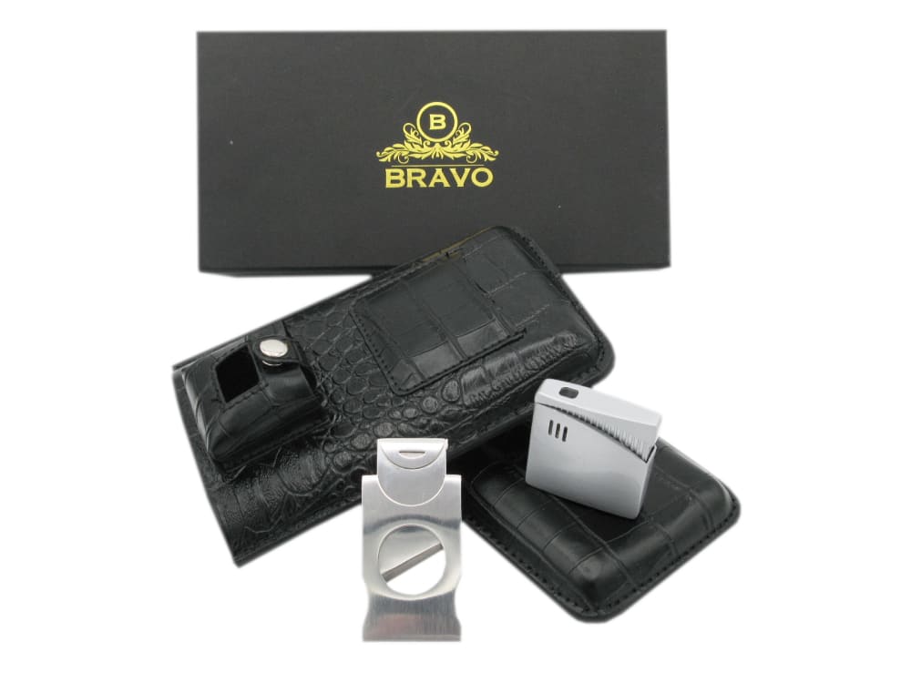
Option C won this Ranked poll with a final tally of 46 votes after 1 round of vote counting.
In a Ranked poll, respondents rank every option in order of preference. For example, when you test 6 options, each respondent orders their choices from first to sixth place.
PickFu requires a majority to win a Ranked poll. A majority winner differs from a plurality winner. A majority winner earns over 50% of the votes, whereas a plurality winner earns the most votes, regardless of winning percentage.
If an option does not earn a majority of votes, PickFu eliminates the option with the lowest number of votes. The votes from the eliminated option are reassigned based on each respondent’s next choice. This process continues in rounds until a majority winner emerges.
Scores reflect the percentage of total votes an option receives during the vote counting and indicate the relative preference of the respondents. If there is no majority winner, look to the scores to see how the options fared relative to one another.
| Option | Round 1 |
|---|---|
| C | 92% 46 votes |
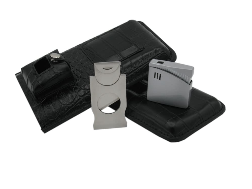
| B | 6% 3 votes |
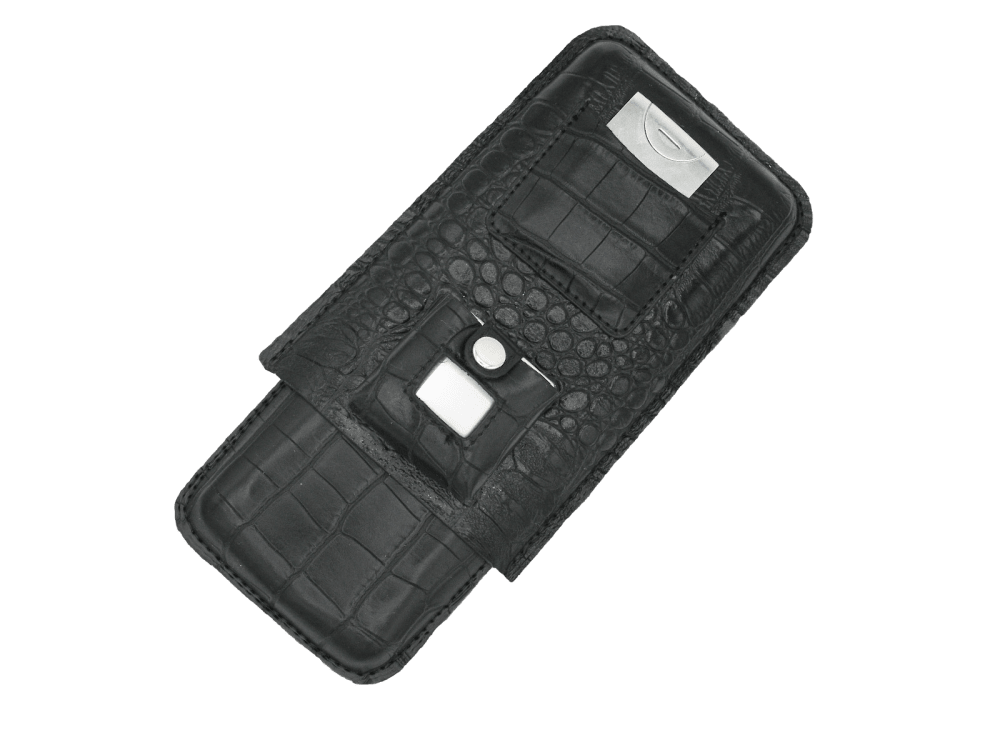
| A | 2% 1 votes |
1 Responses to Option A
It is so unclear what the product is, I would click to get more info
3 Responses to Option B
I chose B over C because it is more zoomed in and really focuses on the product. However, I like how C seems to include more than A, so I chose C for 2nd. I ranked option A 3rd because it doesn't look as sleek/professional.
I chose number 1 because of the items that are within it. It looks like it is more handy than the rest. The others are ranked in least handiness order, starting with the most to the least.
I like the idea of a package. I don;t want to buy this kind of kit piece meal. I chose option B over option C because the envelope that says Bravo seems superfluous.
46 Responses to Option C
I like the breadth of what C brings honestly.
I like seeing the brand/box.
I am not very sure what this product is but these photos are the most appealing.
Option C shows the most of the product including the case so I have a really good idea of what it is. A doesn't show me anything.
I like seeing the package and I like it very clear what all you're really getting.
More items, looks more professional
I like when you see all that you are getting in one photo
I like the yellow "Bravo" logo on my top choice, which really stands out and looks sharp. Looks like a good product!
C looks best because of the way the product is arranged, and showing the fancy packaging it came in. Option B is second best because it shows all of the parts of the product. Option A is fine, but nothing exciting.
C- i like how it shows all the items and the box with the brand name on it the most. B- i also like how this image showed the white accessories. A- from this image I really don't know what the product is.
It seems like C has the most included, then B, then A.
I like that C shows you the full function of the product. It is hard to really tell what it is when looking at A and B looks fine but C is far more complete in advertising the product.
I really like being able to see everything that comes with it as well as the pouch that will hold it, much more than I like seeing it all put together.
I like how besides showing me the product, I can also see the brand name packaging as well. This image makes me feel like I can see the most information.
It seems like the product in Option C is more robust with items. Option B has very dark images in the picture so it's hard to see what you are going to get.
I like having more pictures of the material I would be purchasing
I would pick C first because it shows everything that is included and it is the most visually appealing. I would pick B last because something about just doesn't look attractive. I wouldn't click on it.
Option C is the clear cut winner here. The lighting is great, the logo/company is shown, and I am able to see everything inside laid out nicely for me. Option B is next best, with no logo/company information, but all the components are there. Option B could use better lightning. Option A would not be preferable. You can't see what is contained inside the package, and no company information is shown.
I like C because you can see the product best in it and it seems like you're getting more bang for your buck.
The image I chose first has the whole of everything included so I can see it. It also shows the brand of the product.
Option C shows all the parts of the product and looks nicely laid out. Plus I like the Bravo display. The second one looks nice all put together. The third one looks kind of messy.
It shows a more complete package product which grabs my attention moreso than just the product itself.
I like the setup and design of Choice C and B. Having the "Bravo" displayed makes it aesthetically more pleasing to the eye.
I would pick option c first because it shows all the products separately but with the company name; it looks very organized. I would choose option b next if option c wasn't available because it still shows the products, just not displayed with the company name. I'm not too fond of option A because it hides a lot of the features and products that are available
I chose C first because you can clearly see everything you are getting and the packaging it is in. I chose B next because it is pretty much just like C without the packaging. I chose A last because I don't think it shows what the product is at all through the image.
C makes it most obvious what the product is, although I still am not quite sure? Like a flash driver case but not sure what the more square metal piece is. A more close up view might help.
I chose option C first because this would most likely be a gift and it's the only photo that shows the box it comes in, which is very attractive. Option B shows everything it comes with, which is good. A didn't really attract my attention at all.
its all about the quality of the picture. option c looks clean high quality even. option b is darker less quality makes me think its different even though its the same. option a is just 1 item so there is not enough to go off of.
I like the first one because it has the logo in it. The second one I like because like the first one it has the items inside the wallet that can be removed. The third one is kind of difficult to see what it is.
C was clearly the most "descriptive" picture, i.e. gave you the best idea of what was included with the possible purchase. B was second best, but no display of possible brand (C showed Bravo) and items were more bunched together and harder to make out. A was just terrible. Really bad, no idea what they were showing, especially when compared to C and B.
C because the picture gives a clear view of the box, the contents and the pouch which makes it seem like there's more to it and would make me want to take a closer looks. B because it doesn't show the box, but again shows all the contents. C doesn't show either the box or the contents which makes it less desirable to click on, I would want to see what I was going to get before spending the time clicking on something.
C - Feels more like a bundle, I could benefit from the other items.B - Seems to have more options than the last choice and looks less empty.A - Very empty, unless I was looking for that specific item I would choose any of the other options because they provide more than the others.
I would most likely click on C because it looks very elegant with the box and there are two objects in the foreground that are intriguing that I have no idea what they are. For this reason, I would also click on B. A looks like some sort of case that I can't quite identify but I would not be interested in pursuing it further to see what it is.
The ones that show more of the product are the ones I am more interested in. They will catch the eye of the consumer because they will think they are getting more.
More useful to present the entire contents, with the tool itself found in the center, instead of everything packaged up.
I'm not sure what this is so I chose the one with the most products in the photo. It also looks like everything in options A and B are also in option C.
C: Shows items laid out nicely + Logo/boxB: Shows items laid out nicely.A: No idea what that is without seeing other images in survey.
Choice C shows the item more clearly, and makes me feel like I'm getting more for my money.
Option C gives you the clearest idea of all of the products included in just the main picture. Option B is the 2nd clearest.
C has the most stuff included and has a better quality picture, so I would choose that one. B has the second most things, so I would choose that one second. A only has the one object and doesn't look as attractive as the other two.
Vote number 1 shows all the items Im getting including the box. So its more appealing than the other pictures. Next vote to B because in that picture only the box is missing but rest of the items are shown. A is the last option because it doesnt give much information on what actually we are getting
I'm mostly likely to click on this one because the logo of the brand looks interesting and the texture on the product.
I prefer the image which lays out all the components in such a way that I can imagine using it and see more angles.
I prefer option C because it shows everything that is included whereas the others have the same things included but the pictures don't show it. This leads a consumer to believe they get more for the price when there is a picture of everything and they know what to expect.
I think Option C is the best out of all three because it shows all items included even the packaging. Option B is okay too but it's not as complete as Option C. Option A looks incomplete compared to all the other options presented and it looks a bit lazy too.
I placed the three pictures in the order that I would click on the images if they appeared on my Amazon search results. I like when I am able to see more of the accessories that are included with a product when I am looking at a picture of the product. I have a better idea of what should be included when I purchase this product.
Explore who answered your poll
Analyze your results with demographic reports.