Poll results
Save to favorites
Add this poll to your saved list for easy reference.
Based on the images, which drinking horn would you purchase?
Answer Attributes
Age range
Amazon Prime member
Gender identity
Options
Personal income range
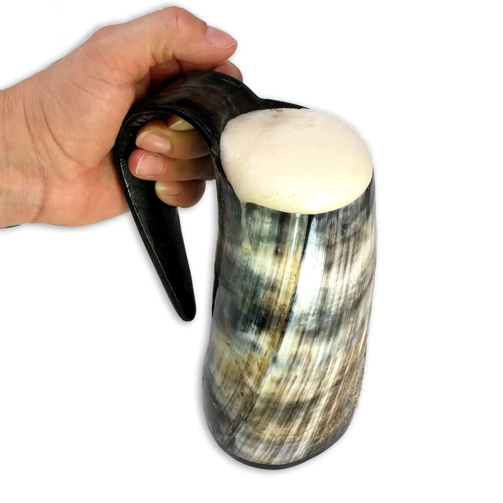
4 Responses to Option A
nicer color and stands out more
I like the angle of the mug in option A. I think that this image stands out to me. I think that the mug looks more desirable because of the design of the image.
The design is slightly more appealing.
I like option A because of its opalescent look. The colors are very unique and intriguing to me. The colors would also better match my existing decor than option B. I like the textured feel of the handle as well.
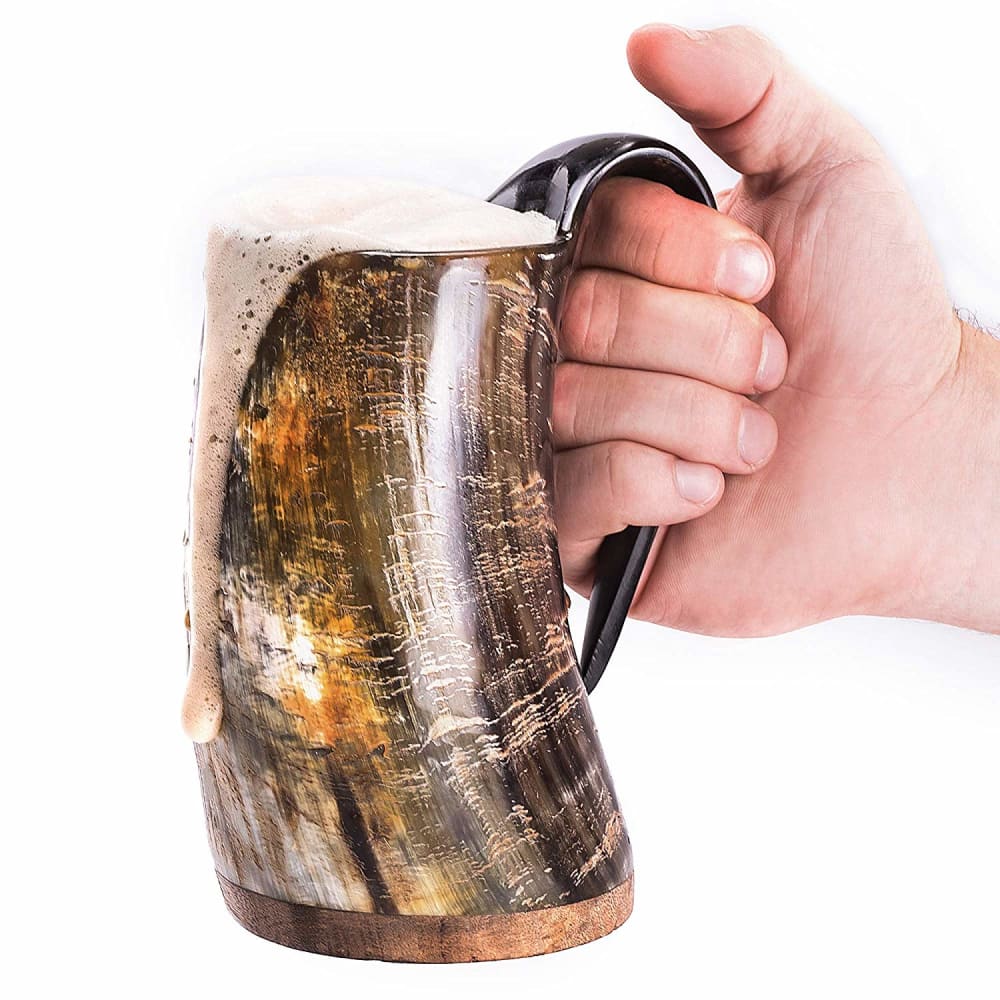
46 Responses to Option B
I like that this photo looks less edited and better shot. I think the angle is so much more informative and inviting.
This seem like a solid picture for the item. I prefer this straight on picture.
I'd consider both, they both look good enough. But I think I'd personally go for the warm colored one.
They are both hideous, I picked the least offensive of the two
I really like the horn cup in B. The grain of the wood is a little bit brighter. I like the full handle. I like the wood on the bottom.
The other image looks blurry
This picture makes the mug look like it has a really nice shape. The other looks somewhat warped.
It's a warmer, richer, deeper color.
The picture is clear and concise and close enough to see the details.
better color overall
The image in the other option just does appear legit and professional
A looks photoshopped so I don't believe the mug itself would look that way when I got it. B shows the mug much better and also seems more realistic to the product I would receive
I chose B because the brown tones are bright, clear and appealing.
Choice b has more orange tones in it and looks like a nice horn,Choice A has more blue tones and looks likea seashell or something.
I love the design and the color scheme of choice B. It has that old school look that I love.
I like the brown swirling color .
Option B has a great rustic vintage feel to it. The hand is not obtrusive. The coloring on this option is great as well. The product really catches the consumers eye. Most consumers would be drawn to this item.
I like the more copper looking color of Option B compared to Option A. Also, it could just be the angle of the picture, but Option B looks bigger and like it would be more comfortable to use than Option A would.
It looks like B conforms to the hand much better.
Like the colors of the horn in this image more.
I like the color of the horn and handle better.
I like the lighter colors of B. I also think it has more of a variance in the colors making it much more appealing to me. A is a little to muted
I prefer this option because it image is clearer and I can more readily make out the details on the product. The other image is somewhat blurry and hard to see.
It's cooler looking
I like B because I like the colors of it better than A. I also like how it is shown in the photo, it's at a nice angle to display the stein.
Choice B has a more aesthetically pleasing photograph. The angle is just right and it properly displays the horn. This is my first choice. I think the second horn would be as equally pleasing if the angle of the photo was similar to choice B.
The color scheme is much more appealing on Option B while Option A is very blurry and not as compelling with the green scheme.
the other image almost looks blurry to me, although i think that's just the patterns on the horn. i think this picture i chose looks the most professional and nice.
i love the color of this horn much better. It is shinier and would fit my kitchen decor perfectly.
I like that the handle is attached on B more than unattached like in A.
It looks like B holds more and it looks more realistic with the foam running over the side.
it looks like it holds more and like the color
This looks more visually appealing
good and nice one
I like B. I like the brownish color to it way better then the other one. I also like the handle on it. Looks like it would be more comfortable to hold then the other one.
I am a righty so I like that picture better. Also the beer is overflowing the mug and it looks frothier. I am a bigger fan.
I find the colors in option B to be more attractive. I like the combination of the colors. It reminds me of an animal pattern. These drinking horns are beautiful and I would want to display them in my kitchen. Option B has almost the same design as my kitchen countertop so they would look wonderful together. Popular colors are shown in option B so I think that would be a favorite
I feel like the photo in option B is much clearer, which makes me trust that product more. Otherwise, I might have chose A since I like the color.
I would purchase B because it looks more fun and animated with the overflow of beer.
Looks larger and like it is gold which I like. So I would definitely choose B.
I can clealy see the grain, the shininess and the handle here. Much preferred!
I don;t like blurry image.I like clear and sharp one-looks very beautiful
It looks better. Better colors.
I would pick B because I am right handed and it would be more comfortable? Joking I like the color of B more than A.
The other one looks to shiny and thus less realistic as a horn.
B because its a higher quality photo. Option A looks slightly out of focus.
Explore who answered your poll
Analyze your results with demographic reports.