Poll results
Save to favorites
Add this poll to your saved list for easy reference.
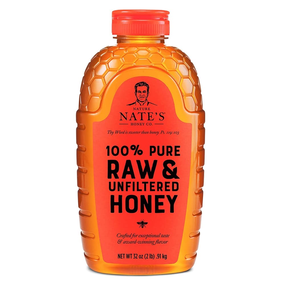
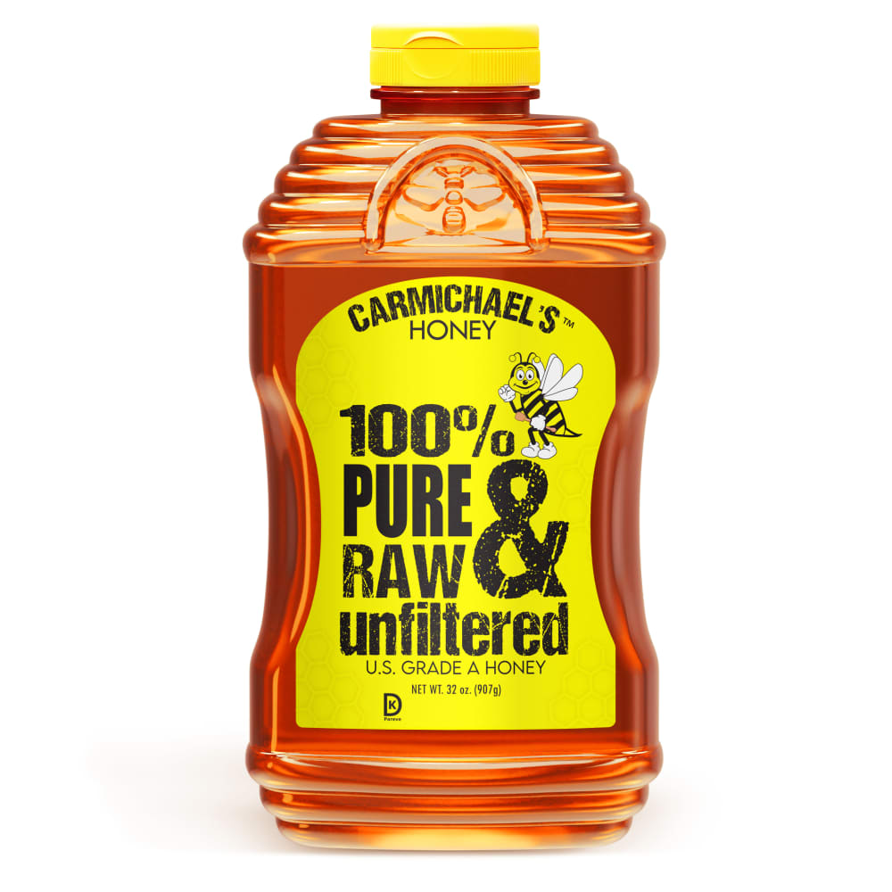
Which product bottle design do you prefer the most for a honey product? (Which is the most aesthetically pleasing?)
Answer Attributes
Age range
Education level
Gender identity
Options
Personal income range
Racial or ethnic identity
19 Responses to Option A
I love the red color. It's a bit unexpected but a very beautiful color and stands out.
I think that the bottle in option A is very appealing and easy to look at. it has a good design and looks professional for the most part
I am loving the character of nate and the design of the bottle
I think the red label looks better than yellow. It matches better with the color of the honey. It almost makes it seem like it would have a little bit of heat to it which is something that would be appealing
This one is more pleasing to look at as you can really focus on the color of the honey and its quality. Great packaging details and design
The bottle with the honeycomb is the most appealing to me.
Option B looks like it would be a color and font for a cleaning product not for food. Option A has an organic feel, better font and logo used.
The honey comb top is what does it for me, it looks more honey like and more soothing.
I picked A as my top choice as the bottle looks very modern.
I prefer A because I like the honeycomb pattern.
I disliked how unnatural the neon yellow color was on B's label.
I prefer Option A as my first choice. It is more appealing as a shape and also the label. It's attractive, looks easy to grip and has a effortless look that's effective and likeable.
A is the better honey packaging. I think the orange label and lid really helps accentuate the beautiful amber color of the honey. The label and overall packaging design is subtle and lets the honey really 'pop'.
Of the two I find Option A to be more appealing.Option B does have a very impressive look and the name Carmichael's sounds important. It is just a matter of personal preference.
A's label and logo just flow better with the jar of honey to me. The stark yellow on B is a little harsh for me. I like everything being even colors like in A.
I like A so much more because I find that the color scene is much more attractive. I think that B is fine but that A just really stands out as higher quality because of the design.
They're both pretty similar to me and I would consider getting either one. But I do like the look of A's bottle design over B.
I prefer option A because I think that it has a more interesting and visually appealing packaging design.
I prefer Option A because it allows me to see the color of the honey itself.
31 Responses to Option B
I like the shape of B better and I really like the bright yellow label with gritty text.
The contrasting color pops out at me and is easier to read.
i like how the yellow pops off and catches my eye. the other option is too similarly colored to the bottle
for an organic honey product option B looks the best.
TRhe design is more colorfull
Looks better and easier to hold and pour
To me seeing US grade honey on the label leads me to believe that this is something that I can count on more so than the other brand.
I strongly prefer the option B product image because I like the bright yellow color of the product label and the cute bee illustration shown on this product label the most, and I like the color of the option B honey the most.
THE YELLOW BRIGHTER COLOR POPS MORE DRAWING THE EYE TO IT
Option B of the bee on the label indicates product is straight from the source and is pure.
The color scheme and general design of B feels more appropriate and relevant for a honey product.
Looks like its a better and more natural product
I think the bee is cute.
B looks more pleasing to the eye because it's easier to read the black font against the yellow label.
I find the yellow are more familiar and recognizable color scheme. The orange/red label feels more linked to a non-culinary product.
I really like the design of the bottle in choice B! The label being that bright yellow shade also caught my eye very quickly.
The yellow label in B really brightens up a kitchen and the bee is very cute. Nice shape makes it easy to hold and use.
I think both bottles look pretty traditional, but I like Option B's shape better. I think that looks easier to use and get all the honey out, when the time comes.
I like this label a little more, the bright colors really make it stand out as opposed to the more muted label in A.
A looks more like scales then honey combs. B you know what it is right away and it looks good.
I like the yellow label of option B, it is much more eye grabbing and pleasant to look at.
This is a little more pleasant looking because the yellow has a brighter look that makes it more inviting.
I like B more as the hourglass design is more aesthetically pleasing and it has a more unique, and in this case, better look overall.
The red in Option A blends in too much with the honey color. The yellow in Option B is distinctive.
I like the colors better on this product, but I like the actual label on the other one.
The other option reminds me of a whiskey bottle too much and B looks good and fits the product category
I like option B the best because the yellow label stands out more and grabs my attention.
The orange red label is kind of difficult to see on the other option. The bright yellow label is very easy to see and comprehend the text on it
I prefer option B because to me it looks more pure and raw. Option A looks too diluted and low quality to me.
I like the bottle with the slight depression in the middle..looks like it would be easier to hold on to.
B - The shape of the option B is different and fun, it seems easier to hold and, as someone that uses honey, seems the easier to clean. About the lable I the information is ok, I just would like to comment about the color. Yellow is too common with honey products and makes this productos looks something you would by in a grocery store, and the other color (I don't know how to define...) does not stand out and made me feel that it's a fancy product (color+bottle), I would like a color tone between both.
Explore who answered your poll
Analyze your results with demographic reports.