Poll results
Save to favorites
Add this poll to your saved list for easy reference.
Which facial mask would you buy on Amazon and why?

There was no majority winner of this Ranked poll after 5 rounds of vote counting. However, Option D and Option A had the most votes (50).
In a Ranked poll, respondents rank every option in order of preference. For example, when you test 6 options, each respondent orders their choices from first to sixth place.
PickFu requires a majority to win a Ranked poll. A majority winner differs from a plurality winner. A majority winner earns over 50% of the votes, whereas a plurality winner earns the most votes, regardless of winning percentage.
If an option does not earn a majority of votes, PickFu eliminates the option with the lowest number of votes. The votes from the eliminated option are reassigned based on each respondent’s next choice. This process continues in rounds until a majority winner emerges.
Scores reflect the percentage of total votes an option receives during the vote counting and indicate the relative preference of the respondents. If there is no majority winner, look to the scores to see how the options fared relative to one another.
| Option | Round 1 | Round 2 | Round 3 | Round 4 | Round 5 |
|---|---|---|---|---|---|
| A | 14% 14 votes | 16% 16 votes +2 | 28% 28 votes +12 | 33% 33 votes +5 | 50% 50 votes +17 |
| D | 28% 28 votes | 31% 31 votes +3 | 33% 33 votes +2 | 34% 34 votes +1 | 50% 50 votes +16 |
| B | 19% 19 votes | 20% 20 votes +1 | 20% 20 votes | 33% 33 votes +13 | Eliminated 33 votes reassigned |
| F | 17% 17 votes | 18% 18 votes +1 | 19% 19 votes +1 | Eliminated 19 votes reassigned | |
| C | 13% 13 votes | 15% 15 votes +2 | Eliminated 15 votes reassigned | ||
| E | 9% 9 votes | Eliminated 9 votes reassigned |
Answer Attributes
Age range
Amazon Prime member
Education level
Gender identity
Options
Personal income range
Racial or ethnic identity
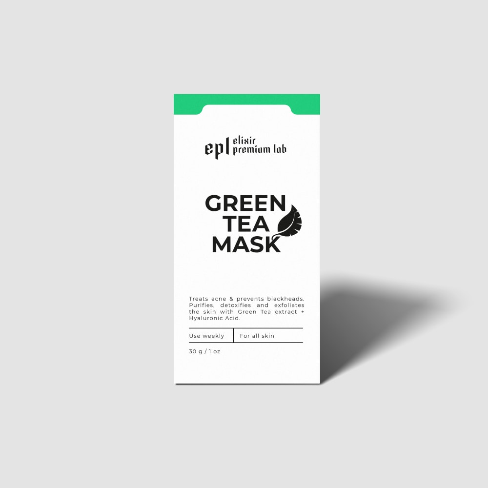
14 Responses to Option A
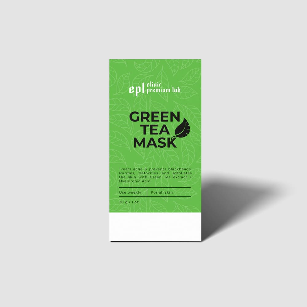
A and C are about equal to me; I like this shade of green for a product like this (it reminds me of matcha powder). D is okay but I prefer the other green. Again, F and B are about equal to me; they're nice but I prefer the green at the top of the package. E is a bit dull compared to the others so it doesn't stand out as well.
I think that the package on Option A is most appealing in comparison to the other packages. Seeing Option A would make me want to buy it over the other products just based off the color being around the entire box, with a good design.
I really like the full-color packaging over the sterile sparse packaging. It feels warmer and way more inviting.
The green packaging seems more appropriate for green tea. The white box looks generic.
I like option A the best because the black text on green background stands out the most to me and grabs my attention.
I like the packaging design of option A the best. I like the green background color with a leaf pattern as it looks appealing.
A/ The color pattern fits well with what i normally see on the shelves. D/ Also like the color scheme on the box. C/ Looks professional like what i would normally buy. B/ I like the way there are tea leaves in the pic as a reminder its using natural ingredient's and the one leaf of different color stands out. F/ Also looks like a medicine product for my face like what i would buy at a pharmacy. E/ Looks to plain and basic not very eye catching for starters un less i knew this was what i was going to buy i may not even look at it.
I chose based on how the packaging stands out to me the most
I like the leaf patterned boxes, I think the pattern adds interest without being distracting from the brand and product name
Options A and C are the best as they have the best contrast with the green background and black text.
I prefer option A and C the most, the design of the packaging looks the best and most appealing while also being easy to read. The dark text on the lighter background makes it easy to read everything on the box which appeals to me as a customer. I would choose option A as my favorite though.
Some packaging looks appropriate for cosmetic products while others look like packaging for food items
I think a majority of the packaging should be green for this item. It helps it instantly stand out, not only from the sheer bright color, but buy auto-recognizing the product is connected to something green
I prefer option A. I like the subtle green design with the black print. It is really pretty.
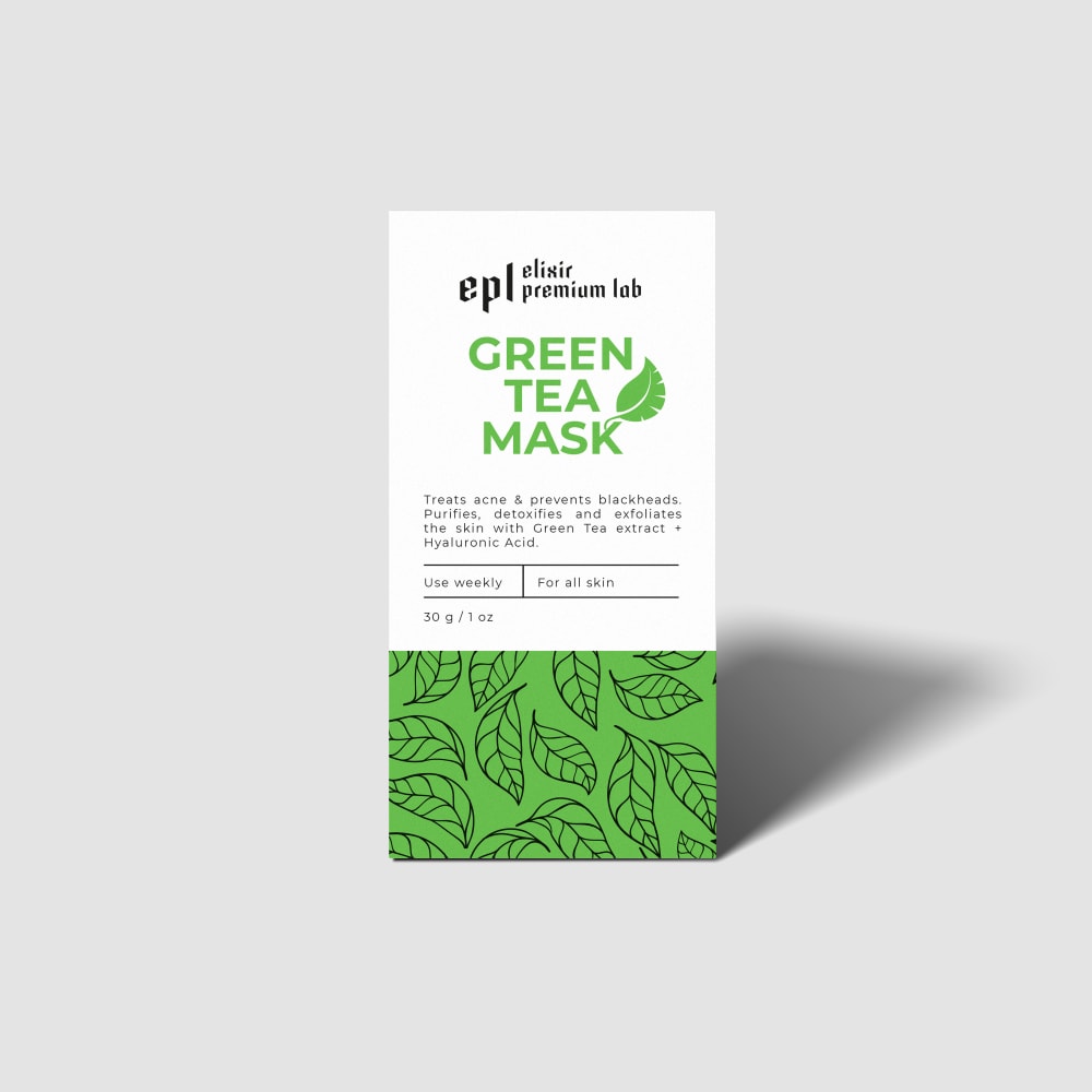
19 Responses to Option B
I would be most likely to purchase option B because I think that it has the most premium, eye-catching, and visually appealing packaging design out of the six options above.
I love green tea items. I like this box because it has a lot of green leaves on it and one yellow leaf that really pops out.
Choice B seems to be the best package design and spent the most time on it, which makes me believe they spent a lot of time on the product itself.
Option B looks the most pleasant with the green leafs and white box atop the product. It looks high end yet friendly.
The packaging looks very modern and professional. Looks like it is from a trustworthy company.
I like the packaging that looks like real effort went in to designing it. It implies that the product is worth the effort that was put in to its packaging.
I just think that the first two have the most in it: text, icon, drawing and clarity. I bet I would easily be able to read quickly and get the gist of the product from the first two.
B and F have a very attractive label. They also present the information clearly
I like the leaf pattern on B, F and A. I prefer the majority of it white in this style. E and C are bland. I like the gradient on D. The patterns on B, F and A make the product look more premium while a bland packaging makes it look like a cheap knockoff.
B i like he leaves on the box it makes it more appealing. The one light leaf makes it stand out.F I like he leavesC the dark green is better D had an off green i dont likeE looks plain and unappealingA I like the green and the faint leaves in the backround
My favorite boxes are those with the leaf print at the bottom of the product box. I think it make the box look well designed and it's easy to read with the print only on the white background. It's very eye catching, especially the one with the lone yellow amongst the black leaves. I don't like the boxes with the majority green background because I think it can be difficult to read the text that is printed.
I chose option B. I like the green and white box. This would stand out to me when I was shopping.
I like option B the best because I really like the leaf graphics on the bottom part of the box, which hook me in to read the information on the box.
Option B was my first pick because the design on the box makes the product look/seem expensive. Option D was my last pick because I feel that the design of the box is outdated and boring and makes the product look cheap. Option C and Option E I ranked in the middle because the product box design "pops" and catches your attention, but its not as contemporary as Option B and Option F.
I tend to like the two-toned box with the green on the bottom and white on the top - that's pleasing to look at.
I ranked my choices based on how easy the design of the packaging allowed me to read the text. I felt that the text on the green background was harder to read than the text on the white background, as such I ranked my choices based on legibility. I also then sub-ranked them based on which designs overall I felt were the most eye catching.
the little yellow leaf is cute. I like all of the patterns and boxes. i like the simplicity of #2. The colors in #3. #4 i like the subtle pattern. #5 is plain but nice color and even on #6 i still like it theres just something off with the font size.
B, F, and A all have a design to it. The rest are more plain looking which doesn't really entice me to buy.
I liked the design for option B the most. Option F, looked nice. Option A and C looked okay. I liked the color a bit more than the gradient look of option D. Option E, had my least favorite design. It just doesn't pop out.
13 Responses to Option C
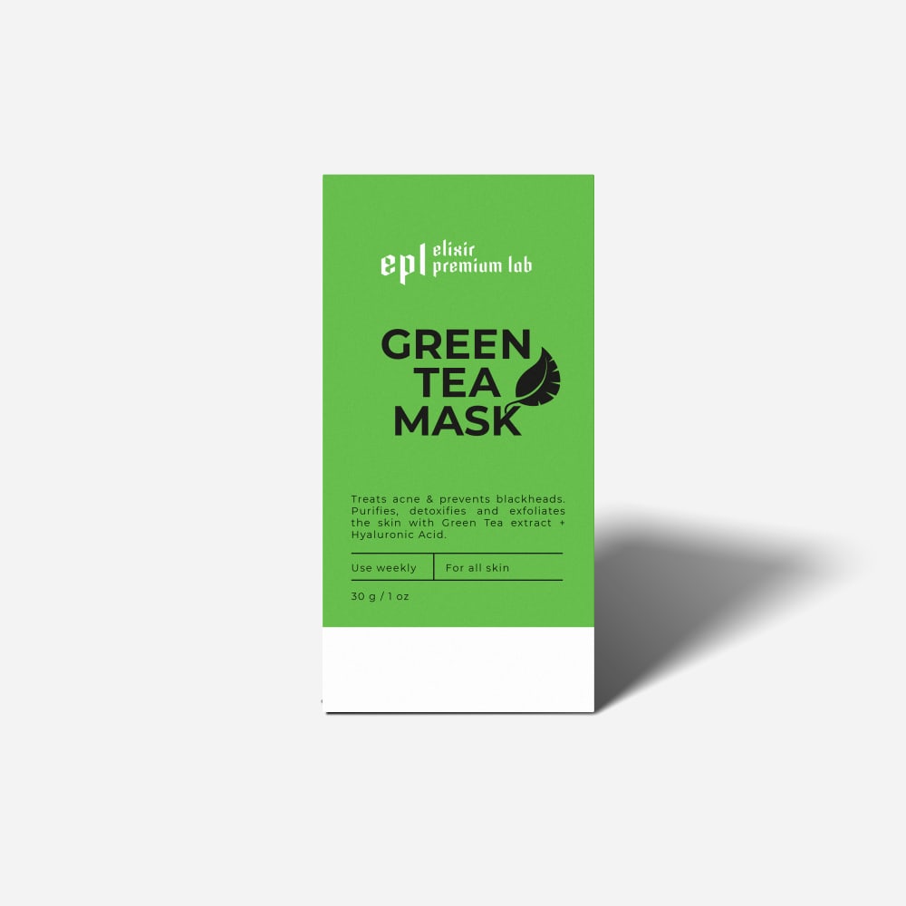
i would buy the green tea mask in option C because the packaging looks healthy and natural
I ranked these from most modern to least modern
I love the mostly all plain green packaging, which is striking in itself and makes the text easier to read.
Option C had by far the best overall color theme and design.
Really like the green in C and A. Makes me want to use the product. Very well done.
Teal didn't remind me of green tea at all - green tea needs to look vibrant and refreshing so the bright green hues on the packaging stood out more. A and B looked a bit too plain and sterile.
I like the designs that are mostly green. I like the color a lot. I like that it is very solid and looks good. I think this shade looks nice and I like how much there is and there is just a little white
Yeah, option C is a great looking packaging design. I like it. I think the green background really helps the text stand out. Besides, I think green, being the dominant color, is just the right fit for your product.
I personally like C and A the best because I like the "color block" look. I also like that it is mostly green, to go along with the main ingredient: green tea.
I chose Options C and A first because I like the green on the box. I chose options F and B next because of the leaves on the boxes. I like the green on Option D, I do not care for the white box in Option E.
I prefer the packaging options with the most green on them.
I like the more green on the box better than just mostly white, I think that they stand out and are a nice color of green.
I like the options ones that have the big name covering most of the front it makes the brand stand out more.
28 Responses to Option D
The black print is easier to read which makes me more likely to pick that product
I think all of them are trying too hard with the color scheme, and there's something "off" about all of them except for D. D is the only one that has a "complete" feel to it - the rest of them have a rough draft quality, an incompleteness that makes me want to avoid the product due to its lack of flair when it comes to selling itself.
The ombre has such an interesting vibe to it that makes the product really cool
I like the design of d and b the most as it looks modern and eye catching.
I like the gradient of green to white in Option D. I also like the strong contrast of green and white with black text on Options A and C.
THey all look really nice, but I like D more because of the shading on the box and the font is easier to read.
The green in E and D looks much nicer. C and A are just kind of boring. D is the most vibrant
Options D and E of the wording and background do not blend, easier to read.
I like the packaging with the gradient. I think it looks the most attractive and modern.
I think Option D is the most visually appealing. I like the gradient of the green and white. I think it looks high quality. I also like the darker green in Option A. The leaves on the bottom of Options F and B aren't that appealing to me.
I would most likely purchase option D. I really like the gradient effect for the background for the packaging and it looks the best overall in my opinion
For me I think that this box gives me a certain feeling. The colors make me think of something that is going to be very helpful to me as it gives off a warm vibe and feeling.
I like how the color is graduated on the packaging from dark to light going from the top to the bottom. This gives the product a more natural and organic look and feel.
I put D first because it’s nice to see the item out of the box and it provides the most information possible. As far as the packaging design, I prefer the ones that are cleaner and more simple. I don’t like the leaf design much but the greener the box the better.
I prefer this option. I really like the green fade type of color scheme. It makes the label easy to read with the green background and black text. The color fade looks better than the solid color versions.
I love how simple option D is, but still has the fading green to white coloring. super cute very attention grabbing, but also the most professional and high quality looking in my opinion.
This would be my choice order, but D, looks most eye catching and appealing based on box design, box color and box layout
I choose option D because it was the first one that caught me my attention based on its design.
I chose D because I like this look best. I like this shade of green with black and white
Option D's color scheme seemed the most eye-catching to me. Plus, it gave a lot of information on the box that was needed.
i like the more basic ones and colors like in choice D and E the best.
Option D and A are my favorite I think they stand out really nice I have no problem reading was is on either of the packaging designs either
How the green fades attracts me to it more. Due to being more visually appealing, I would consider this before the other options
Love the way the green fades into white on D's packaging.
I find the gradient in the packaging of D to have an elegance that befits the product.
I like the solid colors most on the packaging rather than the print. I like the ombre color where the green fades to white. Next I prefer the solid green or the solid white.
I think option D and E have the best looking packaging. It is also easier to read the text on D and E.
D - I like how the green and white slowly blend together. This looks more visually appealing to me. B - The color split here works well and having the leaves design helps it stand out a bit. The gold leaf is a nice touch.F - Exactly the same as B just minus the distinguishing gold leaf. A - This one at first looks a bit plain but do like the subtle backround of the leaves in this one.C - This one just looks like a generic box/product and doesnt stand out too much.E - This would get lost and mixed in with everything else I would see and wouldnt grab my attention to even take a second glance at.
9 Responses to Option E
E looks the cleanest and most professional. B and F also look okay, but not as good. The rest I would probably walk past without noticing.
I would choose choices E, D, B and F first because they have a nice display and the details are more easy to read for me as compared to choices A and C which have a less easy to read details on the product box.
i think this mask looks most likely to be sold at a drug store and work well. it looks doctor made worthy
This one has a more simplified package design. It doesn’t over exaggerate it’s importance.
I prefer a light colored box because it is easy to read and by reading it I would know if it is what I need to use.
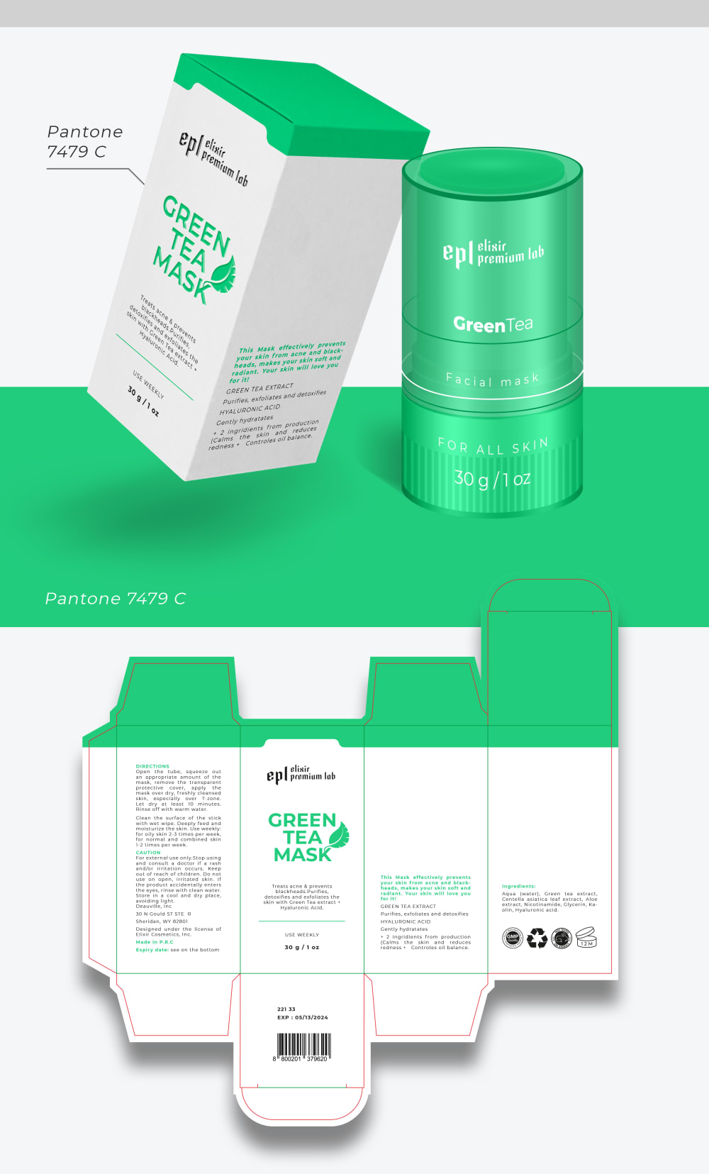
Option E's color scheme best matches the above image of an unfolded package.
I ranked the options based on a preference for clinical and pharmaceutical appearing packaging. The clean and simple labels appeal to me more than decorated packaging. Option E was the most appealing because it embodied these features the most.
The white background makes it easier to read. Otherwise I do not care even a little bit.
I really like the green color used in both E and D, with my preference being the simplicity of the design in option E. Second, I like the designs with the leaves at the bottom in options F and B. I thought the one yellow leaf was a little distracting, so I ranked F above B. I thought options A and C were boring, with the plain design of C being the most boring. The color of the green was too plain for me, so the basic design with that color was boring.
17 Responses to Option F
The options that show off the designs with the black area around the leaves for the face masks is a good fit.
i like the combination of white and green on F and B along with the "leaves" decoration on each
Looks like a more modern, fun design with the leaves.
I like the white colors along with the green. Looks the highest quality. Seems the most well made.
seems most reliable and one i can trust to use and get the job done and it stands out to me as higher end
I prefer the white background on the packaging, it makes the text much easier to see with the ingredients listed.
The packaging design in my top picks looks higher quality and makes me more confident that it's a good product.
I like the leaves on F, and I prefer them all being the same color
I prefer I and B because i like the leave patter on the bottom. It stands out more. Looks more premium.
I do not think it is a good idea to use colorful background for the textual description on the packaging. Those texts are hard to read. Therefore, the designs in A and C are not my favorite. I put A in front of C because the design in A uses background image of leaves which appear to be more attractive than the pure blue color in C. For the remaining designs, I like the ones in F and B most. The bottom part of the design uses green leaves which match the product category pretty well. The design in B shows one leaf in yellow which is somewhat weird. Overall, F is slightly better than B. The designs in D and C do not use green leaves. I put D in front of E because D uses more green in the design.
Options F and B are my preferred choices for this product because the packaging provides the best information on the features and benefits.
I prefer Option F because I find the packaging the most compelling and the most attractive, as well as the most modern.
Option F is the most visually appealing and grabs your attention more right off the bat. I think the label is the most unique and stands out more against the rest. It also has the most professional and advanced look to it that gives you more confidence that it is high quality and would be more beneficial to the user. It matches up better with the idea and concept of the product and would let people know what they are getting and what it's all about. Option F would appeal to a wider audience of people and would make them more likely to check deeper into what it has to offer.
I like where the green and tea leaf are more pronounced and help reinforce the natural ingredients.
F is the one that stands out most to me, I find this to be bolder and more professional looking.
All the options looks great but I think I prefer option F the best. I like the look of the label
I would buy Option F. The white text box and a green pattern base is well balanced and easy to read.
Explore who answered your poll
Analyze your results with demographic reports.