Poll results
Save to favorites
Add this poll to your saved list for easy reference.
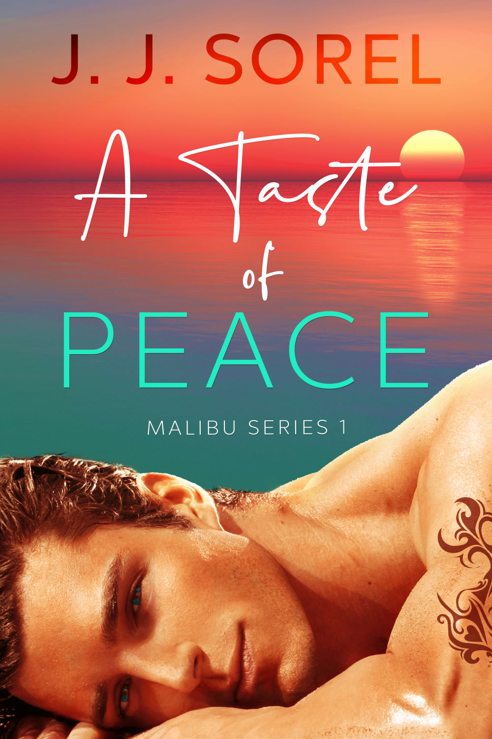
Based on the cover, which book would you rather buy?


Answer Attributes
Age range
Education level
Gender identity
Options
Personal income range
Racial or ethnic identity
Romance book reader
9 Responses to Option A
I dig it without the sunset gradient.
The picture is clearer and the letters stand out more
I prefer the option A because I feel like the color of his skin looks more natural and I love this all over blue calming effect that I am seeing.
the blue looks a little more classy, the red has almost a bit of a trashy feel to it on product B
A is my preferred choice because of the uniqueness of the cover design and the display content of the cover, the design looks good and attractive and will call more attentions to the book, it a beautiful color design on the book and it is pleasant to the eyes
I chose A because I love the calming blue and teal hues used in the cover. I found B to be a little over the top and not very appealing with so many bright colors. I also prefer the saturation color of the photo of the man in A over B. You can clearly tell that B was edited and the saturation was turned way up.
I'd rather by this book because the image looks more realistic and the model's eye stand out.
B has to many effects added to it that it doesn't make the guy welcoming and want to know about the book, while A literally looks just like a picture that would be in a photo album
Though i really love the sun setting image on B but it looks quite warm and don't see much of a peace look. But in A, the image looks calmer and peace so i feel it fits well for the title of the book with blue background gives the vibes of Malibu beach.
41 Responses to Option B
the colors are very vivid and remind me of malibu, which fits the title of this book
Choice B make me think more of Malibu with the sunset in the background. I also think the colors draw my eye to the cover.
Option B, very Sexy beautiful design with the sunset in the background, generate an endearing cluster of sensations.
The gradient of B grabs my attention. The tattoo on both covers looks fake and should be photoshopped better.
I like the warmth of Option B. It feels comforting and inviting.
Looking at that orange sunset gives a much ch more romantic vibe.
the washed out colors in choice a are ugly and unappealing.
I think that option B looks a lot nicer with the sunset, option A looks kind of plain without it. Option B gives you the feeling that he is laying on the beach and it looks like he got some sun too.
The book cover has warmer color tone, it bring people hope.
I love how the sun is setting and turning the sky orange in this cover since that makes it feel very much like Malibu.
I prefer choice B because the sunset adds extra details to the book cover. May I suggest the authors name be in black.
Itslooking very likable.
B seems more fun and interesting, even though the guy is orange. I would tone down the filter on him.
I love the sunset on the cover of choice B. Also the man's skin tone is warmer. He looks like a vampire in choice A. Although the tattoo looks okay on choice A but the color is odd in choice B.
I would read B because the cover itself leaves me feeling peaceful.
I love the sunset in the background. Now if they could get the skin tone of the person in the front right (like option A) it would be perfect.
I like the sunset in Option B more, it feels much more Malibu. I think the sans-serif font of Option B for the author works better as well.
The bright colors make it seem more enjoyable.
I like the warmer hue, makes it more sultry
I would rather buy the book in option b
A seems very washed out and i like the sunset on B more than the blue background
option B is more visually appealing with the background image
I thought the skin tone was more real than the color in option A which seems almost grey, and I like the warmer tones in option B.
I love the lighting of this book. It looks very warm and comforting. It is the kind that I would want to open every time I am free to real. The sunset on the cover also makes it smothering.
I prefer B with the sunset over the ocean on, looks more like it would be a romantic story with a pretty scene in the background vs. A which is just plain
B is colorful, bright, bold, and engaging.
I like the cover of B the best because the colors are better blinded for a more even contrast.
I like that it is brighter and you can see a sunset in the background. The color brings out more.
The sunset is beautiful and the tones of the mans skin looks more vibrant.
Option B definitely. The background says it all..
The inclusion of the sunset shining on the water adds an aspect of heat to book as does the golden tanned body of the handsome young man with the brilliant blue eyes. Having side by side comparisons makes Choice A look washed out and not as exciting as Choice B.
I like the color contrast on B better. There is a sense of balance and "peace," which ties into the title.
I prefer the background of B. However, I would recommend using the photo of the guy from A. The guy in B looks unnaturally orange.
I love the coloring in B. I think having the ocean in the background is a good touch.
I much prefer the way Option B simulates a real sunset on the cover and blends it into the close-up of the attractive man. The other green cover is nice because it highlights the man better, but I get more story and intrigue out of the way that Option B is designed. The first activity/submission for planned outcomes.
I liked Option B much better than Option A and that was because of the color scheme. Those orange and red colors really pop and you can see the water as well as the setting sun. It also looks like the man's skin reflects off of those colors a little bit. When compared to Option A, the colors are a little more dull and do not stand out as much. There are far less details in Option A.
I'm a sucker for a good sunset, so B is my first choice by far.
The sunset is a nice touch
I would rather buy choice B because this book cover is more lively. It is more vivid and radiant. The other is dull and boring and makes me think that the book will be boring. Seeing the sunset image in the background is bold and the man's radiant skin is very visually appealing. It leaves me curious about how interesting the book would be.
Choice B because of the vibrant color of the sunset and the sun shinning down on the gentleman. Make it a very attractive sell.
I love the sunset and it was what I envision when I think of Malibu. The man is very attractive.
Explore who answered your poll
Analyze your results with demographic reports.