Poll results
Save to favorites
Add this poll to your saved list for easy reference.
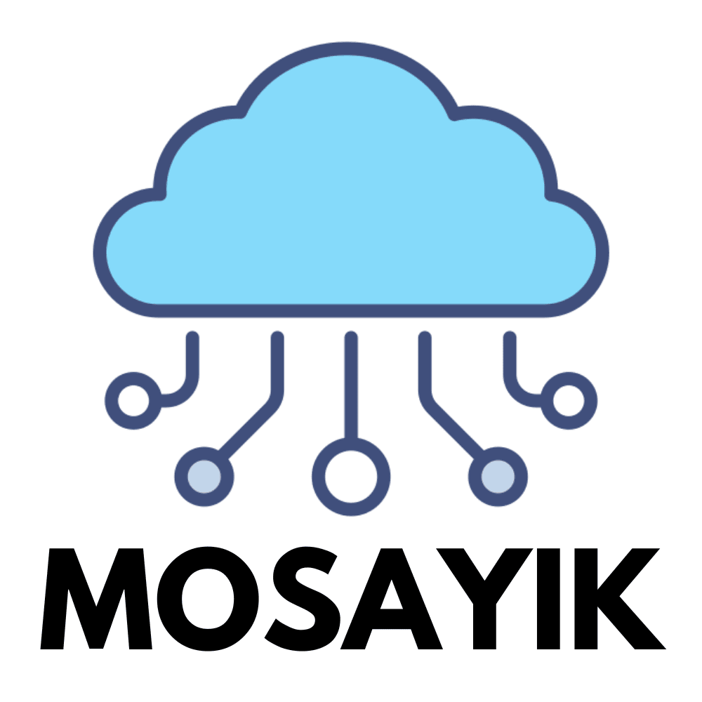
"Which of these two logos do you think better represents a technology company?"
Show answers in:
27 Responses to Option A
Through the lightning that looks like conductive lines and a blue cloud that represents clean energy
So neither looks bad. But I like the number one better because of the color and the wide branches. For me, it's easier to associate with it.
Looks more modern and appealing and the display fits better
I would say because the little nubs on the picture look like they have something to do with to do with technology. Mosaics, however, are old paintings that have something to do with artists.
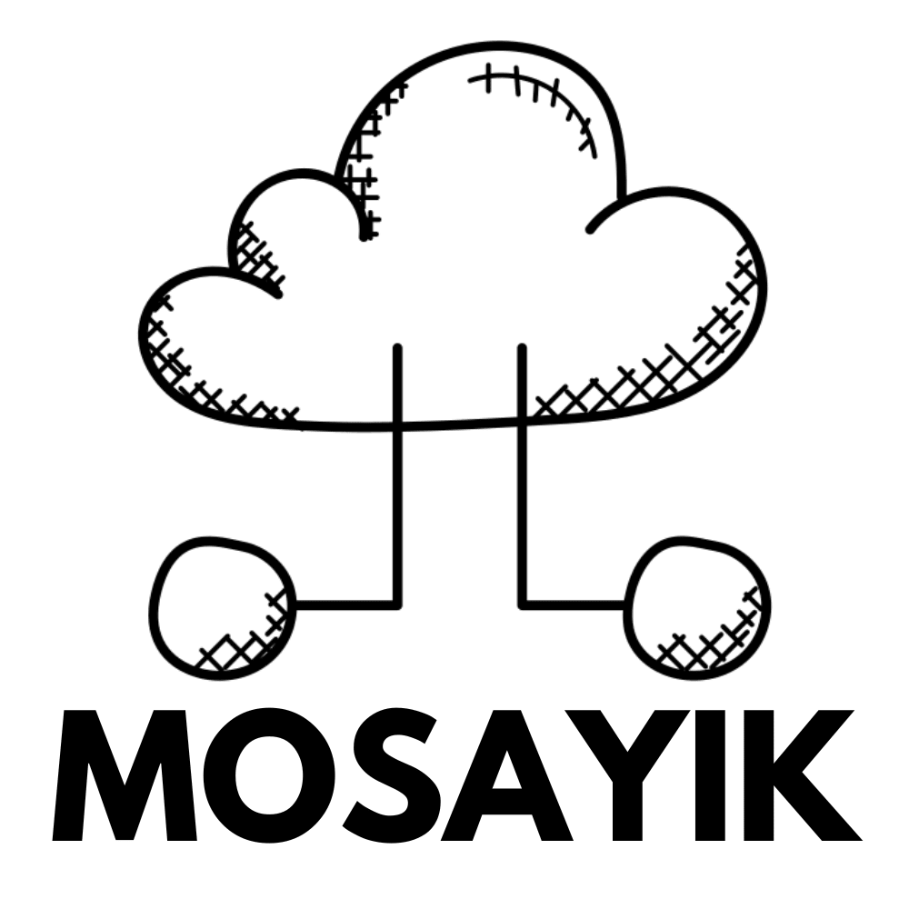
In my opinion, the design on the left is similar to a child's drawing, while the design on the right looks simple and technological.
It shows better that there is a network in the economy. And that we are at a high technological level
Technology is used to create order. The image chosen is cleaner than the other, which makes it seem more serious. It also contains colors, which is a technological innovation.
The other cloud looks so natural, so not like technology. But even my first choice would not suggest a technology company
looks more technological the blue also embodies more power because it doesn't look like it's been scratched on, it looks more professional
I find the graphic design of logo A much better, as it is more striking and much more direct. I would therefore take this variant, as it is much easier to recognize.
First of all, it doesn't look like a children's drawing and the color blue gives the feeling of a safe company
Logo A is very representative in contrast to Logo B
I like the blue logo better visually. Because there are colors involved, it appeals to you. The lines with the dots at the end are reminiscent of power lines, which shows that it belongs to a technology company.
Picture number A that there are several lines and everything is better distributed
Because for me choice a seems more mature and technological also because of the blue color. It is more attractive and makes you think more about technology!
I have decided for a because I find this motif simply better to look at because it is designed in color
Picture A presents it better because you get more of a feeling of technology in the logo
When you look at the picture, you immediately think of technological things or developments, for example because of the color of the design or the line-like strokes. Since the spheres are attached to the lines, it looks very much like technology.
I like the logo for the technology company because it clearly symbolizes the connection between cloud technology and innovation. The blue cloud stands for modern solutions, while the balls falling down like rain indicate the flow of data and networking. The name "MOSAYIK" under the graphic is concise and professional, giving the company a strong, memorable identity. Overall, the logo combines technological modernity with a clear, approachable design.
The blue color emphasizes the guide better. In addition, the branches underneath are more clearly defined and structured
The blue cloud with its 4 data arms networks much better and is also displayed in color, which is why it would be the better choice compared to the other.
I find this one more eye-catching and it is therefore better. It draws attention to itself and looks interesting.
It visually describes a cloud that can be accessed from many points.
I like the design with color better. It looks harmonious and friendly. The blue cloud looks like the sky and makes me smile
I find the design more appealing and more suitable for a technology company. The other logo is also okay, but I don't find it nearly as appealing as my first choice
this is my opinion and it looks a bit more technical - version b is more like a jand sketch while a seems to come from the CAd area - therefore the better choice in my opinion - the question is what others will say about it
It looks more like a symbol that fits a technology company. Because of these branches at the bottom that go off, otherwise it would look more like a tree, as in the other picture effect
3 Responses to Option B
When it rains I think more of nature and in picture b the cloud looks more like technology
For me, picture A fits the theme better, because that's the kind of picture I imagine when I think about technology companies
The picture on the right reminds me more of a rain cloud, which is why I chose the one on the left.
Explore who answered your poll
Analyze your results with demographic reports.