Poll results
Save to favorites
Add this poll to your saved list for easy reference.
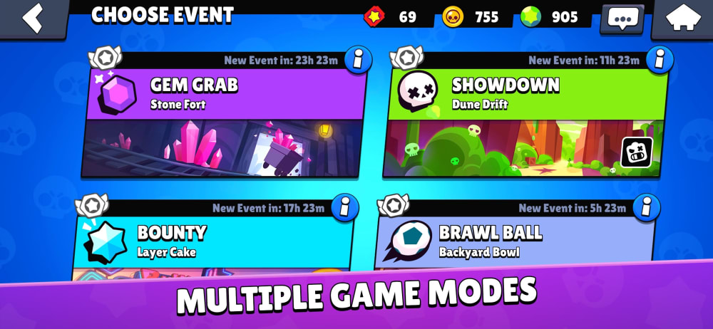
Which screenshot makes you MOST want to download and play a mobile 3v3 battle game?
Option D won this Ranked poll with a final tally of 26 votes after 1 round of vote counting.
In a Ranked poll, respondents rank every option in order of preference. For example, when you test 6 options, each respondent orders their choices from first to sixth place.
PickFu requires a majority to win a Ranked poll. A majority winner differs from a plurality winner. A majority winner earns over 50% of the votes, whereas a plurality winner earns the most votes, regardless of winning percentage.
If an option does not earn a majority of votes, PickFu eliminates the option with the lowest number of votes. The votes from the eliminated option are reassigned based on each respondent’s next choice. This process continues in rounds until a majority winner emerges.
Scores reflect the percentage of total votes an option receives during the vote counting and indicate the relative preference of the respondents. If there is no majority winner, look to the scores to see how the options fared relative to one another.
| Option | Round 1 |
|---|---|
| D | 52% 26 votes |
| B | 20% 10 votes |
| C | 20% 10 votes |
| A | 8% 4 votes |
Answer Attributes
Age range
App store spending habits
Education level
Gender identity
Mobile gaming habits
Options
Personal income range
Racial or ethnic identity
4 Responses to Option A
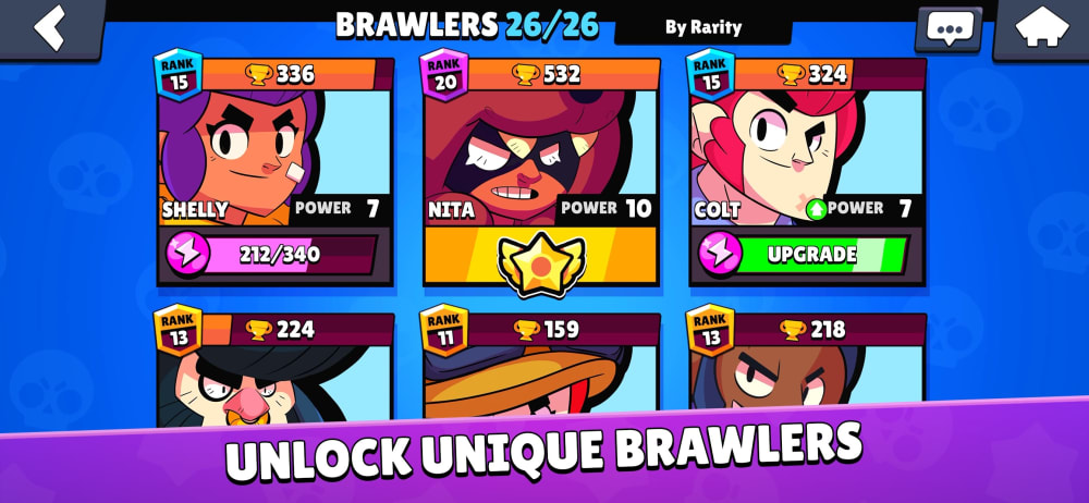
a is a key and good shot, Multiple game modes is a great feature. Unlock Brawlers (B option) is a fun aspect, wisely pointed out. C is ok with making it clear you CAN play with others.
I chose A first because I like having options and "Multiple Game Modes" does just that. It makes it very appealing and inviting.
This one gets my attention. It looks intriguing.
Option A makes me most want to download and try this app because I like that it actually shows you some of the modes you can play in it. I would rather see that than any of the characters.
10 Responses to Option B
I like that choice B looks very bright, interactive and cheery too.
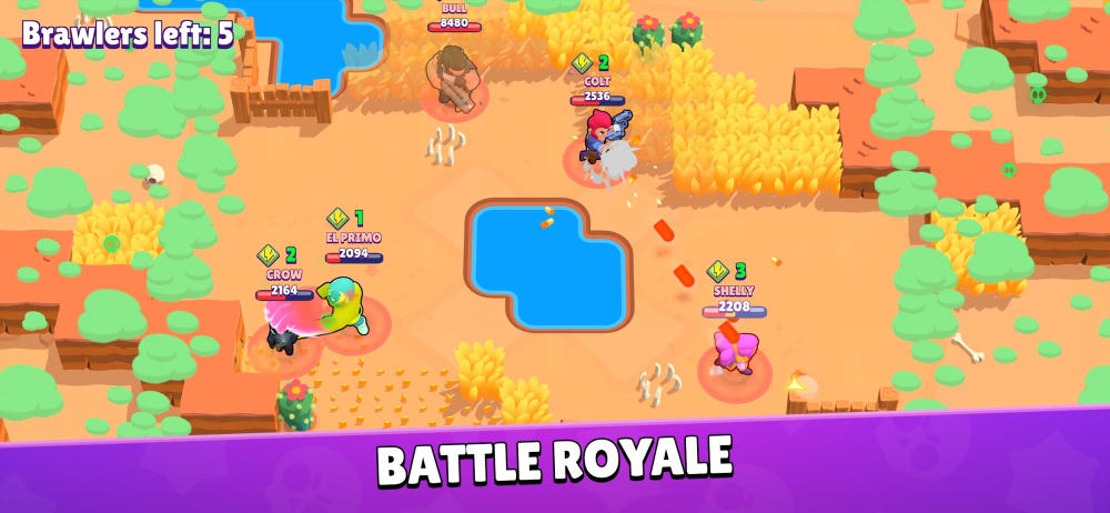
D actually shows the game but it doesn't look that good in my opinion. D would be the best is that graphic was better. B is the best showing what characters you can choose which I find important. A is fine as well but not as detailed as B
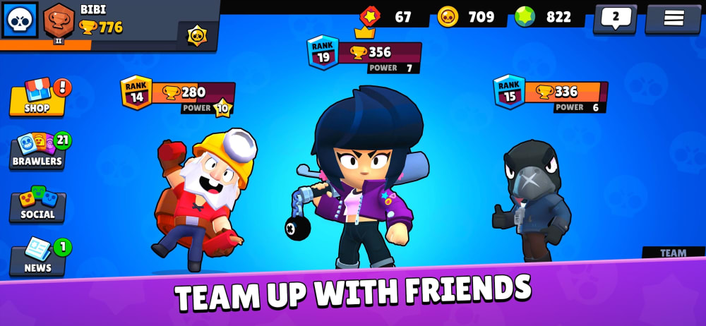
I picked B because I like to see the various characters you can pick and this shows variety, then C shows them a little more, and I like the variety here thought it is less detailed. D presents the gameplay, but it is hard to see what exactly is going on, but it does not seem as detailed as I imagined. Then finally, A presents the game modes, but I don't really understand them or see how they make for a battle game.
I love the look of the character screens and the modes, but I am really not interested in playing mobile games with my friends so I don't care about that screen.
Option A seems too much like a commercial. I think B and C would be the ones that get people interested in clicking on the game. Here are the one-of-kind brawlers and these are your pals in the game - ok, I'm in!
I vote for B for sure! I like being able to somewhat see the different fighters are going to be on the game
I picked B as my top choice as it shows all of the playable characters in the game. I picked D as my second choice as it shows me on what the gameplay is like. I picked C as my third choice as while the background looks great, it feels like it's a bit generic. I picked A as my least favorite choice as the game modes doesn't tell me much on what the game is about.
My choices are ranked best to worst
The character designs in my top two choices look like a lot of fun, and make me want to try out the game. Very cool for sure!
I like my top pick because I get a better sense on what I will be doing and what achievements I can receive if I play it. I give me motivation to achieve all of them
10 Responses to Option C
C simply shows more information. It has the side with all of the options such as social, news, brawlers - It also shows character looks, and promotes the ability to play with friends. Stat information is also listed at the top.
C: I just like the little avatars! They make me want to know more about the game. Having them be front and center is a good choice because I like having cute little characters in games.A: "Multiple game modes" is interesting because more ways to play a single game makes the replay value higher.B: Collecting cute avatars is also fun for me in a mobile(?) game.D: This is my least favorite because although actual game screenshots are helpful so I know exactly what the game looks like, it doesn't tell me anything about the game or what I'm looking at. A still screenshot just isn't very exciting.
The screenshot that makes me most want to download and play a mobile 3v3 battle game is the screenshot featured in Option C. This screenshot clearly shows what I can be expecting on the screen when I'll be teaming up with other players. I like that it shows the avatars, and it's nice that they're cartoons-like and cute. The second screenshot that that would make me most want to download and play a game like this is the screenshot featured in Option A. This one is attractive and would make me want to purchase and play because it lets me know there are multiple game modes. Multiple game modes are great because you have a less chance of getting bored with just one game mode.
I'm drawn to the characters, so I would pick as # 1 and # 2 the best shots of the characters. I liked the display of the battle - so that would be my third choice. My last choice, talked more about the games - a bit less interesting to me.
C would get my attention right away and I'd look at it if I saw it in a listing. D was just okay, I might or might not investigate it further. B and A looked really cluttered and I'd pass them by.
I liked choice C the best because the image shows the characters in their full form and in 3D. Choice C shows the characters in a way which is appealing compared to choice B which shows a thumbnail of the characters which isn't appealing.
Option C screenshot looks nicer and clean, i will likely download this game seeing the screenshot
Option A is too plain, while Option C shows characters that look like they'd be fun to play as!
The characters on C look the best and I like the notion of playing with friends. A is next because I like the notion of being able to play in various modes. I like the look of the characters in B but, the tagline isn't that exciting to me. D looks pretty boring and low-level compared to the others
The first choice version looks way more interesting with its more closely framed 3 dimensional looking characters. The last choice with just the game map is really quite boring and would only be good as a second screen shot, not the primary.
26 Responses to Option D
I think the main focus of the ads should be on the in game footage of the battle space so this option is appealing to me.
Option D: I like this option because it gives you an idea of what the game arena, in progress, would be.Option C: this is a decent option because it shows you what the character models look like. i think people like the character choice screen tooOption B: the last two options aren't all the great. I don't like the view that just gives you a sticker or card version of the character that is 2 1 dimensional.Option A: this is just a bad choice. it shows you the stages and nothing else. its ultimately not a great choice for people to use to figure out how good a game would be.
I selected the options in the order in which I would be likely to click on the games/apps.
I'd rather see screenshots of actual gameplay than menu options
I like the screenshot in option D the best since it gives me an idea of what the actual game play will look like, all the other options just talk about battles but in D you can see the top down view of what i assume is an actual screenshot of the game being played, so that makes it interesting for me since it is the kind of game i would enjoy playing
D looks good because you can see the what the gameplay looks like and how cool it looks.C is also good because you can see how cool the characters you can be look and what kinda outfits you can get.B is ok because you can see the different characters but you can only see the faces so that might be a problem.A i would stay away from choosing this one because it does not really show anything. It shows game modes but to be honest most just care if there is a ranked mode.
I like D the best as it shows the actual gameplay. It's colorful and cute!
I like seeing where the battle takes place. I like the colors and design
I chose the screens based on quality and design
i think the gameplay looks cool and makes me want to play it
D would most make me want to play since it shows an actual gameplay screeshot. The others just show menu screens. D gives me a much better idea at first glance what type of game it is. A would pique my interest since it shows some of the different game modes, more replay value.
This is all great. Everything I look for in a game
Option 4 is too messy. I put it last for this reason. The others I have arranged in the order I would pay attention to them.
D allows you to actually see the game. Option C/B/A doesn't actually show you the game. However, C is better than B because you see your three battlers, and can give you an idea of it being a 3v3. Option B let's you see your characters, and option A has absolutely nothing in it to attract me. I think overall, D is by far the best because it actually attracts you to the game.
I like to see actual gameplay when I look at it, and I like how it mentions teaming up with friends because I enjoy multiplayer games.
I like screenshots that show actually gameplay, or at least how the game will look. That's why I chose the screenshot that showed in-game action.
D I like the most because I can see the actual game play and get an idea what it will be like. C is good because it shows the animation style and give s feeling of the vibe the game is going for. A I like because it shows be the game types which is important. B is okay. it just shows what charecters i can get but i cannot see them well enough, such as a charterer figure, to really get excited or get an idea about them.
I ranked D first because the screenshot provides me with a lot of information about the game that tells me whether or not I would want to play it. It shows me information about the art style in game, it tells me about the game mode, it shows me what the sprites look like it game, it shows me an indication of the combat, it shows me info about the UI, it shows me there's likely a leveling system. That's a lot of info in one screenshot, and it's the most of any of the pictures. A also shows me a fair bit of information, namely that there are many different worlds and game modes that make the game varied, it shows me there's some kind of leveling system at the top, and it shows me that there are time locks on some events. Option C shows me a little less information, but it still is a very helpful image because it shows me that it's a multiplayer game with team battles and shows me more about what the leveling might be like. It shows me there's a specific ranking system, so if I like rank-based games, that makes it more appealing. Finally B still shows some key information like that ranking and leveling results in rewards like unlocking characters. This is a little less information, but this would still be very appealing to a lot of people looking for a new game.
I like D the most because the Battle Royal aspect is really appealing. I like how it would pit a large group of people against each other. I like seeing B and how there are a lot of characters to choose from. I also like how they say unique in that screen shot because it makes me feel everyone wont be using the same characters over and over. C is good but I would expect to be able to team up and play with friends. Also A is good too but unless I know what the game modes are like it isn’t as appealing as the rest.
D is giving me the best glimpse into the game, its vibe, purpose, and level of fun. A shows a variety of settings that could be of interest. I like seeing the players in B and C to get to know the characters and see if I connect with one.
I like D the most because you can actually see the game. I like C because the players seems to have real personality. b and A are fine, but I don't think they would encourage me necessarily to play.
The image showing actual game-play is the most appealing, becauseI can see what I'm getting into. After that I would like to see the charachters and the game modes.
I went with the ones that best gave me an example of what the game might look like. D is my favorite since it shows real gameplay. The second two show interesting things about the options and interface, respectively, and B is okay, but the characters aren't that interesting to me in advertising.
seeing the actual setting is far more inviting than the other options. I chose C for last because I don't like team games on mobile. I play mobile games when I need to kill time, which team games aren't conducive to.
No matter what gimmicks or art style that a game has, in the end, it always comes down to game-play. Having the ability to see the play screen in the image tells me whether or not I will like this game. This is much more useful to me than looking at character images.
Option D shows me the game play, which I view as the most important thing.
Explore who answered your poll
Analyze your results with demographic reports.