Poll results
Save to favorites
Add this poll to your saved list for easy reference.
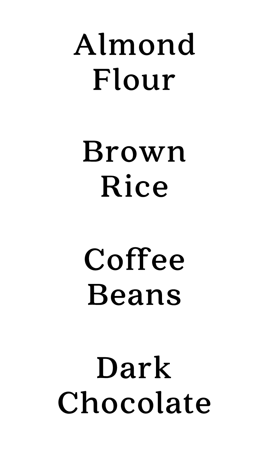
Which font do you like best and why? These will be pre-printed pantry labels.

30 Responses to Option A
I really like A the most. It just looks better to me. B is ok but I think the it's not bold enough for a label.
This font looks more classy.
I like the font of this set of writing the most.
This is a bit more fancy and a bit more distinctive - it catches my eye first.
The font with the darker stroke is easier to read. Most readers prefer serif fonts for ease of reading, even if they know realize it.
This option felt a little more organic and traditional which I liked.
I like the darker and smaller font because it would be easier to read and fit on labels.
I think the bolder looks better and is easier to read
I like A because I think the font's more attractive. It has a more traditional look to it that I like.
I prefer option A. I like the bolder font. It is more formal and easy to read.
I like option A font because it stands out the most.
In above the font of the text is easy to note the all types of instruction. so, I choose this option.
This font makes me think of an old-fashioned pantry. I like it a lot more than B.
I like option A the best. I like how the f's in coffee look. It looks very European and fancy and I just like it. I can read option A a little bit better because the letters are thicker. It took me longer to process some of the words in option B because I was trying to figure out the letters because they are long. I like A.
I like that the text with option A is bold and easy to read. I don't think the font type of option B is bold enough to read easily.
It's easier to see/read. I also think the font is more classy looking than "B". "B" is just too plain.
A- is easily readable, classic, but has a little more character than B. B is ok, just nothing special.
I like how the color black has been emphasized on this one and how clearly it comes out
I prefer option A because this makes food labels look more sophisticated and elegant, gives a special touch.
A is my preference because the font is easiest for me to read.
Font is dark and straightforward, simple and effective.
This is the font that I like. This font looks better than the other one. This one is appealing. This one looks more neat.
It's nicer and bolder.
The writing for option A is bold and it stands out a little more.
It has a more sophisticated look to the font. Its actually really stylish. The other one reminds me of someone who can't see and the font looks really bulky.
I like the boldness of this font. I also like that it seems a bit more laid back and not uptight. This would match my personality because I like order but I’m fun with my order.
Option A is a classic font. It looks classy and could easily match the aesthetic of a kitchen (like the appliances, the paint colors, countertops, etc.). I also just like the way the words look in Option A. They look classic, like they could be found in any era, from the 1950's to now. It has a universal appeal. Option B feels more modern. I don't feel like Option B would have that universal appeal like Option A. I like the font in Option B, as it is sharp and modern, but it feels a little more whimsical and less classy than option A.
A looks a little more fancier, especially the ones that says coffee, I like it a lot. The bolder font will make it easier to read as well, I tend to move quickly in the kitchen and being able to see the words fast is important.
The font looks prettier and would be easier to read on various labels.
I choose A because i like darker smaller font .
20 Responses to Option B
The font in B seems more streamlined and looks cleaner
sans serif fonts are easier to read
I like the more classic, readable look of choice B.
I like the san serif font better in B.
I thought I liked A the best on a 1:1 line comparison, but as I looked at the whole lists, I like B the best. It's a clean and beautiful font.
My choice of font is Option B because of the font is easy to read and big size so i choose
It looks more serious and professional. I like the classic look of it.
I like Option B because the font is sharper and easier to read.
the font in B feels more comfortable and less formal for food label
I like B better I think that this font is more delicate and I think that it makes it look the best
I like option B better because the font is bigger and thinner.
I think the text in B is clearer and would stand out more on your shelf.
I preferred B because it looked fun, clean, and large. Option A looks like more like Times New Roman is boring.
I think B looks cleaner.
I like choice B. I like that it's a very simple font.
I think that B is the easiest to read, especially from a distance, so there would be less chance of mixing up the products.
B looks cleaner as a font. I could see it being used in kitchens of all styles. It could be a more modern kitchen or a farmhouse one and that font would work with either.
I like the font for choice B better. The letters are spaced out and bolded enough to be clearly read by everyone. The font also looks nice and crisp as well.
It is easier to read at my age (60 years old).
I prefer a minimalist, thin font.
Explore who answered your poll
Analyze your results with demographic reports.