Poll results
Save to favorites
Add this poll to your saved list for easy reference.
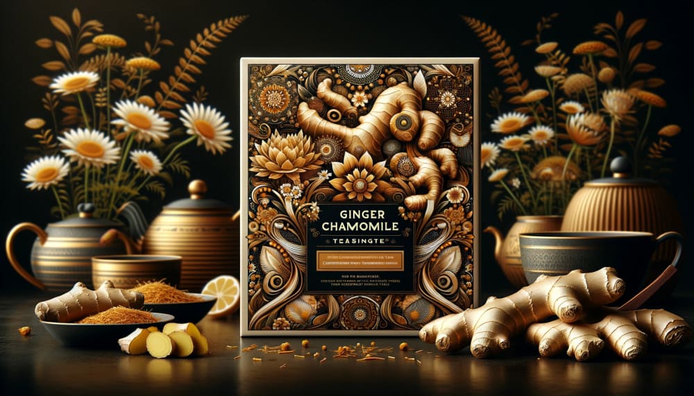
We've used AI to design a new tea package for ginger chamomile, what might you change about this package to help it sell more?
30 Responses
To be honest I think it's gorgeous. If I had to pick something maybe a very tiny spot somewhere that pops with color otherwise I don't think I would ever change that. it's pretty impressive.
It looks very nice, the thing I would change on the packaging is how the ginger is curling, it's a bit worm-like.
I like it with the ginger root and flowers of the chamomile plant. It looks amazing.
There is too much going on with this packaging. I think it is a bit over designed and it should be simplified a bit more.
The cover is very beautiful, so long as one recognizes the ginger roots for what they are, otherwise, it could be quite creepy. It might be a good idea to show a cut root rather than a whole one, and to also incorporate a bowl of grated ginger directly onto the package itself, just as it is shown in the background image. Some more color contrast on the package might also help.
I think I would add some lighter colors to it because all the brown is a bit dark.
i don't like the different size of letters in "chamomile"
I would make the font on the label larger so it stands out more and is easier to read.
I would make the ingredients look more recognizable. If it's just ginger and chamomile, I would make those the focus on the image rather than all the other designs which makes it look all too alien.
I would make the ginger more prominent. It's in the corner and not noticeable unless you are looking for it. Maybe you should pile them in the center.
It seems really busy of a design that should be fixed, it could be done. It looks nice the color schemes for the art work though.
Make it simpler. Too much going on in the art of the package making my head hurt.
I think the shape of the top ginger is a bit weird, especially the circular hole in it. The design might also be a bit too busy for something that is supposed to be more calming.
After seeing above image very closely it seems to me this design is very nicely showing its ingredients and its comes with a very attractive packing .I personally does not found any fault or mistake in this image which can be improved . And i also think it will bring a large number buyers .
I find the design too be too busy. It takes away from the logo on the box. I feel like my eyes are so distracted by all the elements of the artwork that the logo just gets a bit lost in the mix.
I ould change the background color so that the Ginger and Chamomile look more prominent and impressive.
Put more descriptions to the product and lighten the picture design colors to be more appealing.
I would make sure the package has a stamp of approval from a tea expert or governing body.
I don't have any suggestions. I actually like the package as it appears.
Less shapes would be good because there seems to be eyes on them
Nice image and looks rather exquisite. I like it a lot and think it'll be a nice overall look. Great design for the tea. I would brighten the image a touch. Think that would be the only thing if change in this.
Lighten up the colors so they're more subtle and soothing.
I think a tea bag, tea pot, or tea cup should be incorporated into the tea package.
Maybe add some more of the color green to the package. I think it would add a nice compliment
It looks good as is, but I might use a different for the "ginger chamomile" something that stands out a little better.
The font is okay it is very legible but the art makes the product not really look like its for ginger chamomile. I would prefer the design to be change to a more simpler one.
I would try to make it more colorful. It has the color of the ginger but everything else looks the same. The colors are too flat and it's unappealing. Ginger is good for you but the AI do something to make it more attractive. Because all of the colors are the same tone, I can't make anything out. Also, maybe make the subtext bigger to help tell what it is.
I think this is a perfect picture. That it is advertising tea is even better.
I'm actually very impressed that the package is made with A.I, but I'd say that the ginger art displayed here looks a little warped and twisted in some places. Still, very impressive graphic! Nothing to change, really.
I might consider removing some of the flowers and tea kettle.cups to streamline and clean it up. It's a tiny bit busy.
Explore who answered your poll
Analyze your results with demographic reports.