Poll results
Save to favorites
Add this poll to your saved list for easy reference.
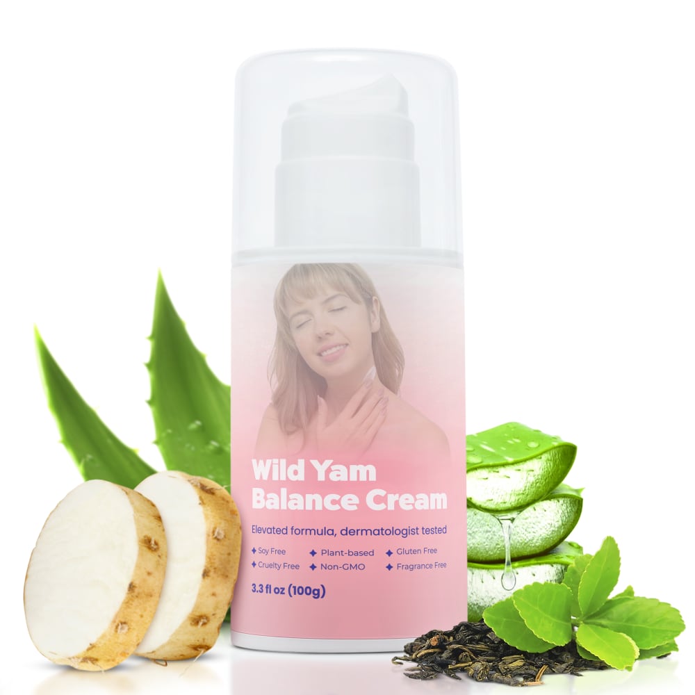
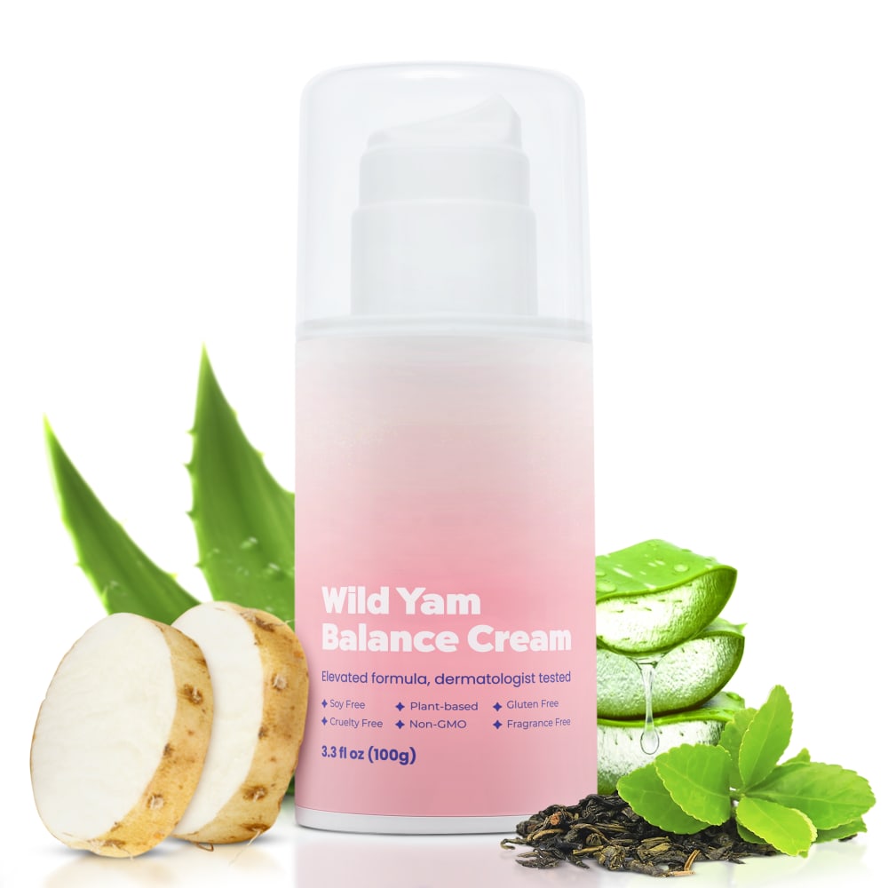
This wild yam cream is for women going through menstrual cycles or menopause stages. Based on this, which hero image do you think is most effective in ATTRACTING this buyer? Please explain your choice.

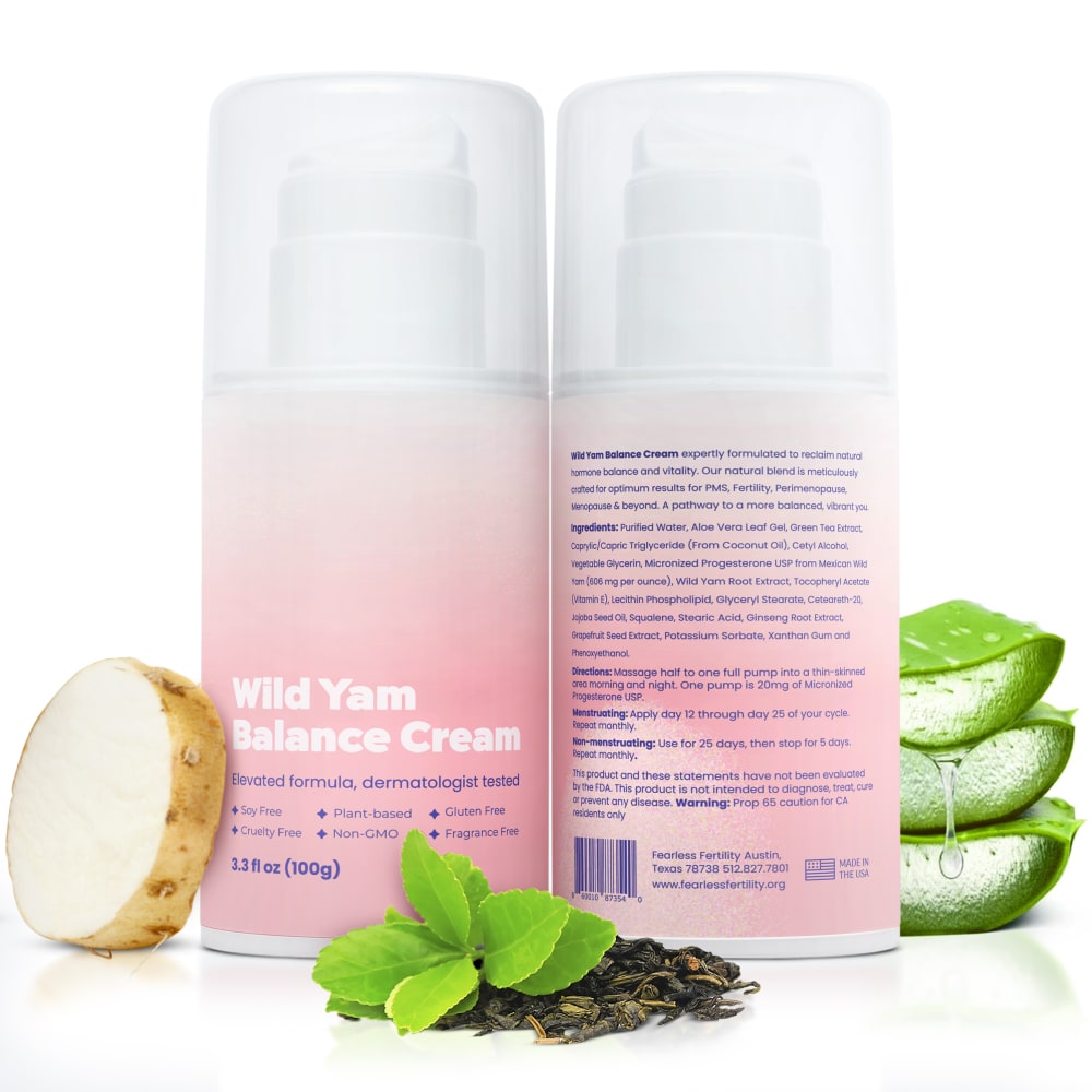
Option C won this Ranked poll with a final tally of 34 votes after 3 rounds of votes counting.
In a Ranked poll, respondents rank every option in order of preference. For example, when you test 6 options, each respondent orders their choices from first to sixth place.
PickFu requires a majority to win a Ranked poll. A majority winner differs from a plurality winner. A majority winner earns over 50% of the votes, whereas a plurality winner earns the most votes, regardless of winning percentage.
If an option does not earn a majority of votes, PickFu eliminates the option with the lowest number of votes. The votes from the eliminated option are reassigned based on each respondent’s next choice. This process continues in rounds until a majority winner emerges.
Scores reflect the percentage of total votes an option receives during the vote counting and indicate the relative preference of the respondents. If there is no majority winner, look to the scores to see how the options fared relative to one another.
| Option | Round 1 | Round 2 | Round 3 |
|---|---|---|---|
| C | 44% 22 votes | 46% 23 votes +1 | 68% 34 votes +11 |
| A | 24% 12 votes | 28% 14 votes +2 | 32% 16 votes +2 |
| D | 26% 13 votes | 26% 13 votes | Eliminated 13 votes reassigned |
| B | 6% 3 votes | Eliminated 3 votes reassigned |
Answer Attributes
Age range
Education level
Gender identity
Options
Personal income range
Racial or ethnic identity
12 Responses to Option A
I think the woman in the picture would resonate with young women but not menopausal women.
I like the one that shows that someone is actually enjoying it and it feels good it gives me confidence to use
The image with the smiling woman picture sends the message that the product makes menstrual cycle go smoothly.
I like the image with the woman using the cream, as it makes it seem easy and pleasant to use. I don't really like the image of the woman on the bottle, as that image looks old-fashioned. Images that show the most ingredients best help me to understand the ingredients and get my attention.
I chose A because I think that having a human model next to the product makes it seem more accessible.
The woman looks like she is in ecstasy.
The photo of the woman enhances the image of the product.
the image where the lady is smiling is the most beautiful one, i love it more as it makes the product more attractive
I prefer the ad with the woman on it, it makes me know right off hand its for a woman.
I find the image with an actual woman who has a pleasant expression on her face present next to the product container to be the most appealing. Additionally, I like the layout of the items surrounding the container because they are spaced out well and don't make the image appear to crowded looking.
showing a smiling face makes it seem happier and more fun to use
I have never heard of this before- so Putting a lady in the pic with the product on her arm helps me know it is for the skin! D would be my next choice cause I like that I can see the ingredients on the pic. C is ok but just average like all other products. And B is just creepy with the lady on the bottle lol
3 Responses to Option B
I don't see enough of a difference between C & D to even judge the difference. I like the image on the bottle opposed to the bigger image of the lady. The image itself looks computer generated and somewhat uncomfortable to look at
The image is feminine in nature supporting the products use. The way the image is used for that product is very unique and makes it have a stylish design
I like B because I love the mixture of produce and the smaller picture of the female on the product. C and D, same thing. I don’t like A because of the large image of the female. It just looks forced or fake.
22 Responses to Option C
Option C is a very attractive and balanced image, which suits the product well. We don't need the photo of the ecstatic woman on the bottle (Option B) or in the image (Option A). Option D seems a less balanced arrangement than the others.
I ranked them according to how well I could see the actual product. I think that seeing it would be the most important factor in this purchase.
I really, really, really dislike the image of the woman. First, she doesn't look old enough for menopause. Second, the look on her face looks really annoying. I would NOT buy a product that showed her, period. I prefer C because I like the overall balance, but D is a close second.
A and B are horrible, to me. I don't like the image used, I don't like the way it looks. It comes off really cheesy. I like C a lot. The focus is on the product and there's where it should be. With D, I like the image because it shows the back so if you were someone that wanted to read the fine print, you can.
C looks more organic and natural, it is safe and more beneficial. The arrangement is also neat and highly visible.
Option C looks most bountiful and pretty. I don't particularly like the image of the lady so those options went last. Option C looks fuller than option D but those are both very close in attractiveness.
The ones without the model anywhere in the image look more professional. She isn't adding anything nicer to the photos she is in.
C, D first because the images are the most detailed and appealingB second because the image is simple and straightforwardly A last because the design is too plain and the least appealing
I like the lovely pink and green plant jungle of option C.
Option C is the most visually appealing and grabs your attention more right off the bat. It is easier to see and read the product and you get a better sense of what it is and what it has to offer. It has a more professional and advanced look to it that gives you more confidence that it is high quality and would be more beneficial to the user. It doesn't have a "cheesy" look to it and makes you believe more that it has something positive to offer. Option C would appeal to more women and would make them more likely to check deeper into what it has to offer.
The pictures with the girl look so cheesy. Why are her eyes closed? The picture is too small to really get any benefit from showing the back of the bottle. C is the most appealing to me by far - bottle looks nice, picture has simple and clean design overall.
The single item shot is nice, so is seeing an actual human. I don't like B cause the item looks weird, and I can't read the writing on D, so it's useless to show the back.
Good, simple, easy to digest image. I think having her on the label looks weird.
The person is distracting and it takes away from the showcase.
I don't like having the woman in the image, because it makes you feel like it's only for a certain age bracket. The surrounding greenery and imagery looks more complete on C.
picture is simple and pleasant
I prefer an emphasis on the natural over a white woman, especially on the package itself. I want the dirt to the side because dirt doesn't scream great for skin to me.
C is the most attractive and balanced arrangement. That said, not every woman likes pink used stereotypically to define their life. It's offensive.
Option C is a well-balanced image with the yam and greens around the bottle acting as an enhancement to the image and not a distraction. The bottle is central focus of the image. It would make me more likely to click on. Option D has more packaging detail, but the image does not look as distinctive. Option A and B have the image of a woman that distracts from the product.
C is best as it has a simple design while showing the ingredients clearly.
I prefer the ones without the model and no need to read the small print on the back.
I like the product without the model, but I also like seeing more of the product itself. Sometimes the elements around it are too distracting and take away from the product.
13 Responses to Option D
I like Option D because it shows the front and back of the label.
I like the clarity and helpfulness provided by showing us all the text on the packaging to inform us of the product right away. Instills a sense of trust and feeling of effectiveness right away.
I think a woman in this demographic would be most interested in information so I think that having both sides in the bottle in the image is important.
I ranked in the order that I feel the ads showcase the product, not the model.
I picked the images I liked best. Option D showing the back of the label is very helpful
I picked them in this order according to which one I felt would inticing buyers in that classification the most. I prefer the images that showed the front and back of the product and gave the most useful information about it.
This has a very natural and organic feel and you can see the information on bath the back and front of the label.
I have ranked these options based on how attractive I personally find them to be.
I think D would be most attractive--the natural ingredients pictured around the bottle that clearly shows the back to show ingredients and benefits is great.
option D keeps it simple making the design look less complicated
I like D the best because I can check the ingredient list and directions easily. Other than that, I think it's better to have asymmetrical balance in the design, as in A.
D looks the nicest since it's the image of the bottle front and back. C is okay but it looks a bit empty. B and A are strange with the woman in the ad.
I like being able to see some of the info on the back of the bottle, like in D. I like the plant images as well.
Explore who answered your poll
Analyze your results with demographic reports.