Poll results
Save to favorites
Add this poll to your saved list for easy reference.
Which packaging design makes the game more appealing to you and why?
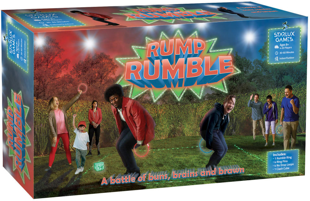
32 Responses to Option A
You see more players and it seems more fun.
A looks like you can have more fun with it because they are showing a party with lots of people having fun.
I think the packaging design looks more creative and interactive in option A. It feels more engaging. Option B looks too average and doesn't look as appealing to me.
I choose Option A because I like the image that shows that this game can be played outdoors. Kids need to do more things outdoors and if this gets them outside I'm all for it.
I like the look of this one and like how it is outside
I think these both look pretty cool. I slightly prefer A since the characters are more attention grabbing and look to be having more fun.
The outdoor scene is attractive. Nature is eyecatching, but with COVID, gatherings need to be outdoors.
It shows more people enjoying the game.
just the people on the box made me laugh once i looked closely at the picture
I chose Option A as the outdoor image makes the game feel like more fun and I could see it better as a party game in the summer when having people over which makes it more appealing to me.
Neither really, they both look terribly unappealing. I'd look into finding some people who aren't mentally disabled to help design boxes in the future.
The red and blue areas where there is light or are they stars looks a lot more appealing and make the box standout
I think that the detail of the picture is a whole lot more detailed and dynamic
I think this image on the box is much clearer and better. It's cool to see the item used at night outside.
I like option A the best because the box is more colorful and stands out more.
I prefer how colorful option A is.
A includes a much better blend of colors; the colors on B make the logo seem to blend into the background of the photo and look almost blurry, whereas the colors used for the background on A allow the logo to stand out
This one has correct colors. The other looks more grey and washed out colors.
This is the packaging design that makes the game more appealing to me. This design makes the game seem more fun and interesting. The design also helps the game stand out a lot more than the design in B
The outdoors photo makes it look more interesting
it shows its fun for the family
I like that choice A looks more safe. I feel the kids in choice B are playing in too small of a place and can get hurt by furniture. A - the image of the people playing makes the game more of an fun event.
The out door setting seems like a fun party and everyone would want to get involved to try it out
What the hell am I even looking at? I have no idea what this game is and who should be playing it. I guess it's appropriate for children, but I don't know that I would want children to be the main focus of the packaging. And I wouldn't buy this game.
I like how this one is showing groups of kids playing it outside, it makes it look more entertaining and fun.
I like the dark image, it looks like a fun outdoor game to play.
The picture on the front of the box is much clearer and higher-quality. The other picture is kind of blurry
This shows much more divercity and also has more of a party feel. I like how it has kids and adults on the packaging.
This image on the front is a lot more colorful and that makes it look more fun and like the game is more exciting.
box b doesn't compare to A. A looks fun, family, neighbors, outside. Everything is right
This design looks more fun since it looks like it can be played at night, under the stars, in the yard outdoors.
The more people playing, the merrier! Moreover, for me, daytime is for work and doing household chores while nighttime is for chilling and having fun; hence, Option A "speaks" to me.
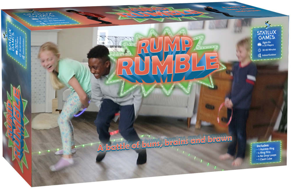
18 Responses to Option B
A is a bit too busy and having it be playable indoors, which B makes obvious is a possibility, it a huge plus that should be emphasized.
This seems like a dangerous idea for adults who are more fragile. I'd expect it to be more for kids who are more resilient. That means Option B looks right, while A is a little off.
I like the idea of this game being able to be played indoors, it makes it more versatile and year round.
I feel like A has a little too much going on, which makes it confusing to look at. B is much more clearer.
I think the outside image looks a bit disjointed and forced. B looks more cohesive and natural. Plus, do kids even play outside anymore?
The package is lighter so I think it exudes more fun than the darker packaging
I like being able to know that the game can be played inside, which this image shows.
More fun looking .
This is a great looking package. The fact that it is lighter makes it much nicer to look at.
It looks brighter and more fun. The other one looks like a 70's-style game with some of the clothes that people are wearing.
Option B design is more appealing to me because it looks more natural and fun, and it shows cozy home environment.
THE CLEARER BRIGHTER BACKGROUND DRAWS THE EYE MORE AND MAKES IT EASIER TO UNDERSTAND WHAT IS GOING ON IN THE PICTURE
This has a cuter scene that appeals more.
Option B looks more realistic
I like the scenery of my the home, says to me the game can be played in a simple place like my home
I feel that this design looks a bit nicer then the other one. The other one seems very photoshopped and I don't really like it as much. I think it looks less professional.
the image is brighter and more inviting.
B looks more like an actual photo and A looks highly photoshopped. B looking more natural makes me think the product is higher quality.
Explore who answered your poll
Analyze your results with demographic reports.