Poll results
Save to favorites
Add this poll to your saved list for easy reference.
Which product are you more likely to click on?
Answer Attributes
Age range
Education level
Gender identity
Options
Personal income range
Racial or ethnic identity
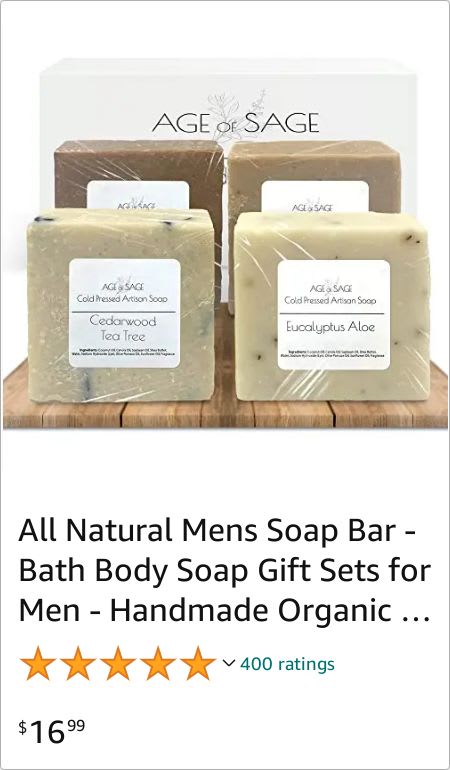
23 Responses to Option A
The way the items are neatly laid out in A makes it appealing to check out.
The angle of the soaps in Option A makes them look more appealing and realistic. The aerial view of Option B looks too manufactured so it does not feel like I am shopping in the way that viewing Option A makes me feel.
The set up of the soap bars are more eye-catching.
A i like how the product is presented in this picture more and with how it's arranged seem more professional and makes me want to check out more compared to the other option.
I chose A because the image is more appealing and doesn't have that gray bar thing across the top and the product is easy to see and read
I would click on this because I like the placement of the soaps better. I like that they are standing up and more of the focus of the picture
I like A better because you can see the actual product better. It is bigger and closer to the front of the picture
The image in my first choice is clearer and it is easier to evaluate the details and size of the product.
I'm most inclined to click on the presentation shown in option A because the design and the way in which element of the image is shown is appealing and makes the bars of soap look enticing to the public and reliable.
The Soap bars are lined up in a better way as compared to the other photo. You can also see the box behind the soap bars that makes the image look even better. Everything is placed on a wooden plank that makes it even more perfect.
This one is more appealing with the product brand name at the top/behind the product.
I really like the way this all is positioned and the box is positioned
I picked A because I liked seeing the soaps arranged on the wooden board.
The soap with the look upright like this in choice A is a great way to showcase this one
Just the soap images is enough to be catchy than the box being in the image.
The box behind the soap gives a nice background and shows how nicely packaged the soaps are and the wood base just adds appeal.
The box on top in option B looks tacky in my opnion.
The layout is more appealing
I chose option A because this image seems more balanced.
I think hte display in A is better to show off the items. I feel that I can better look at it and it seems closer to me. Also it is overall neater and easier to read.
Option A looks cleaner and not as cluttered. What is the thing on top of the soap in option B? It seems unnecessary and strange where as the wooden block on A looks natural.
I like this image better. I get a better idea of what the look like and he size of them.
I like the larger blocks better and they seem more appealing from this view.
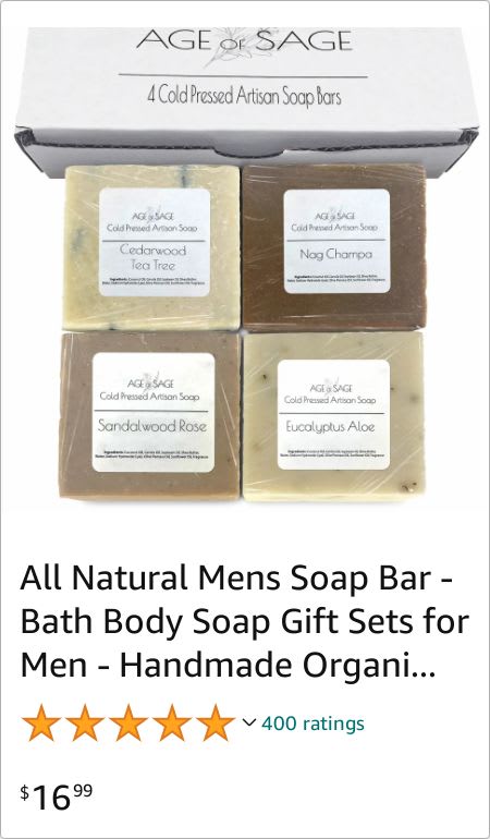
27 Responses to Option B
The layout displays the product more intuitively
I prefer option B because it feels more comprehensive and intriguing to me. Option A does not really compel me as much.
I LIKE SEEING ALL OF THE SOAPS INSTEAD OF SOME BEHIND THE OTHERS SO I WOULD CHOOSE OPTION B
I liked that this option showed the soaps without any overlap as it was more transparent.
B shows a good view of each of the different soaps so I feel it is more informative.
Option B, I liked the look of the photo. I thought it showed off the soaps a bit better.
I much prefer seeing everything without overlap. Having the product overlapping like in option A makes me think you're hiding something.
I would probably click on option B. The layout is more appealing, and I would be interested in learning more about the product.
I like being able to see each product individually without obstruction
I prefer Option B because I get a better, closer look on both the product and the packaging.
The layout of the product allows me to get a much better glimpse at it.
I would be more likely to click on Choice B. Artisan soaps are pretty much the only kind I use these days, so the image outright confirming that's what this is does a lot more to grab my interest. Furthermore, I just think the image stands out more compared to A as well.
I chose option B because the image shows how the soaps will come packaged.
I like being able to read all of the different scents. B is best to me.
In the other choice, the information about two bars cannot be seen.
The unique and catchy header explaining the product really draws the eye.
The wood planks under it don't make any sense. I would rather see the box it will arrive in.
B is better because you can see all four soap scents right away.
I would buy these right now. Look yummy!
i would be most likely to click on the product in option B because it looks more natural
Choice B is the one that I would be more likely to click on because I like how I can see all of the soap bars and the square shape that they make looks nice.
I feel like option B is more eye catching, easiest to see, and most premium which makes me more likely to buy
I chose B because it has the description of the product clearly written in a way that it is easily visible compared to the other options.
I like this one since you can see, all the products clearly and they aren't stacked on top of each other.
i liked being able to clearly see all the scents
i like choice B cause i like that you can read what each soap is and its easier to see them all laid out like they are in choice B. i like the way they show each whole block and i like that you can still see the box they come in as well.
Option B is a nice looking layout. I think it does a great job of showing off your product. It's a nice display.
Explore who answered your poll
Analyze your results with demographic reports.