Poll results
Save to favorites
Add this poll to your saved list for easy reference.
If you were searching for a business marketing podcast on Amazon to listen to for free, which podcast would you click on?


Option A won this Ranked poll with a final tally of 10 votes after 1 round of vote counting.
In a Ranked poll, respondents rank every option in order of preference. For example, when you test 6 options, each respondent orders their choices from first to sixth place.
PickFu requires a majority to win a Ranked poll. A majority winner differs from a plurality winner. A majority winner earns over 50% of the votes, whereas a plurality winner earns the most votes, regardless of winning percentage.
If an option does not earn a majority of votes, PickFu eliminates the option with the lowest number of votes. The votes from the eliminated option are reassigned based on each respondent’s next choice. This process continues in rounds until a majority winner emerges.
Scores reflect the percentage of total votes an option receives during the vote counting and indicate the relative preference of the respondents. If there is no majority winner, look to the scores to see how the options fared relative to one another.
| Option | Round 1 |
|---|---|
| A | 66.67% 10 votes |
| B | 26.67% 4 votes |
| C | 6.67% 1 votes |
Answer Attributes
Age range
Education level
Gender identity
Options
Personal income range
Podcast listener
Racial or ethnic identity
10 Responses to Option A
I like that option A has a man and a woman, so that is the one I would choose.
A looks interesting and good ue two gendersB seems made for guys onlyC image not a good one
I chose by images that are most informative and I like seeing that there are two hosts so it will be a discussion.
I think everyone feels frustrated with marketing, so that title really speaks to me. The one I picked last doesn't look like it would be very high quality - the image doesn't really fit and words get cut off.
I think the question posed by option A is very appealing to me because I have had a hard time marketing a few things and would love some perspective.
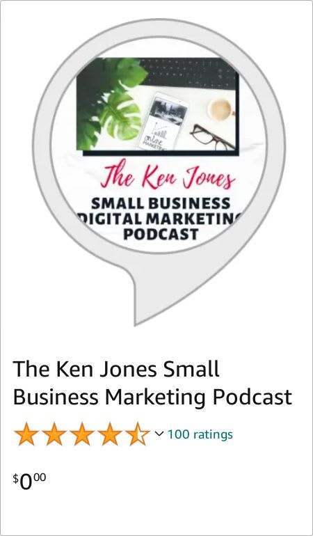
I like the background color on A, B looks very professional and the bubble on C is interesting and eye catching.
I like seeing real people in the ads
C has the best design. I don't like the other 2's graphic choices. B is well balanced and colored.
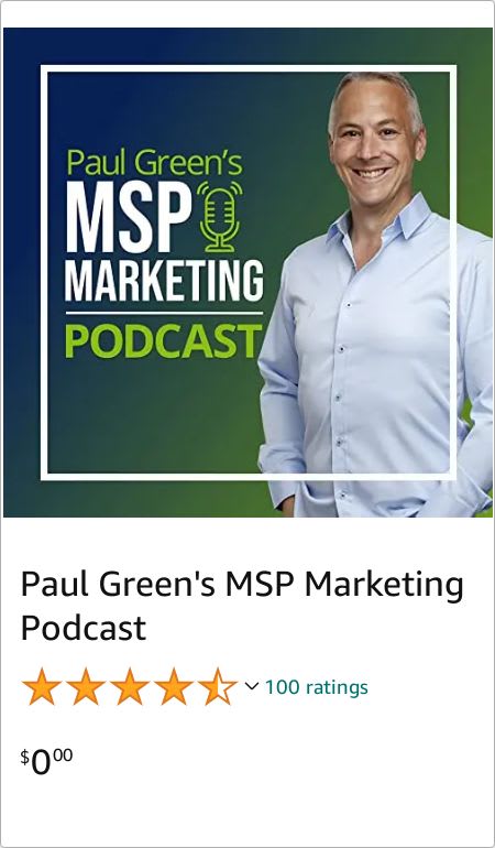
I like the choice that presents a problem in the title and shows a picture of the people running the podcast. The second choice shows a picture of the man running the podcast, but the graphical design is weird. Specifically, there's a white square running through the picture of the man which is awkward. The third choice has an awful design and there's no human in the picture.
I like that this podcast features a woman.
4 Responses to Option B
I would be most likely to click on option B because I think that it has the most interesting and eye-catching preview/thumbnail image out of the three options above. I like that it shows more of the person's body rather than just floating heads like how it is on option A. I also like the multi-colored background of option B.
Because it looks like it would have the best quality, based on the image of the podcast, the others look lower budget.
I think the strong confident male standing up tall with a bright smile really brings my attention to the product and helps make it seem trustworthy
I think B looks the most professional and useful.
1 Responses to Option C
I don't know who these people are so their names and faces are unimportant. The thing that sticks out to me most is, well the picture. Ken displays his marketing skill in the picture. Option A tells me something about what the podcast is about. I have no idea what Paul is going to talk about
Explore who answered your poll
Analyze your results with demographic reports.