Poll results
Save to favorites
Add this poll to your saved list for easy reference.
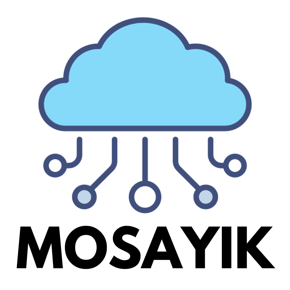
"Which of these two logos do you think better represents a technology company?"
28 Responses to Option A
The blue coloring makes this more modern and fresh.
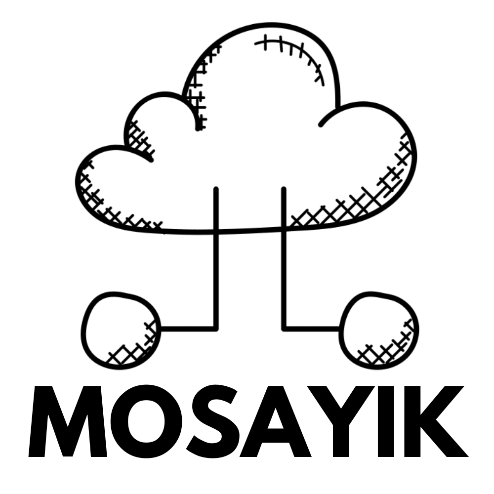
I think there could be a fun way to make a "freehand" cloud architecture logo but option B isn't it. I prefer the logo in option A as it looks professional.
Option A better represents a technology company as it looks clean and professional.
Option A is better representation for the company but option B looks visually more better. So if more elements are added to option A that resonates with theme and looks good as well.
i like A better it is complete and finished and more colorful. B seems uncomplete and plain , boring and average.
The look of the blue cloud stands out to me with the mosayik design here and has an electric look.
This logo looks professional, creative, and beautiful. It has a cloud and circuit line design. This logo design reflects the technology theme. This logo is a good fit for this technology brand/company.
The circles extended in this version gives off a more 'technology-vibe' to me. I also don't think the smaller lines that look like shade are easy to replicate. The logo should be simple.
Option A is the best option because it has the blue color inside of the cloud. The blue color adds a lot of flavor while the other option is just bland.
I like the more colorful and simple design of A.
Overall the color blue or any shading of that type tends to immediately click as innovative and high tech
I feel like the crosshatching in B makes it look dirty or childish, whereas the design in A invokes a circuit board, which seems more appropriate for the company.
I like option A the best because I associated the cloud graphic with technology and I think of the little lines connecting it to the dots as the various different technologies that feed into the cloud.
Technology companies are connected so the multiple modes work.
The design of Option A is cleaner, more simplistic, and modern-looking which is a better fit for the technology theme.
I strongly prefer Option A as the logo for a technology company, because the bottom half of the image is immediately recognizable, even to a neophyte, as part of a wiring diagram or some other type of technical document, so it helps to give the company an air of competence. With Option B, it is not quite clear what, if anything the circles and straight lines are meant to represent, and the rest of the logo itself is drawn in a rather informal way that looks too much like a child's drawing. Option A's drawing, by contrast, is very professional and clearly computer-generated, which is much more appropriate for a technology company.
Option B looks too childish. Option A looks more modern and I like the colors.
"A" looks like it shows that various works are stored and/or solved in one place by technology.
I would prefer the logo in Option A because it reminds me of a PCB design
this one has lines going in different directions similar to a technology product
After carefully studying and comparing both logo images displayed above, I selected Option A over Option B as my first preference and the one that I would most likely click on first. I felt that this logo image jumped right out at me as have more eye catching appeal to me personally based on the general design and contrast in coloring and shading.
I think I would go with choice A. The logo looks computer drawn and very robotic. Perfect logo for a tech company.
I think the color makes it look like the center of the company. The many lines on the bottom look like it spreads their information over many places.
The blue stands out and looks good, just personal preference. The lines and circles coming off the cloud look like "nodes" or something, at least it makes me think of technology way more than B. B just looks like a black and white cloud
Option A has a more modern feel to it and meshes better with the industry involved
I think option A is the most fitting with the circuit board lines.
the fact that this one adds a little bit of color makes it more legit, I also like that it doesnt just look hand drawn
Everything about this logo's design says it's computer related. Truthfully both of them do but this one is better executed. The other option looks like a kid drew it.
2 Responses to Option B
I like the sketch art style, it seems more creative, which is on-brand for the field.
The cloud is white as clouds normally are and is more natural in appearance
Explore who answered your poll
Analyze your results with demographic reports.