Poll results
Save to favorites
Add this poll to your saved list for easy reference.
Which Amazon infographic do you prefer for a slow cooker?
Answer Attributes
Age range
Education level
Gender identity
Options
Personal income range
Racial or ethnic identity
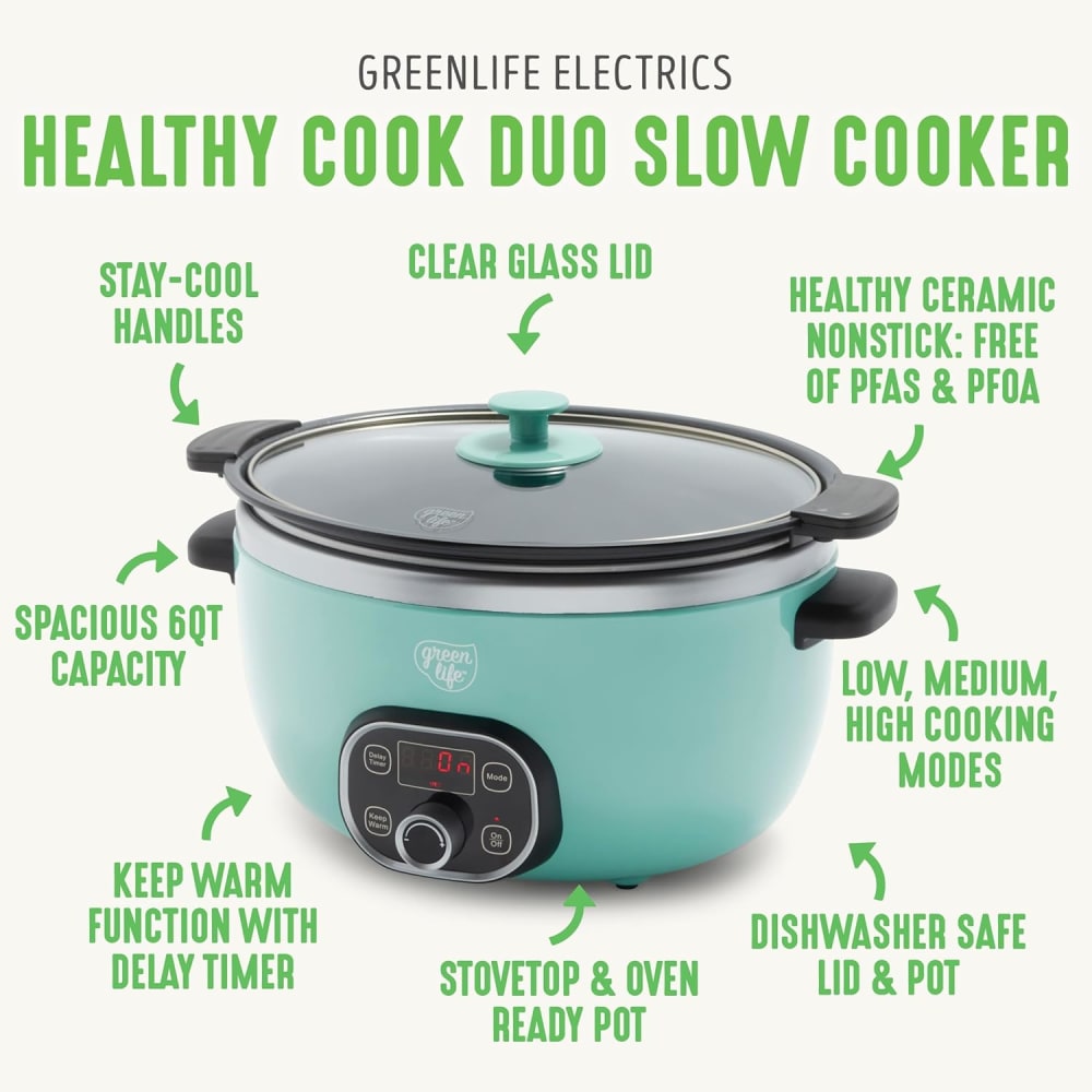
24 Responses to Option A
This option has annotations that make it clearer and easier to understand the benefits of the slow cooker.
This option makes the best use of the space given and uses a good color scheme.
Option A offers more information about the slow cooker.
The way information is distributed and arranged, I like better A but overall product and vividity and attention grabbing is better in B.
This infographic has lots of enlightening information.
A has a lot of information around it. The layout looks good for all the information and grabs attention well.
I like how this one points out the attributes and features. I find this very helpfull.
The instant pot looks hard to use, and like it will take up tons of counter s[ace
I like option A the best because I like that I can see all of the bullet points with the arrows pointing towards the slow cooker.
Option A showcases many more product features in its infographic than B, so that is more appealing to me. Personally, I also think that Option A's "Duo" cooker has a more charming design than either of the more industrial looks showcased in B's infographic. B may be saying that its "Rio" design is an improvement over the Greenleaf brand, but I find both the aesthetics and the broader list of features with A make for a better infographic.
I definitely like this. It is really descriptive. I like how it points to all of the features. It is not confusing at all
I like that B is neutral and black but the red background is off putting. The color of A matches my kicthen!
I like the color as well as all of the information that comes along with this.
I would prefer option A. The light blue color and modern design stand out when compared to the dark, more conventional pot of the instant pot. It visually suggests a cleaner, fresher feel. The infographics highlights various features with arrows pointing to the specific parts of the product.
The bright red is too hot looking. Also, in the one I chose, the descriptions are more detailed and easier to read.
I feel the design of A works better and points out the product features.
The font and color of it seems more approachable with a lot more details overall
I really like A for Amazon infographic image. I'm more familiar with A being a slow cooker than B. So I would definitely go with A.
the infographic goes over the features of the pot with the green text pointing to high quality points used for the product.
I chose this option because the info provided is much more informative.
I think the infographic in A is so much more fun and informative than the one in B. I love the green color bold font. I like the text and arrows match up to what features are being pointed out. The infographic in B seems stale in comparison. The infographic uses one arrow, pointing from the old model to the new model. The infographic in B only highlights three features, but it looks like a high tech slow cooker with many features. Option A looks like a much simpler crock pot, but it does a beautiful job with the infographic by highlighting all its features in a fun and visually appealing way.
this is very nice color scheme, it is very cool and attarcive and it makes it look more expensive
I like option A better because the infographic displays more information.
Option A looks friendly and it's a cool product presentation that makes me easily understand the benefits I can receive if I purchase this slow cooker
6 Responses to Option B
The red color is much more bold and makes me notice this one more.
I like the look of the information surrounding the slow cooker in A but I think the colors and imagery in B look much more eye catching to me
I enjoy the instant POT and it is next level. Whether cooking a soup, meat, or something gourmet the instant pot does it all. This machine is quality and is one of a kind. I will prefer this over any other slow cooker in its class.
Option B seems much more sleek and modern than Option A. The aqua color of Option A seems especially old fashioned.
I like Option B's Instant Bio Pot infographic. The black pot has a bigger digital display and looks more innovative. It looks more featureful than the other instant pots. I want to learn more about this pot. I prefer to click on Option B's Infographic to learn more about the slow cooker/Instant Pot.
I prefer B because this is a brand I'm already familiar with.
Explore who answered your poll
Analyze your results with demographic reports.