Poll results
Save to favorites
Add this poll to your saved list for easy reference.
When shopping on Amazon for men's deodorant, which one of product pages is most compelling for you to purchase from and why?
Answer Attributes
Age range
Amazon Prime member
Education level
Gender identity
Household income range
Options
Racial or ethnic identity
9 Responses to Option A
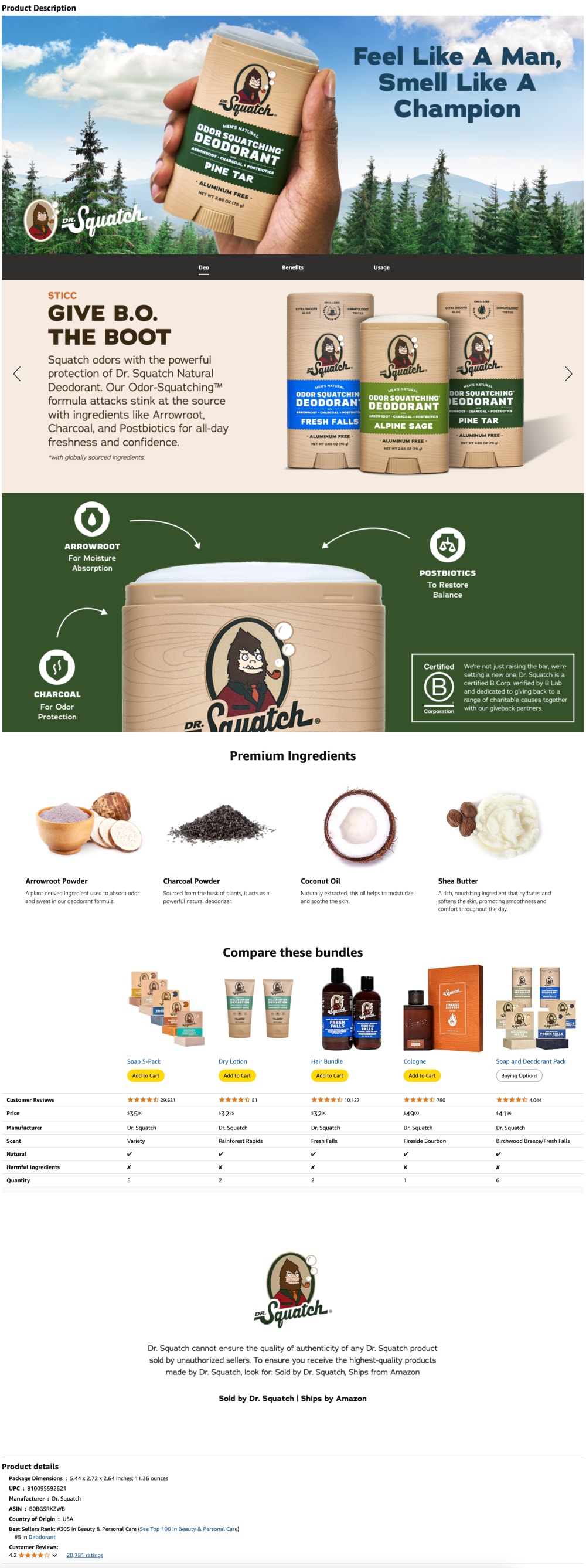
Has a much better close up in the first image
I like option A because of the section that displays the ingredients used.
I like the way my selection shows the product. I think it is more informational than the other one.
I prefer the outdoorsy and natural design aesthetic of the product page in option A. I prefer the packaging and branding design in option B.
I prefer more of a focus on the actual deodorant than some of the weird imagery in the other option. Dolphins? Seriously?
A is more informative with the callouts for the specific product features and the ingredients.
I like that this one focuses more on the deodorant than the other one
Feels more informative and more like what I would expect.
I'm familiar with the brand in A so I'm inclined to pick it since the products and the marketing is very consistent.
6 Responses to Option B
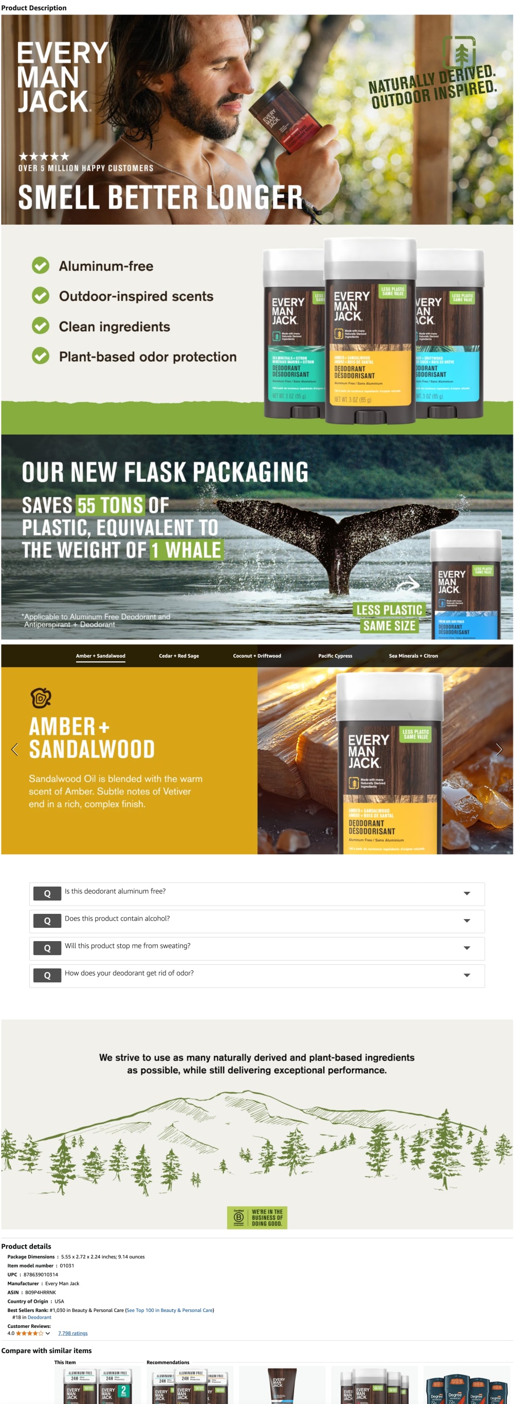
It shows a man with a beard. I am a man with a beard, so I relate to this one more to look at.
Choice B was more colorful and visually engaging, so I would click on that one before I click on option A.
Both are pretty good, but B is a little better. B does a great job highlighting key information like scent.
I found option B to be more compelling because it was organized in a way that made it easier to understand.
I like the use of larger pictures and info graphics as it is the most effective way to give out information in my opinion.
this set of images just seems to include more useful information and has less "empty space" , it makes better use of that space to tell me things about the product
Explore who answered your poll
Analyze your results with demographic reports.