Poll results
Save to favorites
Add this poll to your saved list for easy reference.
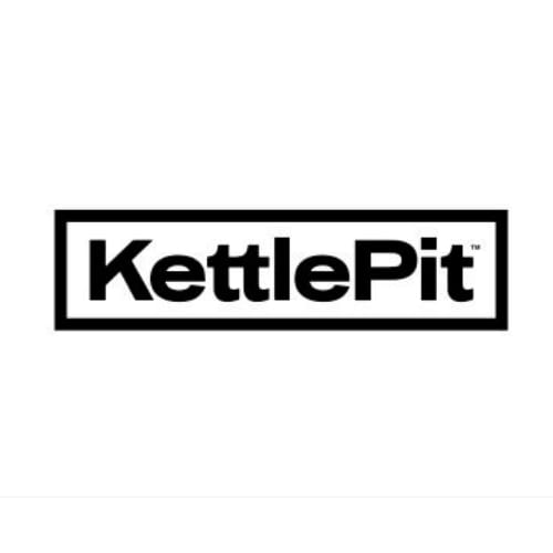
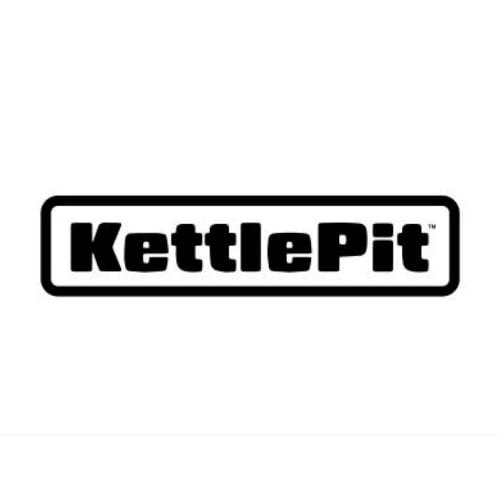
Which logo do you prefer for a product that converts a kettle grill into a fire pit?


Age range
Education level
Gender identity
Household income range
Options
Personal income range
Racial or ethnic identity
26 Responses to Option A
A is easier to read and looks cleaner.
It's easier to read the font
Both logos look good and have a simple, classic minimalism, but I prefer the thinner font of a — it’s easier to read.
I prefer option A because the print was bigger and clearer to read
I have no real preference, it is slightly easier to read A.
This logo is more attractive due to it being less bulky in appearance, which allows viewers to more easily focus on the individual words that come together as one.
i picked option A because I like the thinner letters on the font, making it more clear to read.
A is easier to see and read. It looks attractive
I just like the thinner font.
Easier to read and overall provides a more professional look. Other logo looks like dog food logo.
The font is clearer and easier to read in this logo
I chose option A because I prefer its font to the other option.
A is cleaner and easier to read and looks more modern and fun. B is so block that it's a little hard to read and looks like a knockoff version of a popular grill brand
I like A because I think the larger font is more eye catching and easy to read.
I prefer A: I like the font of A better than the font of B, and A is also easier to read
This option features a more elegant and classy look given the thinner text.
I liked choice A since the font is thinner and easier to read compared to choice B which is too thick.
B's letters are too big and bold I feel.
I like how the logo is sleeker and cleaner with more white space between the lettering. It's also way less bulky overall.
I chose A because the thickness of B's font makes it look to amateurish and childish. I think overall, A is far more legible.
It looks more professional and neat. It is also easier to read.
Option A stuck out to me. The letters looked more crisp with the font they used
A feels a little cozier and reminds me of home, which I think might be more suitable for the product and its usage.
I chose A because I like this text size and type better. It looks good to me.
Option A as it is a very clean and easy to read logo design. The letters stand out prominently and look crisp.Option B is too thick of text. Your eyes really have to muddle through the thick letters to get to the end. It leaves you with a bad impression of the brand and gives you a heavy feeling.Option A is a clean, crisp and light logo that makes you feel good about the product.
I like the square outline with the sharp edges and clean text as it looks more professional.
24 Responses to Option B
I like option B better, the thicker font feels more like a brand logo than the other option.
I prefer option B because I think that it looks like a slightly more premium and trustworthy logo design.
I like the design of B.
B is darker and bolder. DEnotes strength
I think this is more eye catching. The thicker letters standout a bit more and make me feel more confident in the product.
I like the B because the logo looks more rugged and outdoorsy looking. It looks more substantial.
B because I like that it is bolder and thicker writing it makes it seem sturdier and stronger.
I chose B because the special fonts of the logo adds character to the brand.
I like the bold font better. It feels more forceful and stronger. I also like like the look of it better
I prefer option B because the larger block lettering makes it easier to read and stand out more.
I like the thicker text used in Option B, as it makes the logo more distinguished.
I like both, but option B with the thicker lines makes me think of a kettle pot and a fire pit. It looks sturdy and not like it will burn up after one use. and I like the curved lines in the box around the name. It just looks like it wants you to use this product and have fun.
I know this probably isn't helpful, but the font on B feels more... outdoorsy?
I think option B fonts fills the box better, the name looks more robust, I think it looks better than option A
I picked B becaue the bold print makes me think quality.
Option B looks like a respectable grill, kettle product. Whereas the other product almost reminds me of animal food, it seems a bit wimpier and not as durable.
The lettering appears stronger and bolder
I like the boldness of the font in option B.
B has a font that says that it is sturdy.
I like the bolded black better. But they both look good.
There is something about the thickness of the font that make me picture a firepit in my head more than the other one. I think it may also be the rounding of the edges in the logo because a fire pit, in my mind, defaults to being round.
I like the bolder print for a heavy duty item
The bigger and more rounded letters in B are easy to read and evoke the idea of a kettle rather more, making it more unique and memorable.
The thicker text looks a lot better with the words KettlePit. The taller letters are all the same size and it just looks more polished.
Explore who answered your poll
Analyze your results with demographic reports.
Demographics
Sorry, AI highlights are currently only available for polls created after February 28th.
We're working hard to bring AI to more polls, please check back soon.


