Poll results
Save to favorites
Add this poll to your saved list for easy reference.
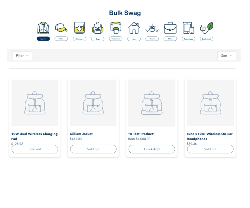
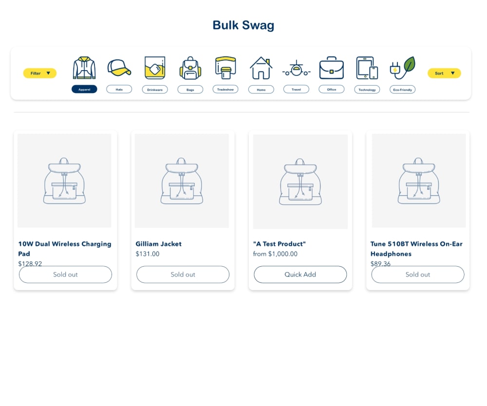
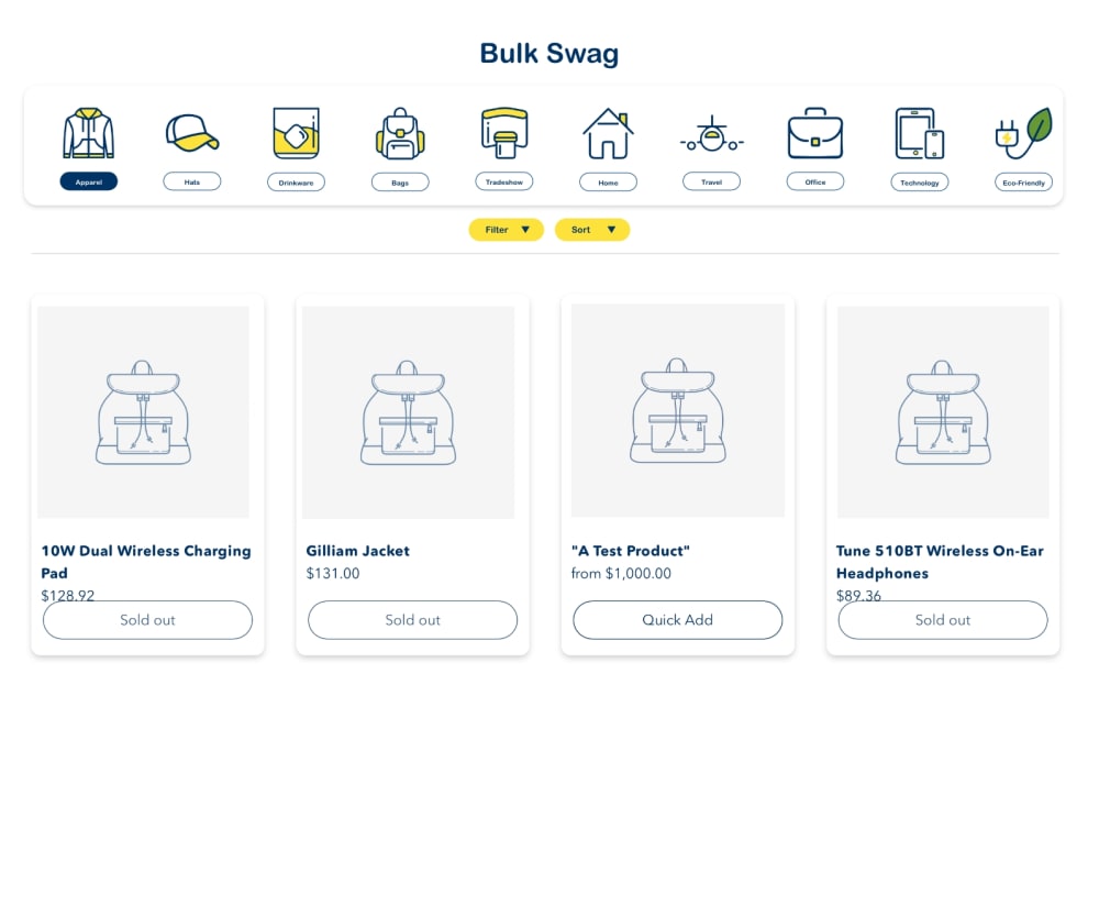
Which collection page layout do you prefer?
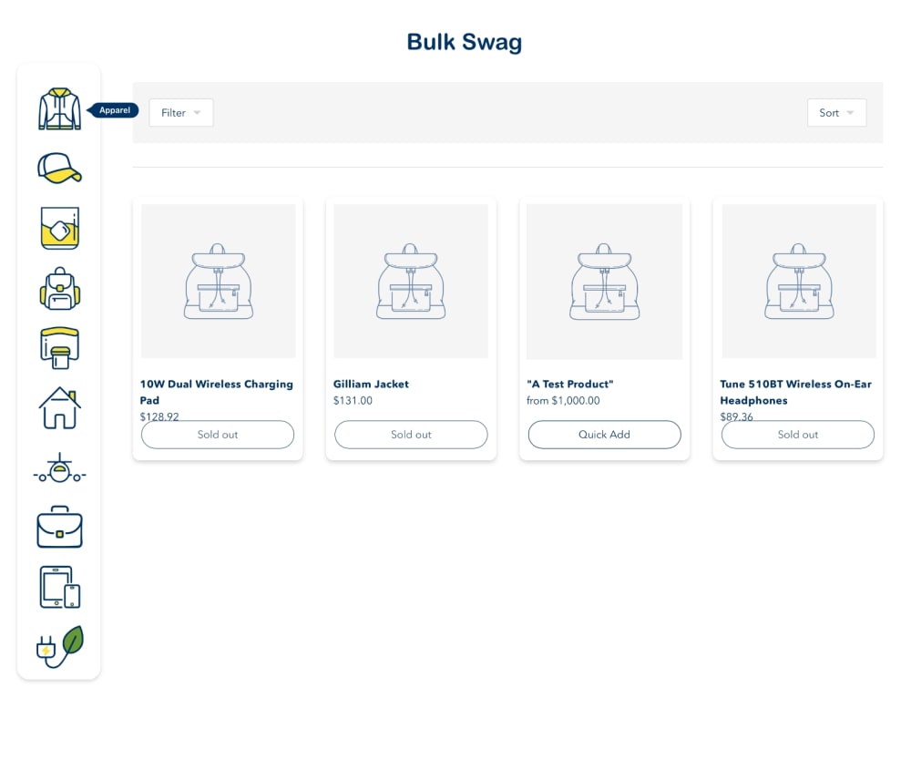
Option D won this Ranked poll with a final tally of 33 votes after 3 rounds of votes counting.
In a Ranked poll, respondents rank every option in order of preference. For example, when you test 6 options, each respondent orders their choices from first to sixth place.
PickFu requires a majority to win a Ranked poll. A majority winner differs from a plurality winner. A majority winner earns over 50% of the votes, whereas a plurality winner earns the most votes, regardless of winning percentage.
If an option does not earn a majority of votes, PickFu eliminates the option with the lowest number of votes. The votes from the eliminated option are reassigned based on each respondent’s next choice. This process continues in rounds until a majority winner emerges.
Scores reflect the percentage of total votes an option receives during the vote counting and indicate the relative preference of the respondents. If there is no majority winner, look to the scores to see how the options fared relative to one another.
| Option | Round 1 | Round 2 | Round 3 |
|---|---|---|---|
| D | 44% 22 votes | 50% 25 votes +3 | 66% 33 votes +8 |
| A | 32% 16 votes | 32% 16 votes | 34% 17 votes +1 |
| C | 12% 6 votes | 18% 9 votes +3 | Eliminated 9 votes reassigned |
| B | 12% 6 votes | Eliminated 6 votes reassigned |
Age range
Education level
Employment status
Gender identity
Options
Personal income range
Racial or ethnic identity
16 Responses to Option A
I prefer the collection page with the menu icons on the left hand side. I believe this is a better viewing and navigational experience.
I prefer option A because having a side bar makes the site seem less cluttered.
I like the options on the side. Makes it easier to click to change.
I have having open spaces on my pages. These are in order of less cluttered to cluttered.
I prefer option A because the icons are on the left side of the page. It looks more organized and clean. It also looks a lot easier to navigate.
A seems less cluttered and user friendly . It seems natural and well spaced. When the icons are small it helps to have them spread out more than normal.
The vertical presentation of the different icons gives a much cleaner look over all that I prefer. The other's feel a bit too cluttered.
I prefer option A because I think that it is the most traditional, intuitive, and visually appealing page layout out of the four options.
I like option A a lot better with the items on the side. To me it is easier to see everything on the side.
I Like the menu selection items on the side not on the top.
i really like the layout of the first one with the icons along the side, i think it looks a bit cleaner and it also lets you see the drop downs easier. if there are more optoins you wont have to scroll as much either. 2 is nice also and i like that the filter is right there under the headings and easy to use. 3 and 4 are not bad, but i think that the layout of the other two are better.
The contrasting vertical sidebar of options makes it much cleaner and easier to read. My 2nd and 3rd choices were because I like how the sorting buttons are bright gold and pop out - couldn't hardly notice them on the 4th place pick, and I prefer them right next to each other since they are both involved in the same function of sorting/filtering.
I think the icons being on the side is pretty natural for a navigation menu and I like the look of it the best as well.
I chose option A because I like that the options are running vertically up and down on the left side of the page.
I prefer A as I like the option bar on the side versus at the top. It is easier to read and you notice the options more having it set up that way.
I like option A the best. I really like the layout. it is very straight forward and intuitive.
6 Responses to Option B
I like the menu on the top rather than on the side, so I ranked A last. I also think the filters and sorting options should be under the main row of items, so I ranked B and D first and second.
I LIKE THE EASY LAYOUT WITH THE TABS ON opposite SIDES. THAT WAY YOU DO NOT GET confused.
Having everything setup across is superior for me and makes it very readable. The more visible the filter button is the better.
Just going by visual. Not sure what this is 100% but it is very interesting.
I like the display clean across the board. It is easy to read and nicely displayed.
The vertical row in A is really unappealling to me. I picked B first because I don't like the color yellow
6 Responses to Option C
I like having the options at the top of the screen like a drop down effect.
C is my favorite because the navigation is the most compact. The arrow buttons being on the side visually represents their action. A is nice because it feels like an application and like I have control. D is my next choice because it is compact, but I feel it is inferior to option C because the navigation menu takes up more space. B is my least favorite because it has the most unused space.
I like the colorful toolbar and at the top of the page.
The top menu bar with the filter and sort works best. Visually it makes the most sense. I would use that for the choice here. That just has the best usability for the menu and is easy to understand. I would go with that as the best choice for this and think it's a wonderful look for the layout.
After carefully studying and comparing all four images of collection page layouts displayed above, I selected Option C as my first preference and the one that I would most likely click on to learn more about. I felt that this image had the most eye catching appeal based on the layout's overall design and color distribution. Option D was my second choice followed by Option B and finally Option A with all four rankings based on my own personal opinion of the relative attractiveness of each layout design.
this is less cluttered and looks nicer to the eye
22 Responses to Option D
I like option D the best because I like that the item categories are arranged horizontally. I also like that the filter and sort buttons are colored yellow and located in the middle right below the item categories list.
I really don't care for C because of the filtering options being in a weird location on the left and right of the navigation strip. It makes it hard to see and I would easily miss it if I were looking to be able to sort and filter down my item search. Option D is good because it is easy to see the categories I can navigate to for items and it is simple to locate the sorting and filtering options. It is highlighted in yellow so it is in contrast and easy to spot. Option B is good too but since it isn't in a high contrast color, it isn't as easy to see. Option A is a little weird with the navigation items being on the left hand side. I didn't feel that one too much.
For A I do not like the side-mounted navbar as it sets the screen off balance. B has a good set of balance but the missing filter and sort buttons do not seem to offer a lot of flexibility. Option C and D are just based on preferences of where the filter and sort bar goes.
i would choose option d as the layout i would prefer with the sort and filter buttons centered in the middle of the page layout
I chose the option D page layout first because the filter and sort options are in the middle of the page and the product categories are on top. I chose option C second because the filter and sort options are on the same line as the product categories. I chose option B third because the filter and sort options are on the left and right side of the page but below the product categories. I chose option A last because I do not like having the product categories on the left side of the page.
I feel D, B and C all are attractive, easy to see and comprehend, and informative
I liked the horizontal layout look the most. I also liked the yellow buttons and found D to be appealing because it’s easier to click back and forth.
The horizontal and vertical design in Option A is not appealing. Option B is also not balanced with the top part not covering horizontally. The filer and sort button in Option C should be together. SO I think Option D is the best.
I like having the images across the top. I like the filter buttons underneath and prefer the yellow buttons to the white ones - they pop more.
I like option D. I like that the navigation is equal to the size of the main screen navigation.
The layout in Option D has a very nice and interesting interface and looks very easy to navigate.
I like Options D & B the Hester. The character lined up at the top makes the layout look balanced and symmetrical. The drawing can be appreciated better and the presentation looks more stylish and attractive. There is also a sense of whimsy that's appealing. The characters on the side just don't have the same impact.
I ranked by which layout was the easiest to read
I like the layout of Option D because it has the filter/sort buttons in a nice "highlight" yellow and next to each other. I like the layout of Option C the least because I don't like how far apart the sort and filter buttons are. Options B & A are both acceptable, but I like D the most!
Definitely prefer the choices across the top and prefer the highlighted buttons - easier to see. Center screen is best.
This is much better as you can see the filter and sort in the middle of the screen and it is highlighted.
Choices D and B are my top choices because everything in the layout is clean as far as the icons on the top and the items on the bottom. I like how the filter button is in between the icons and images so that if I choose to filter the options, it's right below icons. Option a is my 3rd choice because I prefer the icons to be at the top, but the filter buttons are still available in a clean format. Choice is my last choice because the filter buttons are awkwardly placed.
Option D has the "Filter" and"sort" buttons more highlighted and center and the option bar horizontal on the page. I think this is the easiest layout to follow. Option A, with the bar vertical, is more difficult to follow, especially wit the filter and sort buttons so separate.
I prefer the layout of D because it is the most comprehensive and visually appealing to me.
My preference is for the sorting icons to be at the top of the page. I prefer to read websites from the top down instead of having dual scrolling on the left versus the page. Having them at the top enables a quicker decision on which way I might want to go. Also, my top choice has the additional arrow selections right under the icons again enabling to find them more easily and use them more quickly.
Overall I like the options with the horizontal layout (B, C, and D). I like D the most because of the easily locatable sort and filter buttons
They all look very similar to me. I think all four of them are overwhelming and I would probably click away from all of them.
Explore who answered your poll
Analyze your results with demographic reports.
Demographics
Sorry, AI highlights are currently only available for polls created after February 28th.
We're working hard to bring AI to more polls, please check back soon.

