Poll results
Save to favorites
Add this poll to your saved list for easy reference.
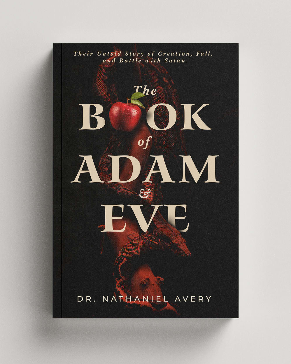
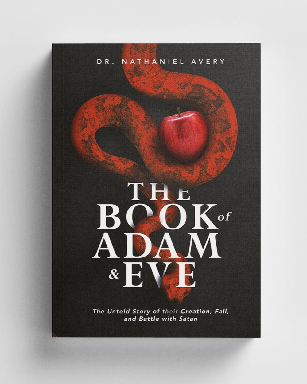
Which book cover do you prefer, and why?
Age range
Audiobook listener
Average monthly book spend
Favorite book genres
Gender identity
Literary preference
Options
Pet owner
Preferred book format
Reading frequency
11 Responses to Option A
The cover seems more interesting with the more abstract.
It's weird but the first thing I thought of when I saw #B is intestines. Then the "O" is sort of hidden, whereas in the other one, it's cool the way the apple becomes the O. Also, I like the larger spacing between the main words in #A.
option a because it stands out to me more and the snake is not as visible, i hate snakes
I prefer option A because the title text pops out more. I also like how the apple is part of the font. I think that the other option is a bit too "top heavy" with the cover picture.
I prefer this book cover, I like the darker color elements used on this cover. I like the apple used in the font.
I chose A because the image/cover art in B seems a bit "too much". I prefer the more subtle art of A, which balances better with the text on the book's cover.
The font and graphics are attractive and appealing.
I like showcasing the apple which is a pivotal piece of the story
it's a lot more creative to use the apple as a letter in the title
I like the less gruesome but still inviting book with the apple on it.
I prefer this book cover much more because it is darker shaded, which makes it better fit with the vibe of the book, making this one feel more intriguing to read.
4 Responses to Option B
Both the title text and the graphic are positioned so that the reader can see and appreciate both clearly, unlike the alternate option.
It's more dramatic and conveys all of the elements of the story. It has the serpent and they forbidden fruit. It hints of evil and mystery.
I prefer choice B because the elements of the story of Adam and Eve are clearly displayed in artistic form on the book cover.
I like Choice B's cover a lot more since it makes both the fruit and snake aspects of the art a lot clearer. The fruit is clear in A, but I can't really tell that's supposed to be a snake. At all. So this one is better designed in that regard to me.
Explore who answered your poll
Analyze your results with demographic reports.


