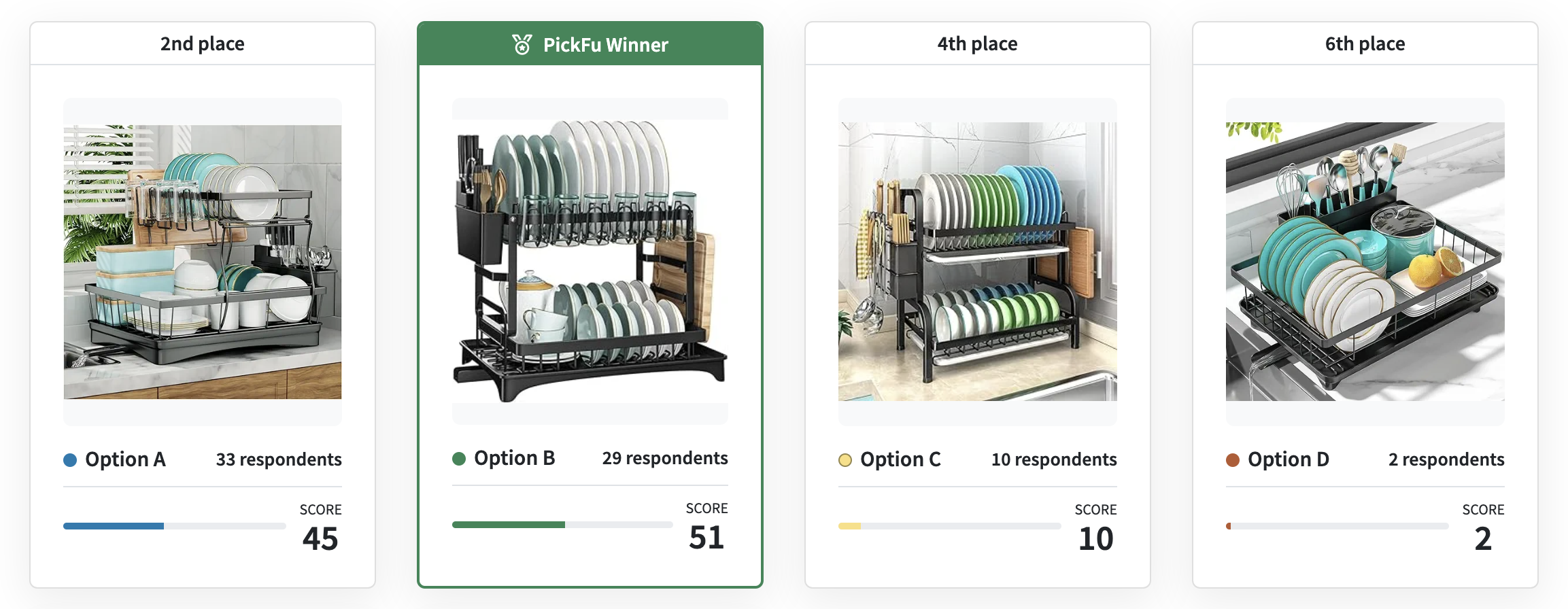
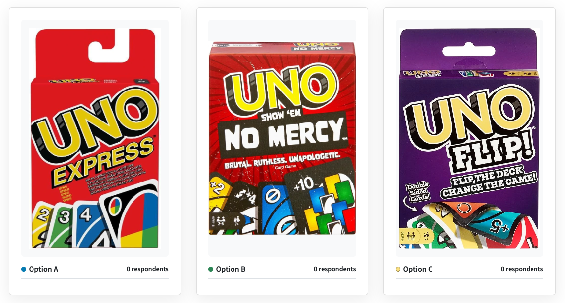
Explore our collection of poll and survey examples to spark ideas for your next PickFu test. See how businesses gather actionable consumer insights on their products, designs, and ideas – so they can make confident, data-driven decisions.
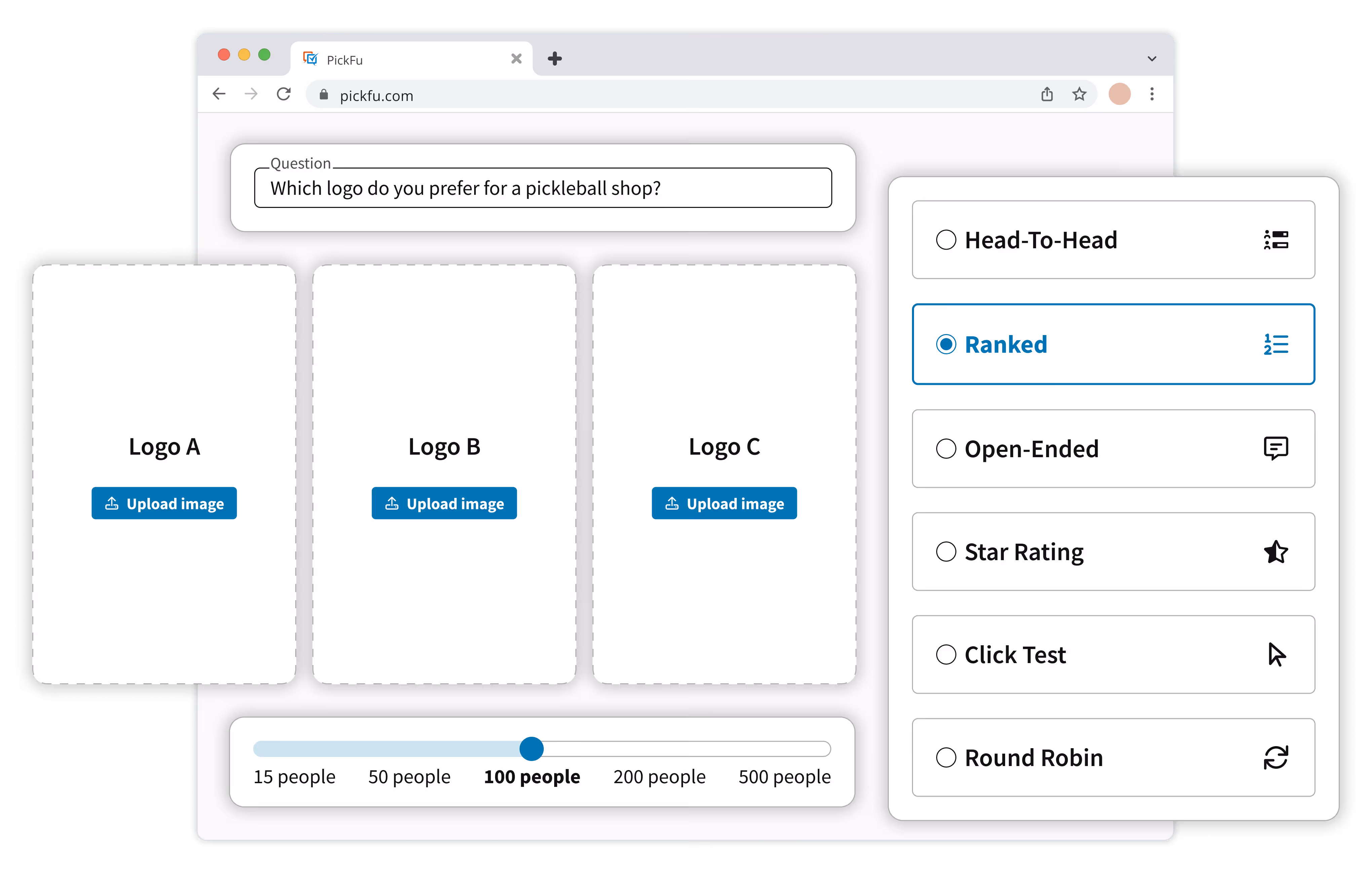
Run a poll and get in-depth feedback from real people in minutes. It's that easy.


.png)