Poll results
Save to favorites
Add this poll to your saved list for easy reference.
Which logo do you like more for a Vitamin Company? Which logo would make you trust company & buy its products?
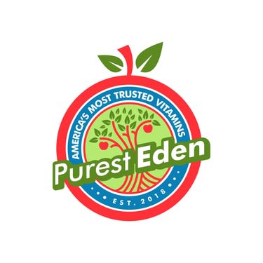

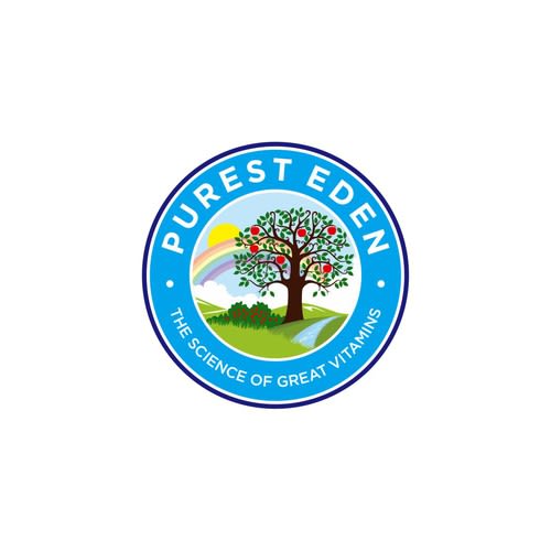
Option C won this Ranked poll with a final tally of 27 votes after 2 rounds of votes counting.
In a Ranked poll, respondents rank every option in order of preference. For example, when you test 6 options, each respondent orders their choices from first to sixth place.
PickFu requires a majority to win a Ranked poll. A majority winner differs from a plurality winner. A majority winner earns over 50% of the votes, whereas a plurality winner earns the most votes, regardless of winning percentage.
If an option does not earn a majority of votes, PickFu eliminates the option with the lowest number of votes. The votes from the eliminated option are reassigned based on each respondent’s next choice. This process continues in rounds until a majority winner emerges.
Scores reflect the percentage of total votes an option receives during the vote counting and indicate the relative preference of the respondents. If there is no majority winner, look to the scores to see how the options fared relative to one another.
| Option | Round 1 | Round 2 |
|---|---|---|
| C | 42% 21 votes | 54% 27 votes +6 |
| A | 40% 20 votes | 46% 23 votes +3 |
| B | 18% 9 votes | Eliminated 9 votes reassigned |
Age range
Amazon Prime member
Education level
Gender identity
Nutritional supplement use
Options
Personal income range
Racial or ethnic identity
20 Responses to Option A
I like the shape of this logo best
I thought that Option A was the easiest to read because the name was so pronounced.
Choice A is larger, colorful and more prominent and stands out and is more attractive. A also states the trusted component of its brand.
A is great. It suggests that this is pure, like fruit. And that's what you want when talking about vitamins, right?
I like that A looks more like a apple.
The color and graphics on Option A are more appealing for a vitamin product.
I like how the option A logo is actually an apple with the stem at the top of the circle. This makes me like it more than the other two options.
i chose the labels that looked the 'greenest' first.
I prefer the options that have more green and blue in their logo's color scheme. Those colors make me think more of nature and that the product is more natural.
the first two logos would make me trust the company more because they seem pure and natural just by the way it looks. I would click on any of these in this order to see what they offer
I liked this one the best because the logo actually looks like an apple. The apple is a nice touch seeing that the name is purest "eden". The words actually are bigger in this option, making them jump out at you. Also, it lets you know america trusts this company!
Love the in-your-face option of A - the apple around the perimeter is a nice touch.
A is eye catching and intriguing.
I like the colors and the size of the A choice. The hand in the B choice is nice, and the C choice is just okay. I'm not really going to trust a company by it's logo. sorry.
I like logo option A the most and I'd be more compelled to purchase its products based on the logo because it's the logo that most emphasizes that it's pure, which means it's probably very good for my body. My second choice is logo option C, because although it doesn't emphasize that it's pure and it isn't as in my face as logo option A, the colors of the logo are very light and more natural looking; it looks good and it looks friendly. My third choice is logo option B, because it doesn't emphasize pure like option A, and the colors are very bold and it looks somewhat unnatural to me for a vitamin company.
Option A was both eye catching and professional. Option C is professional looking, but not very eye catching. Option B is too bright and the color combination doesn't work for me.
Eden and apples.
I like choice A the most because the apple shape makes me think of it more as a healthy product. Then I like choice C the second most because I like the phrase of it being involved in the science of great vitamins.
the name really stands out since it is above/extends beyond the circle, and the little stem at the top is cute
For a vitamin company I chose Vitamin A as the best logo that I would trust to buy its products because the display looks very natural (apple design) and the name (purist) implies purity and goodness in the products. The chose C as second choice because the design is nice and also the verbiage (the science of great vitamins) is very compelling. I chose Option B last because I did not like the color choices as much - it was a little too bright with the reds and oranges together.
9 Responses to Option B
Grabs my attention and looks professional. Easy to read.
I like Option B the most because the design of the hand holding the tree seems very steady and dependable, like the company is holding its customers carefully in its hand. I like Option A next best because the image of the apple tree seems very wholesome and honest. I would trust that company. I don't like Option C as much because I think the colors of the logo are a bit too bright and it makes the company seem like they might not be focused on serious matters like making good vitamins.
The red stands out/the blue is nice but doesn’t catch my eye/I don’t like the stem. The logo is not clean.
I chose these in order of what logo makes me trust the company for vitamin C. Option B is the most professional, serious looking one. I would buy that.
I think B is the most professional looking. When I buy products like this I want it to be serious. While I like the look of A, it seems a little cartoonish and gives me the impression of a company that doesn't take itself too seriously. C is ok, but I think that the text is pretty hard to read and I could do without the rainbow.
I like B the best because the logo is attractive an says what it needs to say about being trusted. I like the design of C a lot too but because it doesn't have the "trusted" message on it I chose it second. I really don't care for A at all. It seems kind of cheesy and overdone.
B is unique, bright, bold, and memorable.
I love the image of the tree in the middle of the sun and the open palm below, and so went with B for a first choice. I also liked the similarly looking C, but that logo doesn't contain the outstretched hand.
This one was tough. As a Catholic, the garden of Eden and the apple are not something that I trust. Catholics believe in Satan, and Satan tricked Eve into eating the apple. Eden was pure before Eve ate the apple_ but after Eden was no longer pure. I chose B because it is a very traditional logo. C is also very traditional but I I do not think that light blue is a good color for vitamins. I like the rainbow on C if it is meant to remind us of Noah and the ark but I fear that it is used instead as a symbol of gay pride. A does not look like a vitamin logo but rather a child's board game logo- it reminds me of Hi-Ho! Cherry-o (it looks like a cherry not an apple). You need to make some more logos and try again. If you want something pure maybe just the garden of Eden but not the apple from the garden of Eden that Eve ate and caused all of mankind to be doomed- requiring God to come down to Earth and sacrifice himself to provide us with the possibility of everlasting life. It is not common for vitamins to have a primary color scheme unless they are children's vitamins. I also think that all 3 of the logos are too complicated.
21 Responses to Option C
The blue is calming whereas the red makes me more alert. I like the calming affect
For some reason the blue looks more trustworthy
I like option C. I really love this shade of blue as it really catches my eye.
the light blue one is nice and eally stands out compared to the rest
I like this logo the most for a vitamin company. This logo makes it appear more legitimate and trustworthy. I feel it looks the most professional out of the choices and I like the word choice of "science" being included.
It was difficult to choose because I do like all three logos for different reasons... I selected option C as my favorite because I like the scene with the rainbox and the apples on the tree. It's very lovely and memorable. Option B is visibly memorable. The sunbeams behind the tree really stand out as well as the red border and the established date of the company. Option A has its merits, too, as I like the look of the tree with the red lines of bark turning into apples. I also like the apple design on the edge and the way that Purest Eden is slightly ajar and wider than the rest of the logo. They're all solid logos and I would use products with any of them.
i like the apple tree best on C but the name stands out better on A
I would choose C first. This one looks the most professional out of the 3. If I am purchasing a vitamin, I would want something that at least looks like it has been around for some time. B, while not quite as professional, still fits this bill. A appears as though it would be for an apple juice container for kids, or apple flavored kids vitamins.
My top choice is simple and more trust worthy. But I do like the other ones so I could easily pick the other ones.
C is definitely the most visually appealing, in my opinion. It's pleasant to look at and clear to read. I also prefer the line "The science of great vitamins" over the lines in the other options. After C, I like the look of B next (I think A looks a bit cheesy), however the line "America's most trusted vitamins" when the company was established in 2018 seems...ridiculous.
I really like the color choice for option C, the blue is really relaxing and calm and the rainbow in the background looks really good
C gives the impression we are solid and our vitamins speak for themselves. A confident brandB is similar to C but I like the colors of C betterA appears to be trying too hard. It gives a sense of desperation.
The tree should be the focus and center.
C I Liked the overall look of the label. It was simple and had a lot of color. / A i also liked was a nice logo to see. / B well I liked it just not as much as the other two
This is really hard to quantify in words; overall it's just personal preference. Red is actually my favorite color but I think the predominantly blue logo is more attractive. Then I went for readability and finally the one that was left. The hand my last choice doesn't quite fit...
i WOULD TRUST THE ONE. i LIKE THE NATIRE FEEL AND THE COLOR balance.
easiest to read, and the colors are easiest on the eyes
Choice C is compelling, the color Blue with rainbow, beautiful tree, and complementary design is appropriate. A isn't bad, I enjoy the apple that composes the border, it's interesting, it MIGHT make you think they sell apples though.
I chose Option C because the color scheme and layout is appealing and pleasant. It looks established and it's in good taste. Option A is colorful and vibrant but looks very new. Option B is a bit dull and stodgy with the colors looking dated and old fashioned.
I like choice C the best. I love the colors of the logo. I love the tree with the sun behind it.
I trust the cool blue of C because it is very peaceful; I would buy from this company.
Explore who answered your poll
Analyze your results with demographic reports.
Demographics
Sorry, AI highlights are currently only available for polls created after February 28th.
We're working hard to bring AI to more polls, please check back soon.


