Poll results
Save to favorites
Add this poll to your saved list for easy reference.
Which logo do you prefer for a CONSTRUCTION business? Our services: ADU's, Outdoor Living Spaces & Full Service Remodels


Option D won this Ranked poll with a final tally of 11 votes after 1 round of vote counting.
In a Ranked poll, respondents rank every option in order of preference. For example, when you test 6 options, each respondent orders their choices from first to sixth place.
PickFu requires a majority to win a Ranked poll. A majority winner differs from a plurality winner. A majority winner earns over 50% of the votes, whereas a plurality winner earns the most votes, regardless of winning percentage.
If an option does not earn a majority of votes, PickFu eliminates the option with the lowest number of votes. The votes from the eliminated option are reassigned based on each respondent’s next choice. This process continues in rounds until a majority winner emerges.
Scores reflect the percentage of total votes an option receives during the vote counting and indicate the relative preference of the respondents. If there is no majority winner, look to the scores to see how the options fared relative to one another.
| Option | Round 1 |
|---|---|
| D | 61.11% 11 votes |
| B | 22.22% 4 votes |
| A | 11.11% 2 votes |
| C | 5.56% 1 votes |
Age range
Education level
Gender identity
Homeownership
Options
Personal income range
Racial or ethnic identity
U.S. geographic region
2 Responses to Option A
This logo clearly shows the letters of the company and one can easily notice and understand what it stands for. With the others, it took a while for me to figure out where the letters were placed, even though they are cleverly designed.
I like A because the logo is eye-catching and clearly incorporates the letters of the business. I consider the "S" to indicate safety -- which is what I want in a construction firm. Chose D second because it was similar to A. I did not like C -- looked like some weird Marvel Wolverine comicbook cover with a face. Couldn't see how that either captured the company name, its business, or safety.
4 Responses to Option B
B and D were my first two choices because they might help you remember the name. A was next and C was last because it looked too earthy/organic a logo for a construction company.
I think B had a nice modern look and you can clearly see the SF in the logo. Option C is modern looking and the SF is seen although you need to look for it. Option D was less modern due to the company name but the logo is clearly modern and SF is interestingly depicted. Option A was interesting but harder to see it more than an interesting design. All good looks but varying ability to associate to the business name.
I prefer easy to read letters, abbreviations that clearly let you know what it's short for, and logos that clearly show what the company is, instead of using unclear graphics.
I liked B because it is a clear logo, and the square appearance fits with the idea of construction. D is second because while not very imaginative, it at least fits the idea of a construction company. C and A do not, so they were last. C looks more like an environmental service corp or a charity. A would be a good logo for an Ecommerce or software company but is completly unsuitable for a corp that deals with physical objects.
1 Responses to Option C
Option C is most memorable and least disjointed. Option C has elements of being something of a object drawing that cleverly incorporates the letter SF. Option A has some of that appeal, but the blocky-ness makes it somewhat less memorable and confusing. Option D is more traditional with the text combined into the logo, but lacks a bit of originality. Option B is my least favorite because it lacks impact and looks/feels fragile.
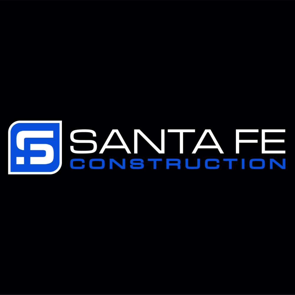
11 Responses to Option D
I like option D the best. I think it looks very fresh and innovative. The logo is very clean and straight forward
I chose Option D because it clearly indicates the name and purpose of the company. With Options B and Option C I can at least identify the letters S and F, though it is difficult in Option C. I don't see any connection to the name or purpose of the company in Option A.
I really liked the full words, Santa Fe, on the black background - that's easy to spot and appears it would be one that people would know over time. I also liked the one that had the S and the F intertwined in the logo - that was my second choice. My least favorite was the one that just had the eagle-wing type of look to it. I don't see Santa Fe in that at all and I think it would get confused with similar type logos.
I like D the best because it indicates what kind of business it is (Construction). Without the word construction - B is a good logo with a prominent S and F. I like C it looks like a leaf and maybe signifies renewal and growth. Option A is my least favorite. It looks more like a maze than anything else.
D is clear and to the point of the business, nice design and colors. C is a nice design but doesn’t convey a point. B is just the letters SF and is boring. A reminds me too much of the SquareSpace logo, don’t like it.
D is by far the clearest - not super artistic but hey, it's a construction company, not a high tech firm or fragrance. Seems most appropriate for the trucks and billboards we'd see it on. B is more artistic, but at least I can make out the letters in the logo. As for C and A - I can barely make out the letter-shaped figures in them. I doubt they would build any brand-associated whatsoever if the reader can't make out at least a couple of letters.
I prefer option D because the name of the company is spelled out and easy to read. It acts as an advertisement piece so people will be able to see the name and remember it, whereas the other logos do not tell you what the name is or what the business is about. As smaller collateral or gift items, the SF logo can be used as a secondary option but doesn't help the company in promoting the name on something that would be seen by clients regularly.
This logo is very simple, to the point, easy to read, simple in color scheme and reads well. It would also be very workable in terms of printed marketing, collateral such as company vehicles as well as the web.
I chose Option D as my choice #1 , because that is only option which gives you some idea what kind of business is it , and the full name of the business. All others options you have to guess what they are about ...
I chose option D as first choice because it states what the business is. The rest do not. Option A was second because it has the company letters and are displayed in a way that represents what they do. Option B also shows the business letters but does not quite convey what the company does. Option C is just a logo, it does not display what the company does at all.
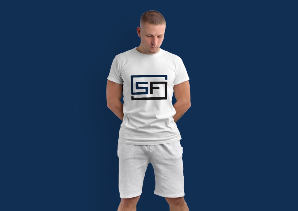
C looks like its for a rock band or biotech companyD, B, A are appropriate because they have the abbreviations for the company name. A is third because it looks more like FS than SFB is second because it looks modern and to the point.D is best because it uses color and says exactly what it stands for and the stand alone logo would be nice on shirts and caps.
Explore who answered your poll
Analyze your results with demographic reports.
Demographics
Sorry, AI highlights are currently only available for polls created after February 28th.
We're working hard to bring AI to more polls, please check back soon.


