Poll results
Save to favorites
Add this poll to your saved list for easy reference.
If you were shopping on Amazon, which baseball card binder cover artwork would you prefer?
There was no majority winner of this Ranked poll after 4 rounds of vote counting. However, Option E and Option B had the most votes (25).
In a Ranked poll, respondents rank every option in order of preference. For example, when you test 6 options, each respondent orders their choices from first to sixth place.
PickFu requires a majority to win a Ranked poll. A majority winner differs from a plurality winner. A majority winner earns over 50% of the votes, whereas a plurality winner earns the most votes, regardless of winning percentage.
If an option does not earn a majority of votes, PickFu eliminates the option with the lowest number of votes. The votes from the eliminated option are reassigned based on each respondent’s next choice. This process continues in rounds until a majority winner emerges.
Scores reflect the percentage of total votes an option receives during the vote counting and indicate the relative preference of the respondents. If there is no majority winner, look to the scores to see how the options fared relative to one another.
| Option | Round 1 | Round 2 | Round 3 | Round 4 |
|---|---|---|---|---|
| B | 20% 10 votes | 26% 13 votes +3 | 32% 16 votes +3 | 50% 25 votes +9 |
| E | 28% 14 votes | 30% 15 votes +1 | 44% 22 votes +7 | 50% 25 votes +3 |
| C | 20% 10 votes | 24% 12 votes +2 | 24% 12 votes | Eliminated 12 votes reassigned |
| A | 18% 9 votes | 20% 10 votes +1 | Eliminated 10 votes reassigned | |
| D | 14% 7 votes | Eliminated 7 votes reassigned |
9 Responses to Option A
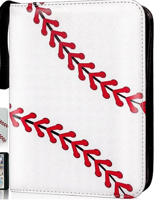
I think A is the most dynamic to me. It feels encompassing, like you're really getting your money's worth, like your cards are inside a baseball. That makes the binder easy to distinguish. B is very nice because it offers dynamic action and looks nice. E is classic, sporting the league logo, so it is similar to A in that respect. C is cute but you don't necessarily know what it represents. D is a bit too destructive and static for me.
I prefer option A because of the simple design and clean appearance. E is also a good design, easily associated with professional baseball. Either A or E would be my top choices, but slightly prefer A. B and C are both good designs but they are not my personal style. C I would consider if I was purchasing for someone else, especially children. I do not like D, the ball appears distorted to me and the design is just generally unappealing.
I like the simplicity of A and E the best. They are a nice clean design. If I was looking for some more stylistic design, I think B would fit it perfectly. It's a nice action packed image. D is interesting also but not sure I like it as much over the others. C is okay but not my choice.
I like the simplicity of Option A, and the design of Option D. Option E is fine, and so is Option B, but Option C feels childish
This is an excellent survey thanks for the invite
The ones that look like an actual baseball are cool, as is the baseball league signature silhouette. The others are kinda silly and might work, depending on the person who will be using them.
I like the more sophisticated and simple designs over the more childish and gaudy ones.
I like the baseball design of Choice A the best, followed by the slightly generic but okay art in Choices D and B. Choice E looks like an offbrand MLB logo and Choice C is garish and awful.
I prefer the two simpler designs. The baseball player one is nice though, and a good runner up. I don't like the baseball photograph one, and the one with the cartoon is my least favorite.
10 Responses to Option B
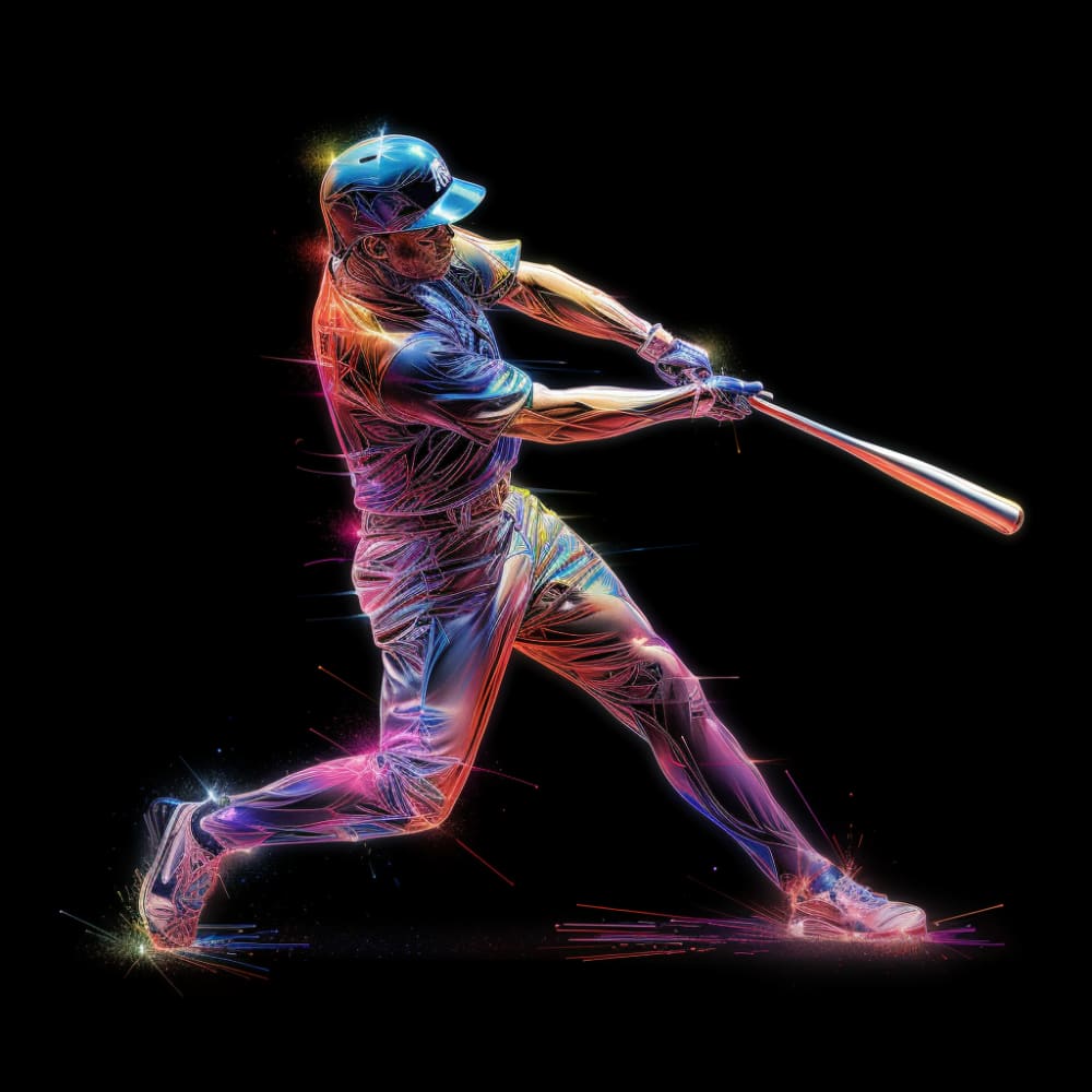
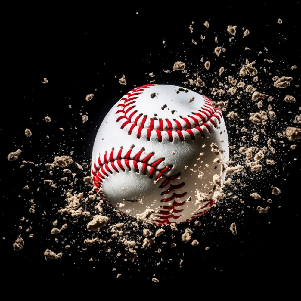
I really like the rainbow holographic effect on Option B. I think that the baseball tearing apart in Option D is pretty striking as well.
I love the art style in B and it very eye catching and can be a good conversation starter. While I also like A and E I do think they are a bit bland and safe in terms of design. C and D look tacky and boring to me.
I love the variety of colors in the logo. I like the picture of a player
i like that this has the ball player taking a full swing and also like the colors.
It is more unique and appealing, it also define a base ball card binder
I love the coloration on option B the most. Options A and E are striking and simple. They also look the most like the product I would be getting according to the photo. I prefer simplicity and accuracy when purchasing online so I would likely compare options B, A and E to ensure I purchased the product with the best quality.
I like the graphic nature of the design and the way it looks I like everything about the picture
I like images than quickly evoke what is inside
I like the design of my first choice, and think it fits my personality the best.
I prefer simple over busy designs. B overall is clean but eye-catching. The other responses are then in order of interest or appeal of their design based on simplicity and aesthetic.
10 Responses to Option C
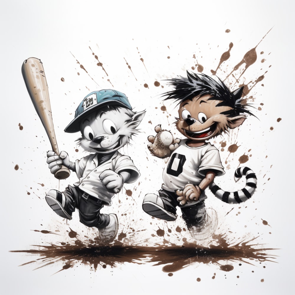
Option C is the clear best option because of the art work on the cover. The boy and the cat with the bat and hat look very detailed. The other options do not look as good and are forgettable.
A is last as this is cute but a bit basic for me. For me, I like C the most as this is cute and feels unique. From there, I like D and B as the artwork looks so amazing to me and I love how bold it is to me
Options C,D and B are really good designs that bring the holder to life and really give an great presentation. Options E and A are bit generic, but still nice.
I ranked it to the way what catches my eye first when schemeing through. For me C is the most eye catching as well being unique. Than B and D are cool shoots of what baseball is. Lastly, A and E were kinda ehhh.
The cartoon characters are diffrent, playing my favorite sport baseball which I collect the most of is funny & cool.....I would love to have a binder like this to put my cards in.....number 2 is still a binder I would like to have, a guy playing baseball is stil pretty cool, the third option a baseball being thrown is not as cool as the first two but is still a binder cover I would be proud to have & show off......Number 4 is just a generic binder cover, a silouette of a player hitting a fastball and option 5is not something that sticks out, its just a plain baseball binding
The option c baseball card binder would be my preferred choice
the design of each logo better defines the answer
I think my first pick is the cutest! I picked the last one because I thought it was a little bit boring.
I really like the cute artwork on option c. To me it would make the binder a bit more fun. I really dont like the baseball with the dirt flying off on it. For some reason, i just dont like that style of artwork.
C is for the kids that are just starting to collect 2 E is more for the baseball fan D is boring and not stylish b is less creative and more for fun. and a is just for the design.
7 Responses to Option D
Option D, C and E are the very suitable binders for the baseball theme and it also looks authentic, excellent design.
I chose option D. I would love to keep my baseball card collection in this book! The artwork is amazing.
I would choose choices D,B and C first because they are more clear and visually attractive to me as compared to choices A and E for me.
The first two selections are the most eye-catching. The next two have a very classic feel.
I like option D the best. It looks like a cool cover. Option A is next because it is also a baseball. Option C I was not find of because it looks cartoonish/childish.
I chose D because I like the Image of the base all, it looks unique.
D is just perfect. dont change anything. its vivid and it almost looks like the baseball has a face. E because Blue is my favorite color and most guys. C could have been second it was hard to choose. the characters look cool. B good. its a man swinging the bat with colors. seems very generic. A is ugly please dont use it.
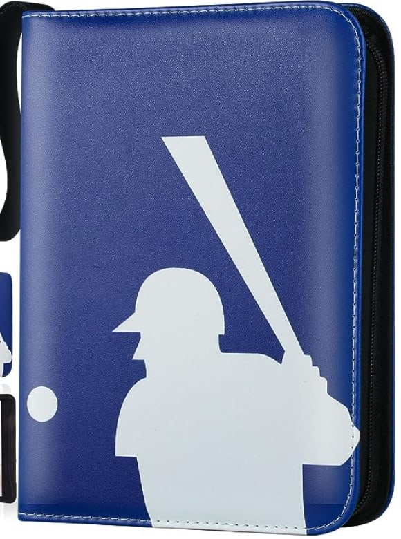
14 Responses to Option E
I like option e the most it reminds me of the real Major League Baseball logo and design and it seems fitting sine I’m collecting Major League Baseball cards
I prefer option E because it is most like the official MLB logo
This logo reminds of my favorite team the LA Dodgers.
I chose E for my first choice because it had simple imagery and it made it obvious what kind of cards I would find inside if it were to be opened. I ranked A as the lowest because it's cover art was very bright and it was offputting to me, making it the least attractive choice.
I like the zipper attachment as well as the blue leather covering
I feel the silhouette of the batter would appeal more broadly while I personally favor the cartoony animal players.
I like the simple and classic look, it reminds me of collecting when I was younger
i like option e has the best details so i know its about baseball i love ghe blue color also
I love the Major League Baseball logo on the front of it.
I prefer the traditional icons of mlb logo which the first two greatly resembles compared to rest
I chose this option because I think the logo looks the cleanest and the best choice of the options
I like the binder to be about baseball, but I don't want it to be outright showing players in action or even cartoon characters.
I'm 44, so options B & C are a little too kid-like for me. Options E & A look like they'd be on a nice quality binder. Option D looks nice, but it would be better to see it mocked up on an actual binder.
I would pick Option E first because it is the most simple and visually appealing binder cover to me. Option A would be my next choice also because of its large/total use of the cover with its simple design. Option B was my middle of the road type of choice because I think the artwork looks nice, is appealing to look at, while the design is also fun yet relatively simple (with just a baseball player in center frame, nothing else to look at). Option D was my next choice because while it felt visually somewhat similar to the option before (B), but since the baseball is either in motion/splintering, there's so much action and motion to look at, it starts to look too busy for my taste - so I obviously preferred all the simple designs first. Option C was my last choice because it also looks pretty busy, but also mainly because I'm not familiar with either of the two characters on it and that severely limits my interest in this design.
Explore who answered your poll
Analyze your results with demographic reports.


