Poll results
Save to favorites
Add this poll to your saved list for easy reference.
If you were shopping on Amazon, which product will catch your attention and make you click to learn more about it, and what caught your attention to click it?

There was no majority winner of this Ranked poll after 2 rounds of vote counting. However, Option C and Option B had the most votes (25).
In a Ranked poll, respondents rank every option in order of preference. For example, when you test 6 options, each respondent orders their choices from first to sixth place.
PickFu requires a majority to win a Ranked poll. A majority winner differs from a plurality winner. A majority winner earns over 50% of the votes, whereas a plurality winner earns the most votes, regardless of winning percentage.
If an option does not earn a majority of votes, PickFu eliminates the option with the lowest number of votes. The votes from the eliminated option are reassigned based on each respondent’s next choice. This process continues in rounds until a majority winner emerges.
Scores reflect the percentage of total votes an option receives during the vote counting and indicate the relative preference of the respondents. If there is no majority winner, look to the scores to see how the options fared relative to one another.
| Option | Round 1 | Round 2 |
|---|---|---|
| B | 32% 16 votes | 50% 25 votes +9 |
| C | 38% 19 votes | 50% 25 votes +6 |
| A | 30% 15 votes | Eliminated 15 votes reassigned |
15 Responses to Option A
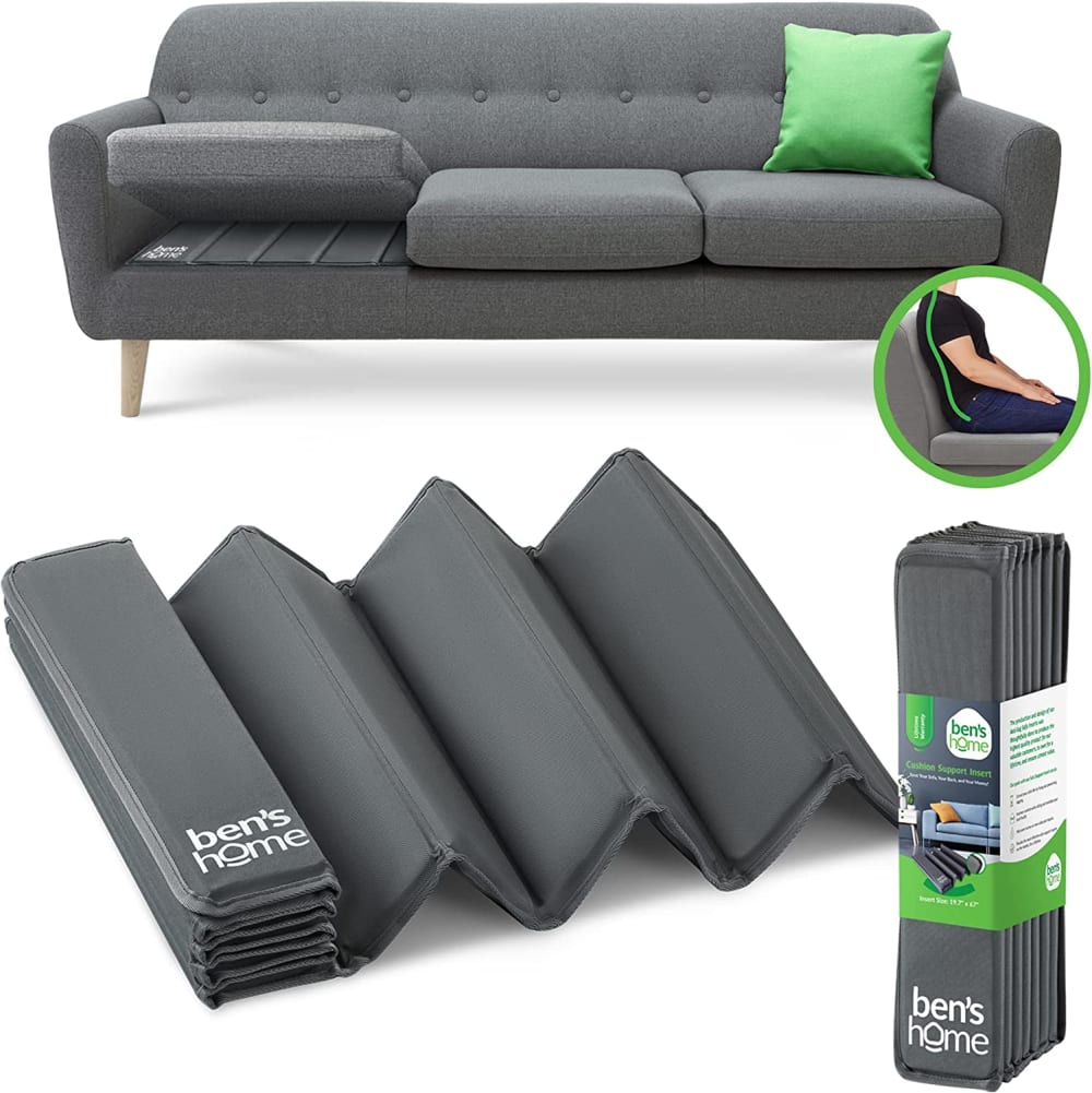
A shows it being used in a practical way.
Showing the lifted cushion gives an idea of what the item is used for in a home setting in choice A
A does the best job of showing the product and its uses.
I like the visual of a person sitting on the couch in A. B is more descriptive than C. C doesn't really give the appearance of how it works.
I ranked them this way based on color and design.
I would click on this option because it shows that it not only supports a sagging couch cushion but also helps with back support.
A shows the product in use and is visually pleasing.
option a shows what the product would look like underneath your couch and is very nicely presented . option b draws the eye to the ad due to the yellow couch but doesn't show the product in use which i think would help a lot with me wanting to click on it option c is nice but it honestly feels a bit cut and paste for a picture as if someone just threw it together and said that was good enough for them , while it does show what the product does there aren't enough details in the picture to make me want to check it out
The look of the sofa and the look of the product is what made the first option I picked appealing to me.
I like the style of couch better. Interesting to know how this works and how durable it will be. I also like the color better.
The colors grey and green in this attracts my attention first. Tough I like the color orange, I don't want it in my living room furniture. It would be even better if the couch was in a pink motif with a green or black pillow
While the use of color in both A and C catch my attention more than B, "A" keeps my attention with the simple illustrations of what's included and why!
i chose this one because you can see it shows a picture of someone back being supported with this product
I chose A first cause it would fit my current couch. C would be too long for my couch. Bis too small for my couch
It caught my eye of the color green . I love this color
16 Responses to Option B
With the image of choice B, its showing me that it's for the couch so I would purchase based on the image. Choice A shows slightly it's for the couch but not as detailed as choice B. No clue choice C is for the couch so I am passing on this choice.
You can more easily tell from this image exactly what the product is and what it is used for.
i really like that choice B and A both show the product with the couch cause then i feel like it explains what it is actually used for better and you understand how it works better. the photo of the couch is what made it stand out more to me and the box in choice B
I like getting to see the actual product being used and what it would look like.
I like how the first one literally has couch support right in the image, so if this was something I just ran across then I would at least have a vague idea as I go on to click and learn more.
B has the best illustration and demo of the product being used. C is terrible sorry. A is OK but not as clear as B.
Option B gives me a better idea of what the product is used for. I would probably click on that one first and then option A because the couch cushion being lifted gives me a clue as to what the product is for as well.
B shows what the product is and how to use it, the most clearly
The reason why I choose option B is because I like how they show how to uses this product and what this product looks like when you take it out of the package. The reason why I choose option A is because I like how this product looks so comfortable when you sit down on it, and I also like how long this product is when you open it up. The reason why I choose option C is because I like how they have this product in different colors, and I also like how this product can fold into a couch when you pull it out of the package.
Looked like something i would use.
It’s a simple couch support good for a sagging couch
I can actually see what the product is and what it does.
The packaging tells me what I am looking at without having to guess and search.
It showed what the product actually was. I couldn't until I read the packaging
I liked the words “couch support” on option B. It looked smaller than the other two and I have limited space in my apartment.
I don’t need couch support, but these look nice and firm. I decided to choose based on couch color.
19 Responses to Option C
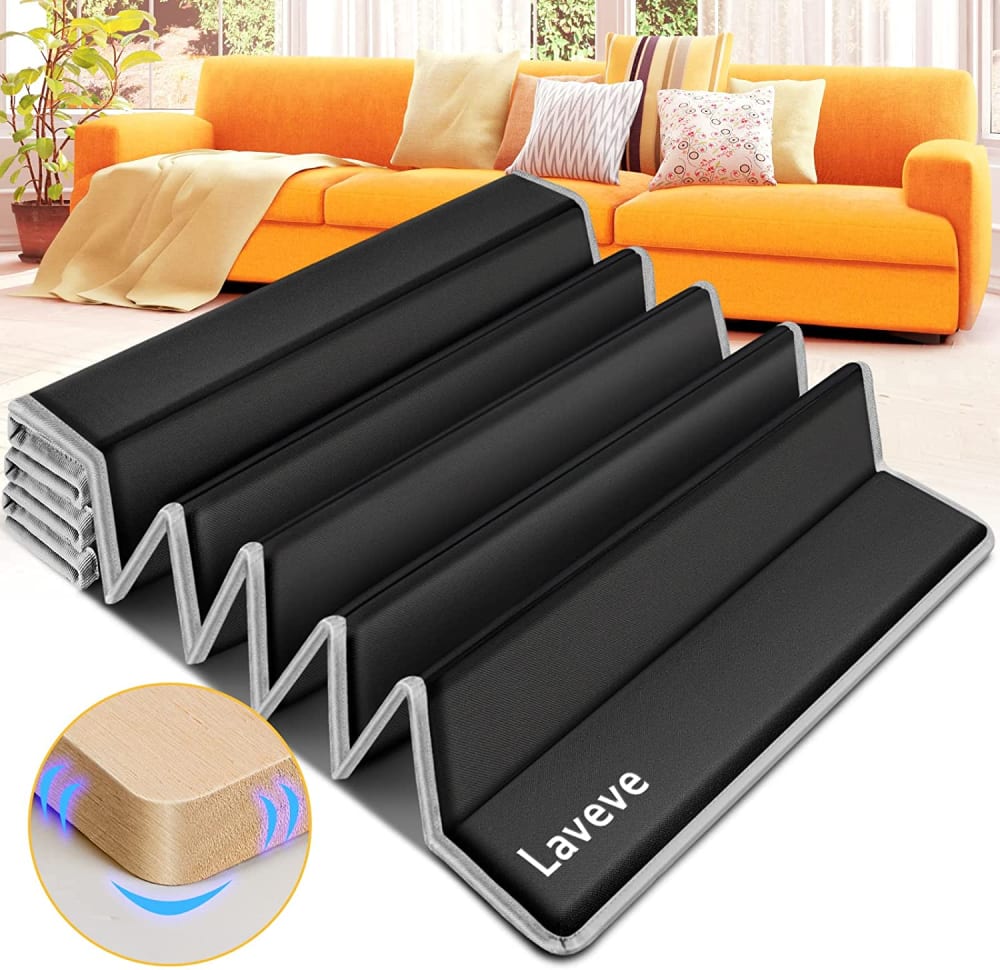
I would combine C and B. The orange couch with the product label showing, as in B.
stands out as being the best option for me as it shows all the features and benefits for me and how it can be used
C would for sure catch my eye because it looks interesting. A looks interesting to so I would probably check that one out as well. B just looks bland and not very durable so would pass on that one.
I picked C first because I would want to click on this one to learn about what the image at the bottom left means. It looks like a piece of wood and I'm guessing it has something to do with it staying in place because of the lines around the edge, but I'm not positive about that, so I would want to find out more about what that image means and why it's beneficial to have in this kind of item. A is second because I like the thickness this one looks to have and I like that it's shown on a full length couch because that would probably come with more pieces/section for a couch than one like B which is shown on a love seat. B is last because this product looks thinner and it's only shown on a loveseat so it might not be enough for me if I need this product for a full length couch. The way it's folded also makes it look more flat or less supportive so that's why I would click it last.
The couch support looks big and inticing and I just want to see what it about with the first one.
It displays the whole living room. It places the product as part of the living room.
The placement of the products is more interesting in option C.
I think that option C with the item way out in front. The other two look like the main item is the sofa, and the support thingie is just a feature of that sofa.
C caught my attention first because of the bright orange sofa. B makes it very obvious what the product is and how it works.
While browsing on Amazon for couch support options, I was immediately drawn to option C. The vibrant colored couch in the background caught my attention, making the product stand out. The listing also featured a detailed display of the product and included an image showcasing the supportive cushion.The second product that intrigued me was option A. Similar to option C, the image prominently displayed the product and showed how it provides back support to the user. This visual representation helped me understand the functionality of the product.In contrast, I did not choose option B because its image appeared bland and lacked contrasting colors. The packaging only provided the name of the product and its purpose, without offering a clear visual depiction. The padding seemed less thick, and the small sofa in the image appeared to lack cushion springs.Overall, option C and option A stood out to me due to their attention-grabbing images and informative displays, while option B fell short in terms of visual appeal and clarity.
The first caught my attention with the orange couch and weird looking product, I would have clicked just to see what it was, but the other two were better descriptions in the photos.
a much more colorful and eye catching picture
The picture shows the product well. Being the color of black, it shows up real good.
The style of couch on option #1 caught my attention and also type of support looks different.
The colors stand out in that picture that makes the picture more noticeable
Option c is more colorful with the orange couch. Option a is more descriptive than option B.
Chose this because black caught my eye. I need couch supports as I’ve had mine for over five years
The bright color caught my attention that’s why I clicked on it
A bit more eye catching color in choices in options 1 and 2, then 3 was the only remaining choice.
Explore who answered your poll
Analyze your results with demographic reports.

