Poll results
Save to favorites
Add this poll to your saved list for easy reference.
About the brand: "High-value food brand. Simple and pure as straight from nature with heavenly taste.". Tagline of the brand: "Make your taste buds fly". Which Logo do you think the fitest one and why?
Option A won this Ranked poll with a final tally of 29 votes after 1 round of vote counting.
In a Ranked poll, respondents rank every option in order of preference. For example, when you test 6 options, each respondent orders their choices from first to sixth place.
PickFu requires a majority to win a Ranked poll. A majority winner differs from a plurality winner. A majority winner earns over 50% of the votes, whereas a plurality winner earns the most votes, regardless of winning percentage.
If an option does not earn a majority of votes, PickFu eliminates the option with the lowest number of votes. The votes from the eliminated option are reassigned based on each respondent’s next choice. This process continues in rounds until a majority winner emerges.
Scores reflect the percentage of total votes an option receives during the vote counting and indicate the relative preference of the respondents. If there is no majority winner, look to the scores to see how the options fared relative to one another.
| Option | Round 1 |
|---|---|
| A | 58% 29 votes |
| C | 22% 11 votes |
| B | 20% 10 votes |
Age range
Education level
Favorite book genres
Gender identity
Hobbies and interests
Interest in cooking
Options
Personal income range
Racial or ethnic identity
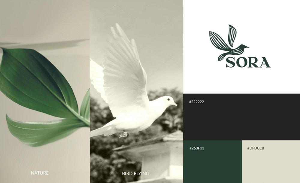
29 Responses to Option A
Something seems super high class with the limited color palette in A though its close to C to me in quality. I like the feeling of straight from nature for something with the bird design. A seems cohesive as well as C. A just seems the most outstanding in terms of design. I really understand where A is coming from with the unique impression it gives. The lack of cohesiveness in B is getting me down even though it is quite earthy. There's no particular impression for me.
A was my first choice because I like the white dove. Doves make me think of peace and purity so I think this would be a high quality and well made product. B was next because I like the colors. C was last because it seems to be too dark of a color scheme to represent pure natural products.
I think the buzzword 'heavenly' fits well with the white dove, and A looks more high class. I don't mind the sepia tone of C, and I just dislike most of B.
I would prefer A the most out of all options. I think I could resonate with A the most as the other two might seem a bit unrelated to a food brand, thus might ineffectively convey their central messages. The overall layout for A makes me feel like the brand is natural and is free of harmful ingredients and chemicals, in which I would feel safe consuming it. With that being said, I do feel like the color scheme for A could be a bit more vibrant in order to be more eye catching and compelling.
I feel like A is the best fit because the logo looks nice, stands out, and looks like a food brand's logo that matches the description. I also like C but it reminds me too much of Nestle's logo for some reason. B doesn't look like a food brand at all so I ranked it last.
I chose this because it best fits the branding lines above. The colors match well, and doves best relate to heavenly topics. With 'sora' meaning sky in Japanese, this is very clever, and to have a known bird type that flies high in the sky does it justice.
option A looks the most clean and natural, the other colors are a bit dirty and off-putting. option B has too much going on in the color pallet. the green in option A is straight forward, sleek, clean and trustworthy.
for this kind of high value brand for me option A does the job of sending a message through images the green and with just catches your attention ,The Sora logo with the bird in the green gives out a feeling of an adventure and makes you want to explore more about the brand.
This was a little hard but I thought the leaf that was also shaped like a dove was creative and fit really well- so I went with A. was a close second because the colors are nice and the bird fits nicely into the logo.
I don't have a strong preference. Any could work. I liked the colors and bird flying rather than standing.
I think A fits best with "pure" and "heavenly" to have the all white bird, and I think that the logo is easy to read and see. I think that b is nice but the birds don't match quite as well with the text. I think that C is okay, but the logo/name is harder to read and the birds don't seem as majestic.
I chose Option A as my first choice because I think the logo is simple but classy, and I could imagine it being related to food, which I think is important for a food brand. I chose Option C next because I could also see it being used for a food brand, but the more intricate detail makes it a bit less immediately recognizable as a bird. I chose Option B last because the logo doesn't make me think of food at all - it looks more like a banking/financial logo or insurance-related.
The color scheme and the white bird are more 'pure' and wholesome to me. I like the addition of the plant in the graphic, it speaks more to food than the others which are just birds. I like C better than B because I feel that the logo and the hawk on the far left fit the tag line "make your tastebuds fly" more.
A's logo composition comes closest to what I expect from a food brand. C looks like furniture and B looks like an airline. B has the best colors, the other two are too monochrome.
Choice A is the best of them, with the dove - it has more of a call to the brand logo - heavenly with the dove. It is clean and pretty and suits the tag well. Choice B has a better aesthetic but doesn't suit as well as a, and c is a bit... off, in my opinion. It looks a little dusty, and not like food I would purchase.
I would say that option A fits the most with the brand because of the images and the colors. It has a leaf for nature which would be closer to a food brand than just bird images. It has an image of a bird flying that goes with the tagline of tastebuds flying. The white bird goes along with the heavenly part of the tagline. The other two options only have bird images which go with the brand but not necessarily would think of it as a food brand as much with just bird images.
Option A is my first choice because when I see the dove I think purity. I also like the color palette with the green. B is my second choice becuase I think that the bird is striking and I would want to take a second look. I also like the green and brown together. C is my last choice because I feel like the all brown with no contrast is drab.
none feel like a food brand, but A at least has something that's a little more abstract (the leaf). I do not want to eat a songbird, and those are depicted prominently in option c and b.
I picked A first because it seems to go the best with the brand having a "heavenly" taste. The peace dove has that look to it. I like choice B the most because of the colors and how realistic it looks. Choice C is also really pretty, but I don't like the SORA label as much, and it maybe doesn't fit the product as well as the other two options.
Option A has the best color palette relating to food. The green makes me think of plants and organic produce, more food related than the other two choices. The bird doesn’t cover name, like other option.
Option A looks most sleek and well thought out, whereas the colors in the other are unprofessional looking.
Option A fit the brand the best because the white bird represents elegancy, simple and pure. Its an automatic draw to the brand and tagline. The second option was not as good as the first because the bird does not represent the words as good and the 3rd option represents the words the less.
Dove is the most pure, and the leaf means natural. For B, would the bird's head actually be cut off? I assumed not, so I chose that one because it incorporates brown AND green. But if it will be a headless bird as shown, then I'd choose C over B.
A has the most natural look and the bright white of the dove screams pure. I ordered B and C based on how natural I thought the color of the birds looked.
I chose A as my top choice because with the reference to simplicity and purity, I thought white would be a fitting color. In addition to it being associated with heavenly and religious undertones. B was my second choice a the color scheme and representation seemed more appropriate than C.
Option a look at the nicest I like the color scheme and it’s a very modern and pretty and clean
I ranked these in order of how much the logo conveys flying. Option B did not look like a bird flying at all, while the logo for options A and C did clearly depict a bird flying which fits with the tag line of the brand.
option A is the best because each image is either of a bird in flight or elicits the image of a bird in flight, I feel like it gives a cohesive vibe for the brand.
I like A best because this image incorporates both the "straight from nature" with the leaf and the color scheme and the tagline about flying by having the flying bird. Sine B and C only have birds in the image they don't get across the "straight from nature" idea. However, I think the color scheme from B is the best option because it makes me think of the brand as natural and pure more than the other 2. I think combining the design from A and the colors from B would make the idea come across best
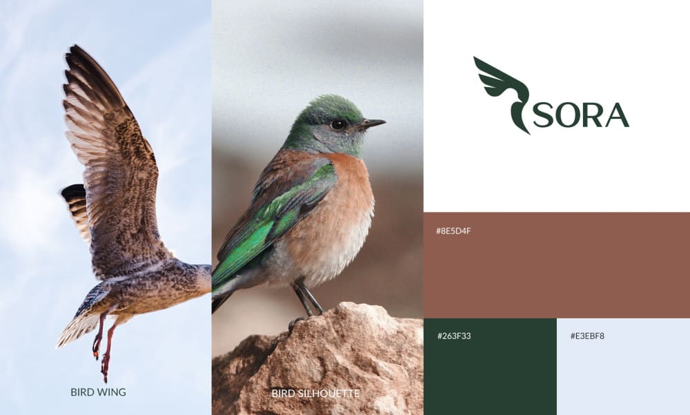
10 Responses to Option B
I ranked Option C last because the the all-brown color scheme evoked feelings of dry dead dirt, rather than the lively heavens of the tagline. Option A was ranked second because while the green in the color scheme evokes the heavens, the white dove is a symbol of death, something I don't want to associate with food. I ranked option B last because the inclusion of green pleasantly invokes the heavens, and the pleasant-looking birds give me good, nature-related associations.
I put the images in B,C, and A order. I really like B and C. I think they're both fitting. I think they match very well. The colors look amazing and match well.
I like option B the colors here look dynamic and energetic. Option A's colors look a bit sad. Option C doesn't seem to fit for bird food.
This logo has more color and is more vibrant and goes well with food more because you want more color and less blandness.
The birds are cute, and I like the colors of options B and A. C is a little too plain.
i like option c because the logo only has the wings. I think the whole bird would make it seem like a product for birds? It is also the most symetrical and catches the eye
I like B's color pattern the most and think that the bird in the image best represents the tagline. C's colors are a little too bland.
B_I love that the first image is of a bird flying, I think it fits great with the theme of "let your taste buds fly". C-I picked this one second because i prefered the color of the bird in image B more than the coloring of this bird. This bird looks kind of dull. A- I did not get the "let your taste buds fly" vibes from this image.
Option B feels the most simple and pure to me. It isn't filtered, it's just pure pictures of the birds and sky. I like the others as well, but they feel dulled in comparison, mostly because they are literally dulled.
I chose based on the type of birds. B has a duck and not sure of the other type, A has a dove and C has a pigeon.
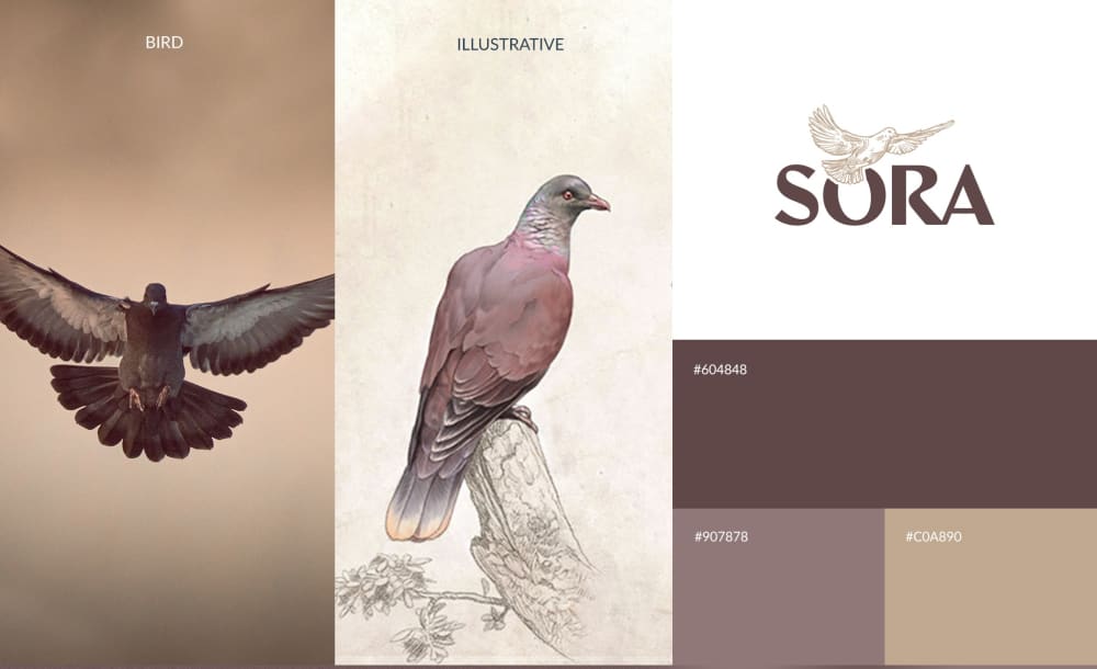
11 Responses to Option C
I like the bird logo in A best because I like the thin linework in the bird. I also like that it is delicate and light. I like C because the colors are simple. I think the colors in B do not go together well.
I really like the bird and the color combinations on option C.
Although I like the logo of option b. The color pallet and bird of option c make me think more of the wild and natural aspect of the brand more.
I personally really love seeing the bird icon as it grabs my attention and just feels so elegant and beautiful for me. That is why C is ranked first followed by A. B is last because there is no bird. I like C more because the color of the icon is so pleasing for me.
B’s brown hues did not look appetizing. C looked the most fresh and vibrant.
B kind of looks like an airline or something. I think the design and colors of C give off more high quality, elite vibes. I like the overlapping of the bird on the words, it adds some nice depth and makes it look more cohesive.
I like C the best because I think the pictures fit the tagline and logo the best since the bird looks the most majesty of all of the three. I like A over B because A has better pictures of birds and I do not like how the picture along the logo for B only has a bird head.
I like the overall colors the best on C. I also like the colors of A and B it just doesn't grab my attention as fast as the other one
When I think of the word "Heavenly" I think of being at peace. My first ranked photo choice looks very peaceful to me. The white bird looks peaceful as well.
The color scheme in C looks the nicest and most professional (it has a very classy feel!) I think the wingspan of the bird on the left really resonates with "Make your taste buds fly" the most because it looks the most like powerful flight. I don't think the little robin in B or the dove in A is very fitting with the brand idea.
The green for a natural product is overdone to me, and the bird image doesn't really fit the content being marketed. The neutral palate in C is easiest to look at while still being interesting. I don't mind the color palate in B, but the color palate in A feels contrived.
Explore who answered your poll
Analyze your results with demographic reports.
Demographics
Sorry, AI highlights are currently only available for polls created after February 28th.
We're working hard to bring AI to more polls, please check back soon.

