Poll results
Save to favorites
Add this poll to your saved list for easy reference.
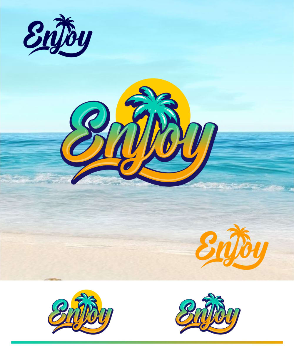
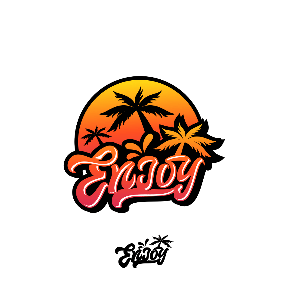
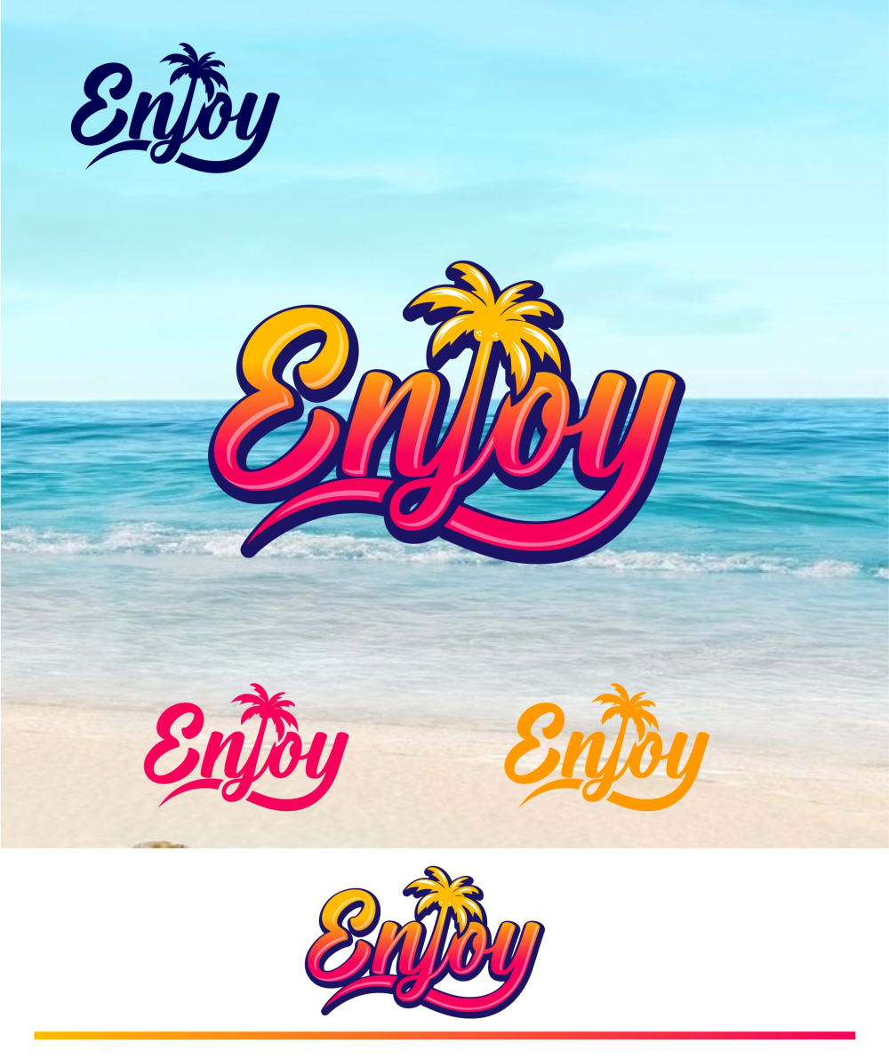
Based on the logo, which one would you trust to purchase from? (Enjoy is a brand that sells beach accessories such as beach blankets, beach bags, beach towels and more)


Option A won this Ranked poll with a final tally of 29 votes after 3 rounds of votes counting.
In a Ranked poll, respondents rank every option in order of preference. For example, when you test 6 options, each respondent orders their choices from first to sixth place.
PickFu requires a majority to win a Ranked poll. A majority winner differs from a plurality winner. A majority winner earns over 50% of the votes, whereas a plurality winner earns the most votes, regardless of winning percentage.
If an option does not earn a majority of votes, PickFu eliminates the option with the lowest number of votes. The votes from the eliminated option are reassigned based on each respondent’s next choice. This process continues in rounds until a majority winner emerges.
Scores reflect the percentage of total votes an option receives during the vote counting and indicate the relative preference of the respondents. If there is no majority winner, look to the scores to see how the options fared relative to one another.
| Option | Round 1 | Round 2 | Round 3 |
|---|---|---|---|
| A | 36% 18 votes | 40% 20 votes +2 | 58% 29 votes +9 |
| C | 32% 16 votes | 38% 19 votes +3 | 42% 21 votes +2 |
| D | 22% 11 votes | 22% 11 votes | Eliminated 11 votes reassigned |
| B | 10% 5 votes | Eliminated 5 votes reassigned |
Age range
Amazon Prime member
Education level
Gender identity
Options
Personal income range
Racial or ethnic identity
Travel frequency
18 Responses to Option A
I liked the color scheme for option A the most. Option D, was good too, but I liked the more blue look to A more. Option C, I thought was okay. I wasn't a big fan of the hot pink as much. Option B, I ranked last because I didn't like the font style as much.
option A: is the most interactive, lively, and full of character, I like that the enjoy word does not distract from the theme of the ad. pleasant to look at making me want to go the beach.option D: much like A its pleasant but the placement of the word enjoy seems out of balance and a bit disruptive in design does not look cohesive.option B: i like the color schemeoption C: boring and something that can be found in a stock library. lacks personality and character.
I like the logos that actually show the beach the best. It would make me think that their accessories and items had to do directly with the beach
This logo reminds me its for beach products
I like A the best because of the colors; I like the font of the lettering and the orange/greenish blue matches the beach aesthetic well; D is second because of the lettering/font, which is the same as A; C is third because it's similar to D in the coloring, which is nice, but the style is different, albeit fun; I dislike B and ranked it last because the font is almost unreadable and I don't like the color scheme.
Option B is a little too animated for me. I like the beach background in Options A and D. I also like the simplicity of Option C.
The colors on C and B got increasingly dark and just reminded me of a bad sunburn. I loved the lush blue background for A and D as that felt more beachy and summery. I also liked the sun in the background of A as that brightened up the image.
this one looks the most beachy with the blue background and the green and blue coloring
I really liked the logo in C, but the beach background and color combination in A was nice and better.
love the beach background and feel the blue in the logo fits best with it, like the beach background in d also, feel c has a better color scheme and pops more, b is boring
A: classic colors and vibes for a beach theme. D: classic theme but with updated colors. C: I like the palm tree connected to the word Enjoy better than the palms in the background. B: the palm trees look like marijuana leaves here.
B is very difficult to read and is very graffiti reminiscent.A is clear, unique and shows right away what the product is for
More appealing colors and representative of water and sand.
I like my top 3 choices the most. B looks okay, but not as interesting to me.
My top option has more beachy colors
I liked A the most because of the colors, they really grabbed my attention from the start I also like the background. D has a similar style but I i like the colors of A better thats why I placed it in second place. B and C have nice fonts and colors but the background is boring.
I like A and D the best, with A first just because I like the blue more than the red. B and C are both significantly worse in my opinion because they are not very readable. They are legible enough that I can figure it out if I look at it long enough but neither immediately read "Enjoy" to me. B looks like "Endoy" and C looks like "Evioy" and because of that, I wouldn't bother checking out that company. I would trust the first two.
The background is inviting and stimulating. The design image is sensuous and fun.
5 Responses to Option B
I like the design of B the best. It's very unique and I love the colors
Such a cool design. Blow it up so we can see it. I also like the colors of the other options as well.
I like options B and C because they are simple and do not have the beach scene behind them. The beach scene interferes with the logo design.
Options A and D feel overwhelming to me, I see so much of the logo all over the photo and it's a bit much to process. Option C is almost flat and one dimensional, and I would like to see it with more differences in it. Option B is the least overwhelming and most engaging option because of the shadowing and outlining to me.
I don't know that I really like any of the logos, but if I had to choose I find simplicity is best so I ordered my choices in what is the most basic and easily accessible to view
16 Responses to Option C
I like the colors of C and D the most, but C's font is a bit more fun.
I picked option C because I liked the color and how the palm trees looked in the background. It was bright and inviting. This would be the logo I trust to purchase from for these reasons.
A and D, since they have a logo all over the place, look wildly sketchy.
I picked these options in this order according to which one had the best overall design and layout. I chose the best color scheme
I don't like overly busy logos, so options A and D were out and just ranked on my personal taste in colors. Option C ended up beating Option B just because it's a clean design and I think the brand name is easily readable.
I like C the most. I think that the color pallet is the best. It reminds me of a beach sunset so I definitely think that it works for beach wear logo
I picked C because it was the only logo that contained the company name once, which made me feel that the company wasn't trying so hard to attract the attention of customers. I tend to discount companies with logos that are too bombastic and flashy and think of them as generally being less reliable. Logo B only displayed the "Enjoy" logo twice, and did not seem quite as ostentatious as either logos D or A. I thought that D was slightly more trustworthy than A though only because the formatting of the "Enjoy" logos looked off on choice A with two of them stacked on top of each other in the lower right hand corner.
C is simple and clean, I love the look of it and the colors remind me of a sunset. A is nice too, reminds me a bit of a Pina colada, just tropical vibes in general. D is similar to C but not as clean and crisp, so I prefer it less. B just doesn't look right and is my least favorite.
I like the color combo the best, it is clean but bright and vibrant
B makes the company look sketchy to me for some reason. I like C the best because it's bright and straightforward.
I like C the most because it isn't overwhelming and overly busy like D and A, it's simple and to the point but also stands out and is neat and interesting. I like the color design and everything about it.
Option C is my favorite! It has the perfect blend of being hip and retro. The color scheme is the best as well, and I think it well portrays what the brand is selling. It's basic, not too busy, but still gets the point across.
I prefer options C and A because the yellow to orange fade present in the wordmark reminds me of summer, popsicles, and sunrises on the beach. I picked C as my favorite choice, however, because it shows the logo standing alone on a white background. I found the ocean wave background distracting and the outline around the palm tree J in Option D to be distracting as well. For similar reasons, I think Option A is okay. In addition, the teal to yellow gradient color makes me think of cosmetics or health instead of beach accessories. The teal color is too green for me to associate it with the beach.Option B is my least favorite. The palm trees look a bit like marijuana leaves and may turn off potential customers. Also, the letters are hard to read.
I picked C because the colors remind me of a sunset at a beach, it is easy to read and simple. D is very similar to C so I picked that , it also had some other options which are nice. The only thing I'm not sure about is if all of the different variations are options for logos or if it would be printed that often. A is similar to D, I also like the colors here, and B just seems too plain.
The simpler the logo, the more attention I paid to it. The logo with the pink in it with the palm tree inlay is very nice; the rest of them aren't as good in my opinion.
I think the one-tone circle background is very good for making the logo readable on most images, and the fonts for A and D are the best compared to C or B.
11 Responses to Option D
The colors in this one is my favorite and I love the ocean background. It really stands out.
I preferred the pink letters, hence why I put D or C first. I liked the beachy background, so I put D as my top choice and B ahead of A.
I trust option D the most because it looks more professionally done. It’s got a better font and is easily readable and distinctive
Based on the logo i would prefer to trust to purchase from option D i would enjoy buying beach accessories from them it looks fun and trustworthy
The bubble letters in C I think just look to simplistic, and the Palm trees in the background seem to cut and paste. Meanwhile the integration of the Palm Trees with the word Enjoy helps to make a cohesive design.
I selected the logos that I would feel most comfortable purchasing from and that appear the most trustworthy.
i love choice d. i love how it shows a beach scene as well as warm calming colors
I would most trust Option D. It looks to be the most professional out of the options given.
I think D gives off the impression of being at the beach and beach accessories the best out of all of the options because of the beach background
I like the warmer colors and more simple design
I like that D and A have an actual beach scene!! It gives a much better idea of what the products actually are.
Explore who answered your poll
Analyze your results with demographic reports.
Demographics
Sorry, AI highlights are currently only available for polls created after February 28th.
We're working hard to bring AI to more polls, please check back soon.

