Poll results
Save to favorites
Add this poll to your saved list for easy reference.
Hi all, I'm a small food startup biz in the UK currently focused on natural Nut butters (almond, cashew, pistachio). I've created the 2 logo's for my brand 'PRIME EARTH FOODS'. I do not intend to use any image of 'nuts' & I'm unhappy with overall look
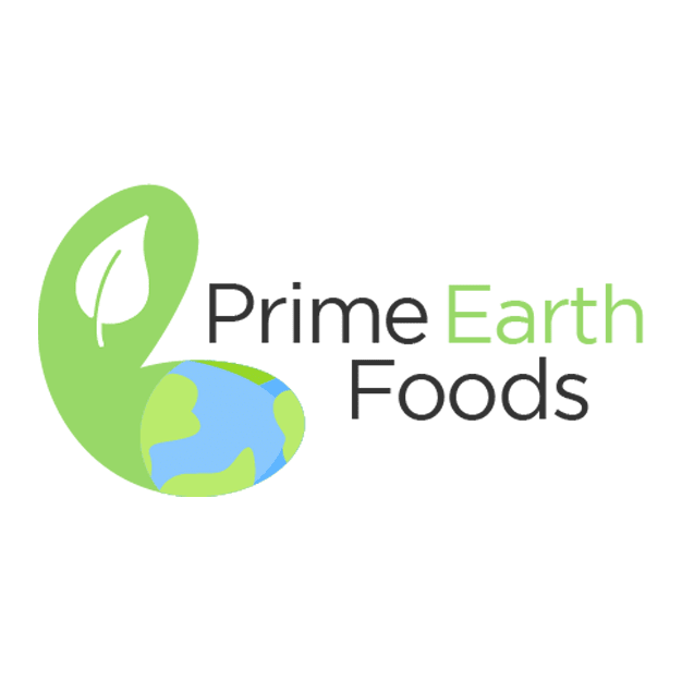
14 Responses to Option A
This one looks more unique.
I feel like the simplistic look to it looks much better and pleasing to look at.
It is more vibrant. It stands out more. It basically says earth friendly. It gives the better impression that it is natural.
I think a is the better choice. The font and looks of b are just too childish. A looks much more professional, although I don’t love how the colors are so light. I like how there is a logo in A too but I would n maybe just use the lead and swoop, not the earth.
I pick A because I like that it has the earth in the logo. I think B is a bit simple and that can also work but I like an actual logo.
I like this design a lot better. I like how bright it is. It gives off a more refreshing feeling and also makes everything feel natural
I like the logo. The leaf is kind of cool and different and makes everything stand out.
I I think he is very attractive. It has nice soothing colors in a fairly artistic, I catchy logo
This seems a more empowering logo for food. The other one seems almost scar y.
Option A has a better color way. It is slicker than its counterpart. I think both options need a bit of work.
Choice B is a bit plain and boring. I like A more. It’s seems a bit softer and more appealing. I also like that the green images looks sort of like a cashew. I feel like it would be better if it looked more like a cashew. Keep the leaf and the earth i the inside, but shape it more like a nut. I know you said you didn’t want nut images, but this would be more of a stylistic cashew, not a literal one.
I like the simple and clean look of A. This says natural to me.
A is better since it is bold and simplistic
I think I like choice A better because to me, there's an air of wholesomeness to the overall look. I feel that choice B lacks that and looks almost cold.
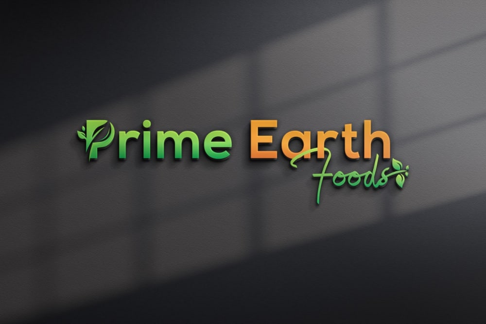
36 Responses to Option B
I know A is supposed to be a nut shape but it doesn't look good. B is better.
I really like option B the best because I like the colors used and I like how there are plant graphics in the letter P and the ending after the letter s. The first thing that comes to my mind when looking at it is that you could replace the a in Earth with a graphic image of planet earth in its place. That might be a catchy logo.
A looked too much like a warped, distorted nut, like a cashew gone very wrong, so I didn't like that shape at all.
B actually looks pretty good. My only complaint is maybe changing the color on "Earth" to a more brownish color or something else.
option B is more attention grabbing and eye catching in my opinion
I like B, the overall color scheme is nice. The darker background is easier on the eyes and more pleasing than a white background. I would get rid of the leaf in "P" for Prime, keep the same color. The one leaf at the end of foods is perfect.
i have to be honest..."A" resembles a fetus; i''m not trying to be disrespectful or funny but that's what it looks like to me. therefore, i'm for "B" obviously
I like the look and color of the font.
Option B is a little simple, but does emphasize how it's natural and healthy with the leaves incorporated with the logo. Option A's symbol looks a little odd, and can be misconstrued as something negative.
I definitely like this better. I like the black. I also think this looks much more professional. Honestly the other one resembles a penis and if I seen it as a woman then I can see many more people seeing it. Sorry I am just stating my view, no offense. Thank you.
Option be looks like something that can become a big business. It has a nice structure and is pretty unique in the design. It looks professional and confident.
This logo feels very modern and professional to my eyes, especially in comparison with A here.
Option A really has a great design. I like how you incorporated the leaf into the P, it looks amazing.
I think this Option comes closest to what you're looking for without the use of nuts in the logo, but I think this could use some finetuning with the font design and supporting graphics.
A looks kind of phallic...
I prefer this option. I think it looks professional and superior in quality. The color scheme is tasteful and easy to read. It's a great name that sells itself.
This one looks a lot better, like a logo you could put on a site or a building. I don't like the shape of the graphic on the other image. It doesn't look right.
B is very nice looking, this is very sharp and modern, it has a sleek style that I find eye catching and pleasant.
I thought that option B looked really nice in terms of design and colors. The font looks edgy in a good way and I think everything fits well together.
b answer is very attractive .
In my personal opinion, I most definitely prefer Option B over Option A. What could improve Option B however is to go with a plain background so it's not so distracting, Change the font of the F in Foods to something a little more legible, and to change the plant to just leaves like in the letter P. Thank you!
I like option B more. As a logo it looks more polished and professional. Option A the image on the left looks a little odd and I'm not entirely sure what it's meant to symbolize. At first glance my reaction was confusion which is not usually what results in me wanting to purchase a product. Option B I was not confused. The logo is clean, easy to read, and it has an aesthetically pleasant color scheme for the font colors. The small artistic details are not extravagant or ostentatious and there's an elegance to the subtlety of the leaves. I don't think the color scheme for option A contrasts well. It's not nearly as aesthetically pleasant to look at compared to Option B. Option B the green and orange are really good for contrast. So I chose B as the better of the two options because in terms of things like aesthetics, color scheme, clarity and overall effectiveness of the presentation Option B looks much better than Option A in my opinion and so it's my vote for the best of the two logos.
B stands out more. I really like how clean the logo looks
This one looks a bit more professional
Option B is just more visually appealing than option A. However, if you're unhappy with either logo, I would suggest going back to the drawing board, and investing some more time into a new design.
The shadow on the wall in the background is very interesting to look at. This presentation is outstanding and I feel this logo is suitable as it is presented here.
Has a very clean look to it and it stands out to me and it draw my attention to it a lot faster . I like the design of this the best
easy to read, yet stylish. the other one has some weird earth/bean logo i am not a fan of.
i like the logo in option B because the text and background colors are the most pleasant and easy to read for me
More colorful and down to earth feeling.
Overall, I prefer B but the words need to be bigger. Also, I like the earth part in A. Maybe there's a way to incorporate it into B?
Option B looks professional and attractive. It is designed in a way that stands out from other brands. I do not care for the image of the earth in option a.
Product B is in 3-D hence captivating and appealing.
I prefer choice B because the dark colors are more vibrant and enticing to my eye personall.y
I like B and think it is a quality looking logo, however, if you feel it is lacking something have you tried adding something extra to image B? Such as extra graphics, like more leaves or maybe a friendly animal added on it or maybe a outline box around the lettering with leaves coming off of it, I honestly think it looks very professional compared to A. If you can imagine a package with a black label and that logo on it I think it would look really sharp and stand out.
They both look really good, did you mean to say that you are happy with the overall look? I like option B a lot, I think that it is really nice and professional looking.
Explore who answered your poll
Analyze your results with demographic reports.
Demographics
Sorry, AI highlights are currently only available for polls created after February 28th.
We're working hard to bring AI to more polls, please check back soon.

