Poll results
Save to favorites
Add this poll to your saved list for easy reference.
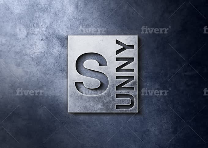
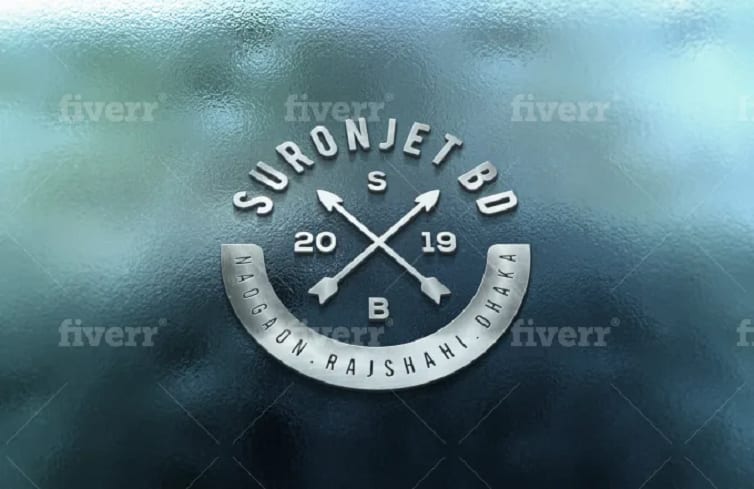
What logo do you find most visually appealing? (Please ignore watermarks)
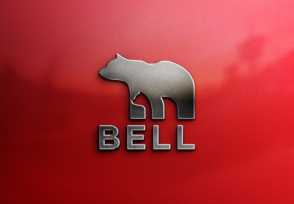
Option A won this Ranked poll with a final tally of 32 votes after 1 round of vote counting.
In a Ranked poll, respondents rank every option in order of preference. For example, when you test 6 options, each respondent orders their choices from first to sixth place.
PickFu requires a majority to win a Ranked poll. A majority winner differs from a plurality winner. A majority winner earns over 50% of the votes, whereas a plurality winner earns the most votes, regardless of winning percentage.
If an option does not earn a majority of votes, PickFu eliminates the option with the lowest number of votes. The votes from the eliminated option are reassigned based on each respondent’s next choice. This process continues in rounds until a majority winner emerges.
Scores reflect the percentage of total votes an option receives during the vote counting and indicate the relative preference of the respondents. If there is no majority winner, look to the scores to see how the options fared relative to one another.
| Option | Round 1 |
|---|---|
| A | 64% 32 votes |
| C | 24% 12 votes |
| B | 12% 6 votes |
32 Responses to Option A
I chose the designs on how much I liked them.
I feel these logos are clean looking and is visually appealing.
I chose A first because the logo stands out from the red background very well. It is very appealing and eye catching.
The bear is the cutest
I like the bear because I am an animal lover. Also, I believe others would like this one because animals tend to stand out more than other things.
The bear is sleek and really recognizable, but also memorable. The last one was just really busy and the middle one was very boring.
The red pops!
I love the bear with the BELL logo. It's like it's 3D. B is pretty cool as well and easy to read. C looks cool but there is just too much writing it's overwhelming
I liked Option A the most. It's simple yet well-thought. I liked the hidden little bear cub the most.
I like A the most. it looks rugged and outdoorsy
I like the bold but still organized look. It looks great when the image is not too busy
The red is a strong color and very visually drawing. The second is interesting though i dont love how one side of the background is considerably lighter. I really do not enjoy how tilted the third option is, perhaps if it was situated virtually with a better background it would be better.
Logo A really pops off the page; the combination of 3D effects, and metallic red, really make the image stand out from the rest. Option C is interesting in the angle alone. The rest of it is rather blah. Option B is a standard dropshadowed image. Not much nice to say about it.
I thought the red background was the most eye catching and the logo most professional looking of the three
I chose Option A as my first choice, because I think that the logo stands out the most. I think the silver on red reads the clearest out of all of them. Option B is section because the log is still clear, but silver on grey does not work quite as well. Option C is just too busy for me. I can't clearly read all of the words.
I think Option A is the most appealing because of it's bold color choice and design. The logo itself is clear and easy to understand. Option C is nice I like the colors of the background and how the logo is presented. The only problem I have is that is seems a little cluttered, but other than that it is a nice design. Option B is weird visually. The logo is odd because of the way the name is presented. I really didn't realize the logo was saying "sunny" at first, overall it is a poor design choice.
I don't know what any of these are for, but the red is the most visually appealing to me.
I like the bear logo because it also has a smaller bear made out of the legs. I think that is a clever design. I don't know how that relates to Bell however. And I chose B second because I liked how it spelled out Sunny but was separated in a clever way.
I like the bear. It's simple and straightforward. C is busy but it looks balanced wherease B looks unbalanced and weird.
The animal motif jumps out at me more than the other two. Makes me more curious about the brand.
I liked Options A and B the most because they were simple, easy to quickly understand.
I choose A because it is a very simple logo, the red back ground caught my attention, B is also a nice log; C has too many things going on and the background makes it hard to see.
I picked based on the colors and logos I liked.
In my opinion, option A is the best because it is very adorable and simple, yet clever. Option B was my second choice because it is also nice and simple, but it's not extremely memorable. Option C is my last choice because it has a lot going on and I do not find it to be memorable.
Love the look of the 3d metallic silver raised letters and bear on the red background. Snazzy! The second one I like the metallic gray and the letters look punched. Don't care for the 3rd one AT ALL. I don't like anything about the 3rd one.
Option A is the best choice because of the brighter color. It catches your attention over the darker options.
I like my first choice its simple and creative. y second choice is also eye catching I like how the capital S stands out and the rest of the word is creatively on the side of the symbol. Im not to attracted to the last choice way too much going on with it
I like the photo of the bear with the silhouette with the smaller bear. Though it is a simplistic design, it looks professional. Option C also looks well made and all the proportions of the design makes it also look professional. Option B was a bit boring for me.
I like Option A the best. Not sure if you guys want feedback on the background color or just the logo itself but for A I like both. Red makes everything pop and gets people attention. I also like the logo itself because it is simple and straightforward and the animal logo is recognizable and simple. I am also found of the metallic. Option B would be the next.. it isn't as visually pleasing to me because I like the Animal but I understand it and would be able to figure out what it is for and recognize it. Option C is too busy for me, there is too much going on and I can't figure out what the logo is for.
The red logo with the bear really caught my eye. I have two black pomeranians and I call them my little bears. Anything that looks like a bear catches my eye. I chose B as my second choice because it's easier to see that it spells the word Sunny. Even though I don't know what it is, I can read the word. The letters and numbers in choice C confuse me a little and it takes a little longer to decipher what it is. That's why I chose C as my last choice.
Option A stands out the most to be by far. Next I would choose B, because the logo is bolder than option C.
I liked the shape of the bear and the texts is bold and stands out.
6 Responses to Option B
I chose in order of most visually appealing.
Option B was very bold and so it stood out. The bear logo is simple and better than Option C because it is difficult to read.
Option B is very modern, professional and classy. The color scheme and overall presentation is very appealing. Option C is not bad but I feel like there is too much going on. Option A is just not appealing to me, the color I think and the bear.
I found the placing of the letters very appealing for my first choice. The color and the metallic look as well
I like the more clean cut, modern looking logo over the others.
I always like the simplest logos. I don't need extra things on a brand.
12 Responses to Option C
the first stands out in design and color
C was the most unique looking. I feel like I've seen A and B before in other forms. Between B and A, B is slightly more unique.
made my choices based on what i like and find appealing
These are the choices that I find the most eye catching.
I liked the blue color in option C the most, followed by the marble appearance of option B. Option A was kind of plain and manly appearing.
I choose C first - the rounding of the logo with the arrows draws interest and the colours chosen, the background has some details (dimpling or pitting) that adds a little also. The B logo is clean and simple, steel gray, legible. A is too boring to me, at first glance. Looking at it closer, I see it also has subtle details in it, that could look like a forest shadow.
It would depend what the logo is for. In general, I like option C the best. I like the circle with the crossed arrows. I also really like the background color.
I like the detail and sense of dimension we get with C, A and B are a bit simplistic
The compass indicates you are headed in the right direction.
The most sophisticated of them
I like the arrows that are pointing in different directions.
i really enjoyed the imagery of option C, the red caught my attention but i did not care for the bear. then option b was pretty interesting too, wish that option C and B could have been in red
Explore who answered your poll
Analyze your results with demographic reports.
Demographics
Sorry, AI highlights are currently only available for polls created after February 28th.
We're working hard to bring AI to more polls, please check back soon.

