Poll results
Save to favorites
Add this poll to your saved list for easy reference.
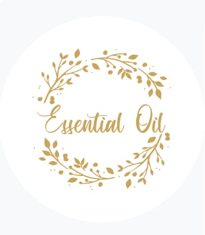
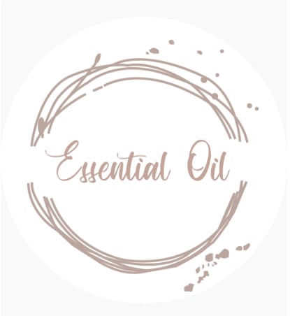
Which design do you prefer for a lid cover for an essential oil holder?
Age range
Education level
Gender identity
Household income range
Options
Personal income range
Racial or ethnic identity
35 Responses to Option A
I think the gold is brighter and is more appealing
I picked A as my top choice as I love the gold color.
A has a more antique color. B is bland.
The direction of the leaves in A helps emphasize the circular nature of the design and make it feel whole.
I like A more because it seems more ‘natural’ than B does. I also like the gold colors
I really like the flair that this one has
I like the color of this design it looks bright and fresh. I also like the leaves that circle around the wording. The other option feels a bit simple and bland.
I think the leaves and branches look much better than scribbles
A i think would fit better for a essential oil product and i like how the floral graphic looks
I prefer option A because I think that it has a more interesting and visually appealing design/color scheme.
This has a warmer style and the color has a more natural and classy look
I like option A, it looks more thought out and professional and safe. Option B looks like someone just quickly did a few circles and maybe cut corners in their brewing of the oil and it wouldn't be as efficient as option A.
I like option a better. It looks more earthy, with the branches and leaves.
i like the floral pattern in A more , i think it has a regal look
the gold looks classy
A seems like a generally more pleasant design
I prefer the option A lid cover illustration because I like the gold color and more detailed leaf illustrations shown here much more than the more plain and gray color illustrations shown in the option B lid cover.
I prefer the logo design for the lid of option A more than option B's design.
I prefer option A because I like the laurel design.
Option A is a lot more flowery, herby, and fresh feeling than B.
I like option A the best because I think the gold leaf design and writing is really eye catching.
After carefully studying and comparing both lid cover designs for an essential oil holder, I selected Option A over Option B as my first preference and the one that I would more likely click on to purchase for my own use. I felt that this design had far more eye catching appeal to me personally and jumped right out at me as my favorite.
I find this one more luxurious and sophisticated. It is more visually appealing to me.
I would definitely choose option A because it is a much more vivid color which pops and makes it much easier to read and know what you’re getting overall.
option A has more character because its design makes more sense, you can clearly tell those are flowers around it but option B just look like disorganised lines
I like option A because the design looks more complete. Option B looks like the design is a bit more messy, in particular the little grey dots that appear to be randomly placed. Option A has much more consistency with respect to the design, that it looks more like a circle, and that the leaves look more like leaves. Option A is more aesthetically pleasant to look at than option B for two main reasons. One is the color scheme and the other is the artistic design. I like gold as a color more than silver. I think the design of option A is nicer because it looks like branches and leaves compared to option B which looks like old branches and not many leaves. The writing is also clearer and easier for me to read with option A compared to Option B, and so that's why I chose option A. It looks nicer, it has better contrast and perspective, the design looks less messy, and it's got a good color scheme.
the leaf design fits the name and theme well. B has a very nice design and it looks excellent, but A fit better
I would choose choice A because the color which has been used in the wordings is really attractive to the eyes and it is easy to read as compared to the one used in choice B.
I like the color of B better, but the design of A
I like seeing the little leaves more, it feels more vegetal and like an oil from vegetables.
I prefer the design for option A since the design is more appealing to me. I also feel like the leaf/branch design matches with the idea of essential oils and overall looks cleaner than option B.
I liked that this option featured a gold color as this was more elegant and luxurious.
I would go with option A because it looks more stylish and premium to me. Option B does not look quite as fancy to me overall.
I like A more because it has the leaves on it and feels more earthy, which I like.
I choose option A for the design for a lid cover for an essential oil holder because I like the image of the leaves which reminds me of nature.
15 Responses to Option B
I LOVE THIS DESIGN. I DO NOT LIKE THE LEAF DESIGN IN OPTION A. IT IS A LITTLE OLD FASHION FOR ME.
B looks more artistic and modern, especially with the color chosen.
It looks a lot more unique and artistic looking compared to the other, which seems pretty generic
This one is more rustic appearance
i prefer the design in option B because the color and design are more soothing to me
The text stands out more since the design surrounding it is less "busy"
I like this option because it's like a new take on an old design. Has a modern feel to it.
I just like the color and design of it more.
It is more unique than option a. Option A is commonplace.
I prefer Option B because it is more abstract and less floral. I like the color better as well.
I like B better as I feel its more unique and has a more fluid feel to it.
I think B is the better design for a lid cover for an essential oil holder. It is a simple and classic presentation style which is not too tacky or gaudy, and doesn't take away attention from the product itself.
I like the naturalness and feel of this design over the other one.
I like this, i think flowers and such as over used.
I prefer B. It isn't overly flowery and has a more natural look.
Explore who answered your poll
Analyze your results with demographic reports.
Demographics
Sorry, AI highlights are currently only available for polls created after February 28th.
We're working hard to bring AI to more polls, please check back soon.

