Poll results
Save to favorites
Add this poll to your saved list for easy reference.
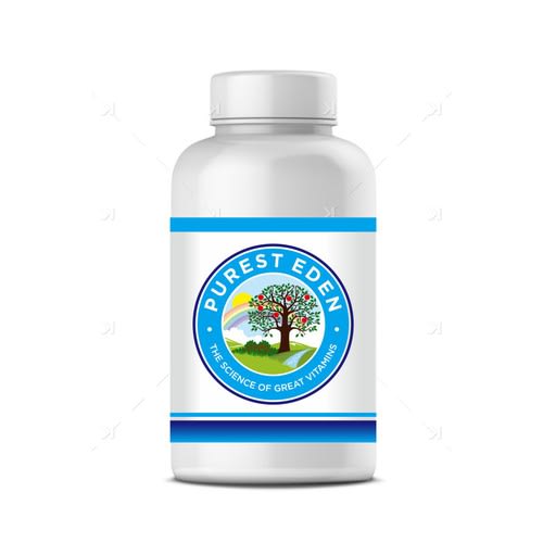
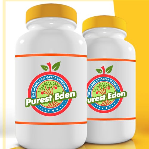
Which logo do you like more for a Vitamin Company? Which logo would make you trust company & buy its vitamins?
Age range
Amazon Prime member
Education level
Gender identity
Nutritional supplement use
Options
Personal income range
Racial or ethnic identity
38 Responses to Option A
There are boo many colors in B. I like how A is primarily the blue color.
I really like the blue and that illustration the best.
I chose option A because I like the scene with the tree and the rainbow. The logo is calming. I like the blue border. It's what I would associate with wellness. The other seems more like juice or something.
A looks natural and safe.
A is a little more serious of a logo. B looks kind of juvenile to me. I think B would be more suited for a kids vitamin. When I shop for a vitamin, I want the product to be serious.
The bottle in option A looks nicer and more professional. I would use that as the better bottle image. I like the blue and the tree shown there as an icon more as well. Good looking brand of vitamins.
I chose option a because I think it looks more calm and makes me think of something that is more natural and healthy
The clean lines and soothing color palalate reflect a quality of freshness and purity, while the simple straight forward graphics indicate to me a level of professionalism and trust I accept in my vitamins
I like the logo on Option B better and would trust the company enough to buy the vitamins - the verbiage is the same on each advertisement but Option B grabs your attention because of the vibrant color choices. Option A is an attractive color choice but seems bland when compared with Option B. I would be much more inclined to purchase Option B.
Blue looks better and more enticing.
The colors look more professional and blends uniformly through. The logo is well designed, looks modern, and is attention grabbing and easy to look at.
blue logo looks more authentic
The colors are more muted and professional. The other was a turn off because of the brightness and font.
The blue looks more professional and prestigious.
there is too much going in in choice B. Choice A isn't5 as complicated and gets the point across very well
The Blue and Green label looks more organic and health oriented.
The tree in the logo signifies natural and health to me. The logo is more understandable and more impressive.
The other one is too eye catching - looks like it is trying to call attention to itself. The blue is more subtle and still get the point across
I like logo A the best and it's more likely to make me trust the company and purchase its vitamins because the warm colors make me feel like it's a friendly product, as well as more natural and good for me to consume.
The logo is simple and explains what I'm taking. No flashy colors or large logos.
The colors seem more trustworthy
B looks too "comic-like"
It looks more professional, the logo is all contained in its space. Option B looks like it is screaming out, trying too hard
The logo for A looks more legitimate, while B looks more like a cartoon or comic book illustration, which makes me less trusting that it is a good health product.
I like this label. It is not busy but is shuttle and sells the product. Very eye appeasing.
So the answer is neither, but B looks just too much like a completed sheet off an adult coloring book.
The design looks more polished and finished in this version. I also appreciate the detail on the tree and the rainbow in the background.
I prefer the color of A, its much more calming than B. But primarily I like the position of Purest Eden on A's bottle
I like this look and color combination better. It looks more "authentic."
Option B is too noisy. Vitamin labels should be simple and tell you what the vitamin does.
This log is more trustworthy in how it looks. I would buy from this company purely based on the logo. It doesn't feel like it's trying too hard.
Although the other option has bright colors. That made me uneasy, it was too sales oriented. The blue seemed to be a safer choice to me.
The neutral blue colors make it seem more traditional. The bright colors make me feel it's hippie like which I don't trust
This logo just looks more professional
The scene seems more real and pleasant.
Logo A has a more calming color scheme and is more modern. B is a little intense and the font for "Purest Eden" is old fashioned.
B seems a bit garish and makes me feel like some fly-by-night company has slapped that logo together and the product can't be trusted. A feels more like something I can hold, embrace, and trust. I feel calmer with this pretty logo.
option A is more calming and more professional. i also like the picture and font better i dont want my vitamins to look like candy and thats what option B looks like
12 Responses to Option B
I like option B which has the tree scene inside of the apple shape. It reminds me of the garden of Eden.
Option B is more appealing and the label colors are more inviting.
I prefer the 'red' based logo for a couple reasons. 1) it has a natural feel with the plant in the center and also has a plant edge around the outside. This double meaning reinforces the the natural theme of the product itself. 2) the brand name is in bold font right across the center as opposed to being in a circle around the top. This makes it much easier to read and provides the brand information boldly and first as you see the logo.
I like both logos and I think they're both trustworthy, but I picked B because I liked how there was an apple tree inside the logo and then reinforce it by putting an apple as an outliner.
the name really stands out here, and I think it is cute the way the stem at the top makes it look like an apple
Either logo would make me trust the company. I chose B because of the way the logo uses the apple for its outline. I also chose B because the name of the company really stands out and that name evokes trust in the product being pure.
The logo that I chose is very vibrant and depicts motion which grabs my atteniton.
Love the apple symbolism.
I would have to choose B.. I think the problem with A is the color pallet. On a dark shelf in a store, surrounded by other vitamins.. The orange and reds on the bottle really pull the eyes. Blue on the otherhand is a cool color (temperature color) and really doesn't grab the eyes. Seeing as a product only has a second or two to catch the consumers eye. I would think option B is the better bet.
I like them both a lot, but I think the orange and pink catches the eye quicker.
This is more colorful and attention grabbing
I LOVE THE PINK ON THIS OPTION. IT MAKES THE ENTIRE PRODUCT BRIGHT AND STANDS OUT
Explore who answered your poll
Analyze your results with demographic reports.
Demographics
Sorry, AI highlights are currently only available for polls created after February 28th.
We're working hard to bring AI to more polls, please check back soon.

