Poll results
Save to favorites
Add this poll to your saved list for easy reference.
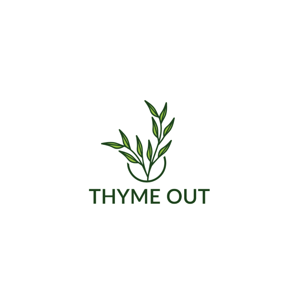
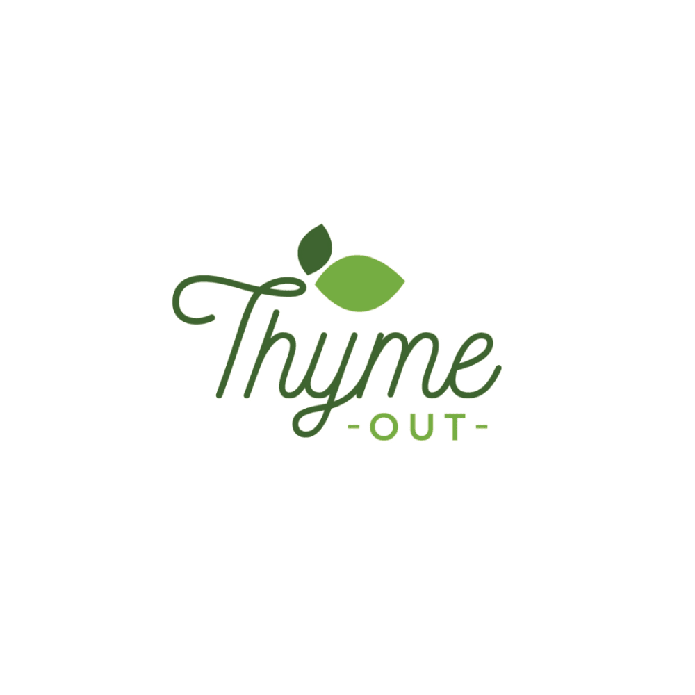
Which logo do you like the most for a Natural Skin Treatment Brand that uses thyme tincture as a main ingredient?
Age range
Education level
Gender identity
Household income range
Options
Personal income range
Racial or ethnic identity
30 Responses to Option A
I find the image more pleasing and I never like reading cursive in logos.
A has a much better flow of the logo, and looks more pleasing to look at.
Option A seems more natural and closer to a rustic image. The art for the sprigs in particular look quite pleasing.
I like the fact that option A includes an image of the plant in the logo. It makes everything seem more natural about the product.
The look of the thyme in these logos is neat to me and I prefer the natural look of this logo
it looks less childish, more professional and clean
I liked choice A since the logo looks the most natural and appealing. Choice A grabs my interest right away. Choice B looks too abstract and not eye catching with its lazy logo.
I liked the more formal and classic look of A and found it convey a sense of quality and trust.
I like this because the thyme looks better. I like how detailed it is and it is the focus. The shade of green looks better too
Choice A looks more professional overall as a logo in terms of appearance
looks a bit better than the other one
I chose option A. When I see the sprig of Thyme, it would be a logo that I would associate with quality merchandise.
This logo is more simple, clean, and seems like a well established company
I like that A\s logo shows a distinct sprig of thyme on it.
I liked the logo for option A the most. It looked more interesting.
I like how A shows the full sprigs of thyme.
The logo of the picture is brought out more than the other one which is more of the lettering instead of the picture.
I like the sprig of thyme better. It looks more holistic.
I chose this option because the logo gives a more realistic vector image of thyme. The font style and colors used are also very suitable for a natural skin care product.
I like both really. If I had to pick one, I would go for A as a skin care treatment logo. B looks more like it is food-related, like a vegan restaurant.
B reminded me of olive garden
I like the font, it is printed and a nice size and style.
Option A is a nice looking logo. It's definitely artistic. It's a nice logo design.
Its more professional in my opinion.
I picked A as my top choice as the logo tells me what the brand is about.
The logo with the lots of leaves on it..it suggests a natural and healthy product.
The words and image flow very well together and seems nicer too.
I liked that this option felt a little more subtle in its design.
The leaves in my top choice look fresh and vibrant, which is appealing. Very cool design for sure!
I prefer option A. I like the detail in the leaves. It reminds me of thyme. I like the simple font.
20 Responses to Option B
I prefer choice B for the bigger letters.
I like the leaf accent. The typeface is more interesting as well for "Thyme."
I chose option B because it reminded me more of a skin care logo. Option A looked more like a tea brand.
I prefer this option because of the multiple shades of green, I think it adds to the logo.
I like Option B more, the colors are more vibrant. It pops out, the cursive is nice.
I like this logo the most because I feel as though it looks the most professional to me.
Love the cursive font and how the logo itself appears to be part of the plant. Both are nice though. Also love the name "thyme out", that's great.
While both look pretty good, to be honest, my favorite out be Choice B. I like the use of cursive in that example, it always looks classy to me. I also like the leaves 'growing' out of the logo's text, which is also a nice touch.
I prefer option B because I think that it is a more interesting, eye-catching, and visually appealing logo design.
The cursive font is really nice and gives a subtle, connected feel to the brand which is in alignment with nature.
I like the different shades of green and the font in Option B over Option A.
The word "thyme" is more prominent and draws more attention to the fact that it's the ingredient.
Both of these are good, but I really find option B the most appealing. There's something...friendly about the fonts used here. I really love it! It's a sweet looking logo and I would feel...safe shopping from here.
After carefully studying and comparing both logo images for a Natural Skin Treatment brand that uses thyme tincture as a main ingredient, I selected Option B over Option A as my first preference and the one that I would definitely click on to learn more about the product before purchasing it for my own use. I felt that this logo jumped right out at me as having more eye catching appeal based on it unique design and variety in coloring.
While I like both, I like the font and colors better in option B. I think it stands out more and is easier to read.
Option B is a fancier and better logo. That seems to be the better fit for this. I'd use that for the choice for the logo. I think it has more potential as that and a nicer feel for a natural skin treatment. Better in option B.
I like the logo that looks more simple. Simple colors, straight to the point. I like how the font looks fancy.
I like Option B. The style is happier, more natural. It is also easier to read.
I like the little leaf inside the words. I think the cursive is really expressive and stands out the most
The logo feels more fun and lighthearted
Explore who answered your poll
Analyze your results with demographic reports.
Demographics
Sorry, AI highlights are currently only available for polls created after February 28th.
We're working hard to bring AI to more polls, please check back soon.

