Poll results
Save to favorites
Add this poll to your saved list for easy reference.
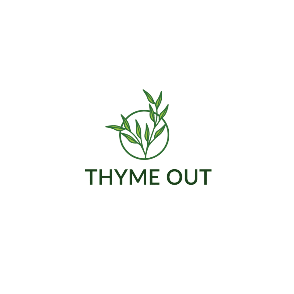
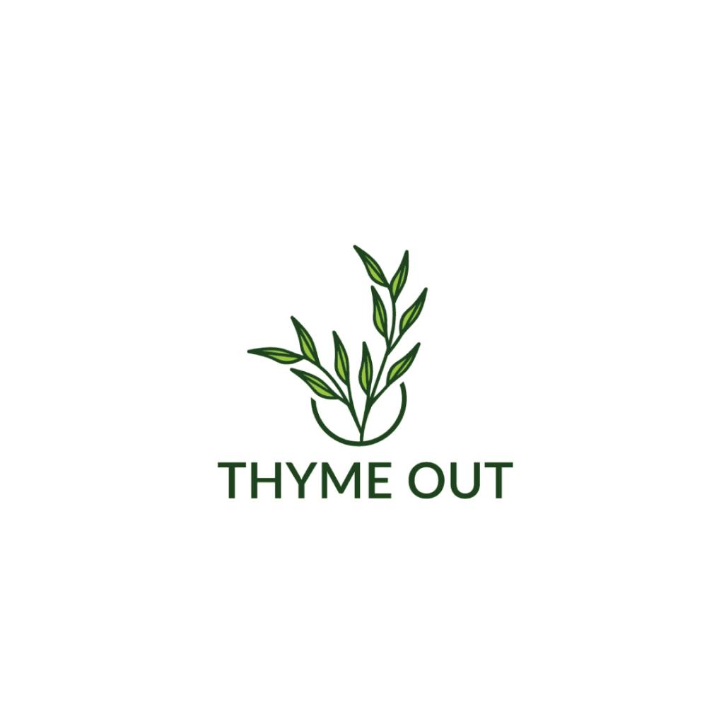
Which logo do you like the most for a Natural Skin Treatment Brand that uses thyme tincture as a main ingredient?
Age range
Education level
Gender identity
Household income range
Options
Personal income range
Racial or ethnic identity
15 Responses to Option A
I like the way this logo is circled around the thyme here
it looks more modern
A full circle feels enclosed and complete. I prefer it to the open circle of B, which feels incomplete, and I'm not as sure what it's supposed to be.
Something about the complete circle makes this more appealing to me.
I pick A, because the design is more detailed for me and it's a good logo design for a product the color is also good that's why I picked this.
I find option A to be the most eye-catching. I prefer the full circle around the name. This logo is fitting for the product and is appealing.
The text is bolder here. The logo looks a bit larger too. It looks more confident overall.
The completed circle looks clean and complete the logo seems really professional as well
I prefer option A because it has a better design.
I like the clever name here "Thyme Out" and I think it best fits the logo shown in A the most because the thyme is breaking out of the circle.
I like the logo with the full circle better and the smaller leafy part. It looks more complete.
A STANDS OUT A LITTLE MORE. THE WHOLE CIRCLE SEEMS TO FIT BETTER IN MY OPINION
Both are pretty good actually! But A just jumped out at me as my favorite.
I chose A because this logo is clear and concise.
The full circle is prettier than the half one. I also liked the lighter green color better than the darker green.
35 Responses to Option B
this one being darker and firmer and bolder makes it look stronger
This logo design flows better with the font style and name.
I selected the logos that most resonated with me visually.
I like this the best because I really like the shade of green. I like that it is a little bit darker. The whole logo looks more crisp and higher quality
I like that it looks like the plant is sticking out of the circle as it's a cool visual.
I like option b better. I think the semi circle looks better, and I prefer the darker green.
I like the darker color of B better and how it looks with the logo.
This darker style looks a little more interesting to me, it gives it a more serious look
The logo was bigger than loggia A. You can see the thyme leaves clearer.
I think B flows better and thus looks more natural. I like having the plants emerge from the top unobstructed.
Choice B is the one I like better because I like the darker color it has to it and I like the semi circle look better as the plant grows above it.
The semicircle looks very good compared to circle
I like the bolder text font in Option B, and the darker logo as well.
I liked the open logo as well as the darker color, it stands out more
I like the circle not being complete, it looks more natural
this one is easier to see and makes the logo and company vibe seem firmer
Option B is a great looking logo. It's good looking art. Definitely a logo that stands out well.
This logo looks better overall.The full circle in option A takes away from the plant in the logo
The design for "B" is most impressive. I think this logo is great.
Like the bolder deeper font
I like to open circle because it implies the thyme is breaking free / growing and to me that conveys a more positive message.
It's a more cohesive look that makes all the parts flow together.
I like the logo with the larger, slightly bolder leaves.
I like the broken circle. It’s like it’s growing out and not being restricted anymore
The second opiton looked like it was hastily done.
I like the darker thyme leaves and that it looks like they are breaking the circle. It is a stronger looking logo.
I think B is the better logo for this thyme-based skin product. I like how simple the logo is, and how the design itself can be used for standalone branding without the "Thyme Out" text underneath.
This is the logo that I like the most for this type of natural skin treatment brand. This logo is appealing and stands out
I like how Option B emerges and grows. It would seem to fit the product better than Option A which seems kind of typical and predictable.
I prefer option B because I think that it is a more interesting and visually appealing logo design/color scheme.
I like that the leafs come out of the circle. I think it stands out.
The colors in this logo are deeper and richer, making the product feel more natural.
I like the darker color of the stroke and the semi-circle with the plant overlapping. It looks stylish and creative.
I like the thyme coming out of the half circle it is eye catching and flows well.
This one is tough, I like aspects of both. Overall, I'd probably say the logo in B is superior. I like it colors a lot more. I like the darker green that forms the majority of the shapes, I like the lighter green that forms the interior, and the contrast between both. The borders are more bold due to the color choice here, and that's what I like the most. My only advice would be to keep those colors and use the closed circle like A has behind the thyme leaf in its version. Then this would be perfect.
Explore who answered your poll
Analyze your results with demographic reports.
Demographics
Sorry, AI highlights are currently only available for polls created after February 28th.
We're working hard to bring AI to more polls, please check back soon.

