Poll results
Save to favorites
Add this poll to your saved list for easy reference.
Which logo do you prefer for a business that is an online marketplace for in-person lessons?
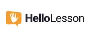

Option B won this Ranked poll with a final tally of 29 votes after 1 round of vote counting.
In a Ranked poll, respondents rank every option in order of preference. For example, when you test 6 options, each respondent orders their choices from first to sixth place.
PickFu requires a majority to win a Ranked poll. A majority winner differs from a plurality winner. A majority winner earns over 50% of the votes, whereas a plurality winner earns the most votes, regardless of winning percentage.
If an option does not earn a majority of votes, PickFu eliminates the option with the lowest number of votes. The votes from the eliminated option are reassigned based on each respondent’s next choice. This process continues in rounds until a majority winner emerges.
Scores reflect the percentage of total votes an option receives during the vote counting and indicate the relative preference of the respondents. If there is no majority winner, look to the scores to see how the options fared relative to one another.
| Option | Round 1 |
|---|---|
| B | 58% 29 votes |
| A | 26% 13 votes |
| C | 16% 8 votes |
Age range
Education level
Gender identity
Options
Parent
Personal income range
Racial or ethnic identity
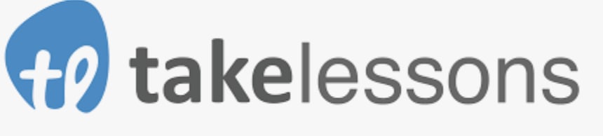
13 Responses to Option A
A and B is direct to the point
Option A was something different and innovative. It would be best option
I ranked based on which ones seem to indicate what the site is for before clicking into it, which would be A and B, with C as my last choice because the name doesn't really represent the company's use.
I think the word "lesson" should be in the title since that is what you are offering. It helps people to quickly know what they are getting.
Choice A is the best for describing the product without having to figure out what it is about.
Take Lessons is simple and easy but it 100% works!
I have no idea what C means and I don't like misspellings, especially something that purports to teach me, so that is why C was easily #3. I liked A the best because it's clean, I like the color and it is very easy to remember. B was acceptable, but wasn't anything unique or particularly interesting.
I prefer Option A as my first choice. I like that's it's straightforward and clear with no cutesy name. It's direct and likeable. Option B is also quite nice and has a easy style to it that's relatable and relaxed. Option C has no correlation to lessons and sounds like made up nonsense.
I like the takelessons logo, it looks professional and I think does a good job describing what the service would be. HelloLesson is similar, I just don't like the logo as much. I do not understand the wyzant logo or name, it would not make me think of an online lesson marketplace.
I prefer option A because it is both appealing and professional looking.
I like A the most because it is the most obvious that this would be a site for lessons
A sounds like it is for lessons and makes it easier to understand
I like the name takelessons because it is clear what I am doing.
29 Responses to Option B
Option B gives me the in person lesson vibe as soon as i read the title. The other two do not give me that same image in my head.
I think option B is probably my favorite. Option A comes off a little bit generic. Option C is interesting, but not really related to the theme.
I like option B because the name is pretty intuitive, but I also like how welcoming the hand logo is. It makes me feel at ease.
I like b. Makes it more welcoming.
I don't like the wyzant name because it doesn't flow and the takelessons is bland so the HelloLesson won out.
Greets you well and the hand has a welcoming feel about it.
I like the logo in option B, attractive and easy to remember. The logo is relatable to the product.
The hand logo is attention grabbing and reminds me of school
B/ I prefer the logo in option B for a on-line market place for in-person lessons as it grabbed my attention right away and the hand gives the logo a friendly feeling of a place that I will feel comfortable learning. A/ Option A is okay and gets the message out that it is an on-line lesson market place but doesn't have much feeling.C/ Option C looks cool and modern though doesn't feel related to lessons at all.
I like this logo the beast because you are using the word Hello. Using the Hello is more personal and It means you are recognizing another person. and since this is an in person lesson it gives a feeling that you care and are focus on that person.
I really like option B. It is an attractive and attention gettting logo, and I think the name makes sense. There are too many logos out there that just don't represent the product very well. I think this one does
C does not have a cool name or shape. The implied misspelling of C is counterintuitive with the proposed mission of the service. Although A is not grammatically correct it does closely and positively relate to the service. C is my favorite, it is memorable and I feel like I can trust that brand to give me quality educational opportunities.
Option B is my favorite name and logo because it's the most professional looking and the name is much more memorable and iconic sounding than the others.
Option B is very ok and cool, I like it as its very appealing and attractive
Option b has a friendly sound to it and makes you feel a level of comfort going into an unknown online class with strangers.
B is descriptive, engaging and fun to look at.
I believe Option B is best, and most approachable. Option C is confusing and seems almost irrelevant using a name like that.
Choice B sounds more captivating and learners would readily enroll followed by A then lastly C I didn't understand what the logo was for.
Hello Lesson seems warm and inviting. I liked the design as well. Take Lessons is dry and boring. Wyzant is weird and off-putting.
i feel like option b gets the point across without having some snazzy confusing name. i like that its clear and concrete
looks most professional and honest looking logo that would engage me in finding out more
I think choice B is quirky and fun, and relevant.
A good design of logo should be meaningful and relevant to the core business. Option C is excluded from further consideration since the name of the log is unclear and I do not see anything relevant to the core business of the service provider. For the other two logos, they both include the word "lesson" in the name which are meaningful. I prefer the word "hello" over "take". The name in B is welcoming people to take lessons. It is simple and it also indicates that those lessons are not a burden to learners.
B appears friendly as well as inviting. A gets to the point. C was confusing.
B is like the lesson is friendly
The logo and name help explain the product at hand!
I like the look and color of the logo in B the most
HelloLesson is a friendly name for such a business. I like it.
My first choice looks welcoming and vibrant. I like the names that have lesson in the title, they are more memorable to me.
8 Responses to Option C
its unique and the name itself is nice
The wyzant logo is the most graphically attractive. Hello Lessons looks like an online option.
I think option C stands out more than the rest
The logo stands out and is catchy. I picked B next because I thought A was really boring and definitely my least favorite.
I find option C is authentic. I prefer this because it is eye-catching.
I liked C the best because it says Wise in the name, and it makes you feel smarter and better. I think the name should have a positive spin on it.
I like the more colorful logo because it grabs my attention and is more interesting than the other two logos. I also like that it includes green, because that is supposed to be a sign of genius and it fits well with educational classes.
I prefer option C I like that the name does not indicate that it's a lessons format. Wyzant I feel has a better ring and easy to remember.
Explore who answered your poll
Analyze your results with demographic reports.
Demographics
Sorry, AI highlights are currently only available for polls created after February 28th.
We're working hard to bring AI to more polls, please check back soon.

