Poll results
Save to favorites
Add this poll to your saved list for easy reference.
Which logo do you prefer for a Certified Public Accounting firm that provides acccounting, tax and consulting services.?


Option B won this Ranked poll with a final tally of 26 votes after 1 round of vote counting.
In a Ranked poll, respondents rank every option in order of preference. For example, when you test 6 options, each respondent orders their choices from first to sixth place.
PickFu requires a majority to win a Ranked poll. A majority winner differs from a plurality winner. A majority winner earns over 50% of the votes, whereas a plurality winner earns the most votes, regardless of winning percentage.
If an option does not earn a majority of votes, PickFu eliminates the option with the lowest number of votes. The votes from the eliminated option are reassigned based on each respondent’s next choice. This process continues in rounds until a majority winner emerges.
Scores reflect the percentage of total votes an option receives during the vote counting and indicate the relative preference of the respondents. If there is no majority winner, look to the scores to see how the options fared relative to one another.
| Option | Round 1 |
|---|---|
| B | 52% 26 votes |
| C | 28% 14 votes |
| A | 20% 10 votes |
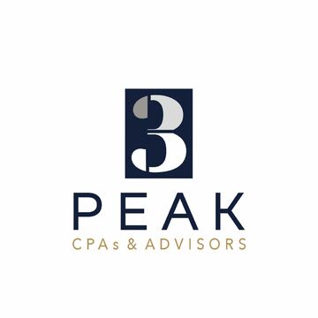
10 Responses to Option A
This type of firm needs dull colors and a small, basic logo. Accountants aren't the type to use bright or bold logos
I think the more minimal design works best and looks more professional.
A because it has a very fresh and clean look and doesn't come across as overly gimmicky.
I like option A and C because its simple and easy logo to remember.
simple is the best, it is accounting not racecars, people dont like showy accountants, at least in my opinion
I like the simple logo with the white background the best and the one with the yellowish color is nice.
I feel A is best. I don't feel the colors in C and B are appropriate. This logo should be more staid and to the point, as in A.
I feel like A and C are more professional and would be want I would think of something for a CPA.
I really like the simplistic design of option A the most. Overall this one stands out to me the most but option C is a close second for me.
Option A is my choice because the simplicity in design and color scheme makes it the most attractive, and sometimes the more simple company logos are the most memorable to me.
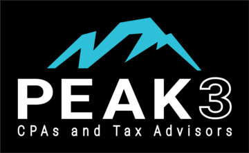
26 Responses to Option B
I don't like the "3" being above the logo I think the image of the peaks looks nice in B. I like the black white and blue in B as well. I think the gold lettering looks better in A than the gold in the "3" in C.
I like the logo in B the most because it is the most colorful and eye catching
Tax advisors is more descriptive of the service than just advisors.
I ranked them based on the design I like, in the second choice i like the green color on the 3
I like B the best because I think the mountain peak looks unique and fits the name of the company. It gets my attention over the other two because it stands out.
I like option B the best. i like the mountain logo with the blue in it the best
Option B has an easy to read logo with nice contrast. Option B is easier to read than Option A
More relatable as being part of the mountains, and more visually appealing to me
This logo is the most creative and has the best image available.
The background image is really appealing.
I like the blue mountain peak design in my top choice, which evokes a sense of fun and adventure. Very cool design for sure!
B caught my attention right away and seemed the most professional. A and C were similar but I went with the bolder letters on C for second.
B stands out more and has a stronger bolder style that looks more intense and serious
The black background greatly compliments the text and colorful mountaintop logo
All of these - except A, which doesn't have enough color - is good. I just prefer B because the blue and black against each other look good. And C is better than A because of the litle green color it ihas
My choice is option B as rank 1 because of the product logo design and the color combination of the product is very attractive and easy to understand the business.And th font color also combined with the product package color .
I think the logo in B is more professional and the arrangement is okay. I would love to see how the logo will look like if the written and background colors are swapped.
B makes sense. The photo and text combination are good. C and A have the words in an incorrect order (based on the order in B) and have random colors placed different places. Not feeling either c or a
The block style logo with the black background is more noticeable than the other two. It has something to support it rather than just a plain white background. That is why I chose Option B first. Then I chose C next because it has a slight hint of color in the number 3. That is so subtle but it also gives it more of a definition of interest. I then chose Option A because although it is not that terrible, it gives me the least amount of visual pleasure. I do like the lighter color of text beneath the word PEAK, but it isn't as noticeable, maybe too light at first.
I think b stands out and looks professional. Easy to remember and locate during a search.
I like the logo in option B the best as it looks fitting for the name and visually appealing.
Option "B": This is a truly visual representation of the company name that is both appealing and memorable; I do hope the name is "Peak 3" vs. "3 Peak" as the former is the better name.
This order of the arrangement is more attractive and more reliable
B is actually beautiful, inspiring and awesome. I love the play of blue and black then giving a white starkness to the words here. Other options are poor in comparison but C is confusing, The 3 has at least 5 colors, it's too much and if it were 3 colors it would at least make sense, C doesn't here though.
This would be my choice order but the colors in B, specifically the white text against the black background look more professional.
B is more colorful, powerful and stands out to me. It grabs your attention
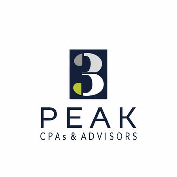
14 Responses to Option C
I think C is the best of the options, I'd go with even bolder text for all the options. B looks like a sports equipment store.
This option seems more serious and to the point without unneccesary background graphics
this looks the most modern and professional. the coloring and accents of C are better than A. B isn't appealing
I think that C and A have an overall look that better resembles a professional accounting service, while B looked too sporty. Among these two, I liked the use of color in C and found it more engaging.
I think that Choice B is just a little over kill. The mountain ridge is just not needed. I like the colors in C slightly better than A.
Option C is the most ideal, from an advertisement standpoint. It has enough of a color transition, that it makes the logo seem lively, and eye catching. It doesnt over do it, with background colors, or any un necessary features.
B looks like a clothing brand
i think the logo in option C is best for an accounting firm because it looks new and innovative to me
The logo I prefer for a Certified Public Accounting Form is C. I really liked the colors and designs. I think it's fitting. They do Accounting, Taxes and Consulting Services. So I like the 3 on the logo.
I like C with the colors in the 3, and B is nice, but seems more like an adventure company.
C and A both look professional and highly legible. I prefer C since it has a pop of color in the logo and keeps the company name highly legible. B looks too much like a mountain bike or camping company.
Logo's are looking very unique. And the style of the logo in option C was fresh and creative. I like that , it was a simple outlook but it gives high recognition power.
Option C looks very appealing and quite professional.
I would prefer C the most. I think the logo is innovative, distinctive, and modern, and yet it still presents a sense of prestige and professionalism. I think the different colors in the "3" makes the firm appear to be more diverse and inclusive in a way that makes it more compelling to potential clients.
Explore who answered your poll
Analyze your results with demographic reports.
Demographics
Sorry, AI highlights are currently only available for polls created after February 28th.
We're working hard to bring AI to more polls, please check back soon.

