Poll results
Save to favorites
Add this poll to your saved list for easy reference.
Which logo do you prefer for a product that sells to men age 18-35 (who are socially liberal and politically conservative)?
Option C won this Ranked poll with a final tally of 54 votes after 7 rounds of votes counting.
In a Ranked poll, respondents rank every option in order of preference. For example, when you test 6 options, each respondent orders their choices from first to sixth place.
PickFu requires a majority to win a Ranked poll. A majority winner differs from a plurality winner. A majority winner earns over 50% of the votes, whereas a plurality winner earns the most votes, regardless of winning percentage.
If an option does not earn a majority of votes, PickFu eliminates the option with the lowest number of votes. The votes from the eliminated option are reassigned based on each respondent’s next choice. This process continues in rounds until a majority winner emerges.
Scores reflect the percentage of total votes an option receives during the vote counting and indicate the relative preference of the respondents. If there is no majority winner, look to the scores to see how the options fared relative to one another.
| Option | Round 1 | Round 2 | Round 3 | Round 4 | Round 5 | Round 6 | Round 7 |
|---|---|---|---|---|---|---|---|
| C | 19% 19 votes | 19% 19 votes | 20% 20 votes +1 | 21% 21 votes +1 | 27% 27 votes +6 | 34% 34 votes +7 | 54% 54 votes +20 |
| F | 23% 23 votes | 23% 23 votes | 23% 23 votes | 25% 25 votes +2 | 30% 30 votes +5 | 38% 38 votes +8 | 46% 46 votes +8 |
| A | 13% 13 votes | 14% 14 votes +1 | 15% 15 votes +1 | 19% 19 votes +4 | 23% 23 votes +4 | 28% 28 votes +5 | Eliminated 28 votes reassigned |
| E | 15% 15 votes | 16% 16 votes +1 | 17% 17 votes +1 | 18% 18 votes +1 | 20% 20 votes +2 | Eliminated 20 votes reassigned | |
| G | 10% 10 votes | 12% 12 votes +2 | 14% 14 votes +2 | 17% 17 votes +3 | Eliminated 17 votes reassigned | ||
| B | 9% 9 votes | 10% 10 votes +1 | 11% 11 votes +1 | Eliminated 11 votes reassigned | |||
| D | 6% 6 votes | 6% 6 votes | Eliminated 6 votes reassigned | ||||
| H | 5% 5 votes | Eliminated 5 votes reassigned |
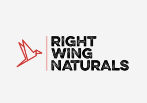
13 Responses to Option A
I liked the colors and the bird on A, I liked the dark background on C, I like the bright clue on E, I like the elephant on F, I like the colors and logo on G, H, B and D were a bit plain and needed more color.
I like the option that shows a bird along with the wing of a bird and an elephant for a brand that targets conservatives.
I prefer the ones that do not use overtly REpublican imagery. I feel like you shouldn’t align yourself with a party. Aligning with the ideology is better.
Anything with right wing and a lightning bolt is just a bad idea. Way to close to white supremacy. I would try to keep it rather neutral as far as the image showing any ties. Option A and B do a good job of that.
The bird in a looks timeless, and i also believe the logo represents the republican community well since i am too republican.
A I feel looks the best and is able to mesh well with the name of the business.
I think that the bird represents freedom and aligns well with the socially liberal view. The name reflects the right-wing preferences.
A / I like the distressed look of the text and the red bird. This looks like a natural product. I like that the bird has wings.B / I like the distressed look of the text and the circle R, which could be used as a stand-alone branding.C / This is a safe, somewhat bland look, but it does the job. Reminds me of an airlineG / Fairly bland.F / I really like the Pacific Northwest style elephant art but nothing about this logo makes me think of natural products and with the political slant, elephants are usually Dems.H / Very bland, communicates nothing.D / I actually hate this, which could mean it's the best for this demo. It looks like a lightning bolt and has major Nazi/White supremist vibes.E ) Generic, evokes nothing.
A defines the name well, bird taking off to the right inclined to succeed. C It look amazing with color combination and fonts. The design is attractive.
the design of option A is beautiful, i like the design as its one design i find fascinating and attracted by it.
I like the simplicity of the logo in option A. It is well designed.
Option A has a clean yet rugged look to it.
I like A the best as I like the idea of a different animal aside from an elephant representing a conservative standpoint.
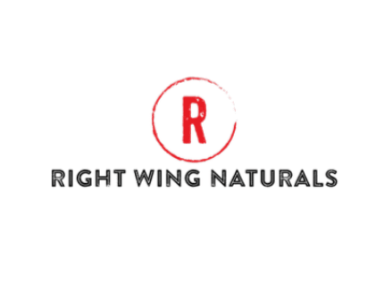
9 Responses to Option B
I only really liked B and F. H and E are too flat and boring. A is a bit too dumb and punny. C and G are ok but a bit flat. A is on the right track but too simple. F i really liked the elephant but the rest is a bit flat. B is the one that stood out the most to me and is the most recognizable and memorable to me.
The wings are good for duration of the flight but the dry print is more even and pristine.
I thought E's text was too broken up which was hard to read. I felt the same about D and F's logos as these didn't seem comprehensive or coherent. I thought B and G used text that was more straightforward so it was easier to skim quickly.
I think option B is the best choice, it's clean and modern, not overly political and would work as a brand.
Yikes! A lightning bolt with the words "right wing"? That is socially liberal at all. I would pick a simple design like choice B. The imagery of it is neutral enough to cover both ideologies.
i like the logo in option B because it looks the most fitting and exciting to me
The overall choice looks better in a minimalist fashion but would look better with Made in America
I like the simple logo that uses white space to accentuate the logo. I also like the modern font used in my first two choices.
I'm not sure why someone who is socially liberal but politicall conservative would be right wing (they seem more in the middle), but I ranked based on the relative appeal of each logo.
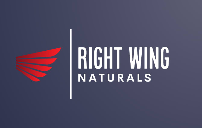
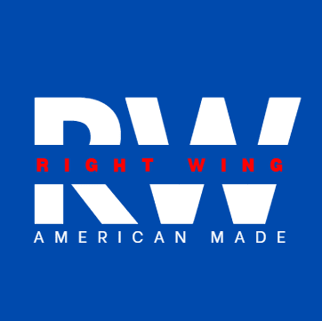
19 Responses to Option C
Option C is a good fit for the description. D is the worst by far because it doesn't make any sense unless these guys lift.
I liked the wing as part of the logo and the colors of C looked best to me for this demographic group.
I would choose choices C, D and G first because they have a good design logo which is attractive and really creative tom then choices A, H and E will follow which also have a good creativity but they are not the most attractive to me then the last options will be B and F which are the least attractive to me from the logo design to the color choices of the logos which are less attractive to me.
I really like the color scheme in option C and I like the wing graphic as it goes with the title of the group.
I prefer option C logo looks natural. I find it is friendly.
This one seems to be more conservative than the rest.
I prefer option C. I like the wings and blue background. It is simple and tasteful.
C Looks most professional and cleanG is attractive but there's too much white space.E is attractive but too much blue space and the font is too largeH this is also attractive but the font is too small and there's too much white space.A I like the bird but it's not my favorite among all the samplesF The elephant is attractive but overused when it comes to politics and partiesB looks too generic but at least it's colorful with the red RD is my least favorite as I don't like the how the word natural was shortened to Natty
Option C seems like the logo that illustates the brand name the best but also provides a pleasing visual aspect with the background colors for the logo compared to the other options.
I love the use of three different colors. The dark background is perfect with the white letter and red wing.
Option C is the best logo for a product that sells to men age 18-35 (who are socially liberal and politically conservative) because it has the perfect color combination, words, logo and background. It's not annoying at all and it inspires me to learn more.
I prefer option C as it is simple yet the dark background and the layout help it stand out amongst the others.
i arranged these from the most liberal looking to the least, i find the logos with the least amount of red color on them are the ones i find to associate with being liberal
I chose C because I like the wings, and the font is easy to read, it looks mature
I feel like option C and G are the best because they look very natural and I am imagine they would look go as logos on hats or shirts.
I like Option H as my first choice. It looks classic and stylish with No frills. Options H & D both are quite nice and have a simplicity that's pleasing. Option E is bold and option F is nicely drawn. The remaining options are perfectly fine but are not as eye catching and seem very ordinary.
C, F, G, and A feel the best for the age range. D, H B and E feel cheap, stupid, and tacky.
H and D and B and F are all unoriginal and not at all unique to me. Throw them all out. The other ones are all equal to me and are well made
Option C- Definitely the best choice. Looks more matured and smart like the brands on the top chain.
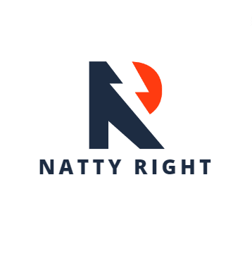
6 Responses to Option D
I would never buy something branded 'right wing'.
I prefer Option D because it is the only one that does not contain the phrase "right wing."
Option D: Unique logo and nice color design. Would be looking professional and classy for men age 18-35 (who are socially liberal and politically conservative)Option H: Is simple and easy to remember also look good and professional. This seems to be the 2nd best design out of all. Option E: I like the fact that they have mentioned "American Made" this is a strong message. But there is too much blue in the design. Logo looks good though. Option A: could have been better if there was another logo instead of the bird. But the font style is really good looks professional. All in all D is the most convincing in all the designs.
I like the ones that make it seem like less of a conservative product because I wouldn't purchase if I knew that about it
"Natty Right" is funny and reminds me of a term that is used for both beer and bodybuilding. I think that will get peoples' attention the most. G looks the most professional, but is a lot more boring.
I like the use of the lightning bolt in option D. Option E looks too much like a Hillary Clinton poster.
15 Responses to Option E
The more colorful and detailed the logo was, the better fitting it was for that kind of political leaning.
I picked E because it looks to have a conservative motif and feels modern, which is appropriate for this age demographic.
I just want a better idea of what "socially liberal, politically conservative" means. Does this mean they're fine with LGBT (which plenty of conservatives are) but are pro guns and pro small government?
I would choose option E because logo seems different and unique which also has a alphabet RW and it says American made which is more important to attract native buyers
I like option E the best because it stands out more than the others, it feels bold and makes a statement
I love E the best because it states american made which should be loved by the politically conservative men. The design of C is classy. The triangle in H looks strong and determined. The R in B is identified with the conservative party. Though D also contains an R, I don't understand what natty is. The elephant in F looks weird. The bird in A looks childish. Lastly the wing image in G seems meaningless.
choices e,h,c,g looked more modern
Prefer Option E. I like that the logo includes the words, 'AMERICAN MADE' in it. Makes clear that it is not anti-American, and not to be confused with the ultra-left wing, socialist movement.
I like the boldness of this one it is a attention grabber and it stands really nice and strong
I picked E, H, C and F as my top choices as the logos look like they are very bold for a company.
I like option E the best mainly because I like the American Made statement, which separates it from the rest of the options.
E is nice because I think the blue shows the concept of being liberal and the Right wing is clear as well
My favorite is option E, it reminds me of a political poster used around election time. I also really like that it says American Made.
I really didn't like most of the options given but E to me was the one which stood out and it was my top choice hands down.
I choose "E" because it says American Made. Enough Said.
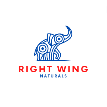
23 Responses to Option F
i thought f was fitting as well as visually appealing
Option F, looked the best and worked the best given the name. Option G and A worked well too. Option C, E, and D looked okay for a logo. Not too great. Option H looked kind of dumb to me. Option B, looked too plain and simple while not looking that pleasing to the eyes in terms of a logo.
F is a really good design and it just pops out. G,A,B,D and H are okay but they feel very generic to me. C and E are too large and I don’t like them.
I liked the design with elephant, followed by images that used wings and birds. The remaining were too plain or were not as visually appealing.
I like Option D a great deal, but Option F is really good, inventive, whereas a lot of these logos are boring bird wings, that artsy elephant is cutting edge, something you won't see everywhere and perfect to symbolize the organization.
Natty Right sounds terrible to me. Naturals is much better I think. E looks like a bad yard sign.
Stay away from red and black. Comes off badly like a dictator. The first one is really creative and looks like art. The rest are just run of the mill "throw it at the wall see if it sticks"
I like F the most as it really stands out visually and really attracts your attention and I think that is the most important thing a logo can do.
I picked F because I really like the elephant with the blue swirls it really drew my attention. I like how Right Wing is in red thick bold colors. I like how if uses the colors of the American flag in a nice design.
i like how choice f really keeps the political aspect of it in the picture. so you know what you're looking for when you're there.
I really like the elephant design as it is true to the group. I also like the wing designs of G and C. It fits perfectly with the name. A and B are great logos as well that I like
I think the right wing naturals logo with the elephant of option F is cute, memorable, and perfect for socially liberal and politically conservative young men.
I have never really thought about political clothing before. I new way of identification for conservatives? Branded clothing?? Well, I guess if you are going to make it conservative clothes then you should put the conservative party symbol on it. Option F is the only design that offers the elephant as the design focus.Option D is the least favorite as it really means nothing. I am not certain what a Natty is so it ranks last in my selections. I believe Natty is an old term so it might not go over well with todays youth.Option G, C and A all offer various form of wings in the design, so that grouping really ranks second collectively. I like the color scheme of Option G the best.Options H, B and E are all designs that really are not aligned well with the name. This represents the third group. Option E looks like a campaign logo design rather than a product brand. Option F is my pick for the best aligned logo from this group.
I love option F the most because it has a logo of an elephant on it making it look cooler.
I prefer the option F men brand logo because I like the elephant illustration the most. I chose options A, G and C second, third and fourth because I like the realistic bird illustration logo more than the blue wing illustration more than the red wing on a blue background illustration. I chose options H, B and E fifth, sixth and seventh because I like the blue triangle that looks like a wing more than the red circle logo more than the American made logo. I chose option D last because I really do not the brand name used in this logo because of its negative connotations.
I just picked the logos that I like best. The elephant logo is easily my favorite logo on this page.
The logo is beautiful and very attractive to the eye. The elephant was very emblematic of the Republican party. Very cool!
The abstract elephant invokes the Republican party. The Republican party symbolizes conservative values which is what the wording right wing implies.
I like option F the best. I really like the elephant logo
F WORKS THE BEST AND HAS A COOL ELEPHANT.
F, G and C are the only three that I remotely like. I chose F first because it matches the description best.
F is my favorite because of the elephant. I like the wing graphic in G, C and A. I like the red white and blue in E. I dislike D, B and H.
F and A re pretty simple, yet not too simple. I don't like D because it seems too juvenile.
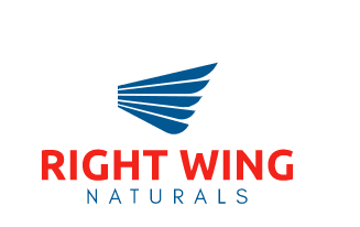
10 Responses to Option G
I think the logos with RIGHT WING in red against a white background look the best.
Natty Right sounds like an awful name. Having the wings in the log makes sense.
This is the most appealing option because it doesn't lean too far on the political side. I like that it relies more on the literal "wing" aspect design-wise. Just a simple, yet effective design.
I like the logo in option G the best. I like the red, blue, and white colors. It has a clean, minimal style which has a simple appeal.
The best ones are G, H, and C. Any of those would be a good choice. A and F are okay options. I didn't care for the others that much.
I really like g. Nice professional look.
I picked options G and C because I like the winged designs.
I like the incorporation of the colors blue and also the wing decoration
I like G because I like how the logo is a wing. It's unique and fits. I like C a lot for the same reason. I think the rest are okay except for D which makes me think of beer. It sounds odd.
Option G is my top choice because it's the best blend of showing the red and blue of both Republicans and Democrats in a balanced way. Option F is a close second, as it also has a nice balance of red and blue, and I like the use of he Republican party logo, as it fits the politically conservative aspect. Option H is too obscure as to what it implies.
5 Responses to Option H
I find options that have a wing or the elephant just forces it all in your face. Option H looks most professional
The simpler designs are overall better, espescially the ones that only use simple shapes. The ones that have a white background are also better.
Based on personal preference and likeability of logo
I don't like the elephant logo, and I think that the best ones are just going to have a white background. I think the best ones don't really have any puns either
I think you want be individual in the logo and stay away from similarities with other fat right groups
Explore who answered your poll
Analyze your results with demographic reports.
Demographics
Sorry, AI highlights are currently only available for polls created after February 28th.
We're working hard to bring AI to more polls, please check back soon.

