Poll results
Save to favorites
Add this poll to your saved list for easy reference.
Which logo do you prefer for a Women's Supplement Brand?
Option D won this Ranked poll with a final tally of 30 votes after 3 rounds of votes counting.
In a Ranked poll, respondents rank every option in order of preference. For example, when you test 6 options, each respondent orders their choices from first to sixth place.
PickFu requires a majority to win a Ranked poll. A majority winner differs from a plurality winner. A majority winner earns over 50% of the votes, whereas a plurality winner earns the most votes, regardless of winning percentage.
If an option does not earn a majority of votes, PickFu eliminates the option with the lowest number of votes. The votes from the eliminated option are reassigned based on each respondent’s next choice. This process continues in rounds until a majority winner emerges.
Scores reflect the percentage of total votes an option receives during the vote counting and indicate the relative preference of the respondents. If there is no majority winner, look to the scores to see how the options fared relative to one another.
| Option | Round 1 | Round 2 | Round 3 |
|---|---|---|---|
| D | 34% 17 votes | 42% 21 votes +4 | 60% 30 votes +9 |
| C | 28% 14 votes | 30% 15 votes +1 | 40% 20 votes +5 |
| B | 26% 13 votes | 28% 14 votes +1 | Eliminated 14 votes reassigned |
| A | 12% 6 votes | Eliminated 6 votes reassigned |
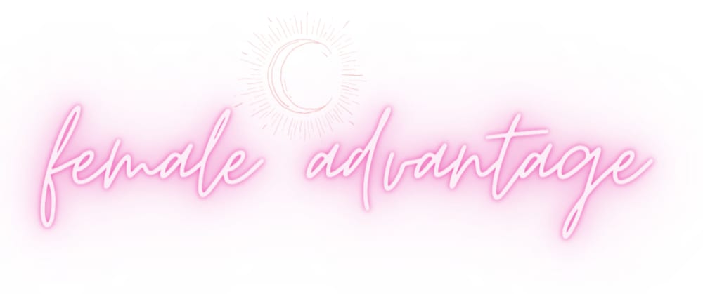
6 Responses to Option A
I like Option A the best because it is the prettiest and the most unique out of the options. I selected Option C last because I don't like the color scheme as well as I like the color scheme of the others.
Most of these are rather boring, save for A. I love the hot pink, almost neon look. Very retro yet chic for now.
i love 1 its so cool and electrical looking, for next 3 i prefer capitalization to let women know theyre important, i prefer purple to magenta
I prefer the option A logo because this logo is much more fancier and interesting to look at, and I like the crescent moon and the hot pink colors. I chose option B second because the Venus symbol is smaller and not incorporated into the text of the logo. I chose option D third because the Venus symbol is larger but not incorporated into the text of the logo. I chose option C last because the Venus symbol is used as a letter, which is odd and makes the logo more difficult to read clearly.
Option A I liked the font style and the overall design it just looked more stylish than the other options. Option D I liked the all capital look. Option B looked okay. Option C I wasn't a big fan of the font style.
Although a bit light in color- this one is the best option; the logo in the name for C is confusing ; In choice D - I cannot get past the typo - and additionally do not like the female sign in there - it does not portray an advantage if you have to provide symbols and the name and B looks like a question mark - so it was last.
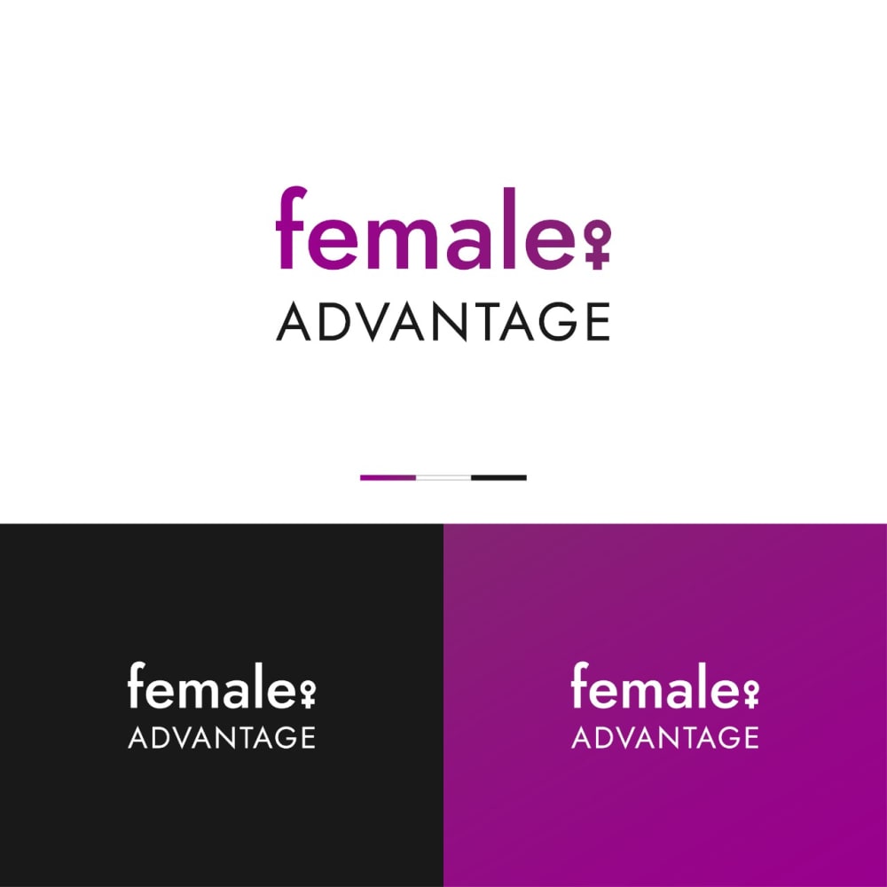
13 Responses to Option B
I went mainly based on readability. The best are easily readable and the worst are hard to read.
I think all of these logos look pretty basic to be honest but Option B is the best in my opinion because of the font style.
These logos are the strongest overall for the most part
B and D look the most professional. C is so so. A is terrible.
I find A looks too much like something to do with nightlife. I think B looks authentic and trustworthy but also softer and approachable than D. C took me a second to recognize how they symbol was integrated into it.
I think B and C are the two best. A is a bit much and D has a really bad typo, also don't like that typeset. I like B the most, seems like the most professional looking.
I actually dislike the brand name "female advantage," so not too thrilled with any of the logos. Felt pretty similarly about B and C. Both OK. Liked bold print on B. A - light pink looked weak. D was misspelled, so that was a no go.
B and A are my two favorites as they are understated and in a good way. I chose B as I simply preferred the font more. C is third as I prefer the female symbol after the word and not as a T like it is in that image. A is last as that font/color with the background makes it harder to see than it should be.
I like a font that looks powerful and strong
I like option B the best. The font is very appealing to me. I like option C as well
This logo is very readable, with great fonts, color scheme and a great graphic element and has the most polished look relative to the others. The others are also very hard to read for me. This one is your winner.
The designs with solid colors and a high contrast level with purple/black shades to be ideally arranged for the target consumer group.
B. Has the right thickness to read text better. D. Great size for text to stand out. C. Has a subtle appearance. A. Too stylish, doesn't fit product category.
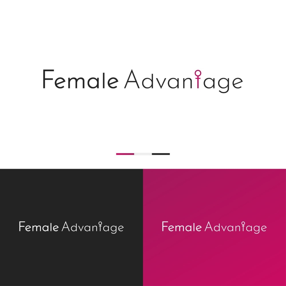
14 Responses to Option C
This is the most visually complex and interesting compared to the others
Options C and A of all lowercase letters creates a less strict and more open minded brand.
I prefer the logo in option C because it feels the most authentic and natural. Option D and B have some potential too. Option A feels the least intriguing to me overall.
Not too much of a fan of the options here but option C is the best of the lot. The main font isn't too flashy.
I like the female sigh inside the word advantage best of all the logos, I thought it was clever and well done.
C SEEMS MORE PROFESSIONAL AND LESS LIKE A SEXUAL AID.
The bright lights in A doesn't fit with the supplement brand, and the lower case letters in B makes it look childish.
I selected the logos that I most preferred for a woman’s supplement brand based on the options available.
The red or purple are all fine, but the pink is too "delicate" looking..it doesn't say "useful and powerful for a woman" it says "weak and frilly and fancy"
I ranked these based on preference for the font with C being the most attractive and B the least attractive.
I like how they have included the gender symbol into the word "advantage" on option C. A is really difficult to see, especially in a white background. I think lower casing the word female may diminish it's meaning. Not being a woman myself, I can't judge it's significance, but I imagine it somewhat similar to how some Christians would get upset if you wrote "god" instead of "God."
I like the logo in option C the best. I like how the icon for female is used to replace the "t" in advantage as it looks stylistically appealing.
I liked that C was clearly for women but also subtle and classy in terms of style. I felt that B was decent at this as well. I didn't like how over the top and forceful A seemed.
I prefer C because I think that it has the most interesting, eye-catching, and visually appealing logo design/color scheme out of the four options.
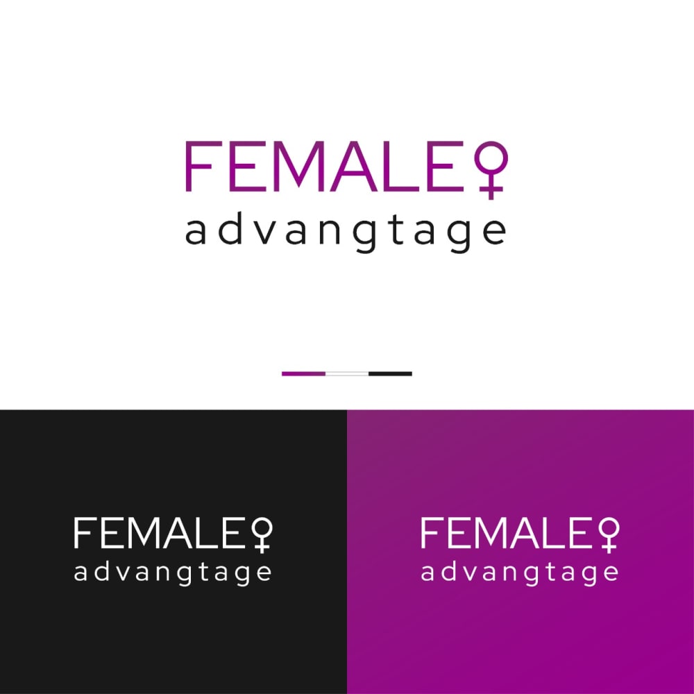
17 Responses to Option D
I prefer option D. The colors are great and I like them. I like the font and it is bold enough to stand for something.
D I feel like flows the best and also has the best design to it.
D looks strong and empowering , C also does but is a little less exciting. B and A I dislike the F in female being lowercase
4 is way too blurry. For the other ones I prefer the bright, vivid colors
Option D is very powerful both colors and font/upper case
I like the look of D , the bigger letters help it stand out and the overall design is sharp looking which makes it attractive in my opinion.
I think this one has the coolest font
Options D and B both have easy-to-read fonts - I just slightly prefer the ALL CAPS section of D. All of these are acceptable except Option A, in my opinion.
The letters are modern, the interpretation of the symbol is more defined.
I like the symbol for female after the word as I think it is more attention grabbing
D & B are the easiest to read. A is the most difficult to read.
Very much prefer the all caps 'female.' makes it seem stronger and more powerful
I prefer the colors and the uniformity of the font in D. B is pretty close to D, but with a different font. C is close, but the colors aren't prettyA is hideous and should never be considered.
Ranked by how patronizing they feel regarding gender
I think it is better with the symbols. THese are in now a days.
D- I like the colors and font size. Eye catching and artistic. A- Very hard to read.
The banner makes the logo stand out and be noticed. The first choice has bold and large font. This helps to see the wording much more than on the other logos. The last choice is not on a logo. It also is pink on a white background. It is very unnoticeable.
Explore who answered your poll
Analyze your results with demographic reports.
Demographics
Sorry, AI highlights are currently only available for polls created after February 28th.
We're working hard to bring AI to more polls, please check back soon.

